

The Citi.com Bank at Home Experience
Couch Clicks Part II: Citi.com Banking — Homepage Refresh & Content Strategies
This is the second article of a three-part series focusing on a general UX/UI review and light redesign improvements for the current Citibank homepage and login experience.
What began as a basic homepage evaluation for a potential role in fintech/digital banking later grew into a deeper UX audit. When the opportunity never materialized, the findings and recommendations were restructured into this article-style case study.
Summary of Articles in this Series
Part I: Citi.com Homepage Evaluation
An in-depth UI/UX review of the Citibank homepage, focusing specifically on the problematic Sign-On area and how the content and overall site fail to deliver a positive user experience.
Part II: Homepage Refresh & Content Strategies
General UI/UX fixes for the issues outlined in Part I by showcasing a homepage redesign, content direction approaches, and how these strategies would integrate with a standalone Sign-On page solution.
Part III: Sign-On Design Concepts & Considerations
Explores alternative design options for accessing the sign-on process, the pros and cons of each approach, and the impact on the overall user experience.
Disclaimer: These insights are based on my experience as a front-end user, without direct info (or history) of how the site was built, managed, or maintained. I’ve attempted to address this issue where appropriate.
Citi.com may have had content, design, and/or functionality updates since the time of this review. Screenshots may now be out of date and no longer represent the current site.
Part II: Homepage Refresh & Content Strategy Objectives
Part I: Citi.com — Homepage Evaluation uncovered widespread UI/UX issues and content flaws, compromising the homepage and Sign-On process, and eroding Citibank’s reputation as a trustworthy financial institution.
While the initial reaction was to burn it all down and start over (and, I won’t lie, that would be ideal), even tiny changes can improve this neglected experience and help restore user confidence.
The remainder of the article will take a few approaches aimed at enhancing the homepage and login experience without resorting to drastic redesigns:
- Restraint-driven design: Integration with the existing brand without causing additional chaos, using the same color palette, fonts, and no crazy effects or trendy elements.
- Minimal page alterations and additions: Targeted homepage tweaks for a more user-friendly and engaging experience, avoiding unnecessary complexity and keeping the existing page and overall IA structure.
- Alternative content strategies: Exploration of multiple content directions to increase user engagement and positive brand perception.
The endgame is to establish the homepage and login areas as reliable and trustworthy, where members feel confident entering their banking information and trust that citi.com is handling their financial data securely. And, as an added result, incorporate a bit of unexpected happiness into the experience.
For reference, here’s the current citi.com homepage:

Content and Stock Image Notes:
Audience and Adaptation: American audiences are the target demographic for the following content suggestions. Use in global markets would require adaptations to account for cultural and demographic differences.
Fictional Placeholder Content: The placeholder content is fictional and may not accurately represent real Citibank services or products. While some offerings may resemble existing products, many have been invented for illustrative purposes to demonstrate hypothetical content direction ideas.
Stock Images: The images were sourced from various stock sites to illustrate potential content curation directions. Image credits are listed at the end of the article. It’s fair to assume that Citibank has the budget for a creative content approach and investing in high-quality, custom imagery that’s uniquely theirs is definitely doable.
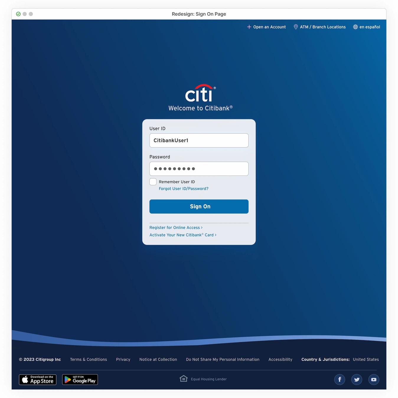
Sign-On as a Dedicated Page — Desktop Views
Right from the start, users are shoved into a cluttered hero section where Citibank promotions and the Sign-On area compete for space. This chaotic mix of headline titles, marketing copy, input fields, links, and two different CTA buttons leaves no breathing room, suffocating the experience with competing content. Forcing these two very different and critical user paths into the same space makes no sense.
The simple solution: separate them.

Each user path and its supporting content deserves its own space to shine! This is easily achieved by creating a standalone page dedicated only to Signing On. Nothing more, nothing less. Members can complete their task without any distractions. Meanwhile, the entire hero section can be 100% devoted to Citibank promotions, opening up a new world of content and engagement opportunities, which will be explored later.
Placing a Sign-On link in the upper right corner is already an established UI pattern used throughout citi.com’s inner pages. Adding it to the homepage navigation is a natural extension and maintains a consistent experience across the site.
A sign-on link in the upper right corner is an established UI pattern throughout citi.com’s inner pages. Including it on the homepage nav also ensures a consistent experience across the site.


Just tinkering with the size, placement, spacing, and colors easily cleans up the entire header. Replacing that ghostly header with a branded Citibank blue background creates a solid anchor for the entire page, including the main nav bar, which no longer floats about in empty white space. Even the Citibank logo, now in white, is securely attached and doesn’t look like it might fly away.
By shrinking the oversized icons for Citibank locations and language options, these links are now appropriately sized as secondary auxiliary items. The ‘Open an Account’ link should also join them at the top, keeping the main navigation bar reserved for primary tasks.

While some categories and their submenu options could benefit from a renaming assessment, a quick fix for this larger IA issue is to add downward-facing arrows to the navigation items. This visual cue for ‘more options’ located under each item reduces guesswork and encourages users to hover and explore. Additionally, renaming ‘How can we Help’ to ‘Help/FAQ’ simplifies navigation by getting straight to the point.
All of these simple updates help users chart clearer paths through the site, including a now clear and chaos-free route directly to the dedicated homepage login section.
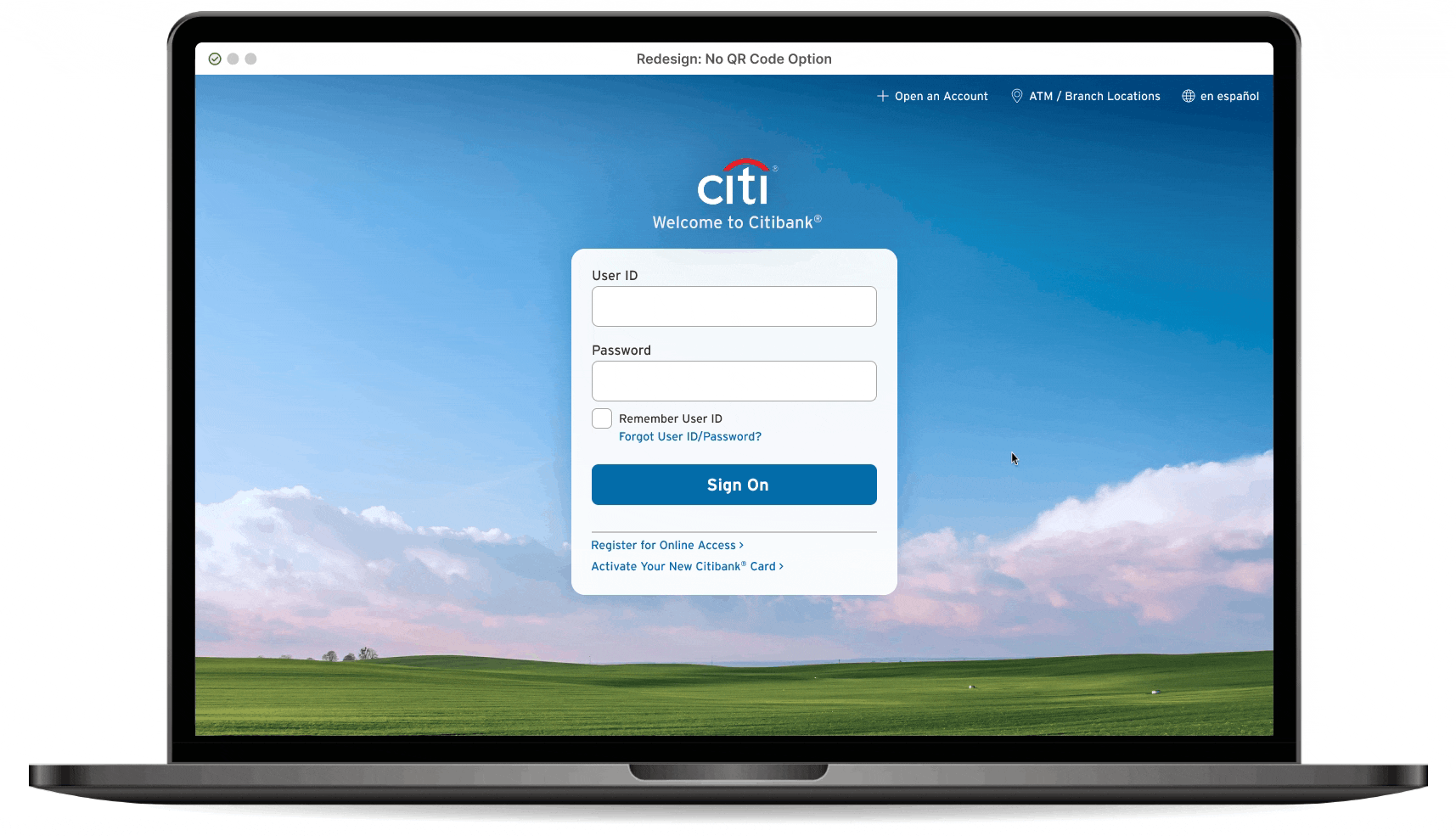
Standalone, Dedicated Sign-On Page
Minimalist Version
Member login is always a prerequisite for personal banking tasks and should be smooth and free of distractions. Clunky headers, extra navigation options, and off-topic promotions only create goal friction. A straightforward, single-purpose screen lets users focus on what they came to do: sign on.

User Control Functionality
Now, when members click a Sign-On link from anywhere on the site, they’re sent to a dedicated page for that task and no longer thrown back to a chaotic hybrid marketing/login home screen. The homepage remains easily accessible; clicking the site-wide Citi logo provides a simple way to return, but only when the user chooses and not automatically triggered by the Sign-On link.
The Page: Bare-Bones Header/Footer
Throughout citi.com, there is a noticeable inconsistency in header and footer styles, with some pages even changing their navigation options without apparent reason (this issue is discussed in Part I). To seamlessly incorporate a standalone Sign-On page and avoid introducing more header/footer navigation inconsistencies, the redesigned Sign-On page includes only account creation, locations, and language at the top, leaving the footer with only crucial legal and company-specific information at the bottom.
Sticking to a fundamental content approach makes the Sign-On page visually versatile — and a special gateway page — that never seems completely out of place on the otherwise inconsistent citi.com site. Eliminating the traditional, category-based navigation further emphasizes the current task at hand: account access.
A Cleaner Way to Bank: Skeuomorphic Transactions
The Sign-On module also follows the minimalist approach, offering only the essentials. It removes the QR code functionality (explored later) and features rewritten, reorganized, and neatly packaged content, all ready for user interaction.
This module + page combination may feel distinctly similar to the universal kiosk wall found at Citibank branches, minus the germy buttons and dramatic lighting.

With the digital version, the only germy buttons are those on your own keyboard. The other advantage is not having to endure random promotional materials on the kiosk monitor (Lady Gaga tickets?? I kid you not!) while struggling to dig your banking card out from whatever crevice it’s disappeared into. And while marketing distractions vanish once the card is inserted, the larger concern remains: keeping an eye out for shady individuals lurking nearby.
Flexible/Rotating Backgrounds
This minimalist approach allows the Citi-blue backdrop to be replaced with non-bank-related visuals, such as scenic backgrounds or other graphics (no marketing content, please!). Effort should be made to keep the images visually calming and brand-aligned, but even conservative choices keep things fresh and interesting. Providing a new visual treat on each visit is also a subtle reminder that the site is actively maintained and secure.

QR Code Option Incorporation
I’m just a Citibank member, observing all this from the front-end. I don’t have any secret insider knowledge, access to magical metrics, or a mind-reading crystal ball to gauge how the current QR Code Sign-On option is being received.
Psychic powers aren’t needed to spot several design issues impacting basic usability. The most urgent (and straightforward) fix is to distinguish the traditional Sign-On section from the QR Code option, reinforcing that these are two distinct login methods operating independently.
Beyond that, the QR Code retrieval method could take several different directions, or none at all…
Possible QR Code implementation methods:
- No QR Option, Minimalist (No Overlay)
Completely remove it.

- QR Code as a Button and QR Overlay Launch (Current Functionality)
Maintain the overlay functionality of the current site. The QR option remains a button that launches an overlay to immediately generate a QR Code. Relocate the button to the bottom of the panel to clearly separate it from the traditional Sign-On input method.

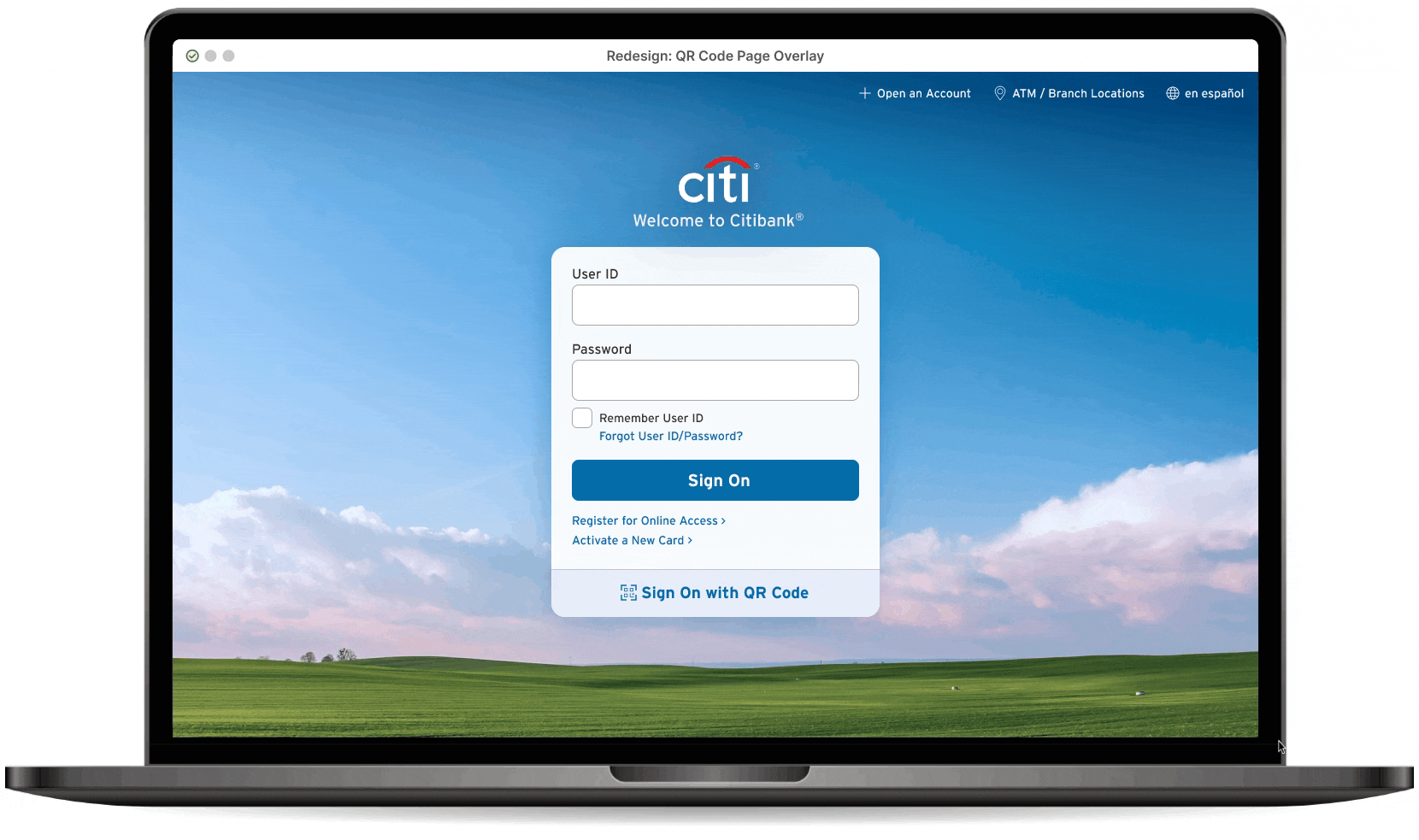
- QR Code as a Link (+ Dedicated QR Page)
The QR option is a link that directs users to a dedicated QR page (discussed in greater detail in Part III of the series). This approach offers greater design flexibility as a standalone page and decouples it from the Sign-On area, eliminating the need for an overlay. An added benefit is the ability to access the QR page directly, bypassing the Sign-On page altogether.


- QR Code as Expanding Toggle (+ User-Initiated Code Activation)
Incorporate the QR Code directly into the panel, where it remains hidden until clicked. This self-contained approach keeps users on the same page, with toggle functionality between the traditional Sign-On inputs and QR Code generation.


Decisions, Decisions…
Citibank may have solid reasons for prioritizing the QR Sign-On method (or perhaps none at all). Regardless, the design approach should be guided by user testing, analytics, and business goals in determining how much to push this QR Code option.
Who knows? The data might suggest that ditching the fancy QR option entirely and sticking with a traditional Sign-On is what users prefer.
100% Hero Homepage
Removing the login module and adding a ‘Sign On’ link to the navigation is a great start for taming this homepage chaos. Citibank products and services are given the entire hero section for their promotions, while Sign- On access is quietly tucked away into the navigation. Users are already familiar with this common UI pattern, and a single click to a dedicated page is unlikely to be confusing or inconvenient.

This approach benefits everyone: members, non-members, and even members just looking for the login link. By just relocating the clunky sign-on section to a separate page, the hero section is free to focus on promotions or services without being overshadowed by competing links, clutter, and CTAs.
With the login module no longer sharing and suffocating the space, this prime real estate is now flexible to accommodate a variety of engaging images and compelling copy, creating enticing content opportunities that might even attract members who originally came just to log in.
Detour: Homepage Content Strategy
Homepage content can make or break a site, influencing the brand experience on multiple levels and across different devices. So… before diving into mobile web issues and those redesign solutions, a brief excursion into content design strategies is necessary.
Garbage In, Garbage Out
A light redesign has its limits when trying to salvage a homepage plagued by a steady stream of subpar content. Despite the design tweaks (see the second image below), the landing page is still unengaging. Low-quality stock images, confusing copy, generic button labels, and ineffective promotions only continue to lose user interest while negatively impacting brand perception.


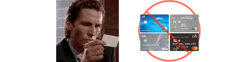
Card Carnage
On the homepage above, users are bombarded with eight different Citibank cards, which occupy 75% (three out of four) of the available content areas. These nearly identical (some even duplicated) plastic cards add minimal value, especially when the corresponding copy is generic, boring, and unrelatable. The content all blends together, offering nothing visually or textually distinctive, and certainly not click-worthy.
Plastic Joy Zone
Even the webpages spared from the invasion of these pesky plastic cards aren’t doing much better. Instead, the fallback images show joyous people completely absorbed in their devices — presumably using the very website they’re pictured on. The happiness here is so over-the-top that it borders on parody. The human emotions are as plastic as the cards they replaced.

Attempting to create a happy user by showcasing images of digitally delighted individuals comes across as lazy, staged, and (worst of all) insincere. Genuine satisfaction falls flat. Paired with copy that has no connection to the images, it all becomes irrelevant clutter that fails to engage, promote, or resonate with the real-life side of the screen.
A Zombie-Less Content Strategy
I’m not suggesting that image selection reflect hyper-realistic situations. For example, a couple arguing over their joint banking account might be a stretch, though it would certainly get my attention. Still, these stereotypical images fail to add any value and just bury the site with more banner-blind areas. Replacing these ‘device zombies’ with a livelier content approach is the way to bring the site back from the dead.
A thoughtful content assortment keeps things fresh and engaging. Carefully chosen images and concise, relevant copy improve the homepage experience and online brand presence. Keeping content regularly maintained and updated further reinforces a sense of security and stability in users. Even tiny changes help show that the site hasn’t been left to rot.
The following are a few content directions and ideas that would assure users that no one has dozed off behind the wheel at citi.com.
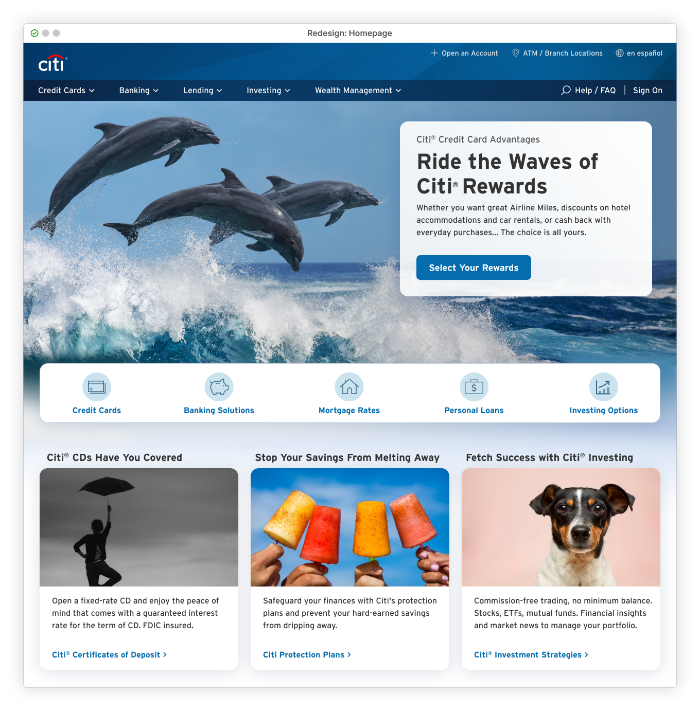
Content Direction #1: Playful Product Presentation
By relocating the login to its own page, the hero area can now showcase a Citibank service, product, or promotion in all its dramatic glory! The stage is set for full-width images with plenty of space for clean, breathable copy, creating the perfect environment for user engagement.
The real power lies in the content choices and how they can bring energy and interest into the most boring banking experiences. Whether through engaging visuals or playful copy that adds a touch of storytelling, good creative content can set the site (and brand) on a positive trajectory vibe, regardless of users’ interest in the actual promotion.


Even a single, dull credit card can become interesting with dramatic lighting and engaging copy. It’s a great way to inject some energy into a landing page. This ‘Go Big or Go Home’ method of eye-catching product presentation isn’t anything new. It works, but it’s also kind of lazy.
Subtle product placements can have a stronger impact, whether promoting banking cards or the bank itself, and they don’t need to eat all the real estate. When juxtaposed with other images, these real-life products (or the bank, represented by a logo) become intriguing in their new context. Throw in some relevant copy that ties everything together, and the product becomes a surprising focal point.
Side Note: Secondary Card Modules
Content Standards: Sync or Sink
The content work doesn’t stop at the hero section. By applying the same high-quality image and copy strategy to secondary promotional modules, tonal consistency is maintained throughout. This cohesive approach avoids the scattered mix of poor-quality assets, as seen on the current site. These were likely added by different branches of the company and haphazardly thrown together as ineffective window dressing.

The Bigger Picture
Each piece of content doesn’t exist in a bubble; context consideration is necessary when curating which products or services to feature together. Beyond the core promotion (ensuring a diverse mix to hit target demographics), this includes strategic design placement and how individual sections visually interact on the page. A thoughtful arrangement balances the layout, creates visual harmony, and prevents credit card images from overrunning the homepage (as seen below).

Content Direction #2: Cut the Noise and Just Be Quiet
Create a welcoming and calm atmosphere using spacious, serene imagery that naturally evokes a sense of quietness throughout the hero space. This breathable, minimalist approach encourages user exploration, rather than recoil from visual overload or cognitive fatigue.
But what about branding? Isn’t this approach too simple? Not when the page already prominently features the Citibank logo, standard colors, and other branded assets. There’s no need to hit users over the head with Citibank content crammed into every area, including the hero section. (Branded hero content can be effective, but it’s not always necessary.)


Image simplicity should be paired with calm, friendly, product-focused copy. References to visuals should avoid being loud or pushy and maintain a light, airy mood. Finding calmness in a financial website is an undervalued asset, yet for members managing their finances, it should be a priority.
Side Note: Copy Adaptability. Beyond content creation, the hero should offer flexibility in copy placement. Left or right text alignment, light or dark styles, and options for free-floating or card-contained layouts should all be supported. This content-first mindset adapts the presentation to the message without forcing it into a singular, predetermined structure. A range of hero layout possibilities keeps the experience fresh, engaging, and adaptable.
Content Direction #3: The Elevator Pitch
Engaging visuals can inject a bit of enjoyment into an otherwise dreadful chore. Well-crafted copy has the same power. A relatable tone is crucial; average users should get the gist of the message without feeling confused (or stupid). The messaging also shouldn’t be so dull that it puts them to sleep. It’s okay to be slightly vague upfront and save the deeper details for after the click.
Align copy with the rhythm of the image. Energetic language for dynamic visuals and a calm, soothing voice for quieter ones. Set strict character limits to reduce overwhelming users. This further forces content creators to break down complex financial solutions into a more user-friendly format.
This approach should be consistent across all hero elements: from headlines to body copy to button labels. Maintaining this balance throughout related content breathes life into the page and minimizes friction.

This space is perfect for a quick elevator pitch. A short, straightforward teaser approach provides quick insight into the product/service being offered. Relatable language is by nature inviting, short, and gets to the point faster than corporate-speak. Users can quickly determine their level of interest without painful guesswork. It doesn’t ask anyone to think too hard and, even better, it respects their time.
Content Direction #4: Out of the Void and Off the Couch
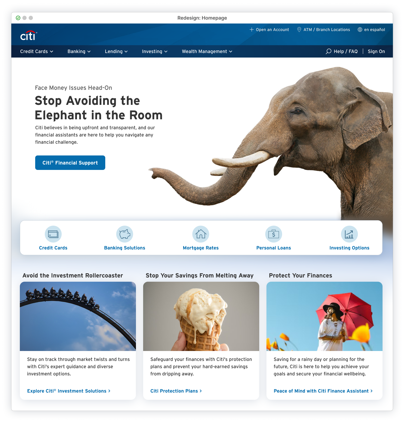
The current Citibank hero section uses a ‘cut-out’ method, removing background context and leaving the subject matter, whether card product images or people, in an uninspiring and disconnected environment. This approach is especially problematic for human imagery, making the people appear unnatural and even creepy, as disembodied figures stripped of any relatable connection to reality.

It’s also exhausting…By removing the environment, the subjects’ stories are lost, forcing users to decipher a puzzle to understand the context in which these images might make logical sense.
Revitalize these images by reintroducing an environmental setting. Even a simple sky can provide engaging context, surpassing a lifeless, invisible backdrop. Depicting humans interacting with their surroundings gives them a narrative, potentially resonating with users and planting an idea of financial aspirational goals.


Most importantly, use images of people who are active and engaged. What user feels inspired by someone in wrinkle-free pajamas, plastered on the couch, and mindlessly fixated on their laptop? Or by someone squinting at a tiny mobile screen, oblivious to everything around them? These lazy, stereotypical content choices show people so connected to their devices that they’re checked out of the physical world. They feel stale and sad, offering little reason to care about whatever promotion is being pushed.
Content Direction #5: Geo-Targeting/Customization
The site uses cookies to personalize content in the hero and secondary modules, initially displaying a wide range of promotional materials targeting various user demographics. With each page refresh, the mix dynamically changes, replacing and introducing new content. However, once cookies are set (e.g., logging in and out), the content becomes repetitive and unvaried, stuck on a narrow set of promotions.
Although this suggests some level of customization, none of the content feels relevant or personalized. In my experience as a Citibank member, it’s just as scattered as before, only less frequent, with the same ads repeatedly showing up. The current content is not only off-target but so dull and ugly that it’s likely ignored, even when, by some miracle, it reaches the intended audience. The original random ‘bombardment’ approach was far more effective. It threw spaghetti at the wall with every refresh, and eventually, something would stick.

A crucial step is to add a cookie acceptance banner, which is disappointing not to see on the current site, regardless of login status. However, should users opt-in, the ability to serve targeted content, even with very generic data points, could be leveraged to add a slight personal touch currently missing from the site experience. By doing so, location-based imagery (e.g., closest major city), and promoting products/services popular among specific areas, ages, etc… could bring members closer to relevant offers, enhancing their overall experience.


While tailored content can enhance the user experience, it can quickly cross the line into creepiness and invasiveness, especially for financial institutions handling sensitive data. A generic approach to personalization strikes a balance and makes a personal impact… but from a safe (and legal) distance.
Content Direction #6: Walk on the Wild Side
The current Citibank site is overflowing with generic human images, each desperately trying to elicit some sort of fake enthusiasm for whatever product spot someone decided to plunk them into. Let’s be real: some doofus stock model with over-the-top gestures and a big smile isn’t going to resonate. It’s a manufactured image leaking fake excitement. Relying on plastic smiles to create appeal or connect with users is boring, inauthentic, and completely lazy..
Cats and elephants (and most of Noah’s Ark) have a certain magic that human stock models can’t match. Animal imagery is a genuine and positive emotional jolt and certainly an unexpected appearance on a banking site. This delightful surprise not only makes for a more engaging experience but is likely to resonate with a broader demographic, regardless of the product or service.
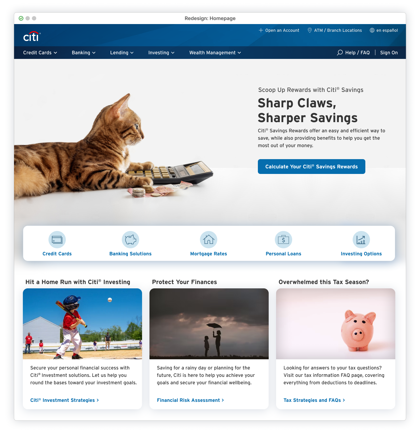
Further supplementing animal imagery with narrative-driven copy creates background context, adding an extra layer of surprise and mild entertainment that can grab attention for often-overlooked products or services. This also provides a much-needed moment of lightness. It offers a refreshing chance to take a breath before plunging into whatever ‘adult’ task awaits.
Typical stock models just can’t compete at this level. And humans suck.
Content Direction #7: Seasonal Splashes
Even if members don’t log in frequently (for months or years), lacking regular, noticeable updates can make the site feel abandoned and leave users uneasy. Wondering if a financial site they’re about to log into is actively maintained should never be a concern. Simple, consistent updates, like swapping out hero images or refreshing secondary modules, add a layer of perceived security.
‘Perceived’ is the key word. These updates have no direct impact on a user’s account, but even small, superficial (e.g., fake) reassurances can go a long way with cautious members. Pinpointing exactly what’s changed between visits isn’t important. It’s the shifting content that provides a subtle sense of trust. This signals that someone is actively paying attention and the site isn’t an outdated dustbowl that development hasn’t touched in years.


Content tied to holidays, seasons, events and other timely material places the site in the current world and not just recycling the same rotation of standard product or service promotions. It’s more likely to be noticed, feel relevant, and add a touch of fun or festivity to the background experience. All of this demonstrates that the site is regularly updated and maintained, showcasing Citibank as both modern and credible.
Content Direction #8: Embrace Creative Clichés
It’s a banking site. Before even hitting the landing page, users are already primed to dismiss the boundless supply of standard, stereotypical ‘banking’ imagery and the same old clichéd marketing copy. This mindless filler evaporates into the background as banner blindness.
But there’s underlying power in stereotypes, and they don’t need to be completely abandoned. They just fall flat when casually slapped on without effort — viewers dismiss them as another static, low-quality content choice, a placeholder for more worthless dribble. All of this quickly changes when stereotypes are thoughtfully reimagined with a new perspective, creativity, and real purpose.


Colorful and dramatic imagery, bold compositions, and fresh, relatable copy can pull clichés from the gutter of lazy predictability to a level of engaging distinctiveness. This approach grabs interest while avoiding cognitive overload, thanks to the intuitive understanding and familiar comfort that stereotypes provide..
Content Direction #9: Fun and Colorful
While writing this, the FTX disaster was unfolding, prompting Citibank to quietly add a subtle banner at the top of their homepage. The tiny 12pt font linked to information intended to ease fears and reassure members that Citibank was unaffected. Public trust in financial institutions was already shaky before the FTX debacle, and despite these reassurances, it only heightened the underlying, ever-present anxiety surrounding the industry.

Beyond the general distrust of banking institutions, most people aren’t thrilled about anything financial. This feeling is especially relevant now, with inflation eroding their hard-earned savings and uncertainty about what new dark abyss this is all plunging toward. Even without the global financial crisis, many people already expect a stressful experience when visiting a banking site.
Colorful images and illustrations can’t stop skyrocketing inflation. They can (temporarily) uplift the mood and lighten the load prior to whatever uncomfortable task is yet to come. Bright, unexpected, and creative imagery matched with sensitive copy puts the member in a better frame of mind. This is an opportunity for a brief, blissful escape, even just a momentary distraction, before users tackle the potentially unpleasant task of financial engagement.


Using whimsical, fun imagery on a financial site, even with an appropriate tone that doesn’t downplay financial concerns, might seem counterproductive. After all, money is serious business! However, playful imagery in banking isn’t new or groundbreaking. The popularity and variety of fun graphics on online check ordering sites demonstrate a clear demand for lighthearted visuals in finance. Even in today’s digital age, where paper checks may soon be as rare as the endangered animals they often feature, images completely unrelated to banking are still being used for… banking.
From random themes and animals to sports teams and trademarked characters, if you can name it, it’s likely available on a check.I personally had Looney Tunes checks for most of the 2010s (though I’ve since switched to a Star Wars theme, I do miss seeing the Tasmanian Devil).

Content Direction #10: A Humorous Twist
Earlier concept directions explored incorporating unexpected content not typically associated with the banking world to grab attention, drive engagement, ease anxiety, and even elicit a slight smile. Each of these approaches, to varying degrees, incorporated humorous undertones to create a more approachable tone.
Injecting subtle humor into a financial website through off-beat, witty content is a valid strategy. Clever wordplay or humorous anecdotes commenting on unexpected visuals can provide a new twist on financial products and services that might otherwise go unnoticed. Users might pause and actually look at the promotion before moving forward with their original task.
Even if the offer isn’t relevant, the moment sticks and (for some users) creates a memorable experience that sets Citi.com apart from the typical dull banking dribble. Just a touch of humor makes everything a bit more relatable, human, and might create some joy in the process.


Warning
A comic approach will backfire if not implemented with great care. Thoughtful choices must be made to avoid being misunderstood, offensive, or alienating to users. Humorous content is already a delicate balancing act, and becomes 100x more difficult with financial matters thrown into the mix. If it doesn’t feel safe, it probably isn’t. And even within safe territory, avoid the cringe; forced jokes rarely land well.
Content First: Laying the Groundwork for a Better Experience
There are easily hundreds of content directions that are better alternatives to the material currently used on Citi.com. Replacing the low-quality, generic stock images and impersonal copy with more thoughtful, human-centered content is an easy way to improve user trust, credibility, and satisfaction — and stand out from the competition.
Restraint is key: avoiding page overload must be kept in check. Every decision, down to a single word, should prioritize a seamless and user-friendly website. A minimal and focused approach helps prevent the bubbling chaos and clutter that currently plague Citi.com.
With the desktop foundation in place and content chaos under control, mobile alignment can fall into place. In the mobile web experience, every pixel matters, and limited screen real estate amplifies every decision. Imperfections become much more obvious, user interactions more difficult, and overall quality drastically declines, making precise design essential for a seamless mobile experience.
Sign-On: Dedicated Page Method — Mobile Web Views
Mobile Homepage and Sign On Page
Mobile web views already feature a dedicated Sign-On page on Citi.com, aligning with the desktop redesign proposal to reserve the homepage for promotional content and relocate the Sign-On module to a standalone page.
Current Problems
Despite having both a homepage and a Sign-On page to organize content for a cleaner experience, issues with layout, spacing, colors, and form fields persist, resulting in a cluttered, confusing mess. Dynamic inconsistencies in navigation options further contribute to a disorienting flow from homepage to the Sign-On page. Header items appearing on one page completely vanish on another, creating an “empty” appearance that could easily be mistaken for a site error


Even the hamburger menu changes the available options depending on the page. On the homepage, it offers a full spread of site navigational items, yet on the Sign-On page, only two options remain: location and language.
This hidden placement is disorienting and counterintuitive, needlessly complicating navigation and undermining user control. Why bury two auxiliary items in a hidden menu when they could be integrated into the page for full visibility and easy access? This design flaw is a significant challenge for users on-the-go, who may be navigating the real world while trying to find a nearby Citibank branch or struggling to access the site’s content in their preferred language.
Header Redesigns
Start by simplifying this mess by stripping out the clutter. On the homepage, keep the self-explanatory search icon and remove the redundant “How can we help” text. Everything can then be neatly aligned, with the logo front and center, all highlighted by the sharp Citibank blue spanning across the top.


Bad Burgers
On the Sign-On page, the redundant hamburger menu (housing only location and language options) can be replaced with a straightforward back link. This places auxiliary options readily available in the header for quick and easy access. Removing the menu eliminates potential user disorientation caused by inconsistent navigation options that change depending on the page. Meanwhile, the back link provides a clear, consistent navigation method, restoring user control.

Sign-On Page: Targeted App Download Type
The current Sign-On page prioritizes app download links over the actual sign-on section that users are there for. Citibank is likely trying to promote the app experience over this horror show (and understandably so), but there’s no need for these two prominent download links to overshadow the page’s main function.

Add functionality to automatically detect the user’s OS and serve the appropriate app download link. Integrate this link into the page using a third-party solution to visually customize the iOS download option and avoid those standard, cumbersome native smart banners. This approach allows users to switch to the app experience if they choose, without the app option overshadowing the primary purpose of the page.

Homepage: Layouts, Messaging & Management
The mobile hero area needs thoughtful planning to ensure that high-quality desktop content translates effectively to smaller screens. Well-sized images and appropriately placed copy are crucial to making the experience visually appealing and functional..
The vertical layout of mobile devices shouldn’t be used as a space to mindlessly plunk down content from the desktop version. It offers a unique opportunity to create unexpected delight. Embracing the narrow mobile canvas with playful cropping, dramatic upscaling, or unconventional image positioning can bring the experience to life in ways that defy typical mobile banking site expectations.

Placing copy and the call-to-action (CTA) button at the screen bottom offers easier thumb access and a way to encourage clicks. But this shouldn’t be the default approach for all content.
Image content should guide the placement of any messaging/CTAs. The layout should be chosen based on what best supports and enhances these art-directed visuals. This includes light or dark copy (adjustable for mobile views) and choosing optimal messaging placement, whether at the top or bottom relative to the viewport.
Offering hero flexibility allows a wide range of content possibilities. Without the constraints of a rigid template, designs can adapt across devices without compromising the experience on any specific viewport. This fundamental page can look its very best, at any size.

The secondary navigation bar is at risk of being buried, regardless of where the copy and CTA are placed (top or bottom). Allowing just part of the nav to peek up from the bottom of the screen provides a subtle hint of more content below. Users might have zero interest, but at least they know scrolling leads somewhere beyond a fancy hero screen.
Balancing multiple art-directed assets across desktop and mobile is challenging, but the high-quality, consistent experience is worth the potential headaches. Mobile adaptation is seamless when the base content is already strong, needing only minor adjustments for brand alignment to snap into place.
Mobile web browsing should never be left to chance or neglected based on screen size. A thoughtful approach, respecting the user experience across all devices, ensures a consistent and engaging journey with implicit trust built into every interaction.

Potential Challenges: Dedicated Sign On Page and Full Promotional Hero Approach
Desktop and Mobile Concerns
Homepage Shine, Inner Rot
Unfortunately, a redesigned and polished homepage only highlights the broader neglect of the site’s internal pages. Should a user wander off the orderly homepage and explore any section of the site, they will be subjected to inconsistent chaos in these subpages for services and products. These internal pages often can’t even agree on a standard navigation bar, let alone enforcing content standards or basic usability interactions.

Content Standards
The success of any content direction, regardless of the method, depends on thoughtful image selection and careful copywriting. Those responsible must exercise caution and diligence, steering clear of low-quality, lazy choices while consistently enforcing high standards and regular updates to keep the site fresh and relevant.
Clear and engaging site representation of banking, service, and financial products goes beyond just polished visuals and clever copy. Getting content to grab members requires a deep understanding of their mindset before, during, and after visiting the site.
Added to this is a member base made up of diverse backgrounds, varying levels of banking knowledge, and shifting financial situations. Targeting a specific demographic is hard enough, but throw in all these other factors and it’s a hole of conflicting needs and expectations. The safest route becomes avoidance: avoid being overwhelming, avoid being boring, and (most important) avoid being frustrating.

Sign-On Page Bubble
Members may skip the homepage entirely and go directly to the dedicated Sign-On page if they have a direct link handy. While great for users focused solely on account access, this reduces Citibank’s ability to promote key products and services. Those open to a slight detour (and even the sign-on-only diehards) might miss out on relevant and beneficial offerings they otherwise might have taken advantage of.

Sign-On Brings All the Users to the Yard
Placing the Sign-On option on the homepage might be a key metric for converting users to additional products and services. If this is a priority, alternative sign-on methods should be considered that still embrace a quality content approach while avoiding the chaos effect that the redesigns resolved.
This is further explored in Part 3: Rethinking Sign-On — Design Concepts & Considerations, where alternative account accessibility options are presented, maintaining the high-quality content approach while being effectively integrated into the homepage and overall Citibank experience.
— End of Part II
To Be Continued:
Part III: Rethinking Sign-On — Design Concepts & Considerations
Stock Photo Credits
(Note: C = Card, ordered left to right)
Sign On: Dedicated Page Method
- Custom Background
Background Photo: @jrmswny/unsplash.com - QR Code Options
Background Photo: Jahoo Clouseau/pexels.com
Content Direction #1: Playful Product Presentation
- Example 1
Hero: Citibank Product Image/citi.com (visual enhancements by Author)
C1: Alfonso Escalante/pexels.com
C2: Yuika Takamura/unsplash.com
C3: m0n5ter/pixabay.com
- Example 2
Hero: Юлия Завалишина/stock.adobe.com (credit card image from citi.com, added by Author)
C1: willyam/stock.adobe.com
C2: Igor/stock.adobe.com
C3: Luke Stackpoole/unsplash.com
- Example 3
Hero: Mathias Karner/stock.adobe.com (Citi logo addition by Author)
C1: Towfiqu barbhuiya/unsplash.com
C2: Nubia Navarro (nubikini)/pexels.com
C3: Ylanite/pixabay.com
Side Note: Secondary Card Modules
- Card Modules
C1: WorldInMyEyes/pixabay.com
C2: Charlie Deets/unsplash.com
C3: Andrea Piacquadio/pexels.com
Content Direction #2: Cut the Noise and Just Be Quiet
- Example 1
Hero: Philip Steury/stock.adobe.com
C1: Lasse Kristensen/stock.adobe.com
C2: Sara Cervera/unsplash.com
C3: Pacto Visual/unsplash.com
- Example 2
Hero: Dmitry Ersler/stock.adobe.com
C1: New Africa/stock.adobe.com
C2: miss/stock.adobe.com
C3: Andrea Piacquadio/pexels.com
- Example 3
Hero: Rafael Classen rcphotostock.com/pexels.com
C1: WorldInMyEyes/pixabay.com
C2: Dave Adamson/unsplash.com
C3: Tim Mossholder/pexels.com
Content Direction #3: The Elevator Pitch
- Example 1
Hero: willyam/stock.adobe.com
C1: J W/unsplash.com
C2: Jarritos Mexican Soda/unsplash.com
C3: Victor Grabarczyk/unsplash.com
- Example 2
Hero: Kostiantyn Li/unsplash.com
C1: Anna Shvets/pexels.com
C2: spencerdavis/unsplash.com
C3: Briam-Cute/pixabay.com
Content Direction #4: Out of the Void and Off the Couch
- Example 1
Hero: Lasse Kristensen/stock.adobe.com
C1: fatty corgi/unsplash.com
C2: 5second/stock.adobe.com
C3: Citibank Product Image/citi.com
- Example 2
Hero: Igor/stock.adobe.com
C1: Tim Mossholder/pexels.com
C2: Leandra Rieger/unsplash.com
C3: Cyrill/pexels.com
- Example 3
Hero: Jirus/stock.adobe.com
C1: Angela Compagnone/unsplash.com
C2: Caitlin Conner/unsplash.com
C3: Ekaterina-Shevchenko/unsplash.com
Content Direction #5: Geo-Targeting/Customization
- Example 1
Hero: Kriz Ly/pexels.com
C1: CoastalSandpiper/pixabay.com
C2: Tim Mossholder/pexels.com
C3: Ben Neale/unsplash.com
- Example 2
Hero: Penny Britt/stock.adobe.com
C1: CleversonF/pixabay.com
C2: halodesigner/pixabay.com
C3: No Attribution/pixabay.com
- Example 3
Hero: Pedro Lastra/unsplash.com
C1: Frostroomhead/stock.adobe.com
C2: Daniel/stock.adobe.com
C3: Ylanite/pixabay.com
Content Direction #6: Walk on the Wild Side
- Example 1
Hero: Svetlana Rey/stock.adobe.com
C1: jatocreate/pixabay.com
C2: J W/unsplash.com
C3: Fabian Blank/unsplash.com
- Example 2
Hero: Nadezhda Bolotina/stock.adobe.com
C1: supervennix /pixabay.com
C2: Dana DeVolk /unsplash.comh
C3: Jeremy Bishop /unsplash.com
Content Direction #7: Seasonal Splashes
- Example 1
Hero: Siam Vector/stock.adobe.com
C1: Pixabay/pexels.com
C2: Brian Jackson/stock.adobe.com
C3: Towfiqu barbhuiya/unsplash.com
- Example 2
Hero: Siam/stock.adobe.com
C1: Karolina Grabowska/pexels.com
C2: RebaSpike/pixabay.com
C3: Jill Wellington/pixabay.com
- Example 3
Hero: Duncan Andison/stock.adobe.com
C1: Ryan Miguel Capili/pexels.com
C2: Elisa Riva/Pixabay.com
C3: sambeawesome/Pixabay.com
Content Direction #8: Embrace Creative Clichés
- Example 1
Hero: 5second/stock.adobe.com
C1: petfoto/pixabay.com
C2: robcartorres/stock.adobe.com
C3: wilhei/pixabay.com
- Example 2
Hero: Brian Jackson/stock.adobe.com
C1: Gorodenkoff/stock.adobe.com
C2: jannoon028/Freepik
C3: Alexander Andrews/unsplash.com
- Example 3
Hero: Roman Motizov/stock.adobe.com
C1: Kato Blackmore/unsplash.com
C2: Nik/unsplash.com
C3: Tim Mossholder/pexels.com
Content Direction #9: Fun and Colorful
- Example 1
Hero: chokchaipoo/stock.adobe.com
C1: Jeff Vinluan /pexels.com
C2: Maria Ionova /unsplash.com
C3: No Attribution/pixabay.com
- Example 2
Hero: aanbetta/stock.adobe.com
C1: Omer Shahzad/unsplash.com
C2: James Toose/unsplash.com
C3: Amaminounou/pixabay.com
Content Direction #10: A Humorous Twist
- Example 1
Hero: Cheng Xiao/unsplash.com
C1: cottonbro studio/pexels.com
C2: Charlie Deets/unsplash.com
C3: Ms VectorPlus/stock.adobe.com
- Example 2
Hero: Anna Shvets/pexels.com
C1: TheOtherKev/pixabay.com
C2: Fawaz_Sharif/pixabay.com
C3: HelpingHounds/pixabay.com
Sign On: Dedicated Page Method — Mobile Web Views
- Mobile Homepage Redesign
Hero: 5second/stock.adobe.com - Sign On Mobile Examples
Device 1: Jahoo Clouseau/pexels.com
Device 2: @jrmswny/unsplash.com - Mobile Web Homepage Content Examples 1
Device 1: willyam/stock.adobe.com
Device 2: anankkml/stock.adobe.com
Device 3: Nadezhda Bolotina/stock.adobe.com - Mobile Web Homepage Content Examples 2
Device 1: Brian Jackson/stock.adobe.com
Device 2: stas_malyarevsky/stock.adobe.com
Device 3: Igor/stock.adobe.com - Mobile Web Homepage Content Examples 3
Device 1: Lasse Kristensen/stock.adobe.com
Device 2: Duncan Andison/stock.adobe.com
Device 3: aanbetta/stock.adobe.com
Summary of Articles in this Series
Couch Clicks: The Citi.com Bank at Home Experience
Part I: Citi.com Homepage Evaluation
An in-depth UI/UX review of the Citibank homepage, focusing specifically on the problematic Sign-On area and how the content and overall site fail to deliver a positive user experience.
Part II: Homepage Refresh & Content Strategies
Explores general UI/UX fixes for the issues outlined in Part I by showcasing a homepage redesign, content direction approaches, and how these strategies would integrate with a standalone Sign-On page solution..
Part III: Sign-On Design Concepts & Considerations
Deeper look into alternative design approaches for accessing the sign-on process, weighing the pros and cons of each option in relation to the overall user experience.