


The Citi.com Bank at Home Experience
Couch Clicks Part I: Citi.com Banking — Homepage Evaluation
This is the first article of a three-part series focusing on a general UX/UI review and light redesign improvements for the current Citibank homepage and login experience.
What began as a basic homepage evaluation for a potential role in fintech/digital banking later grew into a deeper UX audit. When the opportunity never materialized, the findings and recommendations were restructured into this article-style case study.
Summary of Articles in this Series
Part I: Citi.com Homepage Evaluation
An in-depth UI/UX review of the Citibank homepage, focusing specifically on the problematic Sign-On area and how the content and overall site fail to deliver a positive user experience.
Part II: Homepage Refresh & Content Strategies
General UI/UX fixes for the issues outlined in Part I by showcasing a homepage redesign, content direction approaches, and how these strategies would integrate with a standalone Sign-On page solution.
Part III: Sign-On Design Concepts & Considerations
Explores alternative design options for accessing the sign-on process, the pros and cons of each approach, and the impact on the overall user experience.
Disclaimer: These insights are based on my experience as a front-end user, without direct info (or history) of how the site was built, managed, or maintained. I’ve attempted to address this issue where appropriate.
Citi.com may have had content, design, and/or functionality updates since the time of this review. Screenshots may now be out of date and no longer represent the current site.
Avoiding a Dead Tauntaun with Online Banking
On December 31st at 5 PM, I wimped out. There was no way I was going to shove myself into six layers of clothing and trek three cold, dark Brooklyn blocks to the local Citibank branch, just to confirm my paycheck had been direct deposited and that January’s rent check would clear.

The obvious alternative to the miserable experience outside was citi.com. Although I’ve been a Citibank member since the early 2000s, the digital account has always been one of those products I rarely use since living close to a local branch makes it easy to pop in, check on things, and grab physical cash.
I hadn’t even accessed my account on the citi.com site for at least 8+ years, and upon seeing the online disaster, instantly knew that navigating the dark cold would be less painful than this excruciating web experience.

Was Citibank Hacked?
Immediate reaction: Why is everything floating and so overwhelmingly light? Did a CSS stylesheet fail to load? Lousy content selection. Cheap images. Typography and font issues. Horrible copywriting. Items are haphazardly thrown onto the page with no regard for spacing and the layout is littered with visual inconsistencies.
None of this looks legit.
I can’t recall having any particular impression, negative or positive, of the old Citi.com experience. At the time (mid-2010s), poorly designed websites were an everyday occurrence, and users accepted the problems and suffered through whatever painful task was at hand. Since then, standards have drastically changed, and blindly tolerating these issues today is less likely to happen, especially on a financial site requesting personal account information.
I clicked on random pages, trying to find something to provide basic customer confidence. But the problems only accumulated with each new page view. Is this really Citibank, or an impostor site seeking to gobble up my ID and password and leave me financially ruined?

The homepage offered hope with a footer menu link to the ‘Help Center,’ but it only led to another mess. The ‘Citi Help Center’ page was cluttered with tiny, irrelevant article links thrown together without any clear content logic. Not that it really mattered, since the microscopic text and alignment issues made reading nearly impossible.
I clicked on the universal ‘How can we help?’ link in the main navigation, only to open a sidebar containing the same jumble of poorly designed quick links and barely readable FAQs as the page I was already on. How can you trust a site when even the help sections are a complete disaster?
Mobile was the last resort, but it presented the same clunky, unstyled homepage, along with even more functionality and UI/UX issues.

Trust Issues
Citi.com is no longer entitled to the same leniency it received in the past. There is no excuse today for this level of poor UI/UX design from a major financial institution. Dismissing these design details, many of which are easily fixable, does not inspire confidence in the site or brand. What other, deeper issues might be neglected if these surface-level problems aren’t even being fixed?
The brick-and-mortar Citibank, where the physical machines had properly styled buttons aligned in their proper places, suddenly seemed like an oasis. But the cold weather won, and I painfully logged in, hoping Citi.com’s backend was secure while also fearing the worst-case scenario: that this was a scam site set up by the same Nigerian Prince who had emailed me earlier about ‘exciting opportunities.’
Competitive Overview
This dreadful experience led down another rabbit hole, looking for alternative banks that might instill a sense of online trust. Unfortunately, the results were not reassuring. Many sites suffered from the same visual neglect, subpar content, and clunky designs, just in different color schemes. Even similar content themes emerged, with multiple banks using the same types of images, copy, and content patterns, reflecting a lack of originality and conforming to mediocrity and outdated tropes.
The best way to erode confidence is by hijacking someone else’s bad ideas.
Note: This is just a basic analysis based on the initial homepage experience. There was no deeper evaluation of internal pages or the login process. The following banks were selected due to name recognition and popularity.
Theme: Couch Clicks
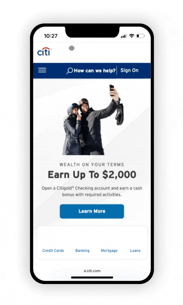
Most banking websites feature individuals lounging on couches or beds, surrounded by supportive pillows, mindlessly gazing at their devices. If this imagery isn’t seen on the homepage, it’s likely to appear elsewhere on the site, reinforcing the idea of happy engagement with online banking.
Issues: Incorporation of text on images is poorly done, often making the text impossible to read. Spacing inconsistencies, contrast issues, and an overwhelming number of navigational options, many misaligned. Lazy copywriting and horrible formatting. Images convey a hazy, ‘just woke up from a nap’ vibe, especially with the light, feathered background effect.


Theme: The Full-Page, Energetic, Professional Woman
Eerily similar-looking stock models.
Issues: Multiple buttons create ambiguity and confusion around the Call to Action (CTA). An exceptionally large hero image adds no value. Contrast and questionable color in image combinations. Lack of clear hierarchy, poor typography (font choices, styling), alignment issues, and inconsistencies. Clichéd copywriting.

Theme: ‘Best Side’ and Bubble Wrapped
While some sites have streamlined their navigation to reduce clutter, the poor layout and hierarchy of other elements, including the irrelevant use of tightly contained stock images, still overwhelm the page.
Issues: Clichéd photos of people gazing left (showcasing their ‘best side’?) while staring at devices or into imaginary space add no value and have no relevance to the content. A random dog found on Cit Bank’s site is more engaging than any of the human images, yet completely irrelevant. Even worse is when the default-open login module overlaps with the person featured in the hero image. This careless image selection highlights a laziness and a lack of attention to detail.
Many sites misuse circular elements as pointless decoration, except for Discover, where the circular hero image cleverly references the logo’s sun. However, even Discover’s design falls short by dropping in a random person gazing out from their “bubble,” without any relevance or connection to the content.

Theme: Family Ties/Layered Chaos
Targeting family demographics, these images rely on stereotypical family stock portraits, carefully adapted to fit within the complex layout of overlapping hero elements and CTAs.
Issues: Boxes in boxes within boxes create layers of clutter. Combined with contrast/font problems and an overwhelming number of confusing buttons, users are left floating around the page without clear direction. The family portraits are wedged between elements, with visibility dependent on browser width (things get very weird at even slightly smaller/larger sizes).
Valley Bank is especially jarring, with a looping auto-carousel causing page disruptions while users struggle to read the thin and nearly illegible headline font.

International Banking: Everything Everywhere All at Once
Disclaimer: I’m fairly clueless about international banks, and the following examples were selected based on random online research. Cultural differences can affect design perceptions, and my reactions may not reflect those of the intended demographic.
Issues: The same chaotic clutter prevails on international sites, often in more excessive forms, just wrapped in different themes and languages. Multiple design patterns that don’t comfortably coexist are simply thrown together. Navigation menus are placed at the top, bottom, and sides of the page, all at once, resulting in a very confusing information architecture. Pop-up chatbots continuously disrupt scrolling and obscure content, while auto carousels turn pages into a non-stop slideshow of confusion. Sites with vibrant color palettes only add to the noise, making everything feel even louder in this automated mess.

UK Banks: Civility Ends and Chaos Begins
The civility and refinement normally associated with UK culture seem to stop at the doorstep of their online financial institutions.
Issues: While not perfect, the Barclays site (final image below) at least demonstrates a sense of restraint in its design approach and an attempt to be user-friendly compared to its counterparts.
Many of these sites struggle with overloaded homepages and poor content organization. Elements and copy are thrown onto the page as if no one made an effort to resize anything from the source material. Some appear stylistically outdated by at least a decade, while others feature headache-inducing color combinations that should never coexist (Bank of Ireland, second row, first image… What are you doing with that color palette?!)

Noteworthy Sites
Slightly Better, But Still a Bit Awful…
Winner: Chase
Chase is the best of the bunch. They’ve given the hero section some space to breathe, and the main content isn’t overwhelmed by excessive clutter. Credit is due for their clean and simple hierarchy, clear section distinctions, and nice use of icons in the mid-page navigation bar. What truly sets them apart is their straightforward and comprehensive approach to navigation, demonstrating a carefully planned information architecture.

And Now, the Awful Stuff…
Basic visual issues undermine what could be a successful page. The green “Open an account” CTA button clashes severely with the branded Chase blue background.
The login module is awkward in every aspect: overall alignment is off, and the inner elements are crammed together, almost stacked on top of each other. The input fields are marked only by underlines with placeholder text, making them easy to miss without clearly defined input boxes. The wording of the ‘Use token’ link is vague, and its placement to the right and just above the Sign In button makes its association with the username and password fields confusing. Even its lower placement within the overall hero section feels uncomfortable.
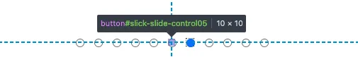
Although the mid-page navigation carousel displays nicely sized icons with clear labeling, using it is painful. The tiny pagination dots have only a 10 × 10 px hit area, requiring very precise clicks. The side arrows do nothing to improve the experience. They only advance items one space at a time, triggering a jarring, unpleasant animation. It takes all day to browse the full list and reach the end.
Then there are the clunky module promos where everything, including the buttons, is 100% image-based. The text wasn’t even anti-aliased before it was flattened directly into the image.

Eyestrain and Vertigo
Winner: Bank of America
Bank of America is a chaotic roller coaster that nobody wants to ride. The login section features eye-bleed red coloring, with illegible thin white typography and poorly defined visual links, where the Log In button is only visible on hover. Flying credit cards swoop in, completely diverting attention from any task, and proceed to pulsate. The page is already stacked with multiple navigation bars, and the central navigation menu doesn’t simply open; it dramatically flies open for every category! This entire homepage is over-the-top crazy and overwhelming.
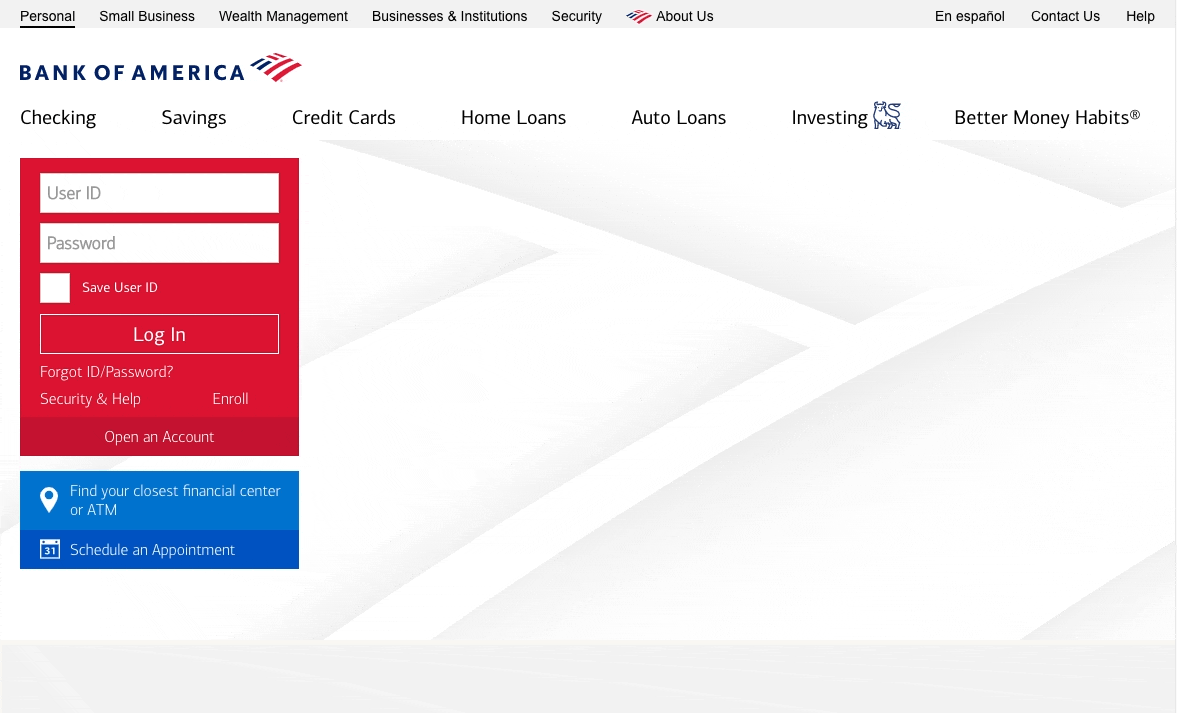
Note on Accessibility Settings: ‘Reduce Motion’:
The expectation is a calm, no-fly zone with very minimal movement (if any at all) when browser preferences are set to ‘Reduce Motion.’ Testing the Bank of America homepage under these settings resulted in only a slightly subdued change. The cards still animate/pop out from the center, and the navigation menu’s dramatic open/close animations persist. It remains a spin cycle of vomit-inducing discomfort.
Conclusion: Banking Sites are a Big Mess
- Design Issues:
Poor hierarchy structure. Difficulty in determining clear information prioritization and navigation, impacting the page flow. Weak font choices and horrible picks for font pairings. Sizing is all off, causing unnecessary basic readability, contrast, and accessibility problems. Visually outdated sites cling to styles from the 2010s. A slightly scary indication of long-term neglect. Visual inconsistencies are everywhere. - Poor Content Creation/Curation (Images and Copy):
Image Selection: Clichéd, low-quality images degrade trust and often make no sense within the presented context.
Copy Labels: Important CTAs, link labels, and navigation items use indirect and vague language.
Branded Content: No suggestion that any of the content used is in any way directly related to the brand. The tone of voice is often inconsistent, images could be random stock photos; little sense of any underlying content standards being followed.
Image-Copy Pairing: Lack of consideration for how images and copy should inform (and support) each other and whatever product/service they’re intended to promote. - Unclear Terminology & ‘Creative’ Phrasing:
Industry financial jargon creates comprehension barriers for the average user. The confusion increases when banks attempt to be clever by inventing unique names for their products and services. Terms like ‘Double Up Credit Card’ or ‘Earn 20,000 points’ are meaningless to anyone unfamiliar with the product or presented without context. - Too Many Cooks in the Kitchen?
The homepages are a cluttered dumping ground, where random services and promotions from various departments are crammed above the fold, making everything important and unimportant at the same time. This “throw everything and see what sticks” approach only throws users off course and distracts them from their original task.
What they need to be doing…
Banking sites can be big and clunky. With so many complex products and services, it’s easy to see why their homepages are often out of control. Neatly folding their content into clearly defined navigational spaces would help avoid this organizational chaos. The use of basic white space and minimal content distractions would further cut through the homepage carnage. Beyond usability, respect the user with quality images and messaging. Because, right now, most of this cookie-cutter content is just glorified lorem ipsum.
No Excuses
Exploring the homepage experiences of other major banks shows that Citibank isn’t the worst option available. However, the shortcomings of these banks don’t make Citibank’s poor user experience acceptable. Just because some banks are committing worse user experience crimes doesn’t mean Citibank’s lesser flaws are excusable.
What follows is a candid (and sharp…) critique of citi.com.

Part I: Citi.com Homepage Evaluation — Objectives
User Rage Review
The bare minimum for any online banking site is simple: users should be able to access their account easily. At no point should the process feel confusing, uncertain, or insecure. Visit the site, find the sign-on, and enter credentials without worry. That’s it.
Unfortunately, on citi.com, these basic steps don’t happen in an isolated bubble. The sign-in fields are forced to coexist with the homepage and all the irrelevant chaos that comes with it. Regardless of user intent, the navigation, content choices, and overall brand treatment are still setting the tone for everything that follows. Even the experience of typing in a password is shaped by these decisions
There’s no escape.
Why Not Just Use the Citibank App?
Citibank’s native mobile app is designed specifically for online banking. By its very nature, a dedicated app can offer members a better, more focused experience and doesn’t have to accommodate the diverse and unpredictable user needs of the large web domain of citi.com. However, the existence of an app is no excuse for neglecting the web browser interface and mobile web experience.
Not everyone is comfortable using a mobile device for delicate financial tasks. This is real money, not a game of Candy Crush. A tiny handheld screen offers little sense of control, especially when pogo-sticking between multiple windows (e.g., paying a bill on another website, using an online calculator, checking a calendar). In contrast, a desktop computer — with its larger screen, physical keyboard, and more straightforward navigation — provides ease of use, greater perspective, and often a sense of underlying security.
Kudos to those Citibank app users who feel perfectly comfortable pecking away on a tiny screen and confirming banking transactions with only their thumbs. Many of us can only aspire to be that confident in our mobile abilities!
Even users comfortable with using a mobile device for sensitive tasks might avoid downloading an app if they don’t think they’ll use it again. There’s also the potential situation where quick account access is needed, and mobile is the only device available. In an emergency, having to detour to the app store, find the app, download it, and then launch it can be daunting, especially under stressful circumstances.
All the more reason, regardless of device preference, that users shouldn’t be forced to download an app just for an easy and seamless banking experience. It should already be accessible through a web-based, mobile-friendly page and ready to go.
Homepage Critique: Trust Issues
It’s already been addressed, but needs repeating: the current state of this homepage erodes trust. Users who simply want to log in to their accounts are immediately bombarded with noise, most of which is irrelevant to their primary task. There’s no clear separation between content and task areas, making it impossible to focus on key sections or get a clear sense of page structure. This slapped-together homepage is too busy generating anxiety to offer any sense of security.

TL;DR
The login module is lost in a sea of white. Page sections blend together, all confined within a flat hierarchy, making it impossible to focus. Space is oddly distributed, with some elements floating aimlessly while others struggle to breathe. The bombardment of heavy buttons, unclear messaging, and poor content choices only adds to the clutter. Forcing members to navigate a chaotic interface just to sign in is the worst possible way to start any financial management interaction.
If the front-end is allowed to be this messy, what disasters might be lurking in the back-end? This is a concern no one wants to face before managing their finances online.
Logo
A blurry logo in the upper right-hand corner is the first branded element users encounter. Why isn’t this a sharp, crisp SVG? On mobile, the quality issue is even more apparent. It’s beneficial that the website opts for the abbreviated ‘Citi’ and drops the ‘bank’, likely to represent the company’s broader reach, but additional visual adjustments would help to ensure optimal context legibility.

While some tweaks have been made to the current online logo to improve readability at smaller sizes, such as thinning the letterforms and using a stronger blue, additional adjustments tailored to specific context requirements should be available. Customized versions for different digital sizes (small, medium, large) would maintain brand integrity across various use cases, from favicons to larger applications. Either way, no PNGs!
Quick Logo History
The current logo was created back in 2000 for the rebranding merger of Travelers Group and Citicorp — on a napkin, in ten minutes — for $1.5 million (look up the origin story for more details). It uses a slightly modified version of the Interstate font, with the most notable adjustment made to the lowercase ‘c’, making it more circular and integrated into the overall design.
Past Its Expiration Date?
After two full+ decades, the logo feels dated and out of sync within the multi-device, digital world. Although the online version has been slightly tweaked, it’s still being used as a one-size fits all approach in the digital space. It’s good they refrain from using the standard, full-length version on the site, given how the ‘bank’ segment suffers from an unsuitable thin and uneven font that already renders poorly and would have further issues on diverse screen dimensions.
Both the digital and standard logo versions could benefit from subtle tweaks. The current design looks dated, and these structured, narrow letterforms feel reminiscent of another era (as detailed in the Typeface section). Just small tweaks to improve legibility, without a full overhaul, would modernize the logo and better align it with today’s digital environments.
Gradient Header Background
One thing is certain: that background gradient needs to go. While it’s not used on the homepage header, its sporadic use on inner pages creates inconsistency and potential confusion site-wide.

Beyond its inconsistent usage, it’s hard on the eyes, outdated, and difficult to incorporate into anything without being distracting. It uses a basic two-color gradient set at the default 0% and 100% stops, reflecting a skeuomorphic style that‘s heavily dated.
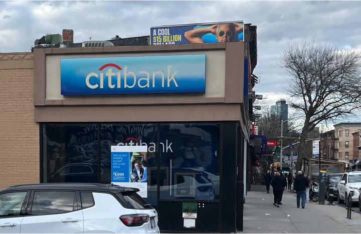
Anyone who’s seen a Citibank branch awning has encountered this same visual cry for help. While it makes sense to mirror real-world branding in digital spaces, this physical element is well past its prime and should follow the lead of a modern, subdued digital update.
Typeface
The website features Interstate as its sole typeface, utilizing a versatile range of three weights (light, regular, bold) across headers, body text, captions, and print materials (for all the marketing junk they send in the mail). Interstate’s clean lines and geometric shapes create a dynamic sense of forward motion while effectively representing the desired attributes of a bank brand: authority, friendliness, and simplicity.

Similar to the logo, this typeface is not suited for today’s digital world. It was once a refreshing alternative to traditional (boring) font stacks and had the advantage of being already integrated with the logo. However, advancements in font technology, flexibility, and the diverse range of devices and displays have exposed this typeface as rigid and antiquated. In the 2020s, Interstate just isn’t up to the heavy task of supporting a modern brand.

These days, most large corporations have their own branded font families and proudly display them at every opportunity. For a prominent brand like Citibank, it seems odd that they haven’t made the investment and are instead still relying on a typeface based on Highway Gothic — a font designed in the 1940s specifically for highway signage. Interface may be strongly associated with Citibank, but it’s become widely used by other brands, making it less and less the unique distinction it once was.
On the plus side, sticking to one font family with limited weights is a great way of keeping things simple and consistent for development and branding purposes, especially in a large organization where multiple departments are likely operating in siloed conditions. Or so one would think…
Interstate Bold: A Double-Paved Highway to Hell
One font family. Three weights. Despite the simplicity, there are multiple instances throughout the site where this font has been implemented and referenced incorrectly, leading to rendering issues across different browsers. For example, in Firefox or Safari, the Interstate Bold weight often appears unevenly stretched, making readability difficult and creating an odd balloon-like bloating effect.
This problem isn’t isolated to any particular element type; it occurs randomly across buttons, headlines, links, and even body copy throughout the entire site. The text appears harsher and heavier, resulting in a jagged reading experience, most noticeable on items with smaller font sizes.
When comparing the same elements rendered on Firefox and Safari to those on Chrome, it becomes evident that a faux style is being applied, causing the text to appear puffy and swollen.

Red flags are evident in the @font-face naming declarations.
- The font weights are consistently set to 400, for both light and bold versions, rather than reflecting the true weight of the referenced font.
- Only the ‘regular’ font should be assigned a font-weight declaration of 400.
Adhering to this common-sense practice leads to cleaner code, easier maintenance, and reduces confusion for future site development.
These naming inconsistencies are asking for potential trouble:
@font-face declarations (note: URLs edited for length)
------
font-family:Interstate_Light;
src:URL("fonts/interstate/Interstate-Light.fontfile");
font-weight:400;
font-style:normal;

font-family:Interstate_Regular;
src:URL("fonts/interstate/Interstate-Regular.fontfile");
font-weight:400;
font-style:normal;

font-family:Interstate_Bold;
src:URL("fonts/interstate/Interstate-Bold.fontfile");
font-weight:400;
font-style:normal;
Font Faux Pas
The extends site-wide, where classes have incorrectly added an unnecessaryfont-weight: 700 to elements using Interstate_Bold. The @font-face declaration of font-weight: 400 is overridden and forces the browser (Firefox and Safari) to apply an additional 700 weight on top of that already bold-appearing font. A blurry, double-bold lettering effect (faux bold) is rendered along with other visual issues:
- Artificially expanded letters
- Loss of crispness
- Uncomfortable visual imbalance

Aligning instances with their correct font-weight and @font-face declarations resolves the faux bold issue and streamlines future maintenance. However, the randomness and inconsistency of this problem’s occurrence (where visually identical elements on different pages have different declarations) is not a simple fix. Unlike a single, universal stylesheet update, this issue requires a page-by-page approach and quickly becomes a tedious and frustrating task.
Keep in mind that this problem is specific to Firefox and Safari. Chrome ignores conflicting font-weight declarations on class elements, deferring to the established values in @font-face, and renders the font correctly.

Although Chrome may be forgiving, adhering to proper and consistent declaration practices is crucial, especially for fallback fonts (see section below). Reserve font-weight:400 exclusively for the ‘regular’ weight. Inconsistent mixing and matching, as seen on the current site, leads to font irregularities and overrides that will continue to become an even bigger mess over time.
Fallback Font Issues
This naming problem has a cascading effect on fallback fonts if the primary font fails to load. The fallback font (typically a generic ‘sans-serif’) inherits the weight assigned to the class. Should the fallback be needed, the resulting font render may appear either too heavy or too light, due to the inconsistent naming of the primary font weights throughout the site. This further complicates the site hierarchy and can impact readability (and potentially accessibility).
With fallback fonts, Chrome behaves similarly to Firefox and Safari, and applies the assigned class weight to the fallback font.

Detailed Explanation: In the example above, the h1 class usesfont-weight:400, as originally defined in the@font-facedeclaration for the Interstate_Bold font variant.
Under these conditions, no faux bold effect is applied by the browser. But ifInterstate_Boldfails to load, the fallback sans-serif font defaults to a regular400weight—nowhere near the bold700weight appropriate for the h1 title. Similarly, instances ofInterstate_Light(not shown) are assigned a400weight when it should be200to read as a light sans-serif style.
Fake It Till You Make It
Due to inconsistent naming conventions in the original @font-face declarations and applied element class weights, the intended font weight will always be incorrect somewhere on the site, regardless of whether the primary or fallback font is used.
Font Styling, Accessibility Issues
There’s a big problem when the typesetting is so bad that it detracts from the actual content. Beyond the font issues, the site also suffers from basic formatting problems that could easily be avoided:
- Excessive capitalization
- Insufficient letter-spacing and line-height
- Problematic font sizes and hierarchy
- Failure to set a max-width for long sentences
These flaws create an uncomfortable reading experience and, more importantly, serious accessibility barriers for some users.

Unbalanced and unstructured paragraphs are difficult to navigate, but it’s in the nitty-gritty details where things truly break down. The detail-heavy specifications for these banking products, presented in long scrolling overlays or Excel-like tables, are often long text dumps, without any clear organization or even basic line breaks. Understanding these complex banking terms is already challenging, and this lack of formatting adds an extra layer of discomfort.

Painful By Design
These visually neglected yet important product details may be intentionally designed to discourage users from reading the fine print and fully understanding what they might be committing to.
Intentional or not, this typography neglect leads to element shifts and alignment issues, hitting mobile devices the hardest. These issues complicate long-term maintenance and expansion but also raise concerns about site security.
Iconography
Citibank uses a collection of thin and generically styled icons across the site for various purposes, including hyperlinks, navigation, and decorative elements. The overall icon set appears somewhat limited, with the same icon often used to represent multiple products and services (more on that later).
Some of these icons render horribly on desktop and mobile devices, despite being mostly SVGs. Instead of crisp and solid lines, they appear slightly blurry and often soft, especially when scaled down to small sizes. Even in an SVG/vector format, universal compatibility across all scales is not guaranteed, suggesting contextual usage was overlooked during design. In some cases, lines become almost indistinguishable, appearing broken or muddled. This is particularly noticeable on detailed icons or during hover states, when a white icon sits on a darker background.

Tonal Misalignment
This soft and generic style accentuates the stylistic mismatch between the iconography and Citibank’s overall brand identity, which is largely defined by the distinctive characteristics of the Interstate typeface.
Pairing such a dynamic font with a dull and generic icon style only highlights a significant inconsistency, where each element fails to complement the other. Viewed together, it’s evident they were not built using the same structural guidelines.

Interstate combines curved areas with sharp ascending and descending stroke cuts, creating a dynamic energy and sense of motion in the typeface. Yet, this liveliness is notably absent in the iconography style, where softened corners and rounded terminals replace angular lines, taking a cautious approach that avoids bold edges. These rounded details are often completely unnecessary and lost at smaller sizes, creating another tonal mismatch with Interstate’s crisp legibility and distinct letterforms.
Incorporating a few key typographic traits from Interstate into the icon style fixes the stylistic clash. Bold, sharp, and purposeful lines, shapes, and forms would bring the icon system in line with the overall brand aesthetic. Interstate’s strong presence needs to be matched by icons that feel like part of the same visual language. Clear, seamless communication can’t happen when both sit at opposite extremes.

Header
Step into any Citibank location, and you’re immediately greeted by a vibrant navy blue wall featuring their iconic logo, overseeing a set of self-banking kiosks. The branding is inescapable. The 3D white logo literally casts a glow over the entire area, while the overarching red umbrella leaps out against a blue backdrop, already accentuated by dramatic wall-mounted spotlights.

This is a major contrast to the website experience, where the homepage sits in a brand-less white void. A small, blurry Citi logo, tucked in the top corner, is barely permitted to make a whisper, let alone a dramatic entrance. The white header background provides no branding support for the page below and offers no contrast boost for the logo. Meanwhile, the location and language options float haphazardly, occupying an obnoxious amount of vertical space.

Navigation
The Citibank brand blue makes its appearance in the thin navigation bar, providing a sturdy backdrop to showcase the navigation items. However, it fails to unify the header and navigation as a cohesive unit. Instead, the prominent blue cuts through the white page, disrupting the visual hierarchy and making the page feel unbalanced and slightly unstable.

Hover-Menu Confusion
Without any visual cues to suggest otherwise, the navigation items appear to be direct links to broad category pages. On hover, they unexpectedly reveal menus containing subcategory links, making the discovery of this functionality largely accidental.
The ‘Open an Account’ option adds to the hidden menu confusion by including an arrow, which may be mistaken for a dropdown indicator. This implies that the other navigation options, lacking arrows, are simply direct links. This initial perception of broad categories may sidetrack users who are unsure how their task or product is categorized on the site. Rather than guessing, they may take no action, missing the hidden menu options that could guide them to their desired destination.
Even the hover functionality misleadingly suggests the existence of a broad category page. On hover, the background highlights blue and the navigation text is underlined, implying a direct link. Yet clicking it only closes the menu, rather than navigating to a page.

Another hover issue arises when hovering from a navigation category item into its opened menu, the highlighted ‘open’ nav bar indication and text underline unexpectedly disappear, visually disconnecting menu items from their parent category. This disrupts the search process and may require a rehovering restart over all nav items to recover the lost location.
While these issues may seem trivial, they quickly add up in time-consuming, useless clicks and navigation disorientation.

Content and Context Confusion
The menu content lacks clear organization and differentiation between products, services, and tools, often resembling a disjointed bucket of loosely related page links. The use of Citibank-specific jargon (e.g., ‘Robo Advisor’) and generic icons fails to provide helpful insight or valuable context.
Why not segment personal banking from business banking to simplify this navigation madness? Or rename vague top-level categories like ‘Wealth Management’ — what does that even mean? What is a Wealth Team? While intermediate category pages could provide a contextual safety net, especially for users intimidated by standard banking terminology, they’re not a substitute for clear and appropriate naming.

Secondary (Mid-Page) Navigation
The above-the-fold/under-the-hero navigation serves as a set of ‘quick links’ for five primary items, which are also randomly available in the main navigation hover menus. It’s convenient that these links are easily accessible (eliminating the need to search within hidden menus), but the intended benefit is lost due to poor design and unclear labeling.
Design
The bar blends into the overwhelming white page, and the thin blue icons struggle to stand out against the sea of white. The accompanying labels also fail to draw attention, and unless a user hovers over an icon to trigger a color change, the entire section is easy to overlook.

Link Labels
More navigation issues arise from conflicting naming. The labels used in the primary navigation menu items are often inconsistent with those in the secondary navigation, even though they link to the same page destination.
For example:
- ‘Lending’ > ‘Home Lending’ (primary navigation menu item) vs. ‘Mortgage Rates’ (secondary navigation) lead to the same page.

Despite the ‘Mortgage Rates’ label in the secondary navigation, users are dumped on a generic Loans page. Meanwhile, the ‘Mortgage’ link in the footer (categorized under ‘Rates’) actually leads to the Mortgage Rates page. This inconsistent naming and linking highlight underlying issues with the existing Information Architecture.
Icon Labels
The use of identical icons for multiple services/products adds to the existing naming and link confusion. For example, the same home icon appears in three different contexts:
- 2nd Navigation:‘Mortgage Rates’
- Main Navigation: Under ‘Lending’ > ‘Home Equity Calculators’
- Home Mortgage Loans Page:‘Buy a Home’

Reusing icons across multiple site offerings can sometimes work, but only if there’s little chance of overlap between those areas (in terms of user flows and product offerings). Regardless of placement, icons should always have strong contextual cues and appropriate labeling to reinforce their true meaning and destination. This is even more important if they function as links or appear in a navigational menu used throughout the site.
Citi.com fails on both. Multiple instances of the same home icon often appear on the same page and can easily be mistaken for identical options. Sometimes the labeling is so similar that any difference isn’t even detected. This sloppy application suggests icons are slapped on as visual placeholders without regard for the broader site context.
Note: I’m picking on the home icon, but this iconography issue pops up throughout the site. Icons are stretched thin and overused by multiple products, services, and site terms. It’s lazy. Citibank should expand its icon library and stop relying on a handful of icons to do everything.
Mobile Labels
The labeling frustration is even worse on mobile devices, where the secondary navigation abbreviates some items and completely removes the ‘Investing Options.’ (the 5th option found in the desktop version). Dropping a single word can drastically alter meaning, especially when many terms are already similar. Omitting an entire category further highlights the sharp inconsistencies that invite user confusion.

Information Architecture: Franken-Fragments
The navigation naming problems are directly tied to a much larger issue: a poorly defined information architecture (IA). From an outsider’s perspective, this looks like a classic case of a site getting out of control due to gradual additions. New pages and subdomains were likely added at different times by various groups within the company (likely siloed) without any in-depth evaluation of how each new appendage would impact the site as a whole.
Got a new product? Just wedge it into any category bucket or pin it as a sub-page link… and hope the haphazard patchwork holds together!

Lost in the Citi-Verse
These visually inconsistent, patchwork pages are often strung together with weakly worded links. The site rarely uses breadcrumbs, and the primary navigation never visually indicates the current category/page/item selected. The unreliable use of visited link styles only adds to the confusion. After just a few clicks, it’s easy to become disoriented and lose track of both the navigation path and previously visited pages.
Citi.com has a relatively flat hierarchy, but poor wayfinding makes understanding the site structure extremely difficult. Users are often dumped onto a page without navigational context, lacking scope or visual cues in the navigation or menu items, leaving them without any visible path of where they came from or how they ended up there. Making matters worse are the use of inconsistent and conflicting link labels, similar and forgettable product names, and duplicated iconography representing different services.
Users determine their current position by contextual cues and page content, not by long URLs or truncated browser titles. If they must rely on these secondary items to find their location, there’s likely an underlying issue with navigation design and information architecture planning.

Visual Discrepancies
This Frankenstein-like site is a jumble of different layouts, numerous header styles, and inconsistent design elements. The inner pages exist in their own worlds, likely created by individual product departments without adhering to a unified site vision or basic guidelines. Navigating between these varied page experiences highlights the underlying issue: the site is a loosely connected collection of pages and subdomains with little to no planning for a cohesive, unified brand experience.

Hansel and Gretel’s Navigation Guide
A rare instance where the site jumps into a deeper sublevel is on the Credit Card detail pages. Thankfully, breadcrumbs are present, allowing users to chart their original path, which is particularly helpful when jumping back and forth to gather product information. (Although, a cleaner design pattern might offer a better solution. But I digress…)
Oddly, the header and navigation on these pages completely shift from the site’s standard design and use the classic Citibank gradient background. Despite being on the same domain, they display different navigation options compared to other pages and the homepage.


Top-level credit card pages retain the ‘Sign On’ link, unlike deeper-level pages where it vanishes for no apparent reason. Although breadcrumbs help with path orientation, the drastic header transformation and sudden ‘Sign On’ disappearance from these deeper pages create uncertainty about the broader location: am I still on the main site, or have I traversed time and space and entered another realm of the Citi-verse?
Accessing Sign On from Other Pages
Most shallow inner site pages (those not deeply nested) feature a Sign-On link in their navigation. It‘s often styled differently, further adding to the uncomfortable and disorienting navigation experience, but it doesn’t randomly disappear.


But any sense of stability is lost when using the Sign-On link. Instead of leading to a 100% dedicated sign-in page or overlay (the common expectation), Citibank redirects back to the homepage. There, users are forced to reorient themselves while being bombarded by unwanted content.

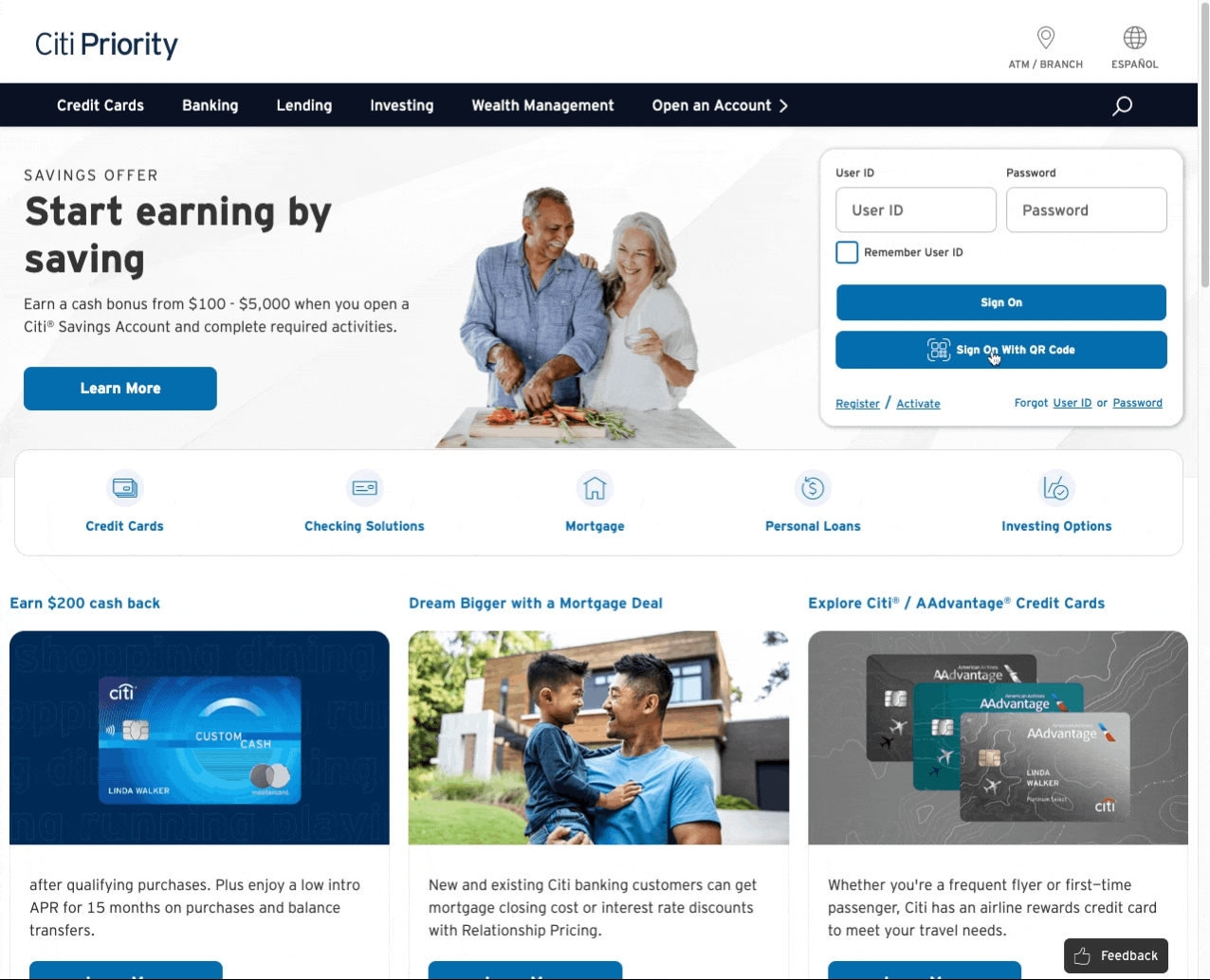
We Don’t Need Another Hero
Who is this content for? The marketing/promotion dept dominates 75% of the hero section with vague upsells (which change with each page refresh, so you can experience multiple versions of hell), leaving only 25% for the actual user (login module). It’s evident they have no clear target audience and are just throwing out a bunch of offers in the hope that something might stick.

Users don’t read text; they skim. Pairing dull headlines with pointless imagery creates a disjointed and inconsiderate experience. Neither element supports the other, and the result is easily discarded as pointless noise.
With each refresh, the hero section showcases a new product or service offer. However, each change only brings more disappointment, with low-quality stock imagery paired with subpar and unrelated copy. Thankfully, this section isn’t a carousel, sparing users from an endless loop of poorly designed offers.


Brand trust and credibility are undermined by poorly formatted, cookie-cutter copy and choppy, silhouetted stock images. The copy fails to communicate any real value, relying on vague terms and pointless catchphrases without any human-like touch. The formatting is clunky, often featuring all-caps usage, strange text wrapping, and disjointed flow.
The images are sloppily edited, with jagged selections of human bodies floating in space or awkwardly placed credit cards. Removing the backgrounds creates an odd and unnatural appearance, leaving the page unbalanced, without a solid visual anchor or valuable context.
Even the vast difference in image quality highlights the fragmented construction of the site. Everything is pieced together from a mismatched collection of randomly sourced bitmap parts. Some images are fairly crisp and well-lit, while others are spiked with pixelated and grainy edges. All of them suffer from inconsistent color, saturation, and contrast, with no effort to make their poor quality look even somewhat consistent.

Sign-On Module
Beyond providing account access, the login module serves several critical purposes. It facilitates setting up online access for existing Citibank members and allows new members to activate their cards, which is a key and vital interaction. For those who haven’t downloaded the app (and don’t plan to), this module is likely their first interaction with the Citibank online banking experience.

Yet, this pivotal section fails to visually stand out, banished to a corner alongside distracting marketing content. The module is further cluttered by poor design and inadequately written hyperlink copy.
The heavy cognitive overload might even send existing members running to their local Citibank branch for the security blanket of an easy-to-use kiosk. Meanwhile, new members, already skeptical of the visual chaos, must navigate this disaster to find two vaguely worded options, ‘Register’ and ‘Activate,’ that may or may not apply to their task. Resorting to guesswork between these poorly named options is hardly an effective introduction or confidence builder for the digital experience.

QR Code/Button
How much usage does this QR sign-in option get? Although styled as a secondary option, the compact design makes it unclear that this button is independent from the input fields above. This can misdirect unfamiliar users into entering their User ID and Password alongside the QR Code option, rather than using the standard Sign On associated with those fields. The module is already a jumbled layout of information, and the unclear element grouping only adds to the confusion.

The button copy might need to be reconsidered; options like ‘Password-Free Sign On,’ ‘Token Sign On,’ or ‘Keyless Authentication’ might be more appropriate. A change in wording would help members quickly determine if this option applies to them. All this guesswork should be eliminated.
At this point, members are focused on accessing their accounts, and learning about a new feature is a roadblock to their primary task. While the average member unfamiliar with QR codes might be curious, they may hesitate to click a button that provides vague information about what to expect. Given the sensitive nature of financial websites, users prioritize avoiding potential risks (even if the new feature enhances security) and tend to overlook features that seem irrelevant.
Getting around this fear, a simple ‘What is this?’ hover hint can be effective. Hidden by default to avoid overwhelming the module, it provides a quick summary of the feature for curious users who are hesitant to click an unfamiliar button.

The target user for this feature is likely tech-savvy, security-conscious, and willing to make the extra effort (let’s admit it — most of us are lazy and probably don’t want the hassle of locating our phones). On the plus side, it’s an alternative to interacting with the clunky login module.
This is all speculative, and gathering user data would determine whether this QR code convenience feature is even worthwhile.
QR Icon
Citi.com iconography was previously discussed, and the same concerns apply to the QR icon. The rounded corners and thin line style don’t scale well at small sizes, especially against a light blue button background. The icon is unbalanced and cramped; the tiny squares create a cluttered mess needing simplification. This entire icon deviates from the traditional, simple, sharp-blocked design that is more often used in QR representation.

The context in which the QR button is used should also be examined. It might be better shoved into a corner, out of the way, rather than cluttering the already busy login module. Members who want this feature are likely to seek it out. Placing it front-and-center only adds unnecessary cognitive load for users who will never interact with it.
Note: This is all speculative, and it would be interesting to see the real usage metrics. I’m biased because I’ve been completely excluded from using this feature (see the next section) and am bitter about it, finding it useless.
QR Code Overlay Screen
Cautious users have good reason to be wary of clicking the QR button. Upon clicking, it launches an overlay screen packed with multiple components: a brief overview, criteria, a step-by-step tutorial, and a rapidly animating stroke circling the QR code every 45 seconds, creating a potentially overwhelming experience.
This is a lot to suddenly process. Experiencing this overload while the animated timer scrolls only increases anxiety and is intimidating for any user, especially those new to QR sign-ons.
Structure/Content
Using an overlay module here feels awkward and rushed, like a last-minute solution. A standalone page (accessible via a direct URL) is more appropriate and avoids the space constraints of an overlay pattern. With room to explain the QR feature and access to FAQs, a full-page format offers a gentler and more productive onboarding experience. The biggest benefit is giving users control over when to generate the QR code. They’re free to move at their own pace instead of being abruptly dropped into the flow and hit with a countdown timer.
Beyond the design and interaction issues, Citibank doesn’t even attempt to make a use case for the feature. There’s no solid reasoning for why someone should use this sign-on method, just a vague mention of “enhanced security” with no further explanation. Without specific details, cautious members (already impatient to log in) will likely abandon the flow and return to the conventional method, never to revisit it.
Citibank Mobile App: The Missing Links
The onboarding process immediately breaks down due to the absence of information about the required tool to unlock the feature: the Citi Mobile App.
The Citi Mobile App is briefly mentioned, but lacks follow-up information about available platforms and direct links to the App Store or Google Play. Convincing users to download an app is already challenging, especially when jumping between devices. Unfortunately, this page falls short by not offering any enticing incentives. At the bare minimum, it should provide App Store links where users can see a compelling download pitch, showcasing key features, reviews, and social proof. This simple addition may motivate users to grab their phones and commit to the download.

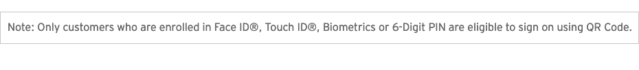
QR Code Club: Exclusive Access
The QR code issues are irrelevant for members not already enrolled in one of the sign-in requirements. While Citibank addresses this in the second paragraph (so non-enrolled users aren’t left wondering why nothing is accessible), they fail to provide any information on how to enroll in Face ID, Touch ID, Biometrics, or a 6-digit PIN, all of which are necessary to use the QR Code feature. Without any basic enrollment information, users hit a dead end and might as well forget about using this feature.
As a 20+ year customer, I’ve never received enrollment information for any of these options. Even after thoroughly searching the site, I still have no idea how to enroll.
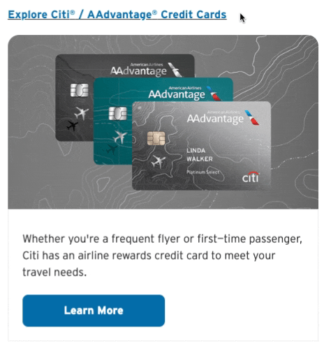
Card Modules: Poor Messaging & Content
The product card modules suffer from the same quality issues as the hero section. Images are often pixelated and use outdated formats like .jpg and .png, instead of efficient alternatives such as .webp or .avif. There is often no strong connection to the accompanying text, and provide even less support for the intended product or service.
This lack of visual and content cohesion becomes even more apparent when viewed together. Side by side, the images can’t escape that random stock photo aesthetic, as if they were pulled from all corners of the internet.
Note: The following visual examples from citi.com were captured through multiple refreshes at various times to showcase the full range of content offered in this section.
Design/Typesetting Issues
Visually, the individual card units lack strong definition, with faint outlines making them barely discernible. The card elements (headline, image, copy, and button) are difficult to perceive as a unified group from spacing, font, contrast, and sizing issues. Even placed side-by-side, the cards don’t appear as distinct units, and their elements are floating, disconnected, and uncontained.

The typesetting is also inconsistent. Beyond just the hierarchy and spacing problems, heading capitalization, punctuation, and bold text are applied randomly without clear reasoning. Sentence structure is often disjointed, with full sentences starting in the header and then splitting and continuing into the body copy. The use of the registration mark® is inconsistent, with some cards omitting it for certain Citibank products while others cling to it for dear life. Even some of the banking terms seem out of sync with the jargon used in other sections. Are there a bunch of different groups working in content silos? Are no guidelines available?

Image Selection
There’s already a significant discrepancy in image quality, content, and color within each card, ranging from washed-out to oversaturated, all impacting overall quality. These poor stock photo selections only highlight the tonal mismatch between copywriting and images.

Haphazard Image Placement
The three cards rotate, change position, and are replaced with other offers on each page refresh. This dynamic behavior, combined with vague copy and poor images, risks making these units appear as external advertisements (possible banner blindness). The issue is exacerbated when two units appear side by side, featuring similar plastic cards with comparable banking jargon (see Card Examples #3 and #4 below).
This is comparable to how similar visual card combinations can lead to visual boredom within the section. For example, when multiple cards feature homogeneous, non-descript images, the lack of contrast makes them easy to dismiss. This oversight suggests that each unit is designed in isolation, without considering the contextual impact on adjacent card offers, and how that affects not only the section but also the overall page experience.
Speak Human
While some of these credit card product images are of decent quality and require only minor contrast adjustments, the accompanying copy fails to communicate any real value. Many instances use random numbers without context, combined with banking terminology that may be out of reach for everyday members, providing very little incentive to click and learn more.

I’m not suggesting Citibank avoid using real and universal banking terms; standardized terminology is still crucial for clarity and credibility.
But it’s possible to simplify things without completely dumbing them down when the goal is user-friendly financial content. Straightforward headlines paired with simplified body copy on the homepage should be the norm. Initial accessibility barriers are broken down with clearer context, and internal pages can be reserved for the more nitty-gritty details.
Clear language is crucial and product-specific jargon is not easily understood by a general audience. Branded terms should always be avoided — especially in promotional headlines targeting new users. Throwing some Citi-jargon phrase into the lap of a newbie is a quick way to leave them confused or feeling stupid. Even long-term members find phrases like “Earn 80,000 Bonus Points” or “Diamond Preferred” meaningless. What do these mean without context?

For users and even banking experts unfamiliar with the Citi ecosystem, understanding these labels is impossible. If Citibank can’t provide clear, understandable context within the limited space of these modules, it should avoid Citi-specific terminology altogether and reserve it for more detailed product pages, if at all.
Missing the Elevator
These cards occupy valuable real estate, yet the inconsistent content cards with sloppy typesetting, ad-like images, and marketing jargon are unfriendly and drive users away rather than prompt engagement. This section should serve as a secondary elevator pitch (with the primary pitch in the hero section) for supporting Citi products or other valuable information. Instead, it functions as a dumping ground for ugly and random content better suited for the trash bin.

Learn More Button
Except for the occasional “Get Started” button, most site-wide buttons are labeled “Learn More.” This vague labeling provides users with poor information scent and could easily discourage further exploration. Where will I end up? What exactly is this?
Using a button element is also inappropriate for these card modules. A button performs an action (DOES something), whereas a link is for navigation (GOES somewhere). In these cases, the buttons act as navigational links to other pages and should be styled as standard hyperlinks rather than <button>. Replacing the clunky, blue button element with a text-based hyperlink would shift visual focus to more important page content and away from irrelevant materials. This change would also allow users to open the resulting page in a new tab, should they prefer not to abandon the homepage.
Note: Citibank deserves credit for setting up descriptive ARIA labeling for users relying on assistive technology, likely to avoid legal issues ($$$). While their effort is formulaic — “Learn More about [insert card headline]” — it’s still a step up from a generic “Learn More.” It sure would be nice if they also provided descriptive copy to all users, making it more user-friendly for everyone (hint-hint).
One Card, Duplicate Destinations?
Instead of reserving the interactive link for just the button, the headline and image are each wrapped in their own hyperlinks, all leading to the same page destination as the button. Multiple hover effects within a single card (underline, cursor change, color alteration) can be confusing, especially when the accompanying copy offers no clear indication about their destinations. Are they leading to the same place or to three completely different pages?
The card element should feature only one active link and NO duplicates across multiple elements! This link could either be applied as descriptive hypertext (replacing the current ‘Learn More’ button) or, ideally, cover the entire card as a full-element hit area. In all my page refreshing, I haven’t encountered a single instance where a card leads to multiple destinations. Having more than one destination should never even be considered anyway. It’s completely confusing.
Mobile Web Evaluation
In conclusion… the web browser experience stinks.
But we’re living in a mobile world. Maybe Citibank decided desktop browsing just isn’t worth the effort and poured all their resources into the mobile web experience instead? Perhaps they’ve created a polished experience so slick that everyone would abandon the safety of their large keyboards and desktop screens and flock to their compact phones for a deeply satisfying experience?
Even if they just converted their existing layouts for mobile, it can’t be any worse. Right?
Mobile Web Homepage, Menu, Sign On: The Nightmare Continues
Nope, it’s far worse.
The mobile homepage picks up the cluttered desktop version and crams it into a vertical stack of chaos. This incoherent mix of content and design issues (once again) tries to cater to everyone while effectively targeting no one. The problems are even more glaring than on the desktop version, with a flawed IA and navigational structure, awkward flows, and frustrating interactivity that’s even harder to overcome on a smaller screen.

Abandon Hope All Ye Who Enter Here?
Is all lost? Unfortunately, most other banking options are just as bad (or worse), so there’s no escape. Realistically, the entire experience should be burned to the ground and rebuilt. Even with the site’s complexity, a minor homepage revamp could offer a realistic chance to partially redeem a critical user interaction point without gutting the entire site or robbing the bank to pay for it.
Simple modifications are explored in Part II: Homepage Refresh — Content Strategies. Multiple directions are proposed, taking into consideration current site limitations and offering straightforward, realistic, and user-friendly solutions, all with minimal disruption to the larger site.
I’m just asking for the basics: a welcoming homepage, easy sign-on, and a sense of security. Nothing more, nothing less. No banking homepage should be so unsettling that it forces the user into the frozen depths of Hoth just to check a bank balance.
— End of Part I
To Be Continued:
Part II: Homepage Refresh — Content Strategies

Summary of Articles in this Series
Couch Clicks: The Citi.com Bank at Home Experience
Part I: Citi.com Homepage Evaluation
An in-depth UI/UX review of the Citibank homepage, focusing specifically on the problematic Sign-On area and how the content and overall site fail to deliver a positive user experience.
Part II: Homepage Refresh & Content Strategies
Explores general UI/UX fixes for the issues outlined in Part I by showcasing a homepage redesign, content direction approaches, and how these strategies would integrate with a standalone Sign-On page solution..
Part III: Sign-On Design Concepts & Considerations
Deeper look into alternative design approaches for accessing the sign-on process, weighing the pros and cons of each option in relation to the overall user experience.