

Disclaimer: These insights are based on my experience as a front-end user, without direct info (or history) of how the site was built, managed, or maintained. I’ve attempted to address this issue where appropriate.
Citi.com may have had content, design, and/or functionality updates since the time of this review. Screenshots may now be out of date and no longer represent the current site.
The Citi.com Bank at Home Experience
Couch Clicks Part III: Citi.com Banking — Sign-On Design Concepts & Considerations
This is the third article of a three-part series focusing on a general UX/UI review and light redesign improvements for the current Citibank homepage and login experience.
What began as a basic homepage evaluation for a potential role in fintech/digital banking later grew into a deeper UX audit. When the opportunity never materialized, the findings and recommendations were restructured into this article-style case study.
Summary of Articles in this Series
Part I: Citi.com Homepage Evaluation
An in-depth UI/UX review of the Citibank homepage, focusing specifically on the problematic Sign-On area and how the content and overall site fail to deliver a positive user experience.
Part II: Homepage Refresh & Content Strategies
General UI/UX fixes for the issues outlined in Part I by showcasing a homepage redesign, content direction approaches, and how these strategies would integrate with a standalone Sign-On page solution.
Part III: Sign-On Design Concepts & Considerations
Explores alternative design options for accessing the sign-on process, the pros and cons of each approach, and the impact on the overall user experience.
Part III: Rethinking the Sign-On Experience — Objectives
Building on the options from Part II: Homepage Refresh — Content Strategies, this final installment digs deeper into the homepage experience, focusing on additional integration methods for account access. These practical solutions offer realistic site improvements without requiring site-wide overhaul, creating a more intuitive and user-friendly experience for both Citibank members and non-members.
Note: A complete site overhaul is desperately needed for citi.com, but that’s way beyond the scope of a Medium article… and there’s no way anyone would tackle that mess for free.
Content and Stock Image Notes:
Audience and Adaptation: The following content directions are aimed at American audiences. These directions should be adapted for global markets to reflect cultural differences and diverse demographics.
Fictional Placeholder Content: The placeholder content is fictional and may not accurately represent actual Citibank services or products. While some offerings may resemble existing products, many have been invented for illustrative purposes to demonstrate hypothetical content direction ideas.
Stock Images: The images were sourced from various stock sites to illustrate potential content curation directions. All image credits are provided at the end of the article. It’s reasonable to assume that Citibank has the budgetary resources for creative and original imagery and is not at the mercy of stock photography.
Sign On: Modal Overlay Method
This approach applies the same quality content strategies discussed earlier by evicting the clunky login module from the hero section, giving promotional or service offerings center stage without visual competition. Rather than redirecting users to a standalone login page (as seen in Part II), the Sign On link in the header triggers a modal, allowing login directly from the homepage without being whisked off to another page.


Now, a site-wide, user-initiated login overlay is applied to every ‘Sign On’ instance. With a single click, a modal appears on any page (ready for input), eliminating the need for page redirects. The page background darkens, helping users focus on entering their credentials into the clearly defined fields, all without distractions or additional page loads.
The overlay login is a conventional pattern that users often expect and prefer over a page redirect. Users anticipate being able to opt out and exit the process easily, allowing them to return to their previous task. Even if they’re just mindlessly browsing the site, there’s no disruption.


This puts the user in full control. There’s no disorientation of an automatic redirect that dumps them onto another page. They can quickly dismiss the sign-on flow and return immediately to their original location, picking up right where they left off. No backtracking required.


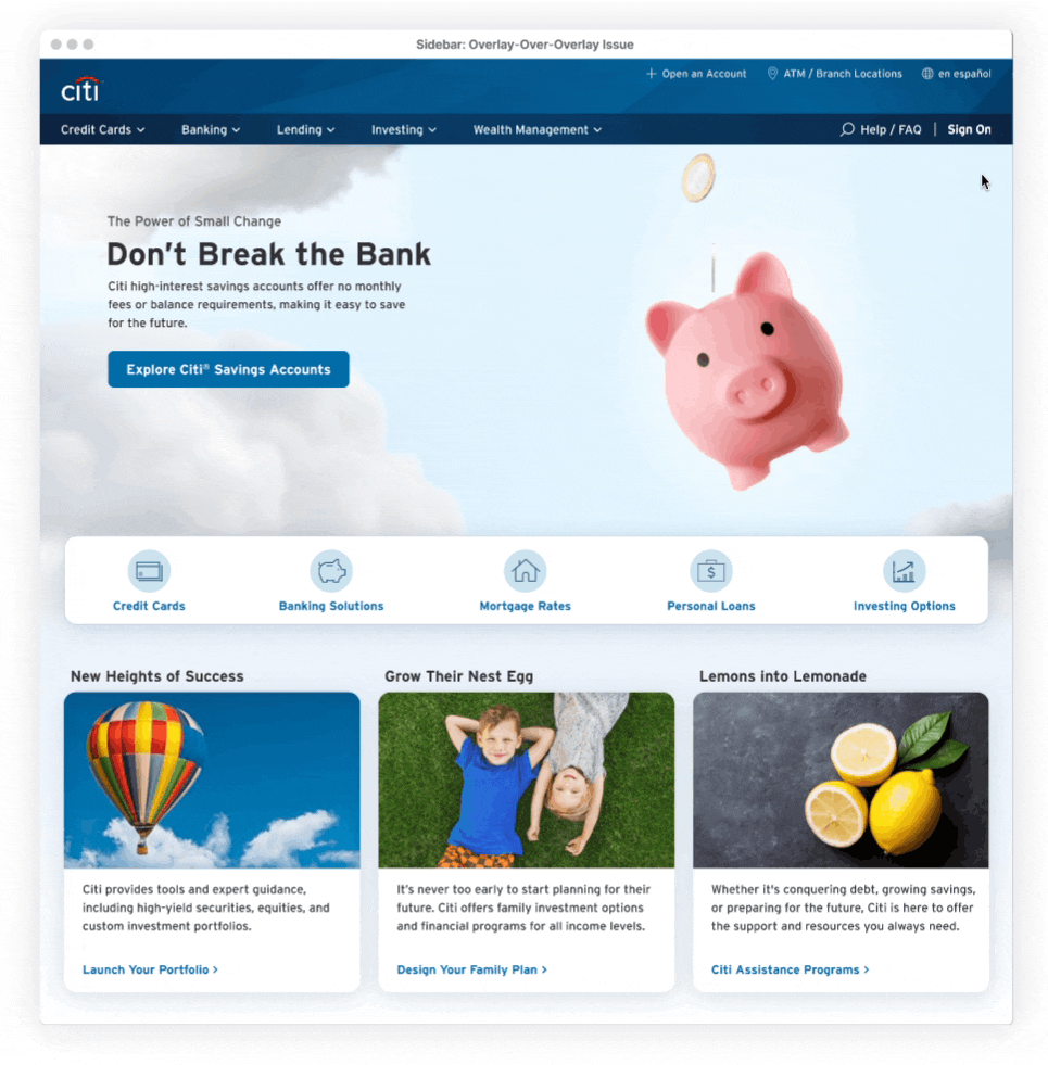
QR Code Integration: The Overlay-Over-Overlay Issue
Currently, citi.com uses an overlay for QR Code activation. Applying this access method to a Sign-On modal (which is also a page overlay) creates an awkward ‘overlay-over-overlay’ scenario, leading to potential visual confusion, performance, usability, and accessibility issues.
Citibank is guilty of this ‘modal pile-up’ approach elsewhere on their site (see example below). But a quick fix band-aid for this specific issue only masks the larger problem… which is a lack of comprehensive site planning.

QR Solution 1: Code as Link (Standalone Page)
To prevent a modal overload, convert the QR Code button into a link. This link sends users to a dedicated, standalone page where they can generate and retrieve their Activation Code.

This avoids awkward overlays and a full page offers more design flexibility. A dedicated page is ideal for customer support: representatives can direct members to the QR page via a simple URL, avoiding the need to manually guide users through the site UI. While the user might still have issues with the QR Code, the direct URL gets them to the right starting point, potentially sparing customer support a significant headache.


A full-page approach also gives users full control with a user-initiated button for code generation when they’re ready, rather than automatically generating it the instant the overlay opens (as currently happens on citi.com). This reduces the anxiety of being thrown into a countdown that’s already ticking down, especially in the likely scenario that users are scrambling to find their phone or open the right app.
If the user decides to switch back to the traditional Sign-On method, the page provides a ‘Sign On with User ID and Password’ option. Selecting this instantly displays the modal overlay without redirecting them away from the current page.
Note: This standalone page would be accessible site-wide, which is why its navigation is intentionally minimal. Citi.com’s navigation often changes from page to page, without any clear reason, so keeping this critical page navigation-agnostic helps stay clear of further confusion.
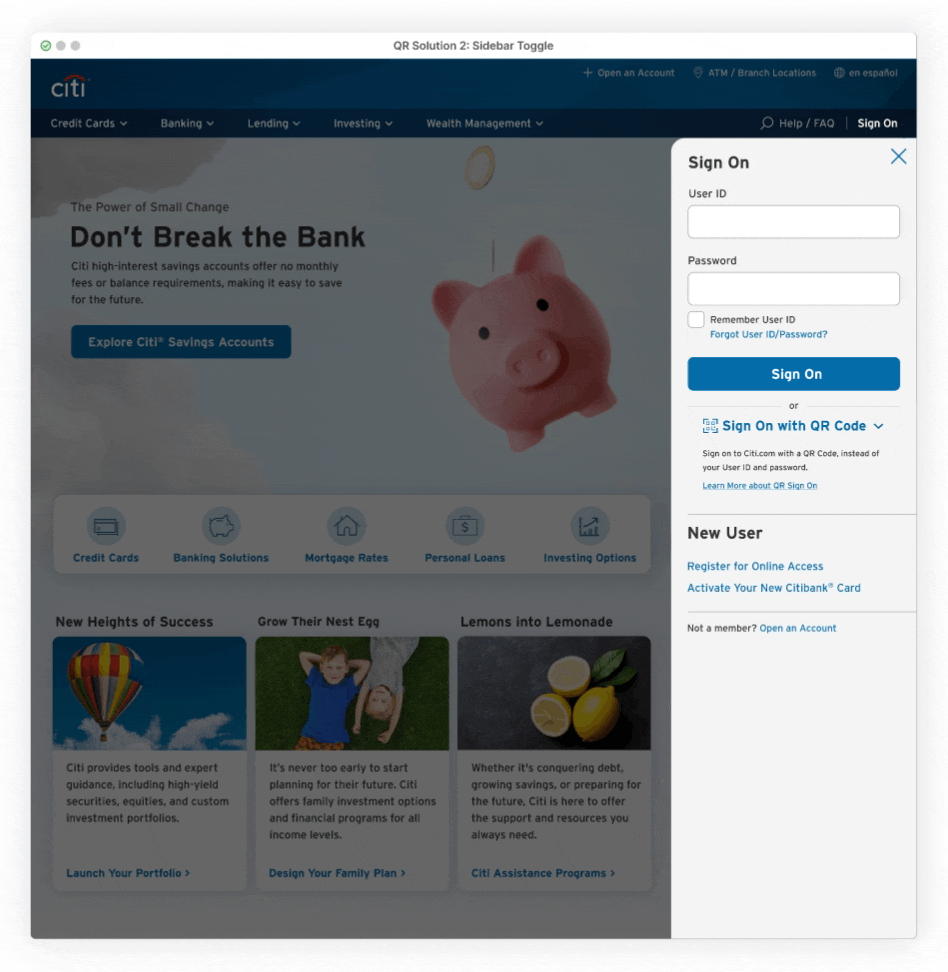
QR Solution 2: Code as Toggle
A second workaround utilizes the toggle approach, previously discussed in Part II (though in a slightly different context). This method enables seamless switching between traditional password sign-on and QR code authentication, all within a single modal. In one click, users can activate the QR feature without leaving the page.
Direct, instant access is ideal for experienced users who prefer a streamlined experience. They can bypass a full-page redirect by activating the feature from anywhere on the site and avoid being whisked away from their current page.
The standalone full-page option can also serve as a fallback for novice QR users (through an integrated ‘Code Questions’ link), offering step-by-step guidance, additional resources, and a clear interface to help them get started.
Mobile Modal Overlay
Current Functionality
As mentioned earlier, citi.com’s desktop navigation menu options and visual styling often shift from page to page without a clear reason. On some inner pages, these inconsistencies even omit the crucial Sign-On link, forcing users to manually crawl back to the homepage just to access the Sign-On module. In stark contrast, the mobile experience consistently offers a visible Sign-On option, transporting users to a dedicated Sign-On page.
Although redirecting users to a dedicated task page is more user-friendly than dropping them onto a cluttered page with multiple unsolicited tasks (as seen with the current desktop homepage), it’s still an unnecessary step that slows account access and creates friction.
Overlay on Mobile
On mobile, loading a URL can be especially painful with slow connection speeds and the wait for a page to fully download. With an overlay login, no new page is required; the sign-on interface appears instantly, regardless of where the user is on the site.
Applying this approach on mobile helps avoid exacerbating the location disorientation already present on citi.com due to inconsistent pages, poor labeling, and a general lack of wayfinding. These issues are even more pronounced on mobile devices. By keeping users grounded on the same page and providing immediate account access, they can bypass awkward site reorientation and unnecessary wait times.

A dismissible Sign-On modal also addresses the difficulty of backtracking on mobile. Hitting the close button (or tapping the underlying page), users are instantly returned to their current page and able to pick up where they left off. The modal covers a significant portion of the view, but enough of the underlying page remains visible as a reference to the previous task or exploration. This is very useful given the frequent interruptions and distractions associated with mobile environments.

Summary: Modal Overlay Method Challenges
No Direct URL
The sign-on modal is easily accessible throughout the site via the header, but a dedicated URL for direct access to the login section is still necessary. A direct link (provided by customer service, email, or another source) allows users to bypass the hassle of navigating to the site, finding the Sign On option, and opening the overlay… just to enter their account credentials. A direct link is also helpful with password reset instructions, modal functionality issues on mobile devices, compatibility problems with assistive technologies, and instances where third-party services need to redirect users.
To address this need, a standalone login page with its own URL (as described in Part 2) would serve as a safeguard for situations where the convenience of the modal falls short.
Note: While it’s possible to use a special URL to open a page with the modal already open, this approach raises JavaScript security concerns (see the last item below).
Out of Sight, Out of Mind: Modal Risks
Password managers often struggle with filling in modal input fields due to implementation factors like limited field access, obfuscation, or security restrictions — all of which can vary by operating system (and add another layer of headaches). While users can manually copy and paste credentials as a workaround, a modal approach is less than ideal if it leads to login issues or long-term management complications.

Sign On: Sidebar Module Method
On the current Citi.com site, clicking the ‘How Can We Help’ navigation item triggers a dynamic slide-in of a full-height sidebar search/FAQ section from the right, shifting all page content to the left.
Although the search/FAQ design could use some improvement (discussed later), it’s still a convenient tool for instant searches and quick answers. It removes the need for a cumbersome header search bar or redirecting users to a separate page just to view their results. When implemented across pages with similar header styles (also covered later), it becomes a reliable, persistent resource that’s accessible with just a click.
The value of some FAQ content choices may be questionable, and the site search often falls slightly short of delivering spot-on results. Still, including a search bar alongside Quick Actions and standard FAQs is a solid attempt to support a range of user questions and member inquiries.


The same slider functionality could also be used to include a dedicated Sign-On area. Placed alongside the Help/FAQ option in the header, this navigation item would trigger another version of the sidebar, containing everything related to account access. Like the Help/FAQ section, it would also be accessible site-wide.
This space is a natural fit for a Sign-On area. Utilizing the full-height span on the right side provides ample room for content to breathe, making items easy to scan and allowing for comfortable interactions. Even with the underlying content pushed to the left to accommodate the expanded sidebar, the page avoids feeling crushed or chaotic, thanks to the content guidelines discussed earlier.
The darkened page overlay also adds a helpful layer of focus, clearly distinguishing the sidebar from the underlying page. This addresses a major issue on the current site, where the lack of clear separation makes it difficult to visually distinguish the opened sidebar as a free-floating element on the page.


A sidebar Sign-On feature offers a welcoming invitation for users to explore the site, providing seamless access to their account from every page, whenever they want. This prioritizes user control, allowing users to access their account without being whisked away by an automatic redirect. Additionally, the highlighted navigation item and overlay indicate the current open sidebar selection and provide a clear indication of easy dismissal (via close button or overlay click), allowing users to quickly return to their original page.
QR Code Peekaboo: Avoiding Overlay Overload
Launching the existing QR Code overlay from the sidebar would create another confusing overlay-over-overlay situation, similar to the modal overlay issue discussed earlier. In this case, the stacking effect is even worse, with both layers visible simultaneously and their respective close buttons appearing just pixels away from each other (see below for an example of what NOT to do).
Button Usage Note: In this context, where data is being exchanged, the overlay is appropriately triggered by a button in the sidebar. A button element signifies that a data exchange will occur, with the activation code automatically and instantly generated on the overlay. In the redesign solutions (see below), users aren’t immediately thrown into this instantaneous data exchange scenario. Instead, they’re provided with context before the code generation begins (which they will activate when ready), hence the use of a styled link.
QR Solution 1: Code as Link (The Reliable Standalone QR Page Option)
Just a basic link to a standalone QR Code page avoids these awkward overlay pile-ups by sending users to a dedicated QR Page, as previously discussed.
QR Solution 2: Sidebar Toggle Option
The previously discussed toggle-like approach is also an option in this context, where the QR code area is initially hidden under a single-item dropdown to reduce clutter. Unlike the cramped modal version, the sidebar area space allows for downward expansion and can showcase both options at once, rather than replacing one for the other. For novice members, a link to a standalone QR page would still be available and contain detailed instructions. Alternatively, if data indicates it would be beneficial, the sidebar itself could even accommodate additional instructions.
QR Solution 3: Static Code DisplayDisplaying the full code area in a fixed, full-time view could be more effective than using a progressive disclosure dropdown method, especially if QR sign-on is frequently used. The sidebar offers sufficient space to accommodate the code area comfortably, making code retrieval a simple, one-click process.

To Show, or Not to Show?The static display approach assumes users are familiar with the feature and enrolled, but that’s not always the case. As mentioned in Part I, I’ve been a Citibank member for over 20 years without receiving enrollment information. Even a site search came up empty, leaving me wondering who this feature is actually intended for.
It’s unclear whether Citibank is genuinely invested in promoting QR feature adoption or simply using it as a lure for a niche demographic of tech-savvy or security-conscious individuals. This feature might even be a gimmick used to set Citi.com apart from other banking sites, but in reality is rarely used among their members.
Ultimately, business metrics, goals, and usage data would dictate whether to prominently display or hide the QR feature. If usage is low among savvy members with access (and Citibank isn’t prioritizing growth or support), then tucking it into a dropdown might be the best approach to avoid confusing users (like myself) who are either excluded or unaware of how any of this works.
‘How Can We Help’ (Search) Sidebar Redesign
The ‘How Can We Help’ sidebar menu has potential use as a valuable alternative navigation aid, but it’s overshadowed by a mess of usability issues and visual clutter. Citi.com has made it easily accessible throughout the site, but the menu’s poor contrast, weak hierarchy, misalignment, and readability problems create a frustrating and uninviting experience. Sifting through this chaos is the last place a user would feel confident finding answers, particularly for sensitive financial information.
A basic visual cleanup goes a long way in creating a more engaging experience, making the menu less likely to be discarded as unusable clutter. Adding a background overlay for emphasis, rewriting and formatting the copy, tightening up line spacing, and clearly distinguishing between links and dropdown items results in a more inviting and approachable interface.
Utilizing the vertical space to include helpful content chunks can address common user stumbling blocks. Ideally, these content choices should be based on frequent queries and related topics to maximize their impact. Even if this isn’t the case, content that simply appears clear and reliable can improve brand perception and reduce immediate abandonment.

Mobile Homepage and Sign On/Help Screens
With a simple tap on the intuitive icons in the header, users can seamlessly switch between homepage, help, and sign-on task areas, enjoying a smooth, instantaneous transition without the need for any awkward page loads. The sidebar design is a natural fit for mobile vertical views, providing a streamlined navigation experience that requires minimal adjustments for these critical screens.
For help, topics are thoughtfully laid out, allowing users to quickly scroll with a flick of a finger and easily dive deeper with a simple tap on relevant links or FAQ menus.
On the sign-on screen, a consistent, top-placed logo takes precedence, while the app download banner sits at the bottom. This placement avoids obstructing main content and balances visibility and usability, making it easy to accept or dismiss the banner with a quick thumb tap.

Mobile Menu Redesign
This is the ideal opportunity to redesign the problematic mobile menu by replacing the current sequential navigation pattern with a straightforward open/close accordion method for submenu items.
Currently, citi.com’s site navigation is flat, with no nested subcategories beyond the primary categories. Even within each primary category, the number of direct page links is limited, helping keep things under control. However, the mobile menu contradicts this simplicity by using a sequential pattern that adds unnecessary clicks, page changes, and cognitive load.
This pattern limits users from viewing secondary link content from multiple categories at once, forcing them to rely on memory to recall specific site items and distinguish between similarly-named banking terms. Site exploration becomes cumbersome, making it easy to lose track of which content belongs to which category, even in this simple site structure.

Switching over to an accordion pattern solves the issue. Users are free to open multiple categories at once and then browse, scroll, and compare choices. There’s no need for repetitive back-and-forth navigation between individual categories or reliance on memory.
This comparison approach is valuable for a financial website serving a diverse audience. By viewing options side-by-side, members of all financial expertise levels can develop a clearer mental map of Citi’s categorization and overall banking structure. Some of Citi’s brand-specific terms can be confusing (e.g., what is a Robo Advisor?), but the ability to quickly scroll all options, even those with vague titles, across categories helps users identify the best fit for their task.
Visual Changes
Implementing a downward arrow for open/close functionality maintains visual consistency with the desktop category redesigns and existing dropdowns on the current site. A general clean-up of basic alignment issues, including text, formatting, and creating clearer distinctions between elements, is necessary for a cleaner and more intuitive user experience.
Summary: Sidebar Challenges
Inline Sign On Not Feasible
The sidebar’s functionality makes a ‘Free Floating’ Sign On option unfeasible due to its direct dependency on the navigation bar. When triggered from the navigation’s ‘Sign On’ link, the sidebar slides out neatly and naturally, positioning the user for seamless interaction. However, triggering it from an inline ‘Sign On’ link elsewhere on the page would be disorienting and against user expectations.

This dependency inherently limits accessibility, making a dedicated Sign On page essential for those occasional inline instances or when a direct URL is needed. In those scenarios, a slider menu is a bad experience.
A Slippery Slide Into Multiple Page Modifications
Citi.com’s sidebar functionality is often undermined by inconsistent design patterns on random pages. Though these pages are in the minority, they stand out when clicking the search/help link in the header unexpectedly redirects users to a poorly designed standalone help page, rather than triggering the expected sidebar functionality.

The sidebar “slider” is true to its name: it isn’t an overlay anchored to the side; it actually pushes and compresses page content to make space for the revealed menu. This complexity goes beyond simply adding an interactive hide/show element and tacking on a hidden menu is only part of the fix.
Reconfiguring the site’s multiple layouts, headers, and elements to accommodate a sidebar method could be a potential nightmare, especially considering the perceived lack of maintenance on many pages, some of which seem abandoned in time. Not to mention the lurking horrors a full site audit might uncover….

Sign On: Homepage Login
Of all the redesigns proposed, this method most closely aligns with the current site’s structure. It follows the existing functionality with one major exception: the entire hero section is now solely dedicated to the Sign-On module, removing the coexistence of CTAs for additional services, products, and marketing materials. The hero now presents a single, clear primary path, free from competing upsell distractions, allowing members to focus on accessing their accounts.
By maintaining the existing site functionality, the homepage remains the designated sign-in area. No matter where users are on the site, the Sign On link will always return them home to log in. Sticking with this self-contained approach means there’s no need for site-wide link updates or new implementations, since inner site pages are already set to funnel users back to the homepage. With minimal effort, everything fits seamlessly into the existing framework.

Guided Landing
By reducing the hero content to a single login module, users redirected from another page via a Sign-On link are less likely to feel disoriented. The Sign On module, now front and center (freed from competing CTAs or random promotional content) signals that this space is dedicated to account access. A clear hierarchical authority is established, prioritizing this user path over the top half of the page. Secondary content takes on a supportive role, allowing the page to maintain focus on the primary action.

Content Directions
Landmark Branding
Although the hero area is dedicated to the login module, pairing it with appropriate content is essential for full support. Without needing to promote specific products or services, the hero can adopt a broader brand recognition approach through background imagery. This might feature iconic Citibank skyscrapers, famous financial district buildings, and other global landmarks. With just an image, the homepage can highlight Citibank’s extensive reach and prominent position in both the financial and real-world landscape.
At first glance, this type of hero content might seem like pure narcissistic window dressing designed to showcase Citibank in all its glory. However, the underlying message in these polished images is designed to reinforce the brand’s credibility as a stable and familiar financial authority, even in digital form. This visual approach effectively transfers that trust and authority to the site at the perfect moment: reassuring current members about to enter their password credentials and introducing non-members to Citi.com, reminding them of its legitimacy as a financial institution.


While a Sign-On module is irrelevant for non-members, showcasing strong, high-quality visual content that highlights the iconic Citibank brand provides an alternative way to present a value proposition without needing copy. In this case, the hero’s ‘product’ is the Citibank brand itself: a symbol of a concrete and stable financial institution.
The absence of the usual promotional overload sends a subtle yet powerful message to non-members: Citibank is well-established and doesn’t need to rely on random deals often found on other banking sites, which tend to miss the mark anyway. Meanwhile, the surrounding page content (navigation options and secondary promotions) is more than enough to guide potential non-members toward conversion paths, effectively turning them into real members.
Shift the Tone: Beyond the Traditional Bricks
Relying on iconic financial buildings with logos reduces the Citi brand to just another generic, dull, and sterile corporate image. This overlooks the brand’s broader impact: one that extends far beyond traditional banking locations, skyscrapers, and ATMs.


Note: Using Citi Bike imagery could risk being misinterpreted as a Citi Bike sign-in page in this context. A more generic approach to Citi Bike-related content might better associate it with the brand rather than the service.
Citibank can escape this blandness with its large range of sponsored events, products, and initiatives, such as sustainable urban mobility and community engagement programs like Citi Bike. This approach positions Citibank as a financial institution that works with members on a human level.
Attaching the brand to something other than typical finance makes the Citi brand more approachable and authentic. A baseball stadium during spring or a Citi Bike waiting for a rider, puts the brand in a real-world, personable context. The Citi logo remains prominent, yet the brand feels a little warmer by avoiding the cold, corporate brick-and-mortar banking imagery.
Using seasonal or relevant, real-world images beyond just stagnant landmarks also provides added reassurance that the site is actively maintained, up-to-date, and secure.
A Subtle Approach: Branding without the Branding
Hitting users over the head with Citibank-branded buildings or extreme logo close-ups can become tiresome, even when done tactfully (as previously illustrated). Mixing things up with a more abstract, subtle approach can create a peaceful, more meaningful interactive experience.

This approach follows a similar trajectory to the content directions discussed in Part II, offering a related yet distinct flavor. By dialing back the business presence and incorporating subtle cues, the brand is conveyed through symbolism and color. It provides a subtle “wink-wink” rather than the direct, ‘in-your-face’ explicit corporate imagery..
Distinctive brand elements are also working on a subconscious level. The iconic Citibank umbrella in that signature red hue, paired with brand-related taglines, quietly delivers subtle hints. Although some users may not catch the references, this understated method creates a sense of familiarity and clever brand connection.
Login Module Redesign
Zig-Zag vs. Top-to-Bottom
The current subpar login module on Citi.com could be easily dropped into the redesigned hero section, functioning just as it does now, with all the same user experience issues. However, with minimal effort, simply reshuffling items and rewording basic text can transform this clunky module to align with the lean usability aesthetic established by the redesign.
A straightforward top-to-bottom, one-column layout would enhance scanability and reduce interaction effort. For a login module, this is essential for a structured and intuitive experience, eliminating the visual chaos of jumping between randomly placed items.

Space here is limited, but friendly microcopy makes the design feel more personable. A brief message, even just a few words, establishes a tonal presence and sets the brand up for future interactions. With the hero section now free of promotional copy, this short message stands out and provides an opportunity to connect with the user, even if it’s just to say hello.

QR Code Options: Placement/Functionality
Once again, the question arises: how to best incorporate that pesky QR Code. By dedicating the hero section to feature only the sign-on module (keeping it always visible with no hiding or redirects), this flexible and straightforward layout makes many of the previously discussed QR display options completely feasible.
Visual Placement/Functionality Options:
- None: Ditch it. Reduces clutter and potential confusion
- Bottom Button (Overlay): Launches the existing citi.com QR overlay.
- Corner Code Button (Overlay): Tucked in the upper right corner, this button launches the existing QR overlay. Its placement reduces modal clutter and height, remaining unobtrusive for users who don’t need it. However, it may be overlooked or mistaken for a close icon.

- Toggle Button: Toggles between standard sign-on and QR Option within the same space. Similar to the toggle option from the Modal Overlay Method. Note: In the QR Code state, the ‘close’ button and ‘ID/Password’ would revert the module to the standard sign-on state.
The chosen approach depends on the popularity and business goals surrounding the QR option, as well as which method (none, button/overlay, toggle) is found to be most engaging and usable (or not needed at all, in the case of none). But, realistically, the deciding factor would likely be the willingness to change the current site.
QR Code Pursuit: One Step Forward, Two Steps Back
In the three Sign-On approaches previously discussed (#1: Dedicated Page, #2: Modal Method, and #3: Sidebar Module), each included an option leading to a standalone page for QR Code access. Although having a dedicated page URL offers several advantages, it may not be ideal when the homepage doubles as the sign-on page, as seen here.

Doing double duty as the homepage/designated site sign-on area, this page serves as the gateway for account access and related actions such as online registration, card activation, and QR code accessibility, all of which exclusively reside here. No matter where a user is on the site, clicking on any sign-on instance whisks them back to the homepage for these actions.

By dedicating the hero section to Sign On, returning to the hybrid homepage/login page is justified, unlike Citi.com’s current layout, which juggles multiple content types and overlapping user journeys. The clean pathway redesign prioritizes account access, making the login section the page’s primary focus. This design feels cohesive and intentional.
Yet by incorporating QR code access here as a standalone page, this intuitive simplicity and priority are lost. Users are funneled onto a longer path just to access their preferred sign-on method. The extra steps of redirection to another page and code generation feel like a long slap in the face for what should be a quick and painless process.

This might seem minor. After all, it’s just an extra page and a quick activation click. But the deeper users navigate into the site, the more disruptive accessing the QR page becomes. When clicking an inner-page sign-on link, they’re forced to abandon their current location, get redirected to the homepage, and then redirected again to the QR Code page. This sequence feels like a series of unnecessary checkpoints just to access their preferred login method. It’s already asking a lot of users to have their phone handy for the QR scanning process; adding more clicks makes the entire experience feel unnecessarily exhausting.

But what about the previously discussed Sign-On options that use the QR page method? The user still has to locate the Sign-On area, find the QR link, and then be redirected to another page…
True. However, in those options, there’s already forward momentum. There’s no unnecessary redirect back to the homepage only to access another link, leading to yet another page. It feels more like progress rather than an interruption
In this context, where the homepage does double duty as the login page, opting for one of the self-contained QR options (whether it’s a toggle, overlay, or abandoning the QR method entirely in favor of the traditional sign-on) is a less disruptive choice compared to a QR page access method. It avoids tossing users around the site and chasing a QR sign-on down a redirection rabbit hole.
Mobile Views
Keeping the sign-in module front-and-center on the mobile homepage could confuse members and alienate non-members. On desktop, the layout easily showcases navigation options and alternative user paths, inviting users who aren’t solely focused on logging in (or are new to the bank) to discover more. However, due to mobile’s space limitations, these options are partially or fully hidden, making it unclear that this is also Citi.com’s landing page. This limited information scent may discourage exploration for some users and lead to abandonment for others.

For this reason, the sign-in module would be removed and made accessible via a header link, leading to a dedicated login page. This approach maintains the current Citi.com functionality while aligning with the redesign featured in the standalone Sign-On option discussed earlier in Part II: Citi.com Refresh — Content Strategies.
Mobile Homepage
With the Sign-On area relocated to its own page, the homepage hero content resumes directing users to current promotions, services, or other Citibank offers. With minor art direction adjustments, the same branded content images from the desktop can be adapted for mobile. The bigger concern is ensuring the image is appropriately paired with relevant copy and CTA messaging for the promoted product or service.

Mobile Sign-On
The transition from the branded landing page to the Sign-On area reveals a simple and streamlined login interface that is consistent with earlier concepts. It’s set against a full-display, clean grey background. A friendly time-of-day greeting adds a personal touch, and a low-profile app banner quietly promotes the Citibank Mobile app without overpowering the screen content.

Branded Sign-On Page
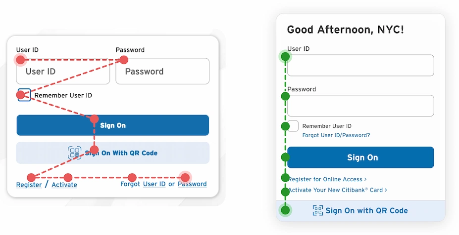
Alternatively, adopt the minimalist approach from Part II: Homepage Refresh — Content Strategies for the dedicated Sign-On page. This design translates to this context, leveraging the Citi-blue background gradient to create visual contrast and maintain a strong connection to the brand. A brief user message initiates the sign-on process and could include a personalized welcome message for users who previously selected “Remember User ID,” assuming Citibank can query the associated account’s real name.

Potential Challenges: Homepage Login Approach
Desktop Concerns
Lost Opportunity for Promotional Materials
Not using the hero as a promotional space eliminates the opportunity to showcase additional product or service content. While this benefits members seeking a quieter, more direct login experience, it misses out on curiosity clicks and could impact further site exploration.
The greater risk might be alienating non-members. Promotional content placed front and center (even if not directly relevant to the user) signals that the page is informative and dynamic, encouraging exploration beyond the hero-based product or service. Non-members who were expecting a value proposition are instead faced with a Sign-On module that doesn’t apply to them. This discourages further exploration, leads to assumptions that the site is irrelevant to their needs, and causes abandonment.

This design asks users to be more proactive by exploring navigation options or scrolling a few pixels. While the homepage contains a significant amount of information beyond just account access, users won’t be spoon-fed a large promotion in the hero section as a jumping-off point into potentially more relevant content. In this scenario, secondary content becomes crucial for both members and non-members and shouldn’t be treated as a dumping ground for random items or poorly worded value propositions.
As discussed earlier in this series, carefully crafted content with enticing visuals and clear, engaging copy is harder to dismiss. All of this should be designed with information scent in mind, whether in clearly defined links, secondary navigation, or within the content modules.

Desktop and Mobile Content Concerns
Image Curation Standards with Citibank Branding
This has been addressed multiple times throughout the series, but is especially relevant when using hero-based imagery so closely aligned with Citibank branding: be smart and put thought into content selection.
Tastefully balancing brand consistency with a simple, barebones login is a delicate balance. An image that just happens to have a Citibank branding aspect somewhere in the frame doesn’t automatically qualify it for use: be it buildings, landmarks, services, or even random objects.
The login should be the primary focus here, not the image. Both need to complement each other, ensuring the login isn’t overshadowed by an extravagant display of corporate chaos. Leaning too heavily into brand-land risks creating an off-putting, unrelatable, and inhuman corporate vibe. Overwhelming users, especially non-members without accounts, is an instant turn-off.

Keep It Authentic: Avoid Fake and Forced Branding
From a content creation perspective, quietly sliding Citi branding onto a generic corporate stock image is easier than securing a genuine branded asset. This approach avoids the challenge (and considerable expense) of finding authentic branded assets by instead manipulating existing stock options for a more convenient selection.
The current citi.com site and adjacent Citigroup websites are cluttered with clichéd banking imagery: executives shaking hands, suited-up professionals posed next to ATMs, and boardroom meetings with neatly arranged laptops. These generic images, closely resembling stock photography, feature sterile corporate motifs that undermine image authenticity and genuine connection to the Citi name.

Generic corporate images, whether stock photos or company-created, already come with inherent issues. However, the bigger crime is when these visuals include a logo or other company asset that appears to have been manually added to the scene, attempting to fake brand authenticity. Just the slightest hint of any photo funny business impacts credibility and weakens the brand.
The hero section is a critical space for showcasing the brand’s identity, especially for new users encountering the online version for the first time. If the introduction to the online brand features what’s seen as a staged stock photo, credibility is immediately compromised. In today’s Photoshopped world, even slight ambiguity feels like deliberate deception, eroding trust instantly.

Digital Feudalism, Circa 2020s
Citibank’s online presence is stuck in the Dark Ages. Simplicity, security, and usability are lost to unnecessary complexity and doubt.
Existing members are thrown into a maze of clumsy navigation, strange workflows, and frustrating interactions. New members face confusing pathways, unclear hierarchies, and uncertain next steps. Then add subpar visual design and weak content choices to the fire. Then add subpar visual design and weak content choices to the fire. In a financial space that demands stress-free and confidence-inspiring interactions, this is a big problem, be it digital or traditional.
This three-part series exposed the central pain points and presented rational solutions: practical redesigns, content strategies, and user-friendly concepts. A modest effort, given the payoff: a seamless, trustworthy, and stress-free experience. Finances can be a painful ordeal, but navigating a banking site shouldn’t feel like walking through a medieval gauntlet.
Citibank… do better.

Stock Photo Credits
(Note: C = Card, ordered left to right)
Sign On: Modal Overlay Method
- Sign On as Modal Overlay
Hero: Roman Motizov/stock.adobe.com
C1: jatocreate/pixabay.com
C2: Mathias Karner/stock.adobe.com
C3: Kriz Ly/pexels.com
Mobile Modal Overlay
- Mobile Redesigns
Device 1 (Homepage): Roman Motizov/stock.adobe.com
Sign On: Sidebar Module Method
- Sign On as Sidebar
Hero: Jess rodriguez/stock.adobe.com
C1: WorldInMyEyes/pixabay.com
C2: Igor/stock.adobe.com
C3: karandaev/stock.adobe.com
Mobile Homepage and Sign On/Help Screens
- Mobile Redesigns
Device 2 (Homepage): Jess rodriguez/stock.adobe.com
Sign On: Homepage Login
Guided Landing
Hero: Casa.da.Photo/stock.adobe.com
C1: MustangJoe/pixabay.com
C2: sasint/pixabay.com
C3: karandaev/stock.adobe.com
Content Directions
- Landmark Branding: Example 1
Hero: Andy Wasley/istockphoto.com
C1: fatty corgi/unsplash.com
C2: Igor/stock.adobe.com
C3: Ms VectorPlus/stock.adobe.com
- Landmark Branding: Example 2
Hero: Roman Tiraspolsky/stock.adobe.com
C1: Karsten Winegeart/unsplash.com
C2: miss/stock.adobe.com
C3: r-q/pixabay.com
- Shift the Tone: Example 1
Hero: danny4stockphoto/istockphoto.com
C1: anncapictures/pixabay.com
C2: Fabian Blank/unsplash.com
C3: Security/pixabay.com
- Shift the Tone: Example 2
Hero: JaysonPhotography/istockphoto.com
C1: New Africa/stock.adobe.com
C2: anatoliy_gleb/stock.adobe.com
C3: Isabella Fischer/unsplash.com
- A Subtle Approach: Example 1
Hero: New Africa/stock.adobe.com
C1: AngieToh/pixabay.com
C2: Ekaterina Shevchenko/unsplash.com
C3: Tuan PM/pexels.com
- A Subtle Approach: Example 2
Hero: sanderforsberg/stock.adobe.com
C1: Eneida Nieves/pexels.com
C2: Mylene2401/pixabay.com
C3: Luke Stackpoole/unsplash.com
QR Code Pursuit
- Homepage Example
Hero: Andreas Prott/stock.adobe.com
C1: MustangJoe/pixabay.com
C2: miss/stock.adobe.com
C3: Jarritos Mexican Soda/unsplash.com
Mobile Views
- Mobile Homepage Redesigns
Device 1: JaysonPhotography/istockphoto.com
Device 2: sanderforsberg/stock.adobe.com
Summary of Articles in this Series
Couch Clicks: The Citi.com Bank at Home Experience
Part I: Citi.com Homepage Evaluation
An in-depth UI/UX review of the Citibank homepage, focusing specifically on the problematic Sign-On area and how the content and overall site fail to deliver a positive user experience.
Part II: Homepage Refresh & Content Strategies
Explores general UI/UX fixes for the issues outlined in Part I by showcasing a homepage redesign, content direction approaches, and how these strategies would integrate with a standalone Sign-On page solution..
Part III: Sign-On Design Concepts & Considerations
Deeper look into alternative design approaches for accessing the sign-on process, weighing the pros and cons of each option in relation to the overall user experience.