UX/UI Review: The 2024 Presidential Donation Pages
The UX Circus Part III: ActBlue & Alternative Funding Page Failures
This is the third article in a three-part series exploring the user experience (UX/UI) of the 2024 Presidential Candidates' donation pages.
Based on research originally conducted for a proposed fundraising/civic-tech product, it examines usability, visual design, content, and overall trust across popular platforms. Although the product didn’t move forward, the 2024 political donation site analysis was completed. Those findings inspired this series.
The UX Circus:
- Part I: The DeSantis & WinRed Donation Page Disaster
- Part II: GOP Candidates & WinRed Contribution Page Chaos
- Part III: ActBlue & Alternative Funding Page Failures
Disclaimer: The following is based on my experience as a front-end user. The views expressed are speculative and made without direct access to any platform or campaign data. The attached screenshots may no longer reflect the current state of the reviewed site pages. Updates to content, design, and functionality may have occurred since the time of this review.
Presidential Donation Platforms
As discussed in earlier articles, the WinRed donation pages for the 2024 GOP Presidential candidates are problematic on multiple levels. Part I provided a detailed design/user experience critique of the Ron DeSantis WinRed page and donation process. In Part II, the review took a broader perspective, focusing on the content decisions made by other GOP campaigns that are also utilizing the WinRed platform.

The evaluations of both the DeSantis and GOP Presidential donation pages showcase significant core user experience issues within the WinRed platform. Basic performance problems, limited payment methods, subpar interaction design, and an overall substandard page structure are just the tip of the iceberg.
Candidates must establish a connection with users through thoughtful content choices, and hope donors will overlook and tolerate the WinRed interface issues beyond campaign control. However, as observed earlier, GOP campaigns are haphazardly styling their donation pages with low-quality graphics, overloaded and clichéd messaging, and noisy emojis.
The resulting combination of platform usability issues and these poor content choices is creating pure chaos.
Political Donation Platform Landscape
There are alternative platforms to consider. On the Republican side, only one GOP candidate deviated from the established norm, choosing eFundraising Connections over WinRed. Within the Democratic Party ecosystem, ActBlue serves as the primary fundraising platform for progressive campaigns, organizations, and committees, and is utilized by the frontrunner Democratic presidential candidate. Meanwhile, non-establishment Democratic campaigns are divided between using ActBlue and NationBuilder.
Are any of these platforms better, or are they just as frustrating as WinRed and loaded with usability issues? On the content side, are campaigns putting any effort into their choices, unlike the disgraces seen on the GOP donation pages?

eFundraising Connections
Larry Elder — The Lone Wolf
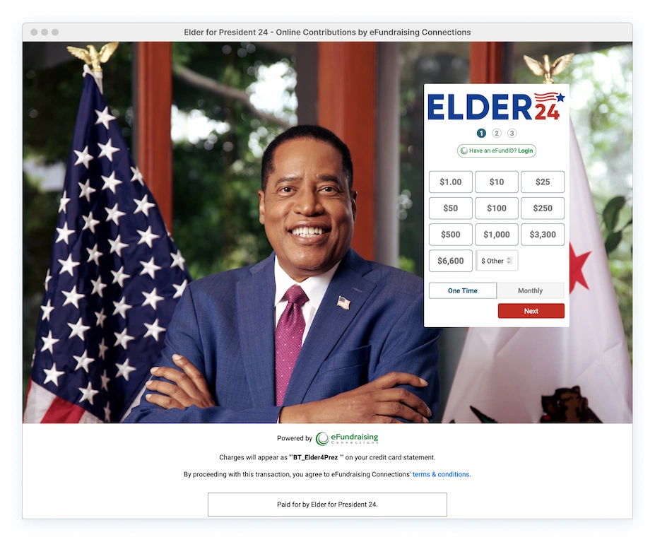
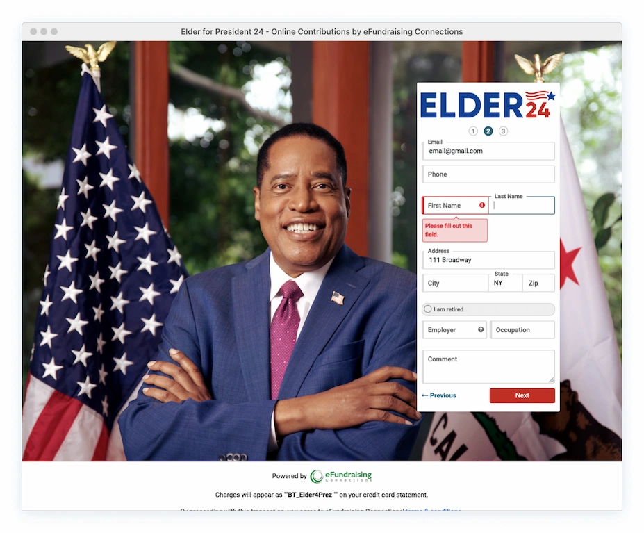
Larry Elder breaks away from WinRed, opting for eFundraising Connections. The page is bare-bones and simplified, with a sole focus on the form and no unnecessary clutter. The process is divided into three steps, further minimizing any sense of overwhelming complexity. It’s not perfect. But it’s clean, to the point and very user-friendly.
Beyond standard credit card payments, it offers an ACH option (direct deposits), a feature not provided by other campaigns. The form design visually aligns with his main website, with slight differences that will go unnoticed by the average user. The logo also conveniently links back to his main site for detailed campaign info.
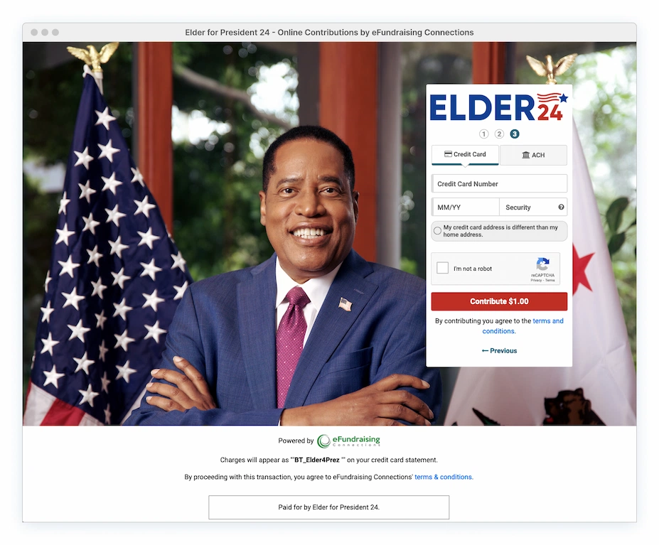
Donation Page/Platform Pros:
Very easy to navigate thanks to content chunking and progressive disclosure. Login option presented immediately. Inline validation offers clear and detailed error info, providing easy and fast recovery. Field constraints are applied to prevent the entry of inappropriate characters. Useful tooltips. Info provided on how charges will appear on the credit card statement. Final donation amount is directly displayed on the confirmation button.

impossible to miss.
Monthly Donation Option: Users can specify the exact number of committed months for their recurring contribution, a feature missing from other campaign sites. While minor questions remain (what happens if he drops out or if the donor can halt payments later on?) this feature still provides a valuable level of control and transparency.
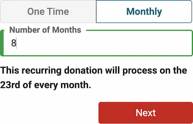
Donation Page/Platform Cons:
Visual design style outdated, clunky. Weak affordances. Some font instances use absolute units. Excessive number of donation amount choices. Form area lacks contrast with background image. Branding limited to logo and background. Process step numbers should be interactive for navigation, similar to the ‘Previous’ and ‘Next’ links. ‘Next’ should be styled as a link, not a button. No explanation provided for why phone data is a requirement. Unclear what use the ‘Comment’ section has regarding employment data, or is it for something else? No digital payment options (PayPal, etc) or check option. Minor autofill issues.
The ActBlue Platform
ActBlue is used by the presidential campaigns of Joe Biden and Marianne Williamson. Serving as the Democratic Party’s counterpart to WinRed, ActBlue focuses on securing small-dollar contributions for Democratic candidates and other progressive causes.
While ActBlue requires roughly the same field data as WinRed, the experience is significantly less overwhelming due to its well-defined structure and clear layout. Information is organized into manageable steps, fields are distinctly labeled, error recovery is straightforward, and using it on mobile devices is slightly painless. It also offers multiple digital payment options, providing donors with additional contribution avenues.
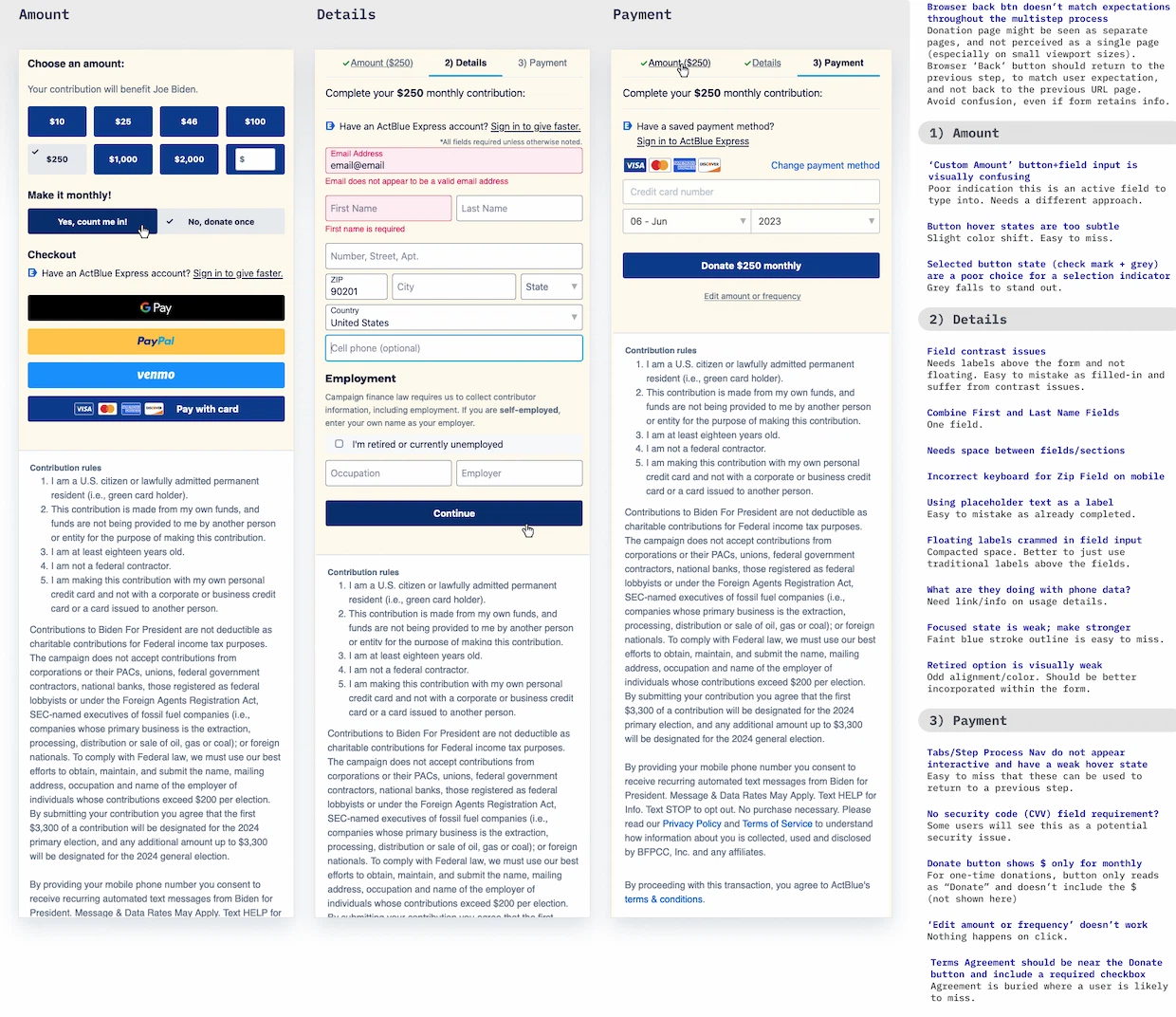
Donation Platform Pros:
Login option is shown early and featured throughout (great for those repeat donors that might suddenly remember their existing accounts while already in the flow). Clearly defined field inputs and errors. Easy error field recovery. Zip code auto-detection functionality enabled, allowing user to completely skip the City and State fields. Donation amount displayed consistently throughout the process. Standard digital payment options available. Concise and comprehensible supporting copy.
Nice use of progressive disclosure for citizens living outside of the United States.
Note: The long drop-down country selector should allow the user to type and suggest possible matches rather than resorting to a bulky selection list.
Donation Platform Cons:
Ugly form design and elements. Crunched layout with no breathing room. Line height issues. Poor hierarchy and unclear section distinctions. Form fields are excessively long and do not match real data input width. A checkbox option (unselected by default) should replace the use of buttons for the monthly contribution option. Donation amount does not stand out. No payment info or options for checks or cryptocurrency.
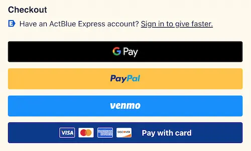
Heavy Payment Checkout Buttons. The multiple payment buttons add unnecessary visual weight to the amount section. To clean things up, these payment methods should be presented as radio buttons alongside their respective logos (as observed in the payment section when the ‘change payment option’ is selected). The credit card should be pre-selected by default, given its predominant use in the U.S. At the bottom, add a primary button that dynamically updates its label to match the chosen payment option (e.g., ‘Continue to PayPal’). This offers users the chance to review/modify their payment option before being thrown into a third-party overlay or the credit card payment process.
This approach would declutter the payment section and eliminate the current layer cake of stacked button styles.
Change Payment Method. There’s a final opportunity to modify payment methods before submitting with a credit card, yet the alternative digital options are hidden behind a subtle and easily overlooked link. The space is already tight and the prominent solid blue Donate button increases the probability of it being skipped over. Using this ‘link’ as a progressive disclosure pattern is not user-friendly and can be confusing. This might lead to hesitation among users who mistakenly think it will redirect them to another page, requiring even more effort.
These options should be exposed by default, giving donors the opportunity to review all available choices before making a final commitment.
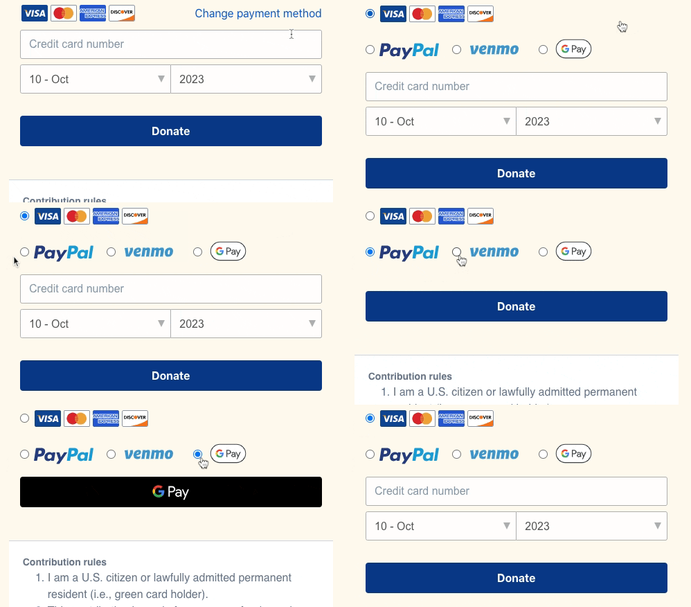
Note: A visual redesign of the payment options (treatment/size/alignment) is advisable. The Donate button should also reflect the payment method selected (it does for GPay, but defaults to the generic ‘Donate’ for the other options).
Contribution Rules. Full legal acceptance of contribution rules are tucked away in the depths of the page, potentially escaping notice after completing the donation process. ActBlue places the Donate button before any of this and doesn’t mention any terms.
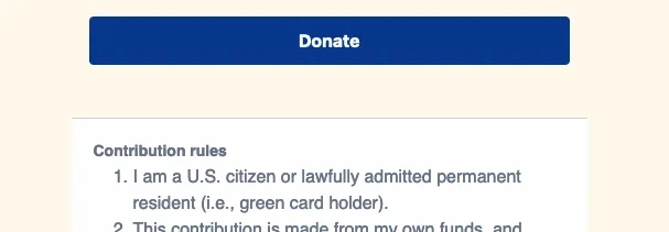
Is this ethical? It’s doubtful that users will scroll down to review the rules, especially with the prominent donation button ready to be clicked. Including a mandatory checkbox to confirm the donor’s agreement with the terms/rules would be more than reasonable.
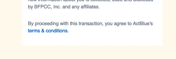
This is very similar to WinRed’s practice of dumping all the legal stuff in the footer. Including an acceptance checkbox might be a safer method; however, WinRed does provide a link for terms and privacy directly under the Donate button, where it’s less likely to be missed and links the click to acceptance.

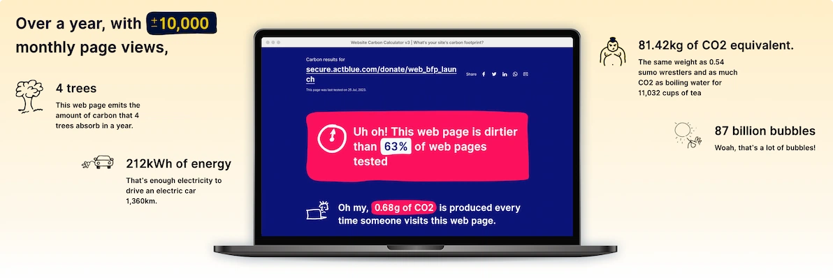
High Carbon Footprint. ActBlue’s purpose is to support progressive causes through technology. From their website:
“ActBlue is a nonprofit organization that builds tech and infrastructure for Democratic campaigns, progressive-aligned causes, and people trying to make an impact in order to fuel long-term change.”
A central progressive issue is the climate and reducing emissions. Yet the platform supporting these causes has a concerning carbon footprint...
ActBlue
Hidin’ Biden
The Biden ActBlue page is the result of a lazy attempt to align the donation page with the visual identity of the Biden campaign. On the main site, vibrant, rounded red donation buttons accompanied by a strong, distinctive font are featured. However, after selecting one of these red button amounts, users are taken to a donation page where a blocky, navy button style dominates, and the distinctive font is swapped for a dull system font.
Even the communication between the sites is a mess. The main site fails to transfer the user’s original chosen donation option from the donation site, forcing the user to re-select the amount on the donation page. Adding to the confusion, the donation amount options aren’t even consistent between both pages.
They opted out of using the familiar campaign logo and, instead, chose a poorly cut double headshot background image for campaign recognition. And paired with a weird branded scribble note (signature??) that just adds to the confusing clutter.
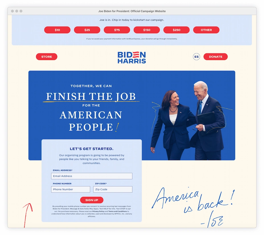
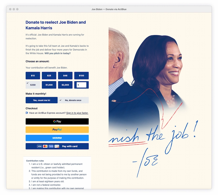
This background choice is a disaster. At certain browser sizes, the form area completely cuts off Joe’s face, while leaving Harris fully visible. A more appropriate background image for these page constraints, or customized images designed for specific viewports, should have been implemented. Excluding Biden from his own donation page is sending a message that the campaign likely didn’t intend.
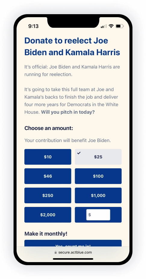
On mobile devices, apart from the eggshell background color, there’s no trace of any ‘official’ campaign branding. This absence of even a logo could raise security concerns about the page’s legitimacy, particularly when a donor arrives via an external shared link and completely bypasses the main site.
Donation Page Pros:
No added clutter. The ActBlue form takes a prominent position on the page, easy to focus on. Page isn’t long or overwhelming. Messaging is brief (but its quality is lacking).
Donation Page Cons:
No logo, weak branding. Background image fail. Headline, subheadline, and messaging provides no real value. Button style/colors/states and typography drastically inconsistent with the main site. Highly generic; raising doubts about legitimacy.
Clicking on the generic ‘Donate’ button from the main site automatically selects $250 by default on the donation page. On mobile, there isn’t a generic ‘Donate’ button, but selecting ‘Other’ sets the amount to $25.

A self-contained bubble. The donation page is striped down to the bare minimum in an effort to keep the potential donor on task. No back button, no header navigation, no social media links. There’s not even a link in the footer to the official Biden campaign site for more detailed campaign information. It’s entirely about completing the form, offering no means of escape.

This is an understandable focus method and a standard approach used by many e-comm platforms. However, this page takes it to the extreme, especially compared to the Williamson page (covered in the next section).
The donation page is frequently shared/promoted instead of the main campaign site. Currently, it even ranks higher in both paid and unpaid Google search results. Visitors arriving at the donation site wanting to explore anything about the campaign (other than making a contribution) will hit a dead end. Some visitors might assume it’s the only site, while this isolation could lead other users to doubt the authenticity of the entire page.
These issues could be slightly remedied by including the Biden logo with a link to the main site and/or throwing some social links into the footer.
Note: The main Biden website does not provide information on current issues, policies, or any accomplishments over the last three years. It’s just a dumping ground of donate buttons, a merchandise page, social media links, and volunteer options. Regardless, it should still be accessible from the donation page.
ActBlue
Crystal Clear Marianne Williamson
Williamson’s donation page shows alternative styling and layout options are available within the ActBlue platform. Some thought and investment have also gone into these minimal content and design choices.
The prominent logo aligns perfectly with the campaign’s overall vibe, creating a natural extension of the main site and brand. This seamless landing experience eliminates any user doubts about legitimacy or security. Donors are likely not even aware that they’ve landed on a URL outside of the main website.
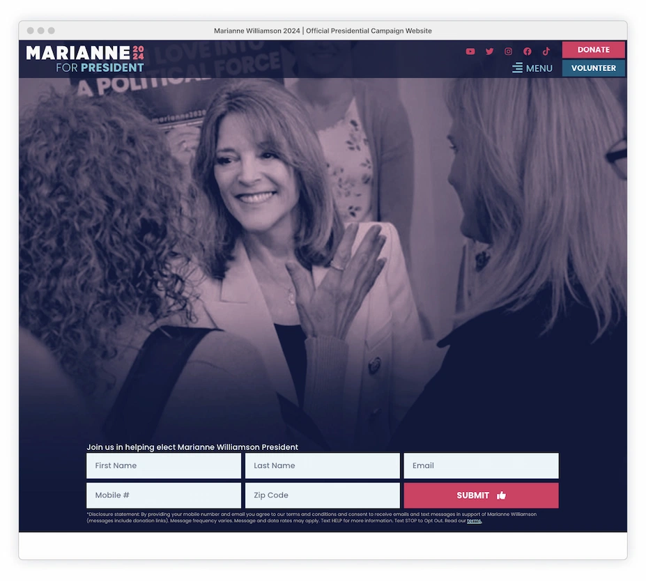
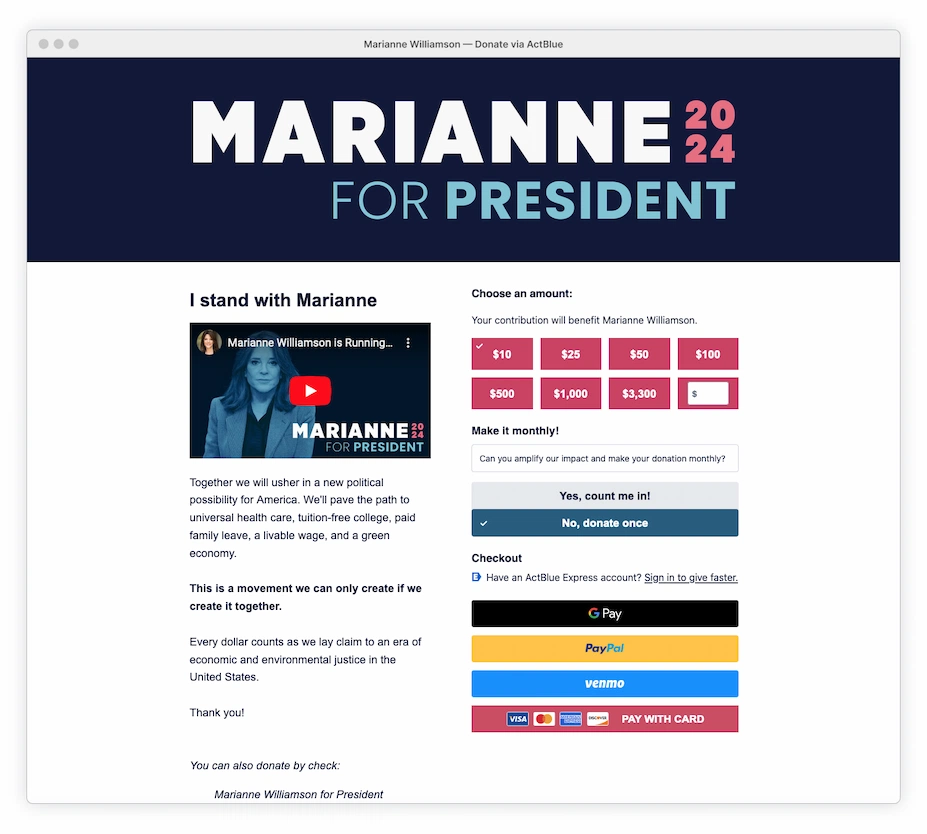

The site strategically removes potential donation distractions, such as navigation and multiple social media links. However, Williamson doesn’t confine users to a donation funnel bubble. More information is accessible through the video or by clicking on the prominently placed logo, which also serves as a natural link to the main site.
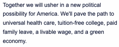
Unlike other campaigns that resort to clichéd political jargon to avoid potential donor alienation, Williamson is transparent and straightforward. She articulates her stance on major issues in just one sentence (and more directly in the video). This use of direct language enhances the credibility of her site and campaign. While there’s still some cringe-worthy messaging on the page, she’s not hiding what she’s really all about.
Donation Page Pros:
Adds a level of transparency with provided video content. Strong branding with a prominent logo/header that makes the site feel legit and links back to the official site. Mentions real issues. Details provided for check donations.
Donation Page Cons:
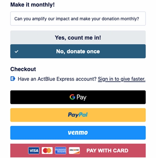
Logo link to the official site may not be discoverable to some users; another available descriptive link would help. Inconsistent font use; while it closely resembles the official site’s Poppins font, the donation site primarily uses Arial. (Poppins is freely available, but ActBlue might have font limitations, regardless of licensing issues.) Inconsistent hover styles; some are animated, all of them are different colors. Design of monthly donation option is confusing featuring boxed messaging above stacked buttons.
Copy could use work; some of the phrases are kooky.

Inconsistent and multiple button colors. The selected donation displays the wrong color, persisting as pink rather than the slate-blue already designated as the selected state elsewhere on the page. Without a color differentiator, the tiny checkmark, also signifying a selection, does little to prevent the selection from still being overlooked. The credit card option is also pink by default, adding to the confusion.

Multiple stacked button styles are another reason why the payment options should be radio buttons, as discussed in the ActBlue platform section. To further reduce this chaos, the monthly donation buttons (and the oddly outlined box message) should be replaced with a simple checkbox option (unselected by default).
Mobile Issues. Donation section on mobile is pushed too far down the page; a minor copy edit and decrease in the ridiculously large line height would help. Logo height could be reduced.
NationBuilder
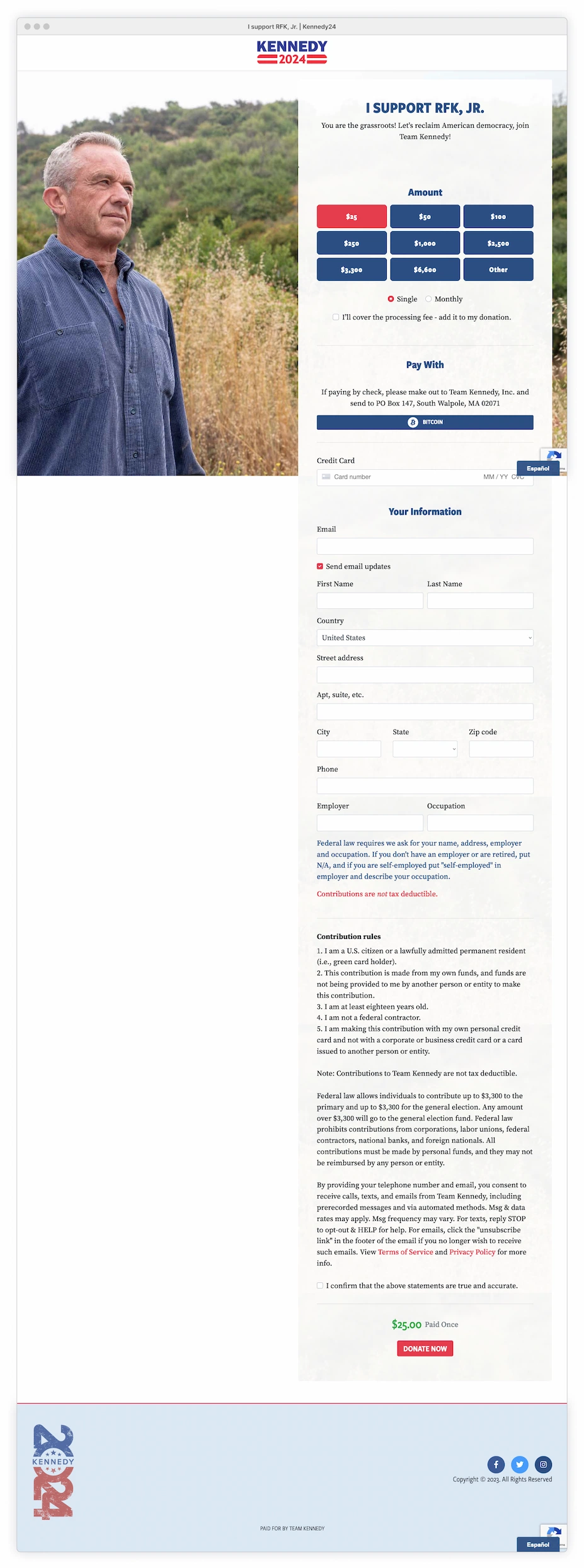
Standing Against the Grain, Robert F. Kennedy Jr.
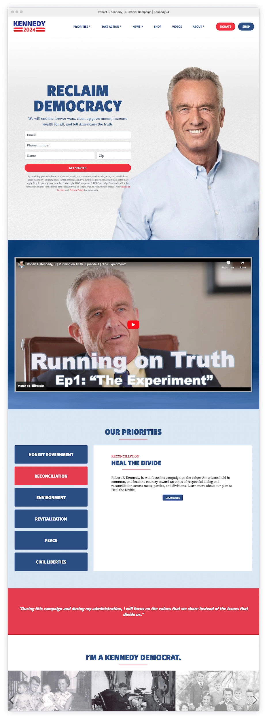
Kennedy ditched ActBlue and is doing his own thing by using NationBuilder, a fully-integrated website CMS/CRM fundraising platform. It’s difficult for an external user to determine the extent of customization/ control for the entire site, especially the donation page. However, there’s a comforting consistency, both visually and mentally, with the entire site hosted on one URL.
It’s nice to click on a homepage donate link and have the donate page open in the same window. There’s no getting tossed into a new browser window, wondering what happened and how to get back.
Other campaigns could’ve chosen to open their donation pages in the same window, but it appears they prefer keeping their visitors isolated on the donation page and without a back button option.
Customized Donation Amount
The treatment of the ‘Other’ donation option is a clever way to avoid displaying another blank field on an already busy form. The input field dynamically appears upon clicking and automatically calculates the processing fee if selected. Unlike the fixed donation amounts, the custom option provides insight into how the processing fee impacts the final amount. Donors can even experiment with the calculations to determine what they’re comfortable paying.
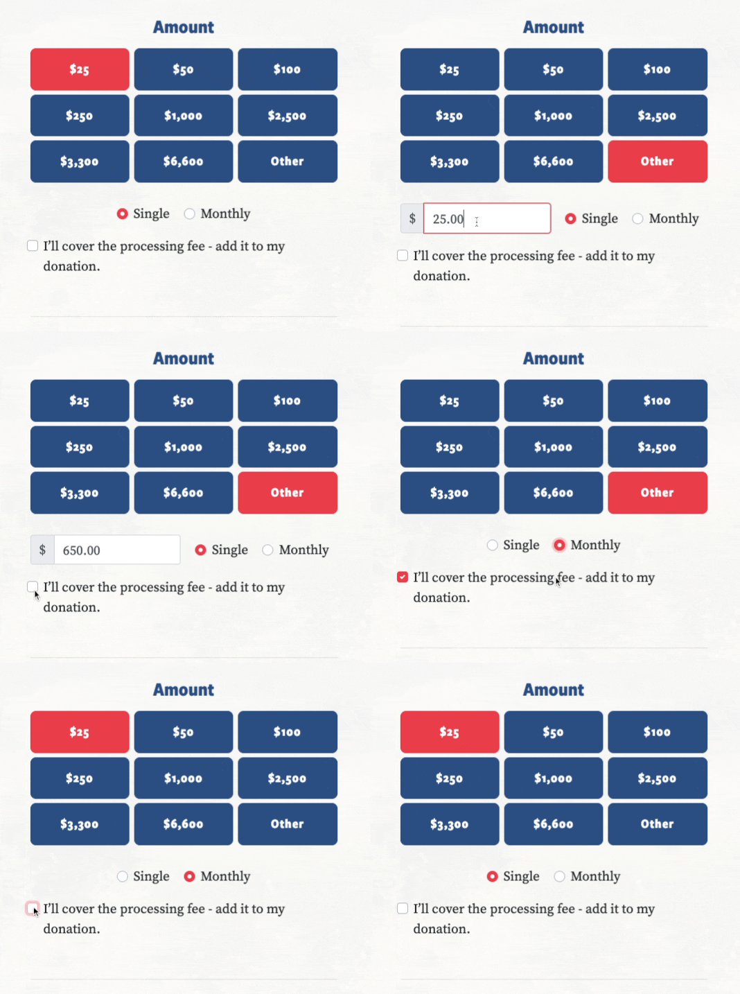
All that transparency disappears when the donor selects the Monthly option + processing fee. Did an error happen? Did it reset? Where did the field go? What is the current amount I’m paying? If the donor endures through all this confusion and doesn’t abandon the process, they’ll only see the final amount after scrolling to the very bottom of the form.
Processing Fee
Similar to other platforms, NationBuilder fails providing transparency into the processing fee and only discloses the final calculation at the end. The individual button amounts should automatically update to reflect the total amount if the user chooses to cover the fee (and include a “/mo” to each button if ‘Monthly’ is selected). Additionally, incorporating a basic tooltip with details about the processing fee would provide extra insight and reassurance.
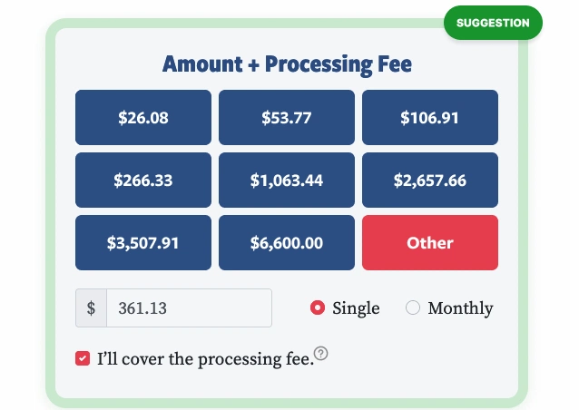
Note: The button text should be using a readable uppercase/lining format (above) and avoid the current use of lowercase/old-style currently on the live site.
Donation Page Pros:
Clean and formatted. Layout isn’t cramped or boxed in. Good balance of limited information. Donor isn’t distracted by multiple elements and can remain focused on form task while still free to navigate to the main site using top logo link to homepage (full navigation could have been left on the donation page and not been a major distraction). Social links are accessible in the footer. No option for account creation ensures donor isn’t taken out of the flow.
Broad demographic reach by allowing Bitcoin, credit, check payments and allows Americans living abroad to donate. Spanish version accessible via the language selection button. Full state and country names are used in drop downs (easy to scan and click, no shortened abbreviations).
The donation page feels secure and legit. Fairly consistent with the overall brand (fonts, colors, etc). Page is part of the main campaign website, no unusual URLs. Legal rules are clearly stated and shown prior to the donation button. Total donation amount (and frequency) is located directly above the ‘Donate Now’ button and can’t be missed.

Donation Page Cons:
Presenting the entire form all at once is slightly overwhelming. Could be better structured and split into steps. No indication what fields are required or optional. Field input length doesn’t match content expectation. Multiple button styles with unbalanced labels. Contrast could be stronger on the form fields. Background image of RFK Jr. could have been toned-down or even removed. Payment options should be better presented, layout is awkward. No options for Google, Apple Pay, Paypal, Venmo. “Send email updates” is checked by default, should let the user opt-in. Footer is inconsistent with the main site and looks strange so blank. (If users are willing to scroll all the way to the footer, they’re looking for more information. Provide it).
Info should be easily available through accessible links/tooltips for terms/ conditions/privacy and data usage.
Mobile Keyboard Issues: Autocorrect left on for Name, Address and City fields. Zip code uses the incorrect keyboard.
Whack-a-mole errors: The form appears to be using the basic HTML browser form defaults via Bootstrap. This is as barebones as it gets and why NationBuilder is by far the worst for data validation. Beyond just the customization limitations and usability issues, this lazy implementation method is an error recovery nightmare, especially on a long form.
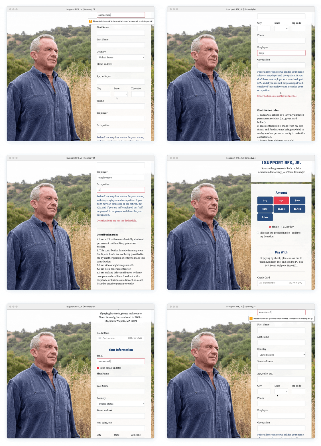
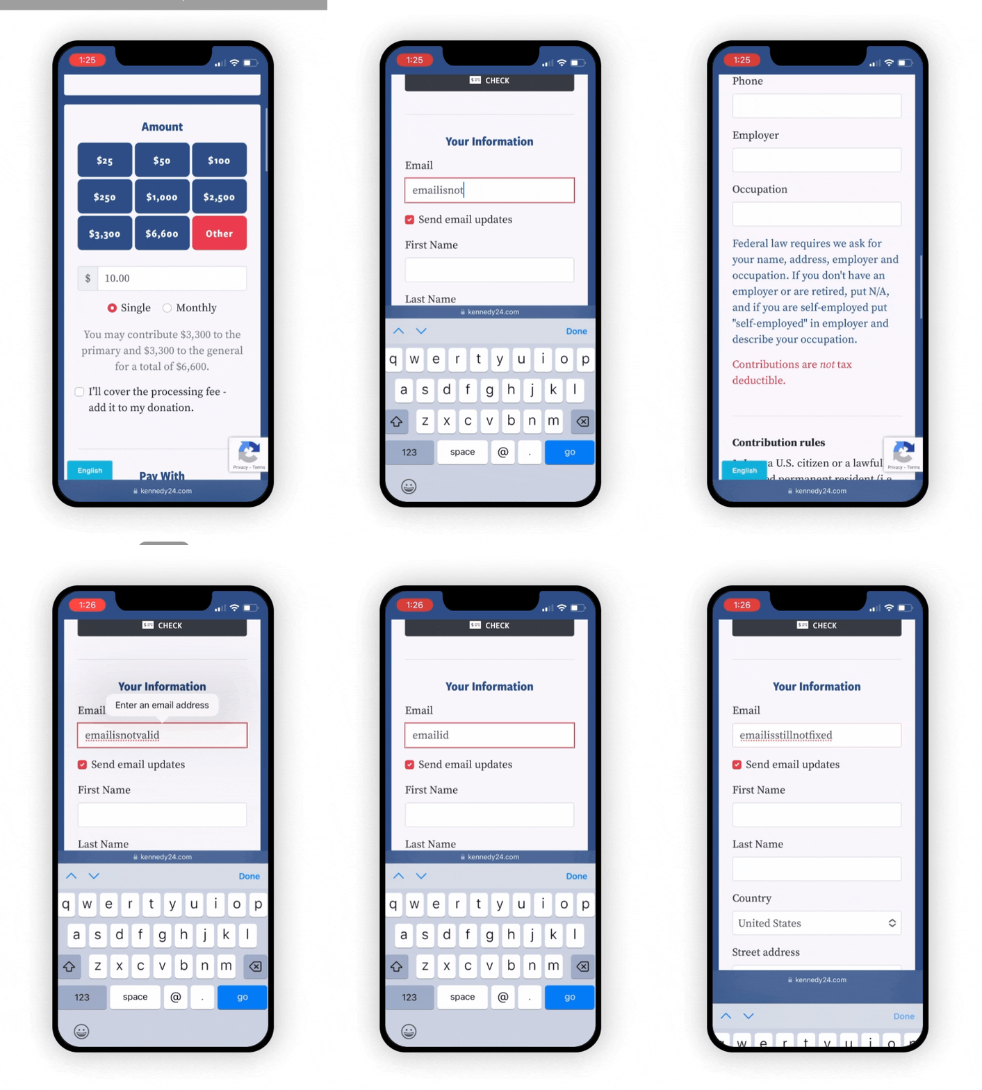
When clicking ‘Donate,’ the page displays only one error message at a time, even if the user has incorrect data or empty fields. The error indication on the field isn’t even static; it vanishes as soon as the user attempts to correct the error, whether or not the problem has been fixed.
The user has to validate the singular correction all over again via button click. Only then (if corrected) will the next error appear and the correction process begins all over again.
Adding to the confusion, the site uses a bright red outline as the default focus state, even in the absence of errors. There’s also no supplementary visual cues for errors (no icons), and the lack of distinction between required and optional fields turns the entire form into a guessing game.

NationBuilder
The Dull Donor Pulpit of Cornel West
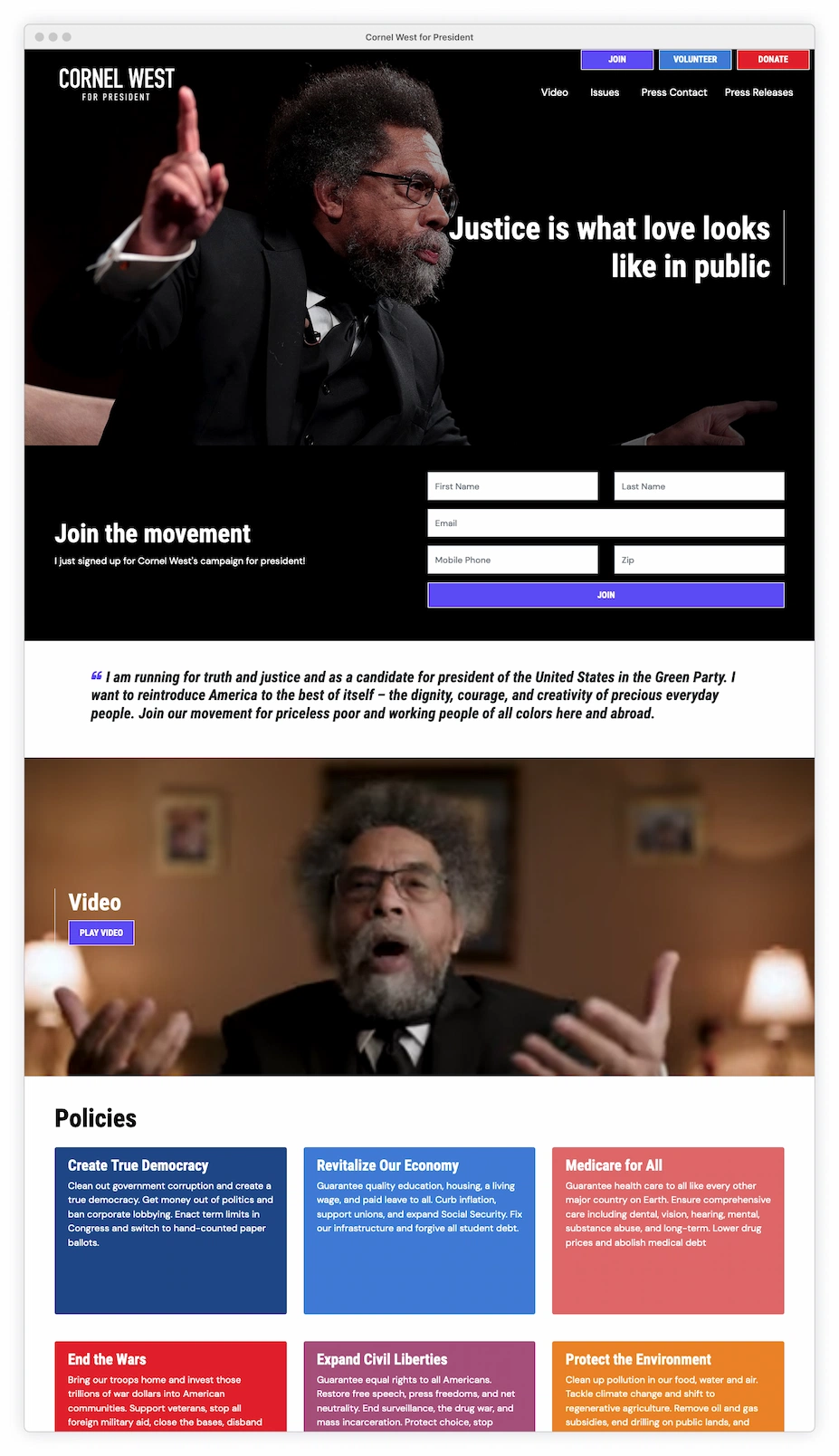
Cornel West also abandoned ActBlue in favor of NationBuilder. Like Kennedy, he successfully carries over the same font treatments and similar style from his homepage to the donation page. West goes a step further by including the full navigation, despite the potential risk of distracting the donor from the donation process.
This page shares the same NationBuilder issues noted on the RFK Jr. site, including error and validation problems. However, it doesn’t end there; the page descends into poor design choices, featuring issues with contrast, text formatting, alignment, a lack of hierarchy, and placeholder labeling — making the West donation experience far worse.
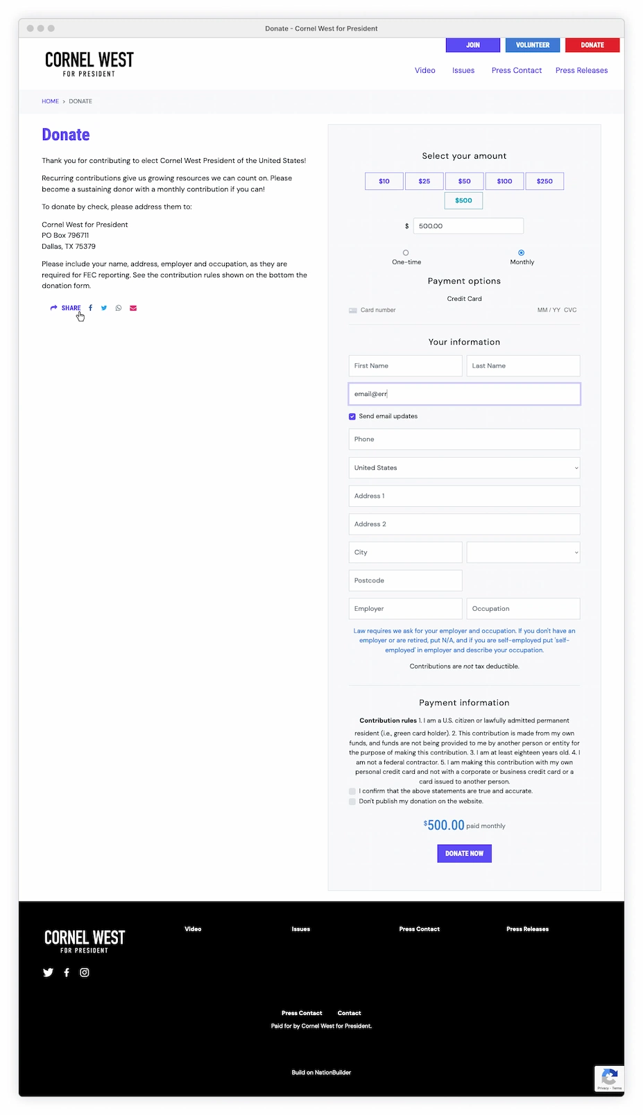

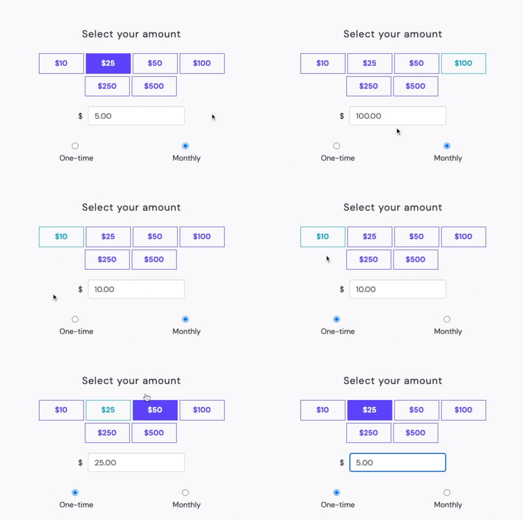
Button state + field input?
The donation selection uses a strange UI pattern which opts out of having an ‘Other’ option. Instead it links the standard button amounts to a dynamic input field, which can be edited regardless of selection. At times, the button becomes filled when selected, but the corresponding field input value doesn’t match and results in multiple values.
Visually, the ghost buttons don’t appear interactive and the blue radio buttons are stylistically misplaced and tiny. The selected amount is only reflected with a subtle change in stroke/text color and not colorblind friendly.
Label and Field Issues
Using placeholder (inline) labels for the fields is a complete nightmare. When a field is in focus, the placeholder text vanishes, forcing the user to rely on memory. To view the original data requirement, the user must fully delete the input to reveal the original inline label and then reenter the data.
The field lengths should match the expected size of content, yet these fields are excessively long. The phone field could accommodate five separate phone lines; the postcode field could fit seven different US zip codes.
The gray text is already challenging to see, and there’s no visual color difference between placeholder text and user-provided data. The weak focus state also fails to provides any visual distinction.
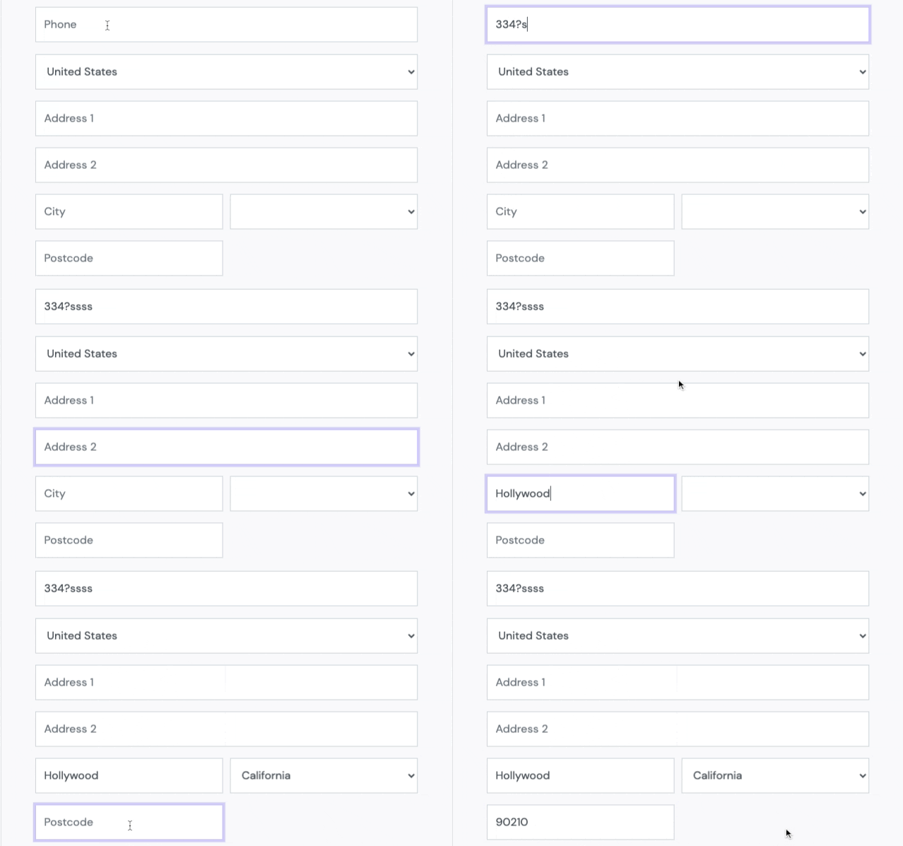
Note: ‘Postcode’, is a European term. America uses ‘Zip Code’.
The most important field on the page is the credit card area, yet there’s no visual input field or any solid indication of interactivity. It consists of only small, poorly contrasted text, floating in space. Live Luhn validation is being used, so at least the user is immediately alerted if the number is entered incorrectly.

Donation Page Pros:
Page is directly part of the site, no redirect to outside URLs. Provides accessible information into his campaign. Social links allow supporters to share the donation link (regardless of contributing).
Donation Page. Pro or Con???
Many candidates chose a minimalist strategy for their donation pages, and striped away navigation, links, and other potential distractions that could divert donors from that important ‘Donate Now’ CTA. In contrast, West retains his navigation and footer links, and doesn’t shy away from providing accessible information into his campaign. Whether this approach is advantageous remains uncertain (and would be interesting to see the % of users that leave and then return). It does signify a level of trust from West that his supporters are focused and won’t be easily swayed from clicking that donate button.
Donation Page Cons:
Page floats in space. Using a dark header (like on the homepage) would help anchor the content. Two tiers of navigation creates clutter and confusion. Why is the overpowering red ‘Donate’ CTA even on the page? Text is tiny, difficult to read, suffers from contrast/accessibility issues, weird formatting, and strange character spacing. Center-aligned copy is difficult to read. No static labels. Check payment option is lost and should be part of the main form flow. Focus states inconsistent. Intro copy on the left rail is weak. ‘Share’ link is too small, awkwardly placed, impossible to click on mobile. Final donation amount does not stand out and needs heavier font with a bolder color treatment. Too many additional issues to list…
Overall: Washed out, weak, boring and user-unfriendly. It lacks character and is tonally disconnected from the main site where West’s dynamic personality is so prominent. The only energy here is negative frustration.
Dropping Out: Presidential Donation Pages Recap
Poor Content Decisions + Platform System Issues
It shouldn’t be this difficult to create a decent user experience for a simple one-page donation form, yet none of these pages are getting it right. The campaigns overseeing their own site elements are thoughtless, haphazardly throwing on subpar copy, adding terrible images, and topping everything off with more useless clutter.
Meanwhile, the underlying platforms are plagued by basic UX issues beyond campaign control, adversely impacting a crucial point of supporter contact. A great way to disrespect your donors is to waste their time. The donation process should be seamless and enjoyable, not painful and regrettable.
The campaigns and donation platforms ignore these fundamental concepts and instead slap donors in the face with careless content choices, clumsy interactions, messy design interfaces and limited payment options.

Look Legit
The lack of seamless brand integration and low-quality content undermines the credibility of what is likely the most crucial webpage for these campaigns. The overall user experience is already suffering from basic platform interactivity issues, and throwing on bad content only makes the situation worse.
This problem is very noticeable when transitioning directly from a candidate’s main website to their donation page. The visual styling discrepancies between the sites are often so different that users may question if the donation site is a fake.
Regardless of how users enter these sites (main candidate pages, social posts, search, etc.) the subpar images, typography, messaging, and inconsistent design choices diminish the credibility and trustworthiness of the campaign.

Beyond the horrible content choices, the underlying donation platforms should offer more accommodating branding integration. This includes element styling, better layout customization (enhanced mobile control), footer content flexibility, and standard webpage attributes.
For example, candidates are unable to use their personal favicons on their donation pages. This lack of customization only further highlights that the donation page lives on a different URL, separate from the main campaign. If, hypothetically, a potential donor bookmarks the page for future reference (future $$!!), the displayed favicon would be that of the platform icon rather than the more distinctive and recognizable candidate icon.
Nationbuilder is off the hook here. The donation page is already part of the main site, sharing the same URL and embedding the campaign favicon. While there appear to be limitations with brand integration within form elements, this isn’t one of them.
Chunk It: All Fields (Should) Matter
Reducing the overwhelming number of empty fields presented at once supports user focus and facilitates easy error recovery, especially in the mobile experience. While a basic, multi-step process is a good starting point, even platforms currently chunking their forms could further consolidate data requirements and lessen the user burden.
Realistic field lengths should be based on data expectations; for example, the zip code field doesn’t need to accommodate 30+ characters! Evaluate the real need for each field. If a field is only required under certain conditions, then hide it and use progressive disclosure when appropriate. Trim everything to the absolute essentials and merge fields where possible (e.g., combine First Name + Last Name = into a single Full Name field). A strict one-to-one relationship between the form and the site’s database is no longer mandatory.
Use other methods to collect database requirements and take the tedious task off of the donor. There’s no need to even ask for city and state/region if the zip code is available. Automate it! A complete billing address might not even be needed when most credit card processors only require a zip code.
Dead-End Donation Pages
You can enter, but you can never leave…
The user journey into these donation pages often completely bypasses the campaign’s main site, where the bulk of the detailed campaign information actually lives. Users might enter from any number of outside-promoted channels. Social media, articles, targeted ads, email lists, PACs, and other organizations just drop the potential donor directly into the form flow and ignore the main site completely.

Once on the page, the primary emphasis is on swift contributions rather than access to real campaign information. All outside distractions are removed for complete donation focus. Many of these sites don’t even include external links in the footer abyss, other than the required legal terms and conditions.
If a potential donor wants any detailed campaign info, they’re stuck navigating on their own. Google provides little assistance and tends to prioritize donation pages (often through sponsored ads) while burying the main presidential 2024 pages. The search engine also frequently assigns higher rankings to the candidate’s current/past/personal sites (roles such as Governors, Senators, CEOs, etc.) and pushes relevant Presidential page content to the ‘More Results’ graveyard.

The hyper-focused donation page raises questions about the transparency and confidence campaigns have in their own messaging. Linking a logo back to the campaign’s main site should be a given. Throw some social media links in the footer. If the user is already poking around that section, they’re likely looking for something other than the donate button.
Even if there’s no current plan to donate, keeping an open pathway to information is essential, even if it’s just a small crack. It’s a way to establish a relationship and potentially secure a future contribution. Instead, the door is being slammed shut.
As previously mentioned, ‘outsider’ campaigns, such as West, RFK Jr, and Williamson, aren’t shy about sharing accessible info on their donation pages. While the level of detail may vary, there’s a sense that these campaigns trust their supporters’ steadfast commitment and encourage them to learn more. This transparent approach makes them appear more genuine and authentic compared to the more mainstream candidates.
Lorem Ipsum: More Understandable Than This Garbage
The attention to detail on the copy used on these sites is abysmal. These sites are polluting their pages with badly worded, clichéd, and dull messages. Is anyone even proofreading this gibberish?

Some use mile-long text blocks that are overwhelming and impossible to digest. On WinRed sites, multiple ‘URGENT’ donation request modules are crammed with pointless and redundant copy. Other campaign sites simply vomit random political keywords, resulting in complete nonsense.
Lengthy paragraphs should be broken into easily digestible content portions and utilize bullet points. Even campaigns keeping it short are stuffing their messages with unoriginal, boring, and embarrassing taglines of fluff. Stop saying so much about nothing and just get to the point. If the content is still a word salad, then develop an authentic message that isn’t just the same recycled political jargon.

Poor typography and a lack of formatting only add to the disaster. Inadequate line height, inappropriate font selection, orphans, a lack of hierarchy, overly bright text, and excessive yellow highlights collectively destroy the readability of these pages. The overuse of bold, italics, capitalization, and combinations thereof (BOLD, ITALIC, AND CAPITAL LETTERS) is distracting and diminishes the effectiveness of any messaging.
Data Transparency
These platforms lack easily accessible information about their data collection practices, forcing the cautious user to go out of their way to find it. Lack of transparency is an instant turn-off, especially for a potential donor already skeptical about the legitimacy of the page.

Data Disclosure: Every platform asks for an email and phone number. The email is always mandatory, while phone is sometimes optional, dependent upon the campaign.
No site provides an easily accessible explanation for why they need this personal information and how they intend to use it. Donors seeking answers on data usage are forced to rummage through a mess of contribution rules buried in the footer or, worse yet, dive into the deep depths of a legal privacy policy document.

Will donors be bombarded with email newsletters or unsolicited SMS texts? If so, where’s the opt-out option? Donors have a right to worry about who might access their data. It’s not a tech challenge to just throw on a tooltip/direct link that answers these questions.
Cautious supporters are forced to pause the donation process and hunt down privacy info. Others may just abandon the donation altogether. Regardless, it reflects badly on presidential contenders who preach pro-privacy stances and oppose government surveillance, yet refuse to be transparent about their own data requirements.
Money Money Money
Online customer complaints about shady fees, overcharges, and billing problems exist across every donation platform, with varying degrees of severity. The reviews strongly suggest that a cleaner and more transparent UX/UI approach could have alleviated many of these issues, potentially resulting in a decrease in the number of customer support requests.
Bug? Or feature? Note: It’s worth considering that some of these instances of ‘Bad UX’ may be intentional.

Recurring Monthly Donations
The monthly contribution feature, available on all platforms, is a dark hole. None of the campaigns provide detailed and accessible information on how this commitment works long-term. Larry Elder offers frequency control but still hides the finer details. Campaigns might be banking on users impulsively opting in without thinking about all the unknown possibilities ahead. What happens if the candidate drops out? How do the primaries versus the general election factor into this? How many months remain? (Don’t make me do math!)

WinRed: Defaulted Monthly Selection
As mentioned in Parts I and II, some campaigns on WinRed have the monthly donation automatically pre-selected. The platform should never have allowed the option to designate this as a default selection. It undermines the integrity of the system and raises questions about responsible and ethical UX practices.
The following are just a few examples of the many online customer complaints about this ongoing issue with WinRed.


Donors who catch it right before hitting that donate button will immediately start questioning the trustworthiness of the campaign and the platform. It’s even more damaging when donors discover a surprise monthly bill reflected on their credit card statement. Credibility goes down the drain, and any long-term, future support is completely destroyed.
Processing Fees
The option to cover the processing fee is available on WinRed sites as well as RFK Jr.’s site. Asking donors to cover credit card fees is a standard practice for charities, foundations, welfare organizations, and general non-profit sites.
Random ‘fees’ currently accompany everything in daily life (digital delivery, administrative, service, convenience, etc.) with little to zero insight into their specific purposes. Encountering something like this on a political-related site raises an immediate red flag and could prompt questions about who else might have their hand in this cookie jar.
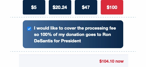
None of the political sites offer insight into what exactly this ‘fee’ is. Detailed fee information was impossible to locate for RFK Jr.’s site and the broader Nationbuilder.com site failed to provide any concrete details. On WinRed, the breakdown is only vaguely mentioned deep in the support section.

What is the fee actually covering? Is it just the standard credit card processing transaction, or does it include other separate expenses like customer support? These are valid questions, especially considering WinRed is a for-profit company.
There’s lots of past WinRed drama surrounding its ‘for-profit’ status, candidate complaints, campaign finance laws and other questionable financial practices. From a UX perspective, the key takeaway is the importance of complete transparency regarding the ‘processing fee.’ Users should have easy access to a clear breakdown of whatever this fee truly covers.
Note: I reached out to WinRed several times for more details on how this is calculated, but they declined to answer.

ActBlue takes a very different approach. There is a 3.95% fee, but it’s not displayed on the form page, and donors can’t opt-in to cover the fee. It’s automatically deducted from the campaign group.
By not mentioning it, they keep the donor in the dark that the fee exists and avoid doubt and drama. They even bury the very existence of the fee in their support section. While remaining skeptical about what ‘processing costs’ might include and how tips manage to cover their expenses, their statement does offer some degree of transparency into their operations.
Note: It would have been nice if ActBlue had also provided a mathematical breakdown, using a $100 donation amount as an example, similar to WinRed.

Although campaigns on ActBlue might miss out on a few extra processing bucks, keeping the user in the dark might be more beneficial in the long-run. ActBlue campaigns avoid appearing money-hungry by refraining from requesting more funding on top of the original donation. Additionally, no doubts are created, and donors can unquestioningly assume that 100% of their money is going directly to their candidate. WinRed might want to reevaluate its current approach to prevent the question, ‘What is this ‘fee’ really for?’
Users FIRST
There seems to be a naive expectation, shared by platforms and campaigns, that donors will just casually overlook the neglect and tolerate the experience because of their strong support for their candidate.
This might be true for diehard donors. But all types of users, each with varying levels of interest, land on these sites. They could include Casual Visitors (what’s this all about?), Supporters (yeah, I can get behind this candidate), On-The-Fence Donors (maybe I’ll throw in a buck), and possibly even Hate Visitors (where a negative user experience only validates their original perception).

Each page visitor has already donated time, energy, and interest simply by landing on the page, and even this form of contribution deserves respect. But these pages throw everyone — Donor/Supporter/Visitor/Hater — to the sidelines. There’s very little effort in welcoming the person on the other side of the screen and making them feel appreciated, part of something, and reflecting that unity through honest copy, cohesive branding elements, and ease of interactions.
Most importantly, whether they’re donors, supporters, visitors, or even critics, they’re also potential voters. Yet these campaigns and platforms appear more focused on bolstering their piggy bank than on supporting the voter, failing to recognize that everything is interconnected.
Break one, break them all.

UX Circus Articles:
Part I: The DeSantis and WinRed Donation Page Disaster
Focuses on the Ron DeSantis presidential launch, featuring an in-depth design critique of the donation page and donation process.
Part II: GOP Candidates & WinRed Contribution Page Chaos
Provides a general overview of how the other GOP campaigns are handling their content on the problematic WinRed platform. What they're doing right, wrong and how they're standing out.
Part III: ActBlue & Alternative Funding Page Failures
Examines ActBlue, the Democrat Party fundraising platform operated by the DNC (Democratic National Committee). Also included is a look at two alternative platforms used by outsider candidates that decided to ditch ActBlue and WinRed and do their own thing.

