UX/UI Review: The 2024 Presidential Donation Pages
The UX Circus Part I: The DeSantis & WinRed Donation Page Disaster
This is the first article in a three-part series exploring the user experience (UX/UI) of the 2024 Presidential Candidates' donation pages.
Based on research originally conducted for a proposed fundraising/civic-tech product, it examines usability, visual design, content, and overall trust across popular platforms. Although the product didn’t move forward, the 2024 political donation site analysis was completed. Those findings inspired this series.
The UX Circus:
- Part I: The DeSantis & WinRed Donation Page Disaster
- Part II: GOP Candidates & WinRed Contribution Page Chaos
- Part III: ActBlue & Alternative Funding Page Failures
Disclaimer: The following is based on my experience as a front-end user. The views expressed are speculative and made without direct access to any platform or campaign data. The attached screenshots may no longer reflect the current state of the reviewed site pages. Updates to content, design, and functionality may have occurred since the time of this review.
Blame the Memes
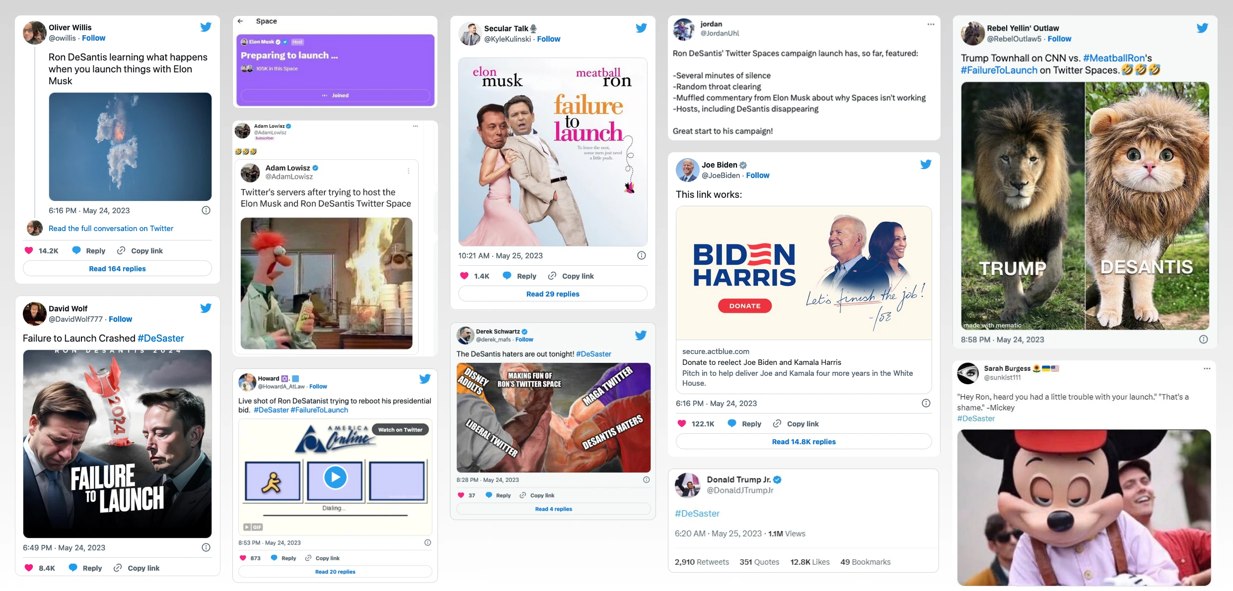
On May 24th, Ron DeSantis officially launched his presidential campaign via Twitter (pre-X), which didn't go exactly as planned. The live audio broadcast crashed and kicked off some users, including DeSantis himself. He managed to finally rejoin 25 minutes later but long after his campaign had already made the official announcement in his absence. The New York Times described the livestream as “The conference call from hell”.
If not for the memes, those of us brainlessly scrolling through Twitter would have missed Ron DeSantis' real-time tech debacle. Once the memes started circulating, no corner was safe from the flood of sarcastic content reacting to this failure.
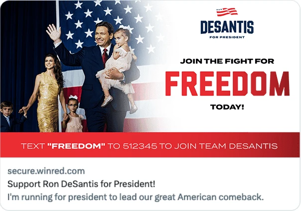
In-between all the creative commentary, supportive Twitter accounts continued sharing a link to the campaign’s official donation page, still hopeful of capturing donations. The ad represented a glimmer of hope, offering an alternative outlet for engagement and an escape from the unfolding chaos.
However, the content on the other side of the link was just another disaster…
Page Overview
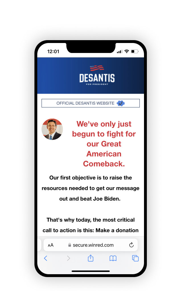
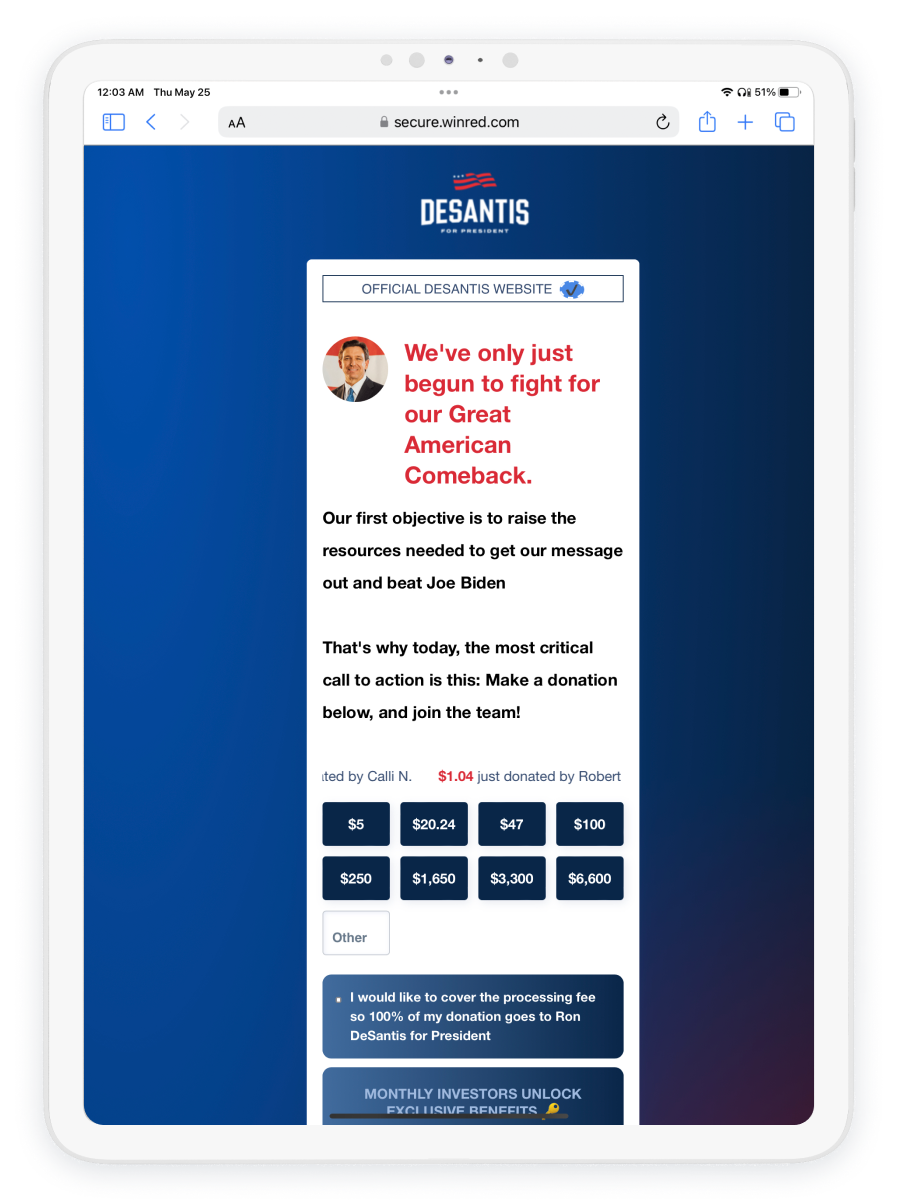
The visitor is directed to a long and overwhelming form page containing no real information and where you ‘join’ the team by contributing money.
The main issue isn’t the money request itself (which was implied in the ad post, though many users likely assumed it linked to a more general campaign site, myself included). The problem is how that request is delivered. Poor content choices, weak visuals, unclear messaging, and clunky interactions make the page feel lazy and disrespectful. If someone is willing to shell out money for your cause, at least put some effort into the experience.
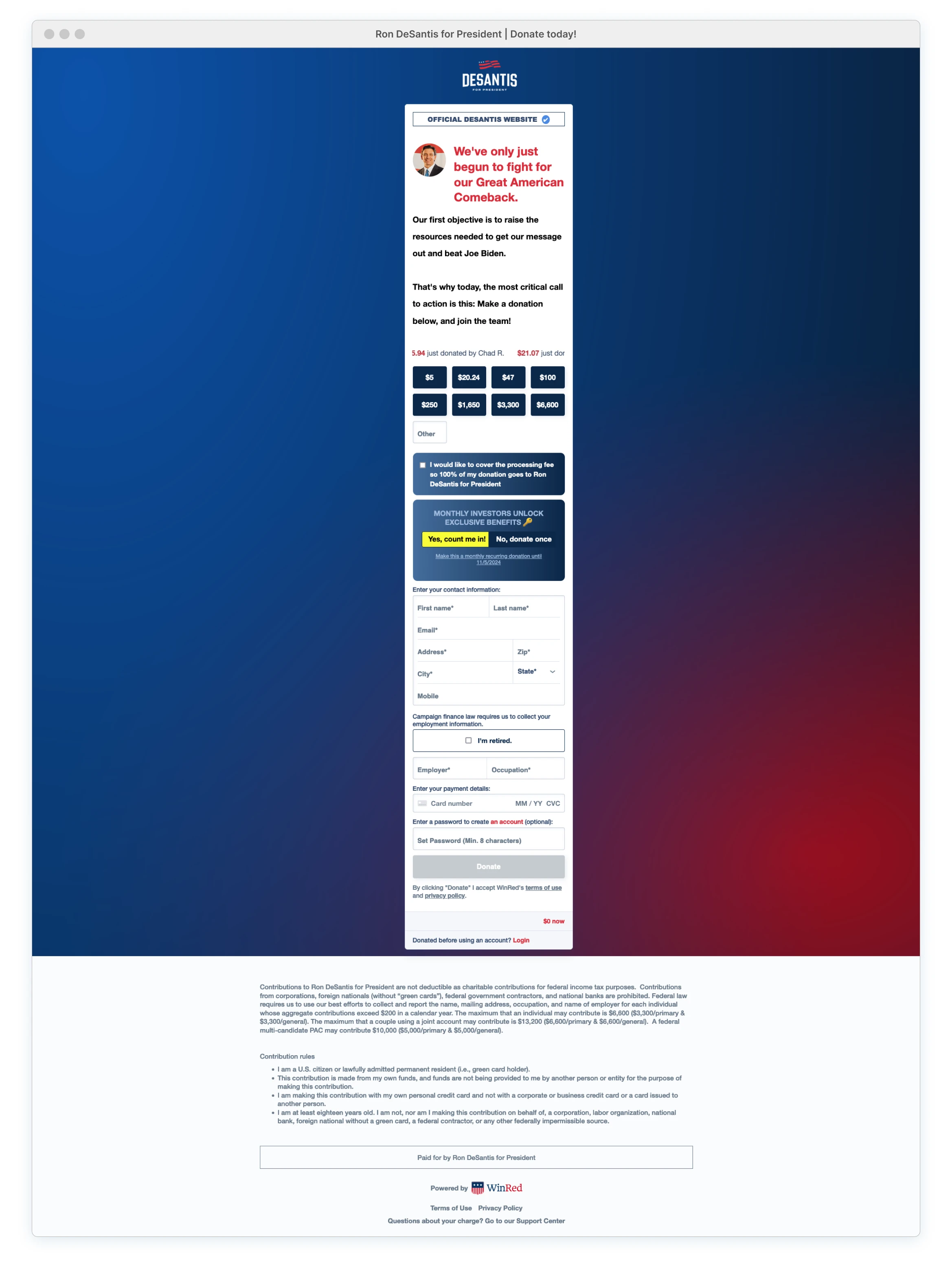
Did they wait until the last minute? Was this planned as a temporary page just for the announcement? Why is there a narrow strip of content cascading down just the center? Did they assume that this page would solely be accessed via mobile devices, justifying the oversight of larger viewports and other devices? This is all not ok.
The module width appears to have been already adapted for mobile use, yet the actual mobile experience is an even larger usability disaster.
Under the Hood
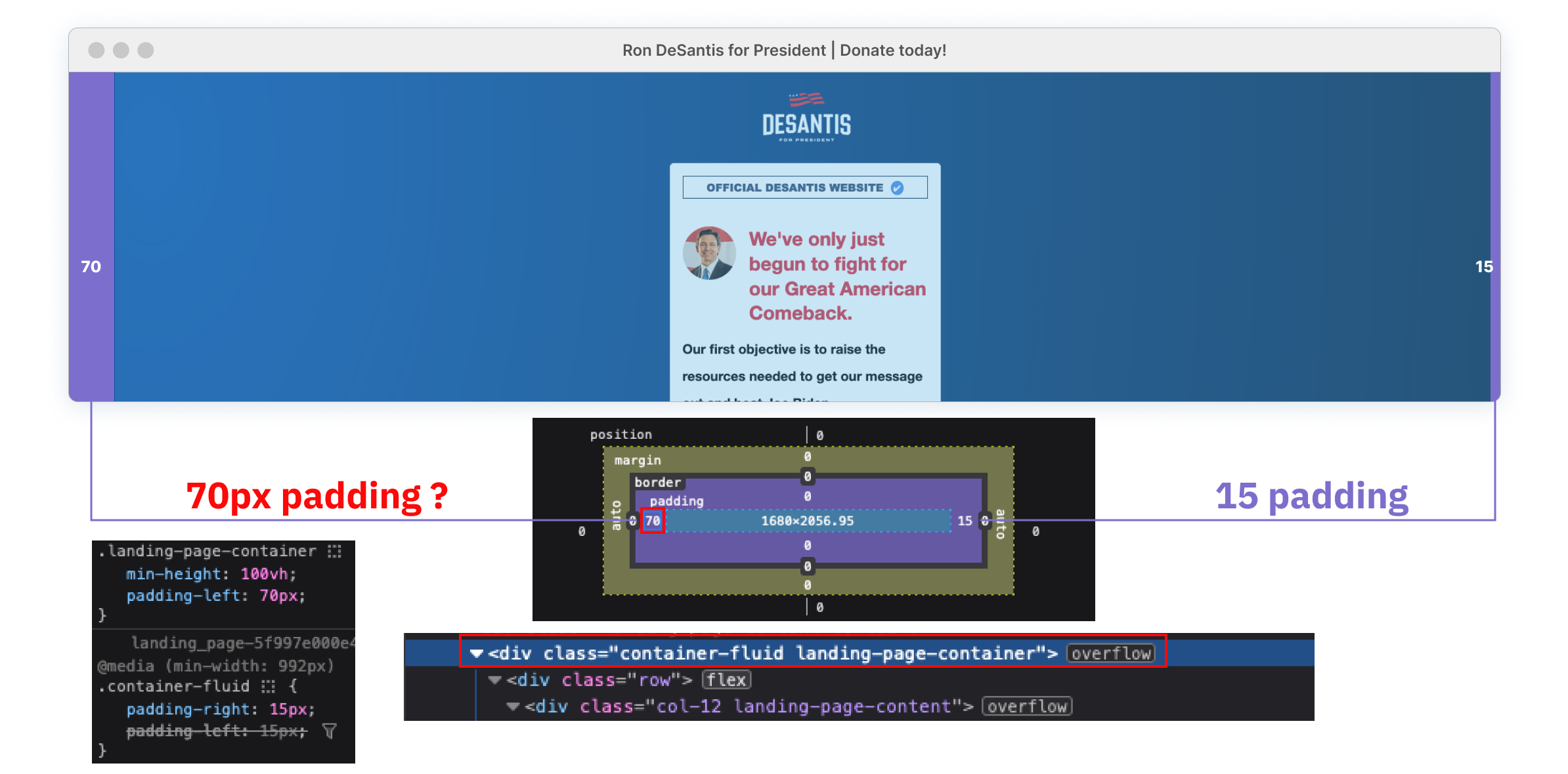
Content is carelessly thrown onto the page without any attention to detail. The logo isn’t even centered, and the form module is needlessly offset by 55 pixels within the central container. Although the standard Bootstrap framework is being used for columns, rows, and containers, a new value has been added, overriding the default padding-left measurements. This impacts everything above the footer and is responsible for this alignment mess.
Logo-Motion Shakin’
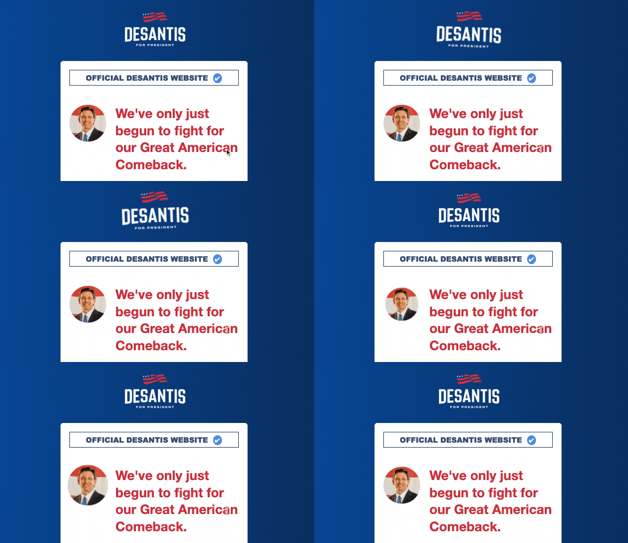
The animated ‘shake’ motion (applied to the logo, the avatar, and finally the preferred donation amount button) helps draw attention down the page to the donation buttons. This effect only highlights the poor alignment of elements, making the site appear amateurish and raising questions about its legitimacy.
The logo itself a low-quality PNG that renders the ‘For President’ tagline almost unreadable, even when the shaking momentarily stops. This quality degradation is even more noticeable on mobile devices where an SVG would have been appropriate.
It’s ‘Official’
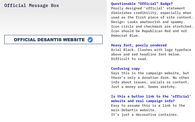
Thankfully, a reassuring ‘OFFICIAL DESANTIS WEBSITE’ statement, accompanied by a blue checkmark (why isn’t this Republican red??), was provided to alleviate concerns regarding authenticity. The messaging is also confusing, and users might assume this links to the ‘official’ DeSantis website, offering an escape from the donation page section.
Nope. The entire box is pure pointless decoration and users are not going anywhere.
Identity Crisis?
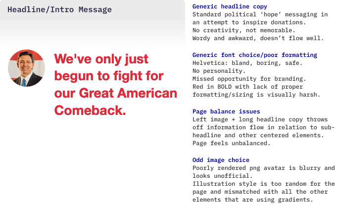
The randomly placed animated avatar is oddly positioned next to a bold, blood-red Helvetica headline. This alignment is completely off-balance with other page elements, disrupting the entire flow. Adding to the misery, the animated ‘shake’ effect further highlights how carelessly these elements were placed within the space.
A font and aesthetic more in line with that of the logo would have worked better for this section. Even incorporating a similar font style from the original link that led to this situation could have provided the form some branding cohesion.
Line Height and Copy
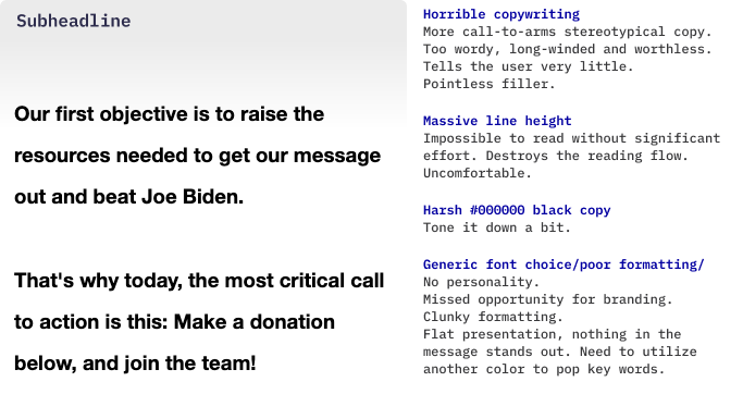
The bold #000 black subtext is hard on the eyes, and the excessive line height disrupts the reading flow, making it uneven and unpleasant. On the positive side, the poor formatting is a welcome distraction from the horrible copywriting.
Deceptive Donation Scroll?
The motion effects are unnecessary. While using animation makes sense with a donor scroll, it's distracting and not very smooth within the current layout. The shake/twist “Click Me” animation on the $100 button seems to be a suggested donation anchor. Regardless, just give it a rest with the animated elements — there's already too much page chaos.
The authenticity of the donator information is questionable. There’s reason to suspect this is a fake scroll, repeating every 45 seconds and not linked to any real data. Even after multiple page refreshes and revisiting it several hours later, the data remained unchanged. The donor names raise suspicions, with ‘Brian A’ followed by ‘Brian B’, (what are the odds of that really happening?). Excluding ‘Brenda G,’ the names on the list are typical male names and would be categorized under ‘Conservative American’ in a baby naming book.
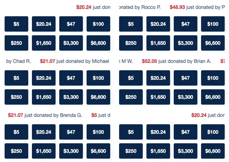
‘…just donated…’ gives the impression of real-time updates, but it’s clear that this is not the case.* Otherwise, the feed would have reflected an immediate change, especially considering it was observed during the same timeframe when DeSantis reportedly raised $1 million online.
The site might be scheduled to regularly update names and amounts to create the appearance of ongoing activity. (I’ve since noticed new names/amounts on subsequent visits). However, the term “just donated” implies real-time, and this disingenuous strategy could backfire.
*Note: This is all speculation and observation as a front-end user.
Donation Amounts
Eight (+ Other field) donation options just add unnecessary complexity to the page. At first, it might seem like they’re simply filling available button template space with random numbers (regardless of user donation data) and hoping something sticks. While there is a rationale behind the specified donation amounts (outlined in the footer section), a more effective design approach could have reduced the overcomplication.
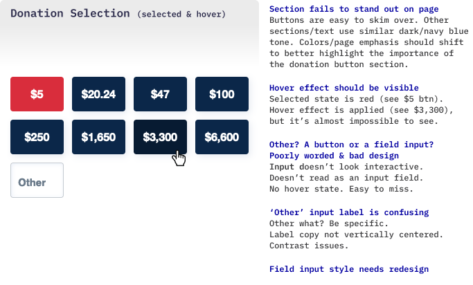
The ‘Other’ field is isolated in a corner and doesn’t even appear to be an interactive input field. Maybe this is intentional, with the aim of discouraging users from entering custom donation amounts (like $1.00). But it looks like another design mistake with poor placeholder alignment and unclear labeling. A clear and meaningful label such as ‘Custom Amount’ or ‘Other Amount’ would make more sense.

Processing Fee
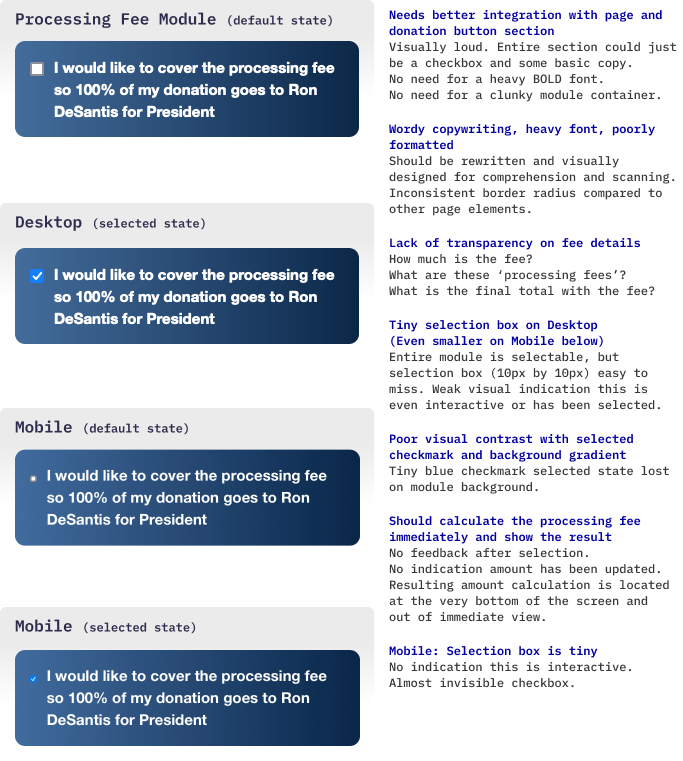
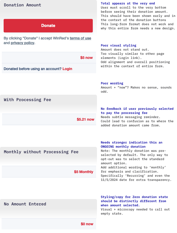
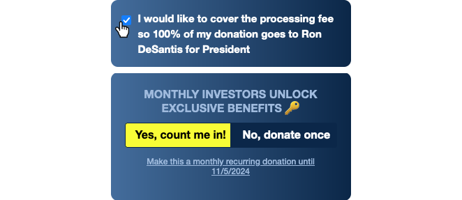
Although both are directly related, placing this fee request into a separate module creates a visual detachment from the donation amount. There’s also no explanation regarding the fee calculation process. Is it a percentage? If so, how much? Even after opting in, there’s no updated total that reveals the final amount, leaving the user in the dark. (See ‘donation visibility and real-time feedback’ section).
Monthly Donation (Dark Pattern Alert)
The monthly donation uses a 'sneak into basket' strategy, by automatically selecting the recurring donation button without obtaining user consent. If the user chooses to opt out, it's their responsibility to manually deselect the choice by clicking on the 'No, donate once' option, which lacks clear visual cues indicating interactivity.
And that's only if the user even realizes the option was pre-selected! The form established (via the previous donation amount buttons) that the color red signifies a selected state, and selection occurs after the user has chosen to click. These elements don't even resemble or function as buttons, exhibiting weak signifiers and lacking hover states. The neon yellow appears more as a decorative call-out than an activated selection, especially since users have been conditioned to believe they're in complete control.
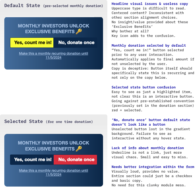
Users interested in becoming monthly donors will likely have questions about this long-term commitment. What are these “Exclusive Benefits”? What if the candidate withdraws? Are there options for donors who change their minds? What if a scandal drops?! The module doesn’t provide clear or easily accessible information. There are no tooltips or links to basic contribution details. Only a small line of underlined microcopy, which isn’t even interactive, states that the campaign will continue billing the donor until the election.

Donation Visibility and Real-Time Feedback. The monthly contribution suffers from the same issue as the processing fee with no updated feedback regarding the true donation amount. The entire form structure should be redesigned to better accommodate this. At the very least all the donation button amounts should be updated in real-time based on once/monthly selections and include the processing fee if also selected. Otherwise, the user is in the dark as to the true donation amount they're agreeing to until the very end of the form.
Note: It would be helpful to show the total cost of the monthly donation option (from the date of donation through 11/5/2024). However, it’s understandable why campaigns choose not to. Seeing the full financial commitment might cause donors to rethink the long-term cost and back out.

The Contact Form
Buried under all this cluttered content… is the actual form section. It took long enough to get to the purpose of the page.
And yet… the form doesn’t even look interactive. All the input fields are tightly packed within the same container, and faint lines offer only a weak visual separation between each data area. Input fields should signify they’re interactive but these appear flat and lifeless. The use of a heavy, misaligned font adds to the confusing and clunky appearance. It’s immediately clear this is going to be a painful experience.
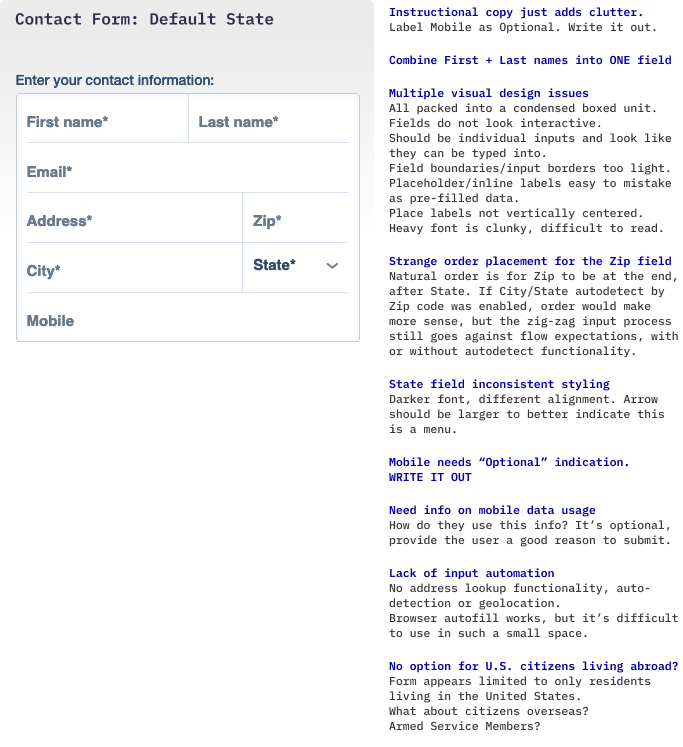
A real concern is how this donor data is (or may) be used. A direct link to the Terms page, where this information is currently buried, would be helpful. It’s also sneaky that the asterisk marking the mobile number as required has been quietly removed. The label should clearly state “OPTIONAL,” and this tiny detail is easy to miss for a donor who is already engaged in the flow.
Contact Form Interactions
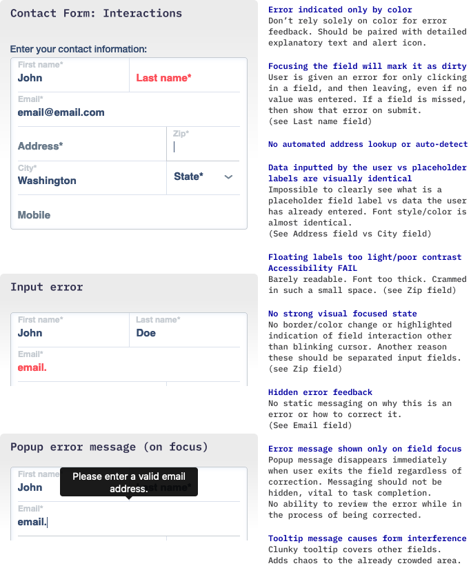
Visual Issues. The similarity in color between label placeholder vs. completed fields makes this a data entry nightmare. Even the floated label functionality does more harm than good. When activated, the floated labels are almost unreadable due to size, style and color, yet they still manage to overwhelm the condensed space. In contrast to the vertical space constraints, some of these fields have excessively long widths, resulting in a mismatch between the suggested data length and the actual input from donors.
No Input Automation. There’s no automated address lookup or zip code auto-detection functionality. Donors are stuck typing this information by hand unless their browser’s auto-fill feature is enabled (and hopefully that pre-filled data is accurate).
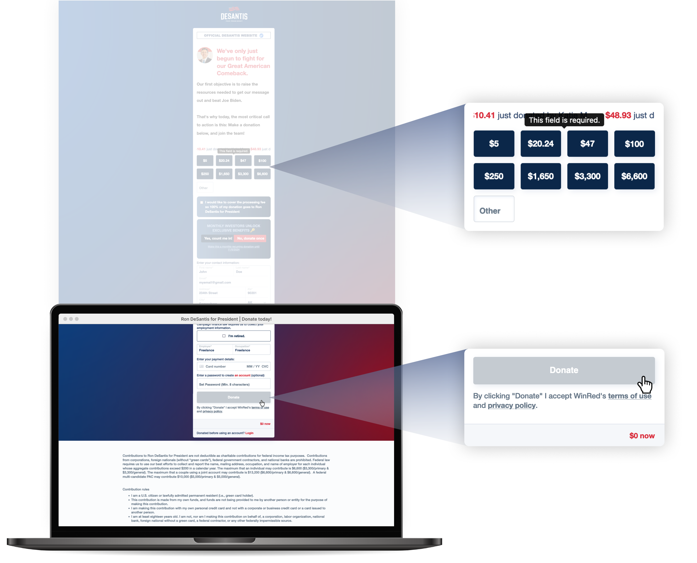
Poor Error Feedback. When an error occurs, it’s impossible to immediately understand what went wrong. Errors are indicated solely by changing the field text to red, without any accompanying alert icons or static messages. The specific error details are hidden within a tooltip that surfaces only when the user clicks back into the field. However, the tooltip disappears as soon as they start typing, regardless of whether the error has been corrected.
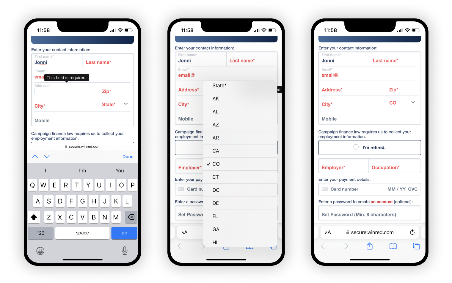
Mobile Interaction Issues. Error correction is even more difficult on mobile and tablet devices, where users navigate between crammed fields and invasive message alerts. Adding to the issue, certain fields don't revert to a non-error state even after correction. For instance, the state field remains highlighted in red, indicating an error, even after correction.
Spellcheck and autocorrect should be disabled (note the underline on the name field and suggestions in the keyboard area for the address field). Implementing these basic usability details would reduce user errors, confusion and frustration.
State Selection: Drop-down Drama
The user’s data entry rhythm is completely disrupted when they’re forced to locate their state within a native <select> element containing over 50 state and US Territories/Armed Services two-letter abbreviations. Time and budget might have been why this wasn’t implemented as a predictive input field, where users could just type and select the appropriate match. Incorporating zip code auto-detection would have been great too, letting users skip the state field completely.
There’s still no excuse for shorting the names of states to their two-letter abbreviations. This just comes across as lazy and detached from America.
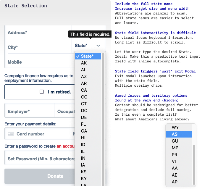
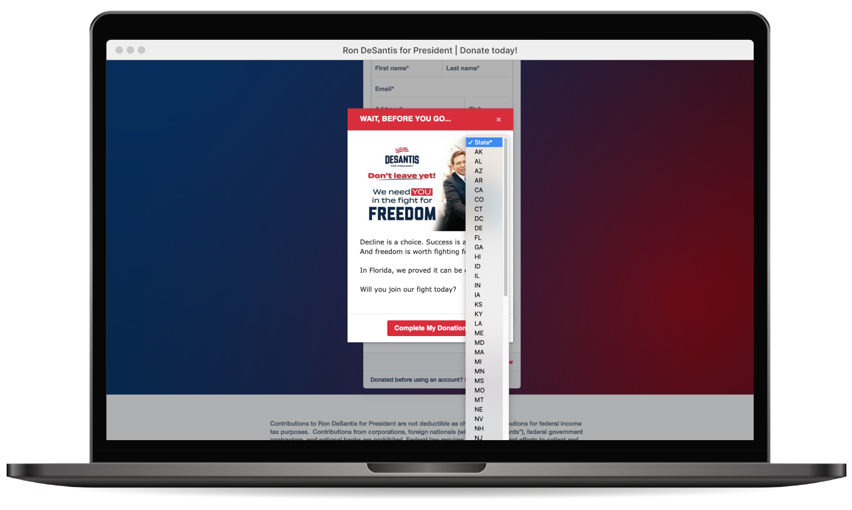
But… It Gets Worse. The donor is slapped in the face with a disruptive exit intent popup, screaming “DON'T LEAVE YET!” precisely as they attempt to select their state from the obnoxiously long state drop-down menu. This brutal interruption causes an overlay pile-up, forcing the user to close the exit warning before proceeding (again) with the state input process (additional details provided in the exit intent popup section).
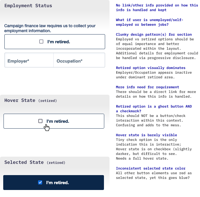
Employment Status
The vague details on why employment status information is required may raise concerns. The average person isn’t going to be versed in campaign finance law and being forced to provide something as personal as employer info could stop potential donors from proceeding.
The checkmark + button combined into one element for the ‘Retired’ option makes this even more confusing. There’s also no guidance for self-employed or unemployed donors on how to complete this section and both demographics are ignored.
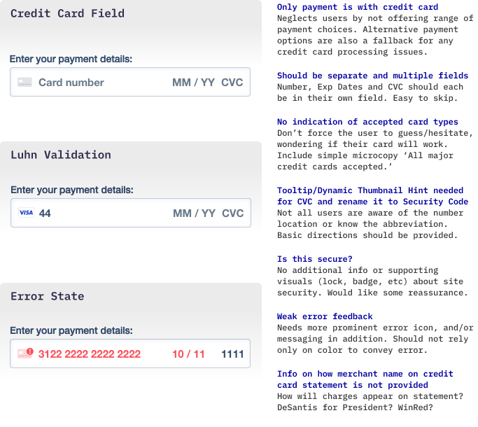
Credit Card Field: The Plastic-Only Party
The only payment option is with credit card. While this simplifies the page layout, it neglects two distinct user demographics. More tech-savvy users are accustomed to using their preferred digital payment methods, such as Venmo or PayPal, which are standard in today’s digital age. There's also an older demographic that might prefer traditional check payments sent via snail mail. In either case, this is a huge oversight that could lead to abandonment.
Having a third-party payment system in place also functions as a backup payment method for any credit card rejections or processing issues. Without a fallback option, the donation is completely lost.
Account/Password Creation
Why is this positioned here? The account creation field is wedged between the credit card section and the ‘Donate’ button. This distraction stops the user from finalizing the donation by unexpectedly asking them to create an account, although it’s not a prerequisite for making a donation.

It’s understandable that the platform would push user account creation for future donations, but this is not the time for this request. It should be on a confirmation dialog, presented immediately after the donation is processed, to avoid taking the donor off task. Presenting the single field separately from the lengthy form is also more approachable, especially after the primary task has been completed.
If donors are distracted with this nonsense, they’ll only discover a weak value proposition for creating an account. The incentives, hidden behind the ‘an account’ link, expand into a poorly designed dialog module. These ‘benefits’ favor the campaign’s interests rather than offering real value or perks for the user… so why bother?
The interactive ‘an account’ link resembles decorative text and will likely be overlooked anyway.
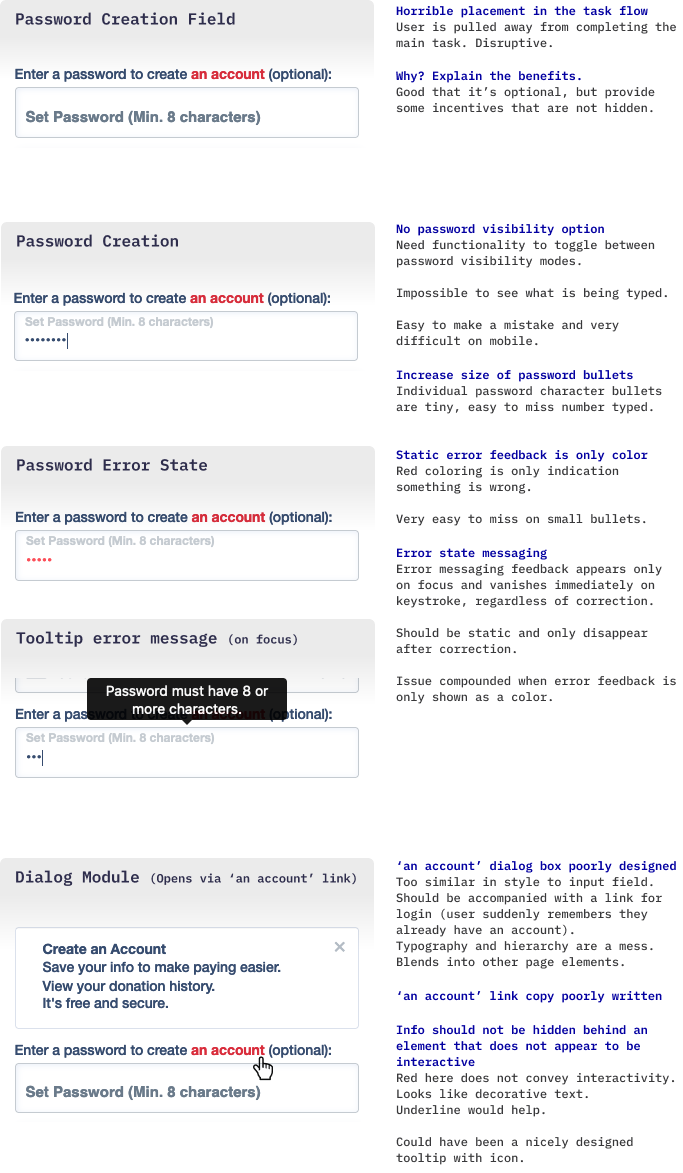
The account creation field is a reminder that a login option hasn’t even made an appearance yet. For certain users, this section might trigger a recollection of having already created an account, followed by the regret of wasted time on redundant information entry.
Disabled Donate Button? Data Collection Alert!
The gray state of the donate button has some strange interactivity issues. The color suggests it’s inactive and will become functional once the user completes the required information. Yet, there’s a very subtle hover/focus state, suggesting interactivity. Upon clicking, it does provide error feedback (red error text appears for any problematic fields), except for the credit card field.
Why not just display the button in an active state (red)? There’s no reason to assume that clicking on a disabled-appearing button would trigger error feedback, yet it does.
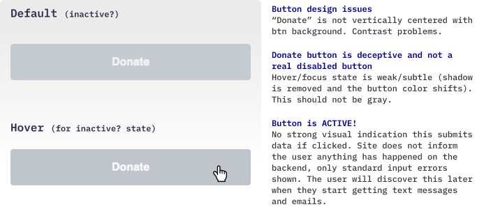
Beware: This deceptive ‘inactive’ button not only validates field data on the front-end but also submits whatever information has been entered, even if the form is incomplete. It’s ALIVE!

Email and Text Message Surprises
There was no front-end indication that any info had been submitted when I clicked on that innocent gray button. However, they did capture my email and phone number, as evident from the bombardment of messages about completing my donation.

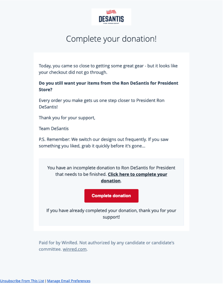
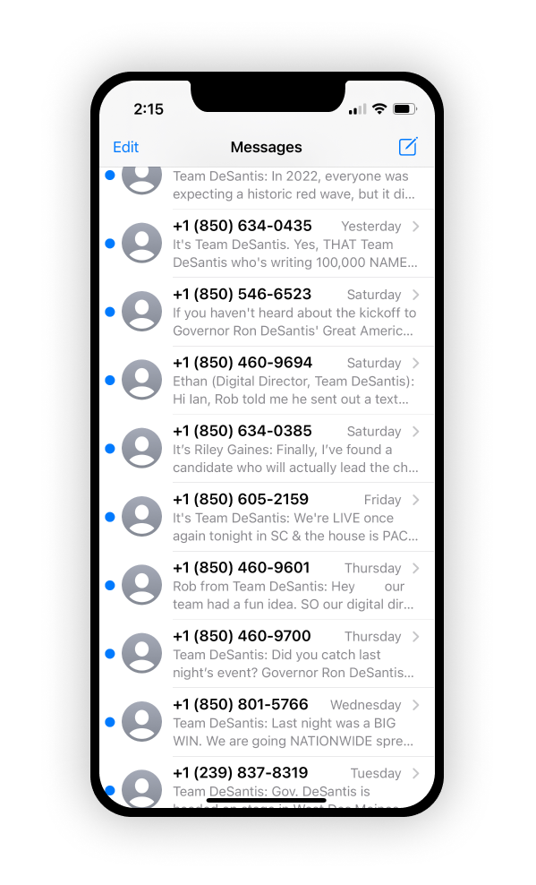
I can’t really fault them for collecting the data; I willingly hit the button, and they did include subtext about accepting the terms on click, even if I had no intention of sharing that information. This would have felt less deceptive if the ‘Donate’ button on the form appeared interactive (red) from the start, clearly indicating that clicking it came with potential consequences.

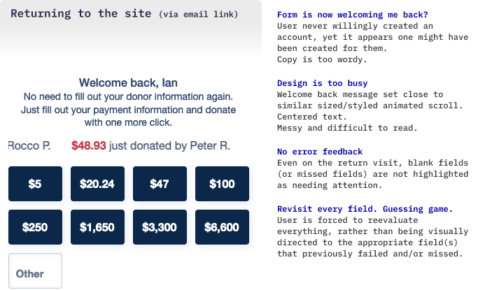
The email CTA button ‘Complete donation’ throws the recipient back to the donation page where a personalized message with pre-filled data awaits processing. While convenient for potential donors, consenting to this type of intrusion was still never clearly outlined. Without a transparent warning, personal information is scooped up, enabling campaigns to directly nag potential donors through email and phone. This dataset grab also includes any other completed input fields.
Donation Button Activation without Credit Card
The donation button activates (switching from gray to red) once the user enters all contact and employment information. This happens even if credit card details are missing or the card fails verification (via Luhn).
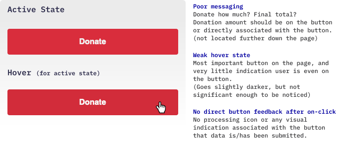
The timing on this is counterintuitive. Seeing the button shift from inactive to active, draws user attention away from the forthcoming blank credit card field and signals that everything is ready to go. The user rushes ahead, skipping over the payment info, all in an effort to smash that big red button.
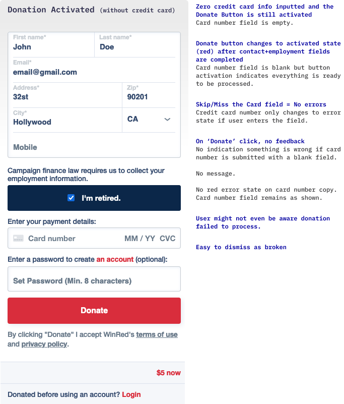
The big issue here is that upon clicking, the system provides no error alert or action indication. There is no form feedback to highlight the overlooked credit card field — no pop-up message, no change in field color or text; there’s no feedback whatsoever. The donor might just assume the payment went through.
Instead, email messaging (discussed above) is used as a safety net for letting the donor know something went wrong. This is a horrible method for providing critical error feedback when just a basic solution could fix this on the spot. On the plus side, the campaign can still capture users’ information for their database, even if the donation attempt is unsuccessful. But relying on multiple channels and potentially irritating a donor is not the best fallback approach.
Terms of Use/Privacy Policy
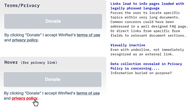
These links direct donors to lengthy pages with small font sizes, packed with legal jargon, including somewhat unsettling details about WinRed’s donor data collection practices. Ideally, they should promote transparency and provide a clear, easy-to-understand FAQ list.
The links seem intentionally concealed within the small gray text at the very bottom, where privacy-conscious users might easily overlook them.
Total Donation Amount
The final donation amount is quietly tucked away in the bottom corner, when it should be prominently displayed and closely associated with the donate button. Instead, it’s displayed in the standard 14px red Helvetica Neue Bold font, sandwiched between an identical login link and a large red donate button, making it easy to overlook.
Security? The lack of security verification or certified trust badges (or links) could negatively impact trust. Users may not be familiar with the WinRed platform, and the site’s legitimacy is already questionable due to the poor UX/UI. There’s also a high probability that users arrived at the page from a shared link rather than directly from the main DeSantis campaign site, raising further authenticity concerns.
Login
Maybe they’re planning to move this option to the top of the form once they have an active donor database. The current placement is frustrating for donors with existing accounts from past elections or campaigns, as they only discover this option at the very bottom of the page.
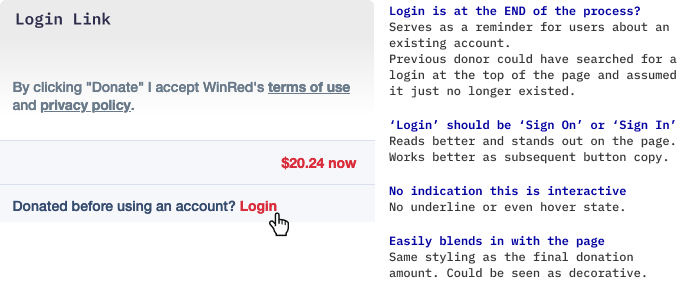
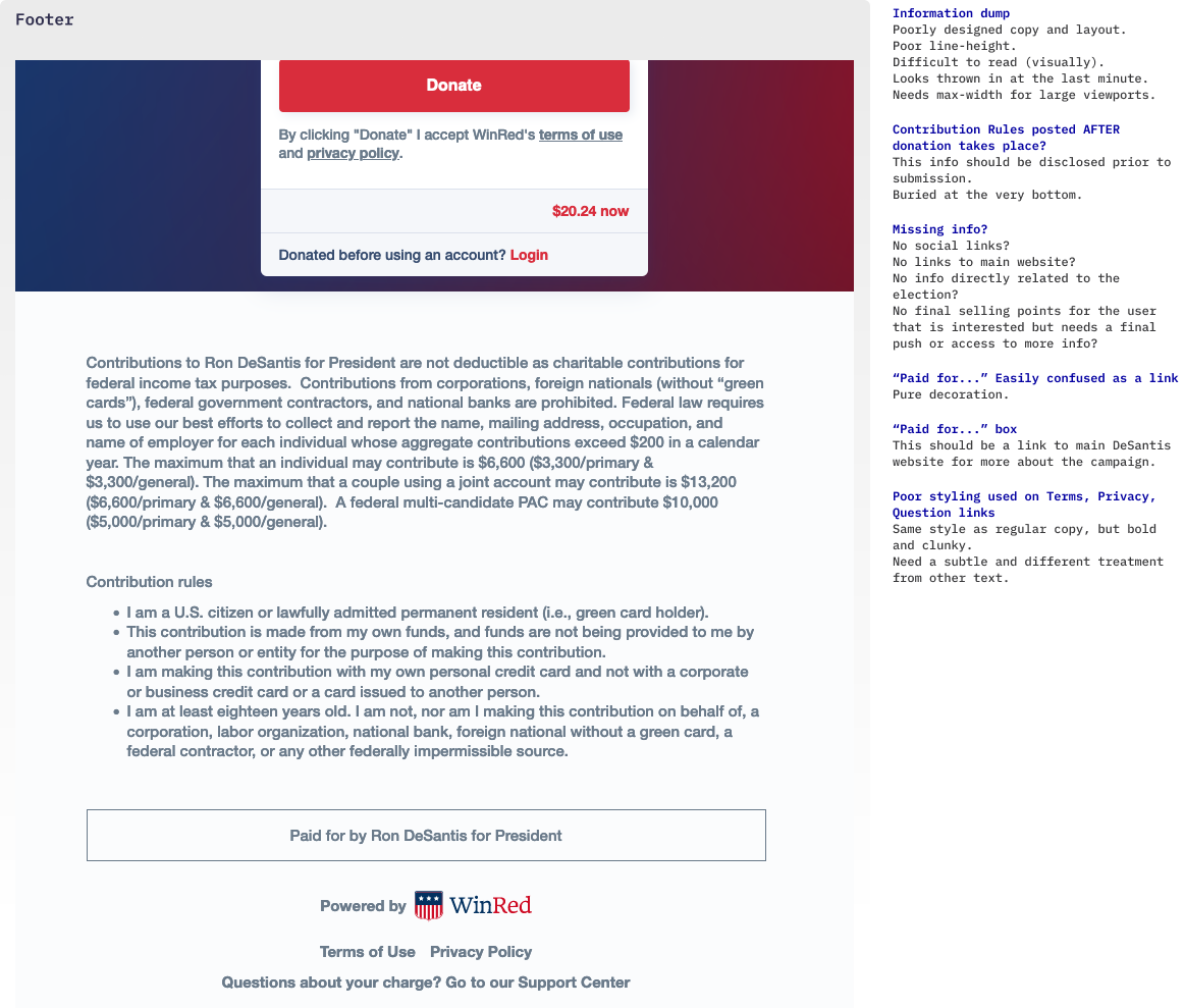
Triggered. Even accessing the login field demands excessive effort. Upon clicking the Login link, there's a violent transition and the majority of the form disappears. The Exit-intent Popup is immediately activated, hijacking the cursor into an email login field hidden beneath the overlay.
The donor must dig themselves out of this mess by relocating their cursor, closing the exit overlay, and then clicking back into an email login field positioned on the bottom half of a now truncated form page. Bugs aside, this is a lazy and confusing layout approach for incorporating a login section.
Footer
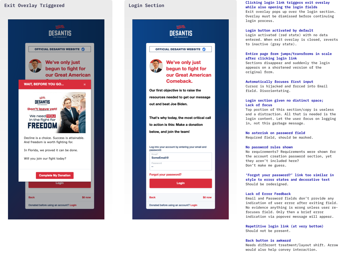
At the bottom of the page, they've just chucked random (but necessary) donation details into some kind of information dumpster. Donors are unlikely to scroll past the end of the form, especially on mobile devices, where the contribution rules are tucked away. At this stage, the donor may have already hit the donation button and finalized the processes.
Within the form section, there’s no indication that these legal guidelines even exist. Is this ethical? Shouldn’t these rules be fully disclosed and agreed to, with a mandatory acknowledgment checkbox, before hitting ‘Donate’?
The easily accessible links under the Donate button relate to WinRed’s terms and privacy but lack any connection to donor compliance laws. Adding an extra link for the rules would automatically attach user acceptance with the button action, raising awareness of fundraising regulations relevant to donors. While there’s no guarantee that donors will read the rules, it would still be helpful to make them easy to find instead of burying them in the footer.
At the very least, a basic FAQ page link to address donation-related concerns should have been introduced prior to the donate button or placed somewhere within the form. There is a support page, but it needs a major redesign, including copy and usability, to focus on general user questions and answers.
Dead End Page. This space is ideal for connecting to the candidate’s main website, social media, and additional content for a those undecided visitors. It doesn’t need to be extensive; just a basic link to the main site could suffice. While external links might distract from finalizing a contribution, those exploring the footer are likely looking for something other than a donate button. Instead, it’s a stack of poorly designed contribution guidelines and WinRed service information.
Exit-intent Popup
This popup is extremely trigger sensitive and screams at the user for slight mouse movements. As previously mentioned, this overlay already disrupts the State Selection and Login interactions. Even when timed correctly, the current iteration has no real value for those visitors that haven’t interacted with the form. The site is asking me to take an action I clearly don’t want to take, which is exactly why I’m navigating away from the page.
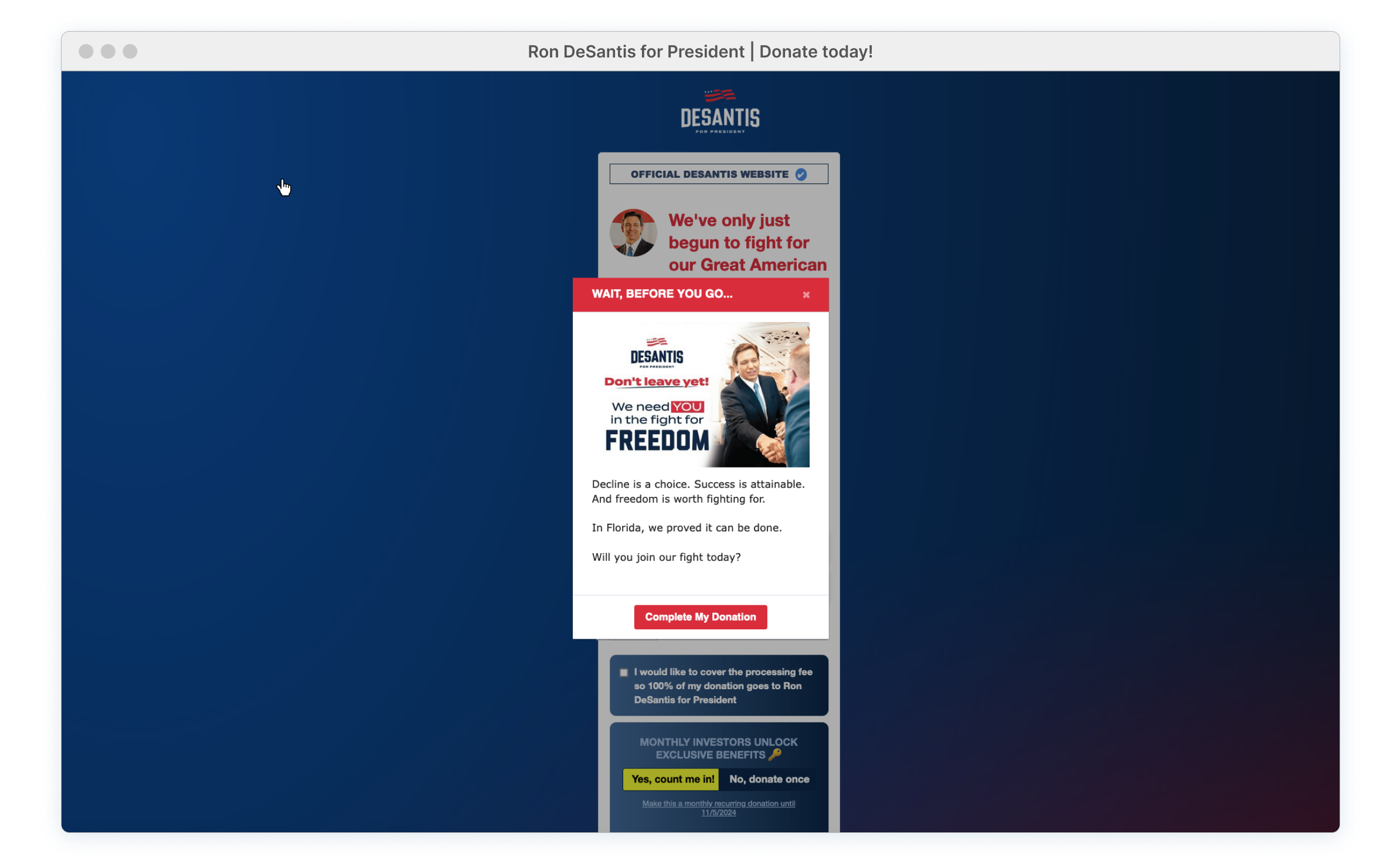
A Warning. There’s one solid use case for the exit-intent feature. The error form feedback can be very unclear (as previously discussed) and users might assume they’ve completed the donation process when they haven’t. The popup serves as a fallback by warning donors that their contribution was not processed. This helps prevent a fatal error, but only if the user is able to go back and identify the specific mistake made in the form.
But this provides ZERO value to a visitor who wandered onto this lackluster page, possibly seeking information about a candidate, with no intention of contributing, and now just wants to leave.
These users have already indicated they’re not donating by not interacting with the form. Yet a ‘Complete My Donation’ button is still shoved in their faces. These are potential supporters and should be engaged in a way that doesn’t involve their wallet, at least for now.
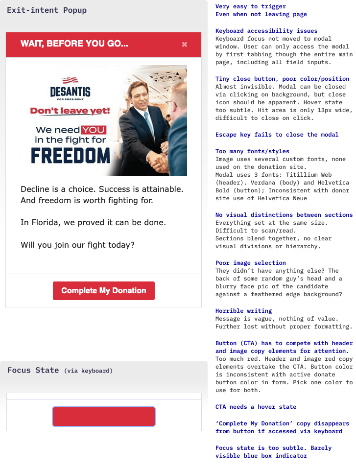
Enhance User Engagement. There are options beyond just seeking donations that, long-term, would be a more productive use for this popup. Avoid making the exit engagement all about the money, especially when the visitor hasn’t even interacted with the form. Showcase upcoming events (streaming, etc). Direct them to alternative links related to the campaign (main site, social feeds, merchandise store, etc). Even adding a feedback field for expressing political concerns or rants would be more beneficial for a campaign than having users abruptly close their browser window.
Re-engage the potential donor, make a solid argument for their support, and find an appropriate moment to request their backing. Maybe next time they’ll bite.
Long Content: Out of Sight, Out of Mind
The bulk of interactive content is tucked away further down the page, and even when it finally appears, the layout is not user-friendly. This type of long structured content makes it impossible to grasp a comprehensive overview of what’s happening on the page at any given time, especially on mobile devices.
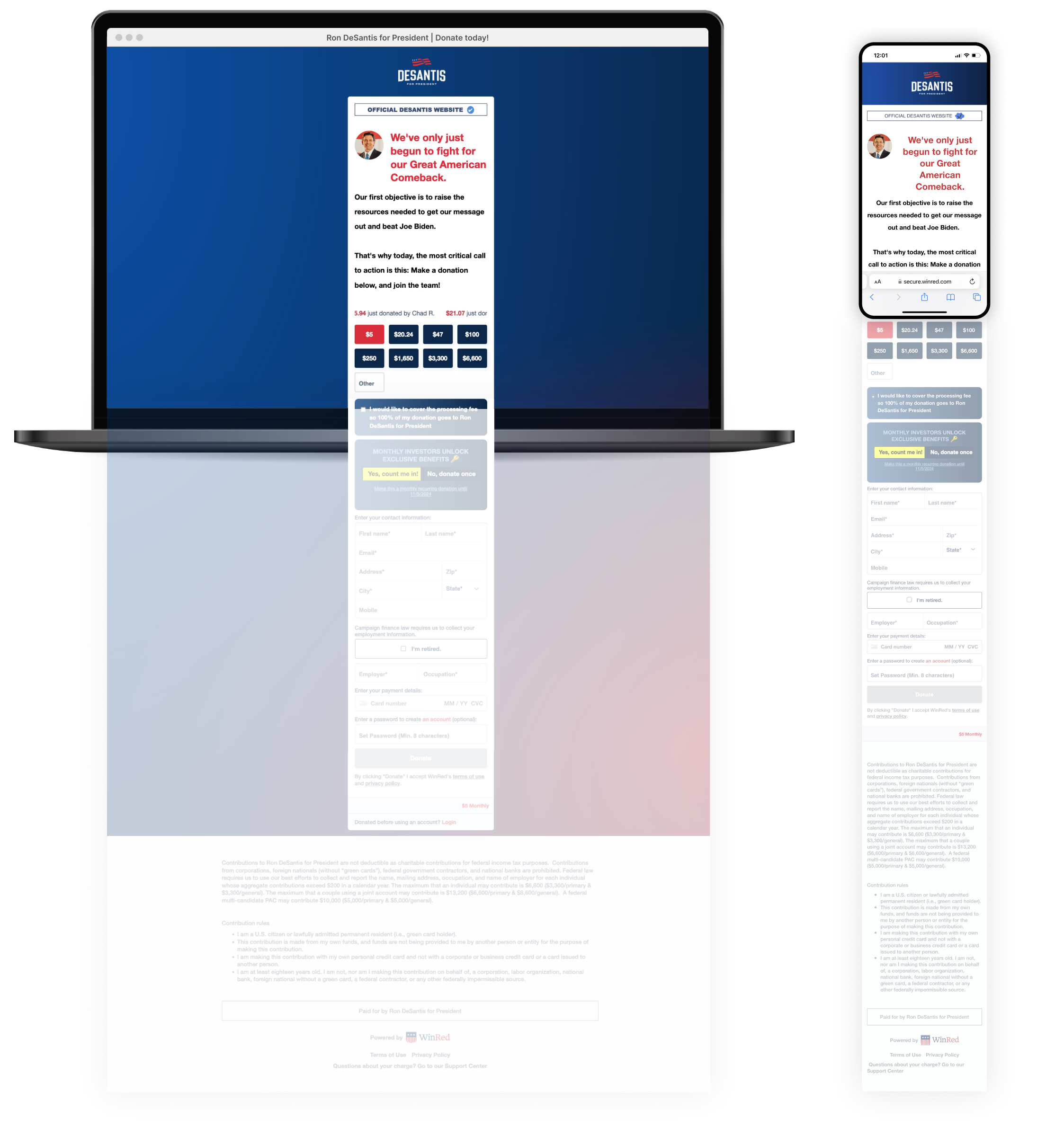
Final Total Surprise. The content length hides how top-level interactions impact other areas of the form. Relevant and timely information is updated further down the page, out of view, potentially causing confusion later on.


Hidden from View Error Feedback. If the donor somehow missed a selection in the top portion of the form, the resulting error notification (after clicking donate) will be completely out of view. There's no alert indication near the button for errors or an error summary provided. The error messages that do appear are displayed in white text on a black background, making them extremely easy to miss when scrolling back up.
Donors are forced into long swipes on mobile and forced into back-and-forth scrolling, should something go wrong. This long bombardment of material, magnified by poor design and multiple interactive issues, is burdensome. Breaking it into multiple screen steps would reduce confusion and tiresome scrolling.

Post-Donation Experience
[Start of Supplemental Section. Added October 30, 2023]The original evaluation skipped the post-donation experience, leaving an important section of the site unexplored and incomplete. To provide a comprehensive assessment, I revisited the page and sacrificed a dollar (the minimum amount) to unlock the full experience.
Note that the DeSantis donation site has slightly changed since the original May review but many of the UX/design issues identified earlier still remain.
$1.00 Donation
Several months have passed since the DeSantis campaign launch, and many GOP candidates are now in do-or-die mode, evident in their last-minute push for funding support. Several have even suspended their runs. The DeSantis campaign continues, but they’re clearly facing challenges, as seen in the low poll numbers. Right now, achieving a great post-donation experience is crucial for maintaining ongoing support.

WinRed Tip/Confirmation
They’ve had plenty of time to fine-tune this part of the donation process and yet it’s a complete disappointment. After clicking that chunky donate button, the entire screen fades into a translucent white state. Before I could even capture a screenshot, the form disappeared and was quickly replaced by a modal requesting ‘Tip’ money via WinRed.
What happened? Did it even process? There’s no personalized message, no detailed donation summary and nothing related to the DeSantis campaign. At the very least, it should mention that an email confirmation/receipt was sent to the user.
Worst of all, there’s no ‘Thank You’ anywhere.
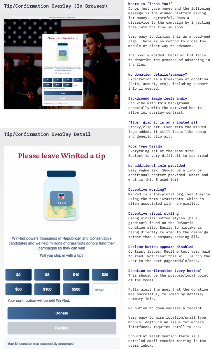
A slap in the face. The post-donation screen is the first chance the campaign has to say “Thanks!” Instead, there's zero acknowledgment of the donation beyond a brief mention of successful processing. At the very least, a receipt is owed to the donor.
This singular module reduces the experience to a financial transaction. The donor/campaign bond, based on a shared vision and hope for the future, is tarnished by the instantaneous ask for more money.
Slamming a door of ingratitude into the face of a donor is a terrible strategy, especially when a long-term connection is vital in bringing the donor (a soon-to-be voter) to the ballot box.
The WinRed ‘Tip’ Jar
My guess is that this ‘Tip’ modal is completely out of the campaigns control and is automatically baked into the post donation flow as a means of WinRed self-preservation. Here, the platform can make a money grab by piggy-backing off the campaign. A donor might fail to separate the candidate from the for-profit WinRed platform, and assume that this request is campaign-controlled. This is risky and could backfire and damage the overall perception of the campaign.
Regardless of the recipient, it’s rude and disrespectful to request a second donation without having said thank you for the first.

Besides the poorly timed ‘tip’ request, the use of low-quality clip art combined with mediocre copywriting sounds unprofessional and appears entirely tone-deaf. People are tired of these intrusive ‘tip’ requests,(tipflation), and this platform fails to provide any solid justification or value proposition for deserving them.

Where’s the direct evidence for this ‘grassroots’ support they claim to provide for the GOP? Want a tip? Provide some validation. Earn it!
Multiple Upsells
The Tip Overly is easily perceived as the end of the experience. With only donate or decline options available, donors might just close the browser window, especially after an such a rapid request for more money.

However, choosing ‘Decline’ launches donors into a hellscape of additional fundraising pleas mixed with merchandise sales. Is promoting a pint glass more important than expressing gratitude with a simple ‘Thanks’? It certainly appears so.
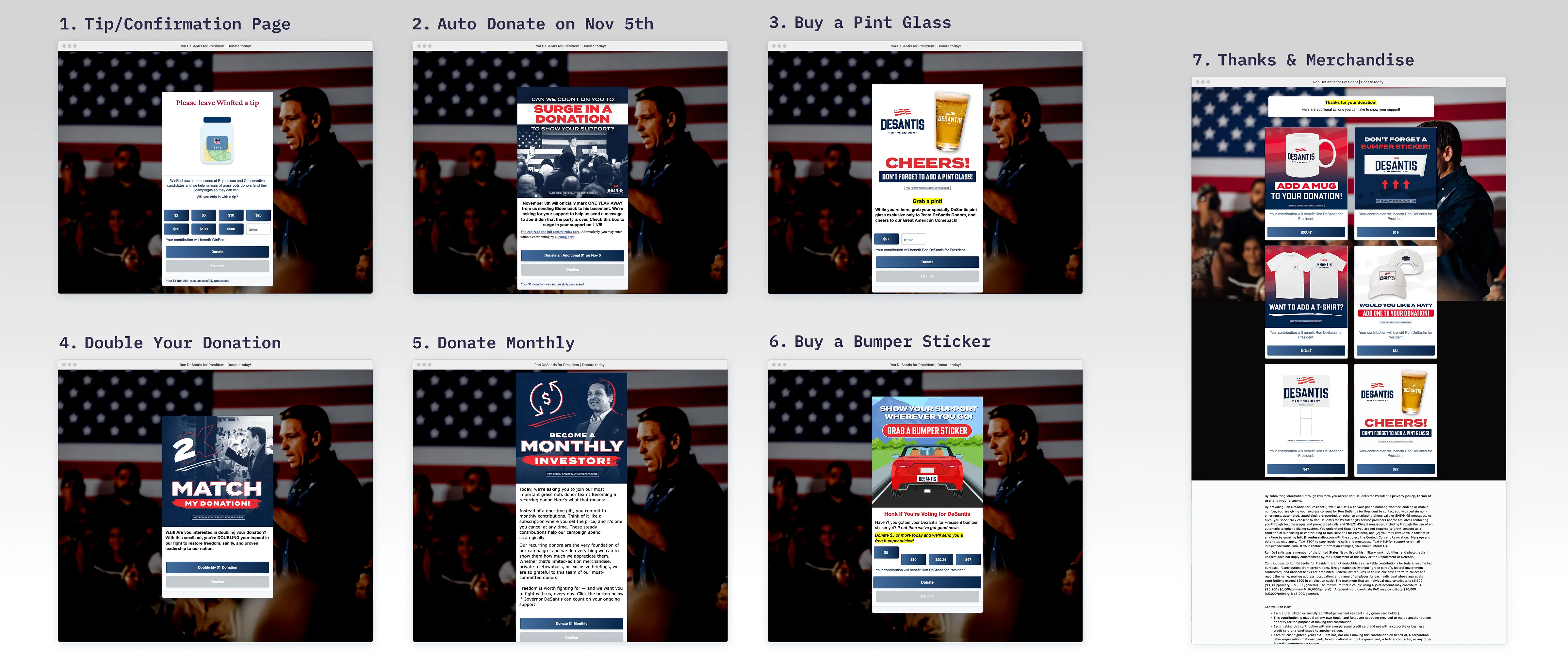
Donors are reduced to piggy banks when campaigns assault them with nonstop fundraising requests, especially so soon (seconds in this case) after making a contribution. None of this conveys a strong, confident campaign. This approach appears desperate, leaving supporters wondering if they’ve just wasted their money on a a soon-to-be failure.

Thank You Message/Merchandise Page
On the seventh screen, a very small ‘Thank You’ message finally appears, squeezed at the top and overshadowed by the overwhelming amount of merchandise options running down the length of the page.
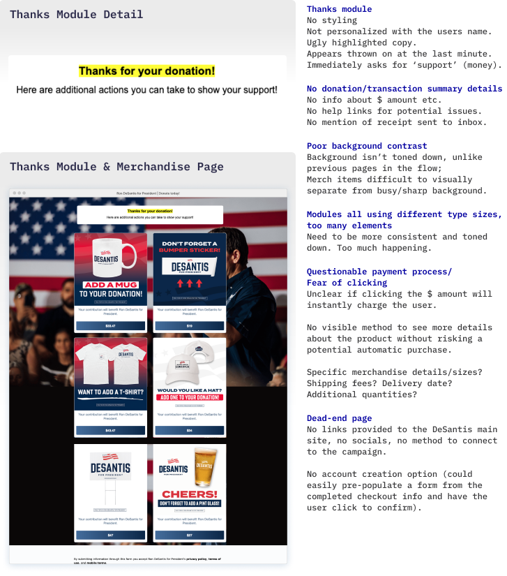
Only 4% of the page is dedicated to thanking the donor, and it’s just a generic and impersonal message carelessly slapped together. Compare this bare-bones thank you note with the design attention given to the merchandise modules. Would it have killed them to align the message with the campaign’s style and tone? Or included the donor’s name for a personal touch?
Dead-End Page. This page provides no final uplifting message or any opportunity for further engagement. It could leave some donors with a feeling of remorse and an underlying sense of being taken advantage of. They’re left with overpriced merchandise options or closing the browser window and calling it quits.
This is the perfect opportunity to empower the donor to take action and feel valuable beyond their empty wallet. Reinforce the campaign message by encouraging further engagement and enabling donors to share their contribution action or support on social media. Even offering a merchandise incentive for referring friends or family to contribute would be beneficial for both the donor and the campaign.
Match the donor’s address with an upcoming campaign event that might be in their area. Pre-populate an SMS/newsletter/alert sign-up option (if not already subscribed) and just have the user click to confirm. The donor’s data is right there, including their support. Use it!
The Power of the Main Site
Just throwing the donor immediately onto the main campaign site with a customized ‘Thank You’ overlay would’ve avoided such a gloomy ending.
The main site showcases a campaign full of life with a feed of recent updates, easing potential buyer’s remorse and leaving donors with a positive outlook. The site offers multiple connection opportunities, such as volunteering, newsletters, socials, and events, fostering long-term relationships. The homepage donor scroll is a valuable nugget of social proof. It not only validates the decision to donate (look, others did too!) but also presents another opportunity for campaign exposure as donors linger on the site, eagerly watching for their name to roll by.
Note: I did look for my name and it never appeared… but they might exclude the $1.00 tightwads.
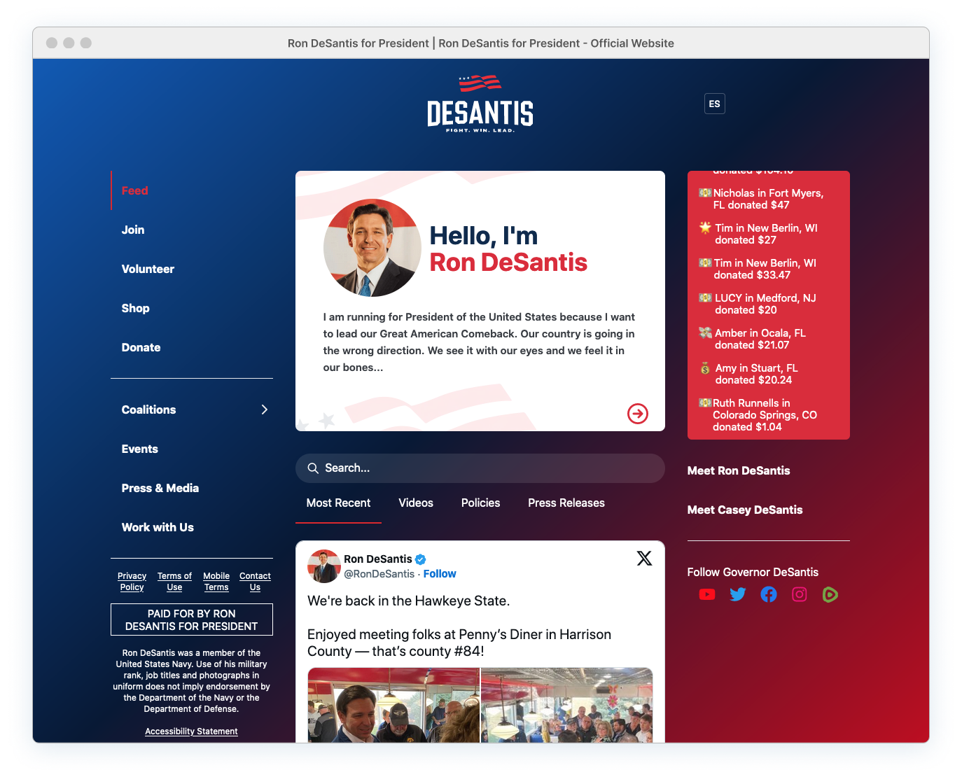
The donor should feel confident with contributing and not left wondering if they’ve wasted their money on a failing candidate. A sincere ‘Thanks’ and showcasing the lively main site would have dispelled any perception of fundraising desperation or a campaign on its last legs.
Instead, the user is asked to buy a very expensive mug.

Confirmation Email/Receipt
Sending the user a personalized thank-you, including a donation receipt, via email is essential after the donation. Similar content found in the email should have taken priority over the WinRed ‘Tip’ page and been directly displayed on the donation site.

Users aren’t running to their inbox right after hitting donate. There was also no indication within the donation flow this was even sent. (I didn’t even see this email until two hours later… and by accident). An email cannot replace an immediate display of gratitude. Nor should it be the sole source for a donation summary and troubleshooting links for any payment issues.
The email content is a disappointing. It’s generic and a mash-up of thank-you, confirmation, and payment details. I suspect this is an auto-generated email via WinRed, restricting the campaign’s control to only a logo and brief message (both of which need improvement). It’s just bland and dull without any solid campaign branding or any real personal touch.
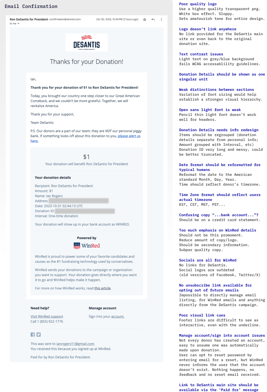
This is more subtle than the in-your-face Tip page, but WinRed once again over-inserts themselves between the donor and the campaign. They do allow the campaign a small space at the top for expressing gratitude, but this is somewhat overshadowed below by WinRed’s logo and messaging promoting the donation platform. It makes sense to keep billing issues (managed entirely by WinRed) separate from the campaign. However, every link, including social media, pushes users to WinRed-associated content, much of which has nothing to do with billing. This email is another immediate dead-end for a donor looking to connect further with their chosen candidate.
I take that back, sort of… Email correspondence isn’t a complete dead-end. A day after making a contribution, donors are bombarded by campaign emails covering headlines, events, merchandise, and additional funding requests. Importantly, these communications are directly linked to the actual candidate, and not hijacked with more WinRed material.
Although there’s a strong effort made for further engagement, relying on annoying email newsletters instead of engaging the supporter immediately after the donation still isn’t ideal. Regaining that initial donation momentum and interest through poorly-timed emails (many of which look like spam) might be impossible. Best to grab their attention while you have it, rather than waiting for a follow-up to bring supporters back in.
Even the branding and tone within the email are centered around the WinRed platform. This only draws attention to the inconsistent visual and content experience across different sites, modules, and messaging at various touchpoints in the donation journey. The visual contrast between this final email and the original image link that led us here represents two completely different worlds.

This is a depressing donation journey. From beginning to end, the flow was subpar, and the lasting impression, which donors will remember the most, is bitter and flat. Multiple money-begging prompts, followed by a generic email, is not an uplifting exit strategy and could have consequences on future financial and ballot box support.

The entire experience should be forgotten, but I’m holding tight to that email receipt after seeing so many negative online reviews about overcharges and unauthorized monthly subscriptions. So, for now, I’m stuck monitoring my credit card and unable to fully purge the evidence from my inbox.
[End of Supplemental Section]
Fundraising Campaign Launch Results for May 24th, 2023
Despite all the issues, The DeSantis campaign raised $8.2 million in the first 24 hours after launching the presidential bid. However, it’s unclear as to how much of that funding arrived through this particular donation site. Multiple fundraisers, phone calls, and in-person events coincided with the launch, so it’s doubtful many of these donors were using an online platform to submit their contributions.
Bryan Griffin, a spokesman for the campaign, claimed that million was raised online within an hour of the announcement.
There is no public data (as far as I’ve seen) that specifies if this funding originated from this single WinRed page. Additional online donation sites, including WinRed pages targeting specific DeSantis voter demographics, could have also been operational during the announcement.
Even if the entire online million was collected through this specific WinRed page, one can’t help but wonder how much additional money could have been raised with a better user experience in place.
Taking a glass-half-empty perspective: How much revenue was lost? Going even emptier… how might this poor experience impact long-term supporter retention?

A Shared Disaster
The platform overseeing the underlying page functionality and billing process is WinRed. Many issues related to performance, interaction, flow, and layout limitations, each impacting the fundamental user experience, are baked into the platform and beyond campaign control.
The DeSantis campaign can't be entirely blamed for this mess, given how so many of the problems are already embedded in the platform. However, this doesn't excuse them from their own content decisions. Their choice of subpar images, copy, modals, and overall lousy brand implementation only magnifies the underlying WinRed issues, creating a joint failure.

Aesthetic-Usability Effect. While content isn’t a cure-all, campaigns can improve the WinRed experience by incorporating high-quality images, appropriate visual styling, strategic messaging and carefully selecting platform widgets (avoiding the problematic ones). Just being content-smart can help mask platform failures, even if it’s just a nice coat of UI paint and some well-crafted copy. It’s only a band-aid, but people tend to be more forgiving of usability issues when a design is visually appealing.
As of now, nine other presidential campaigns are on WinRed and facing the same delicate balancing act between content management and unavoidable platform problems. While the DeSantis campaign flubbed it, are any GOP candidates handling their donation pages effectively?
Or are they all doomed?
To Be Continued…
Part II: GOP Candidates & WinRed Contribution Page Chaos
UX Circus Articles:
Part I: The DeSantis and WinRed Donation Page Disaster
Focuses on the Ron DeSantis presidential launch, featuring an in-depth design critique of the donation page and donation process.
Part II: GOP Candidates & WinRed Contribution Page Chaos
Provides a general overview of how the other GOP campaigns are handling their content on the problematic WinRed platform. What they're doing right, wrong and how they're standing out.
Part III: ActBlue & Alternative Funding Page Failures
Examines ActBlue, the Democrat Party fundraising platform operated by the DNC (Democratic National Committee). Also included is a look at two alternative platforms used by outsider candidates that decided to ditch ActBlue and WinRed and do their own thing.

