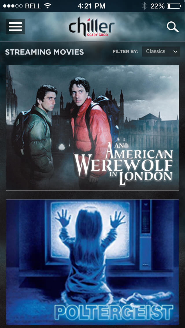
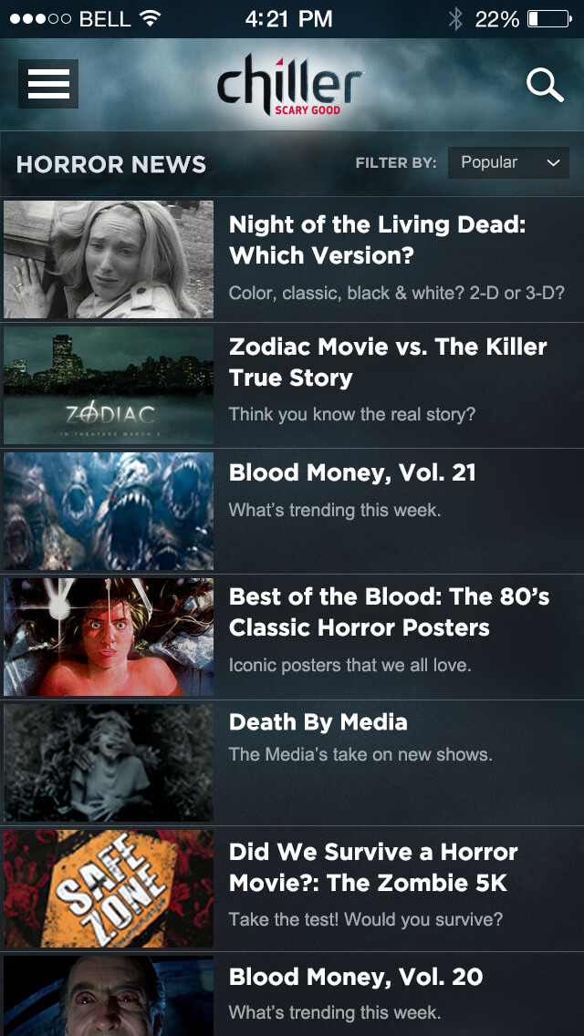
Before Redesign:
Original Homepage
Reference only, shown for context

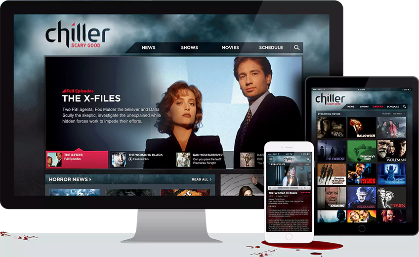
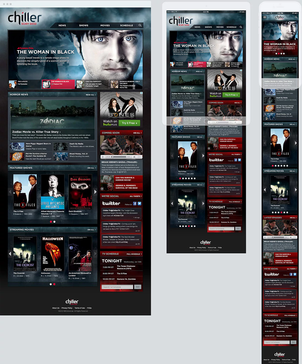
The Chiller POC was a proof of concept demonstrating how a responsive, modular web framework could be applied across NBCUniversal’s cable networks.
Pilot Site
ChillerTV.com was an ideal redesign choice: a desktop-only site with poorly represented content, no video streaming, and a visual tone misaligned with the network’s gritty horror/sci-fi identity (which could be easily fixed with a redesign). Its small, multi-page structure made it perfect for building a reusable component library with room left for future expansion.
Solutions & Impact
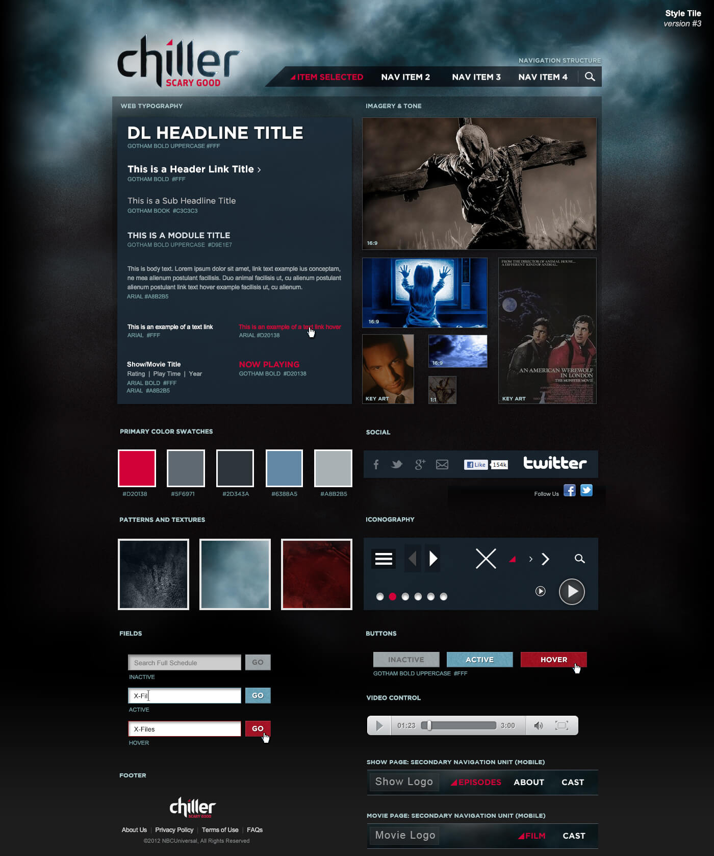
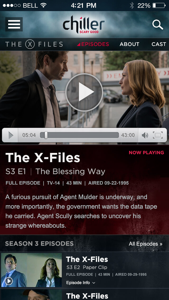
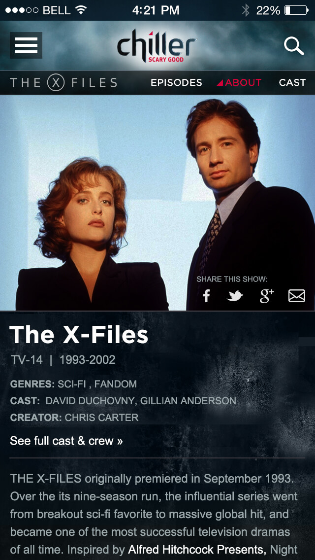
A modular, atomic system of reusable components was designed to fold, stack, and recombine seamlessly across devices, enabling efficient content delivery, lower costs, and easier updates. This approach demonstrated the value of a scalable model, with the project providing a realistic visual reference that would inform future content-first strategies for NBCU networks.
The Chiller TV Network ended operations on December 31, 2017.
Reference only, shown for context
