


UX/UI Review: The 2024 Presidential Donation Pages
The UX Circus Part II: GOP Candidates & WinRed Contribution Page Chaos
This is the second article in a three-part series exploring the user experience (UX/UI) of the 2024 Presidential Candidates' donation pages.
Based on research originally conducted for a proposed fundraising/civic-tech product, it examines usability, visual design, content, and overall trust across popular platforms. Although the product didn’t move forward, the 2024 political donation site analysis was completed. Those findings inspired this series.
The UX Circus:
- Part I: The DeSantis & WinRed Donation Page Disaster
- Part II: GOP Candidates & WinRed Contribution Page Chaos
- Part III: ActBlue & Alternative Funding Page Failures
Disclaimer: The following is based on my experience as a front-end user. The views expressed are speculative and made without direct access to any platform or campaign data. The attached screenshots may no longer reflect the current state of the reviewed site pages. Updates to content, design, and functionality may have occurred since the time of this review.
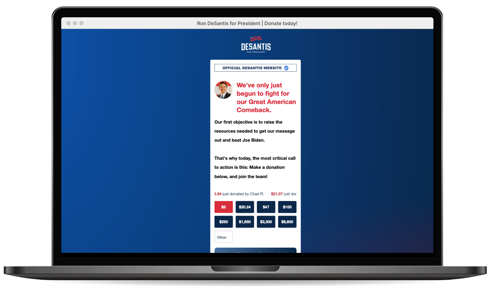
The DeSantis & WinRed Donation Page Disaster
On May 24th, Ron DeSantis officially launched his presidential campaign via Twitter (pre-X), which didn’t go exactly as planned. The live audio broadcast crashed and kicked off some users, including DeSantis himself. He managed to finally rejoin 25 minutes later but long after his campaign had already made the official announcement in his absence. The New York Times described the livestream as "The conference call from hell".
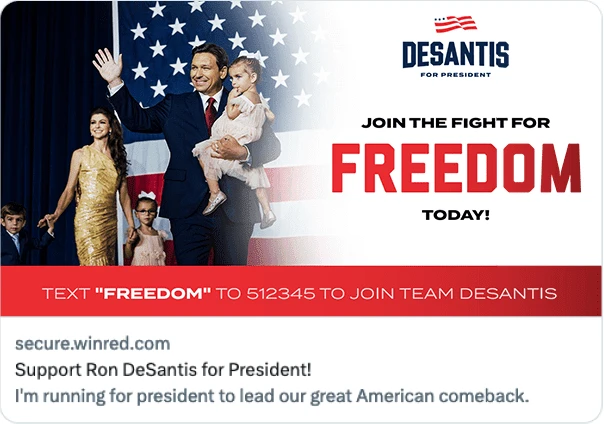
Who’s behind this mess? It’s easy to point fingers at the DeSantis campaign (assuming they’re the ones running this page). They’ve made some awful style, image and copy choices. But it’s not all on them. The page is built on a third-party platform that falls short in delivering even a baseline user experience, lacking user-friendly interactions and core functionality. This underlying experience is baked into the platform and beyond the campaign’s control.
Note: The campaign did manage to raise $1 million online within an hour of the announcement. However, it’s unclear how much of that came specifically from this singular page, as opposed to other online sources. Regardless, this page is still a disaster, and it’s difficult to avoid speculating on the potential losses (including long-term engagement) sustained due to the poor user experience.
WinRed
The URL was the first giveaway that this page was created using an outside platform and hosted independently of the main DeSantis 2024 Presidential campaign site.

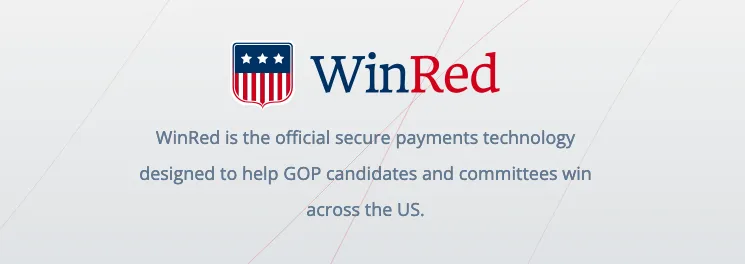
WinRed is the official GOP online platform for collecting donations, processing contributions, and managing donor data for Republican candidates and committees. The WinRed platform is used by candidates seeking office at every level, ranging from the presidency of the United States to local community races.
WinRed also powers the candidate merchandise pages, (transactions, inventory management, shipping), that typically showcase the standard campaign bumper stickers, yard signs, hoodies, mugs, etc.
There’s a lot of drama surrounding this for-profit platform that’s only been around since 2019. Questions and concerns have come up about high service fees, extensive billing errors, and monopoly concerns. There was even an unsuccessful push by the RNC to require all GOP campaigns use WinRed rather than other fundraising services.

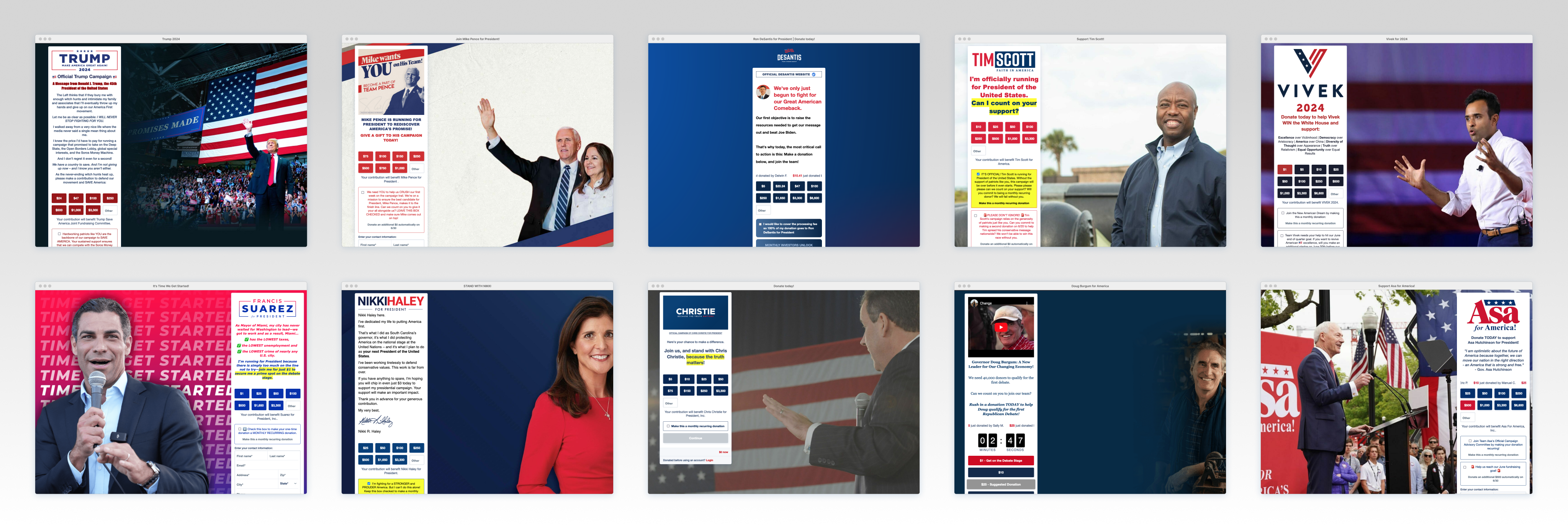
Different Campaigns, Same Disaster: Drama aside, WinRed remains the favored fundraising platform for the majority of the 2024 Republican presidential contenders, with Larry Elder being the only exception. The candidates redirect their main website donation links to an external WinRed donation page, featuring the standard form fields and additional sections to streamline the donation process.
As discussed in Part I, there are some serious core platform issues including: Performance, interactions, error states/feedback, automation, accessibility, dark patterns, layout, default messaging, donation flow… just to name a few. These underlying issues are baked right into WinRed and unavoidable for any campaign using the platform.
Aesthetic-Usability Effect: Still, even with WinRed’s unavoidable front-end usability problems, the candidates do manage some control over their content choices. Multiple content/widget options can be lightly customized for animation, copy, colors, images and other minor aesthetic choices.
Users are more forgiving of platform issues when a site features top-notch media assets. Crafting a page with shiny images and catchy copy, while avoiding an overload of widgets (like countdown clocks, donor scrolls, wordy upsells, etc.), can reduce cognitive load and enhance the overall experience. Less is more. Thoughtful and high-quality aesthetic choices can be a powerful force when working within a problematic platform.
The DeSantis campaign failed taking this approach, resulting in a clunky mess. When examining the wider GOP field, are other campaigns making smarter decisions in designing their donation pages? Or are they just creating their own version of a DeSantis disaster?
Note: Some candidates have multiple WinRed donation pages, each managed by different entities for specific targeting or other fundraising objectives. This design critique addresses only the WinRed donation page accessed directly from each candidate’s main website.
GOP WinRed Campaigns
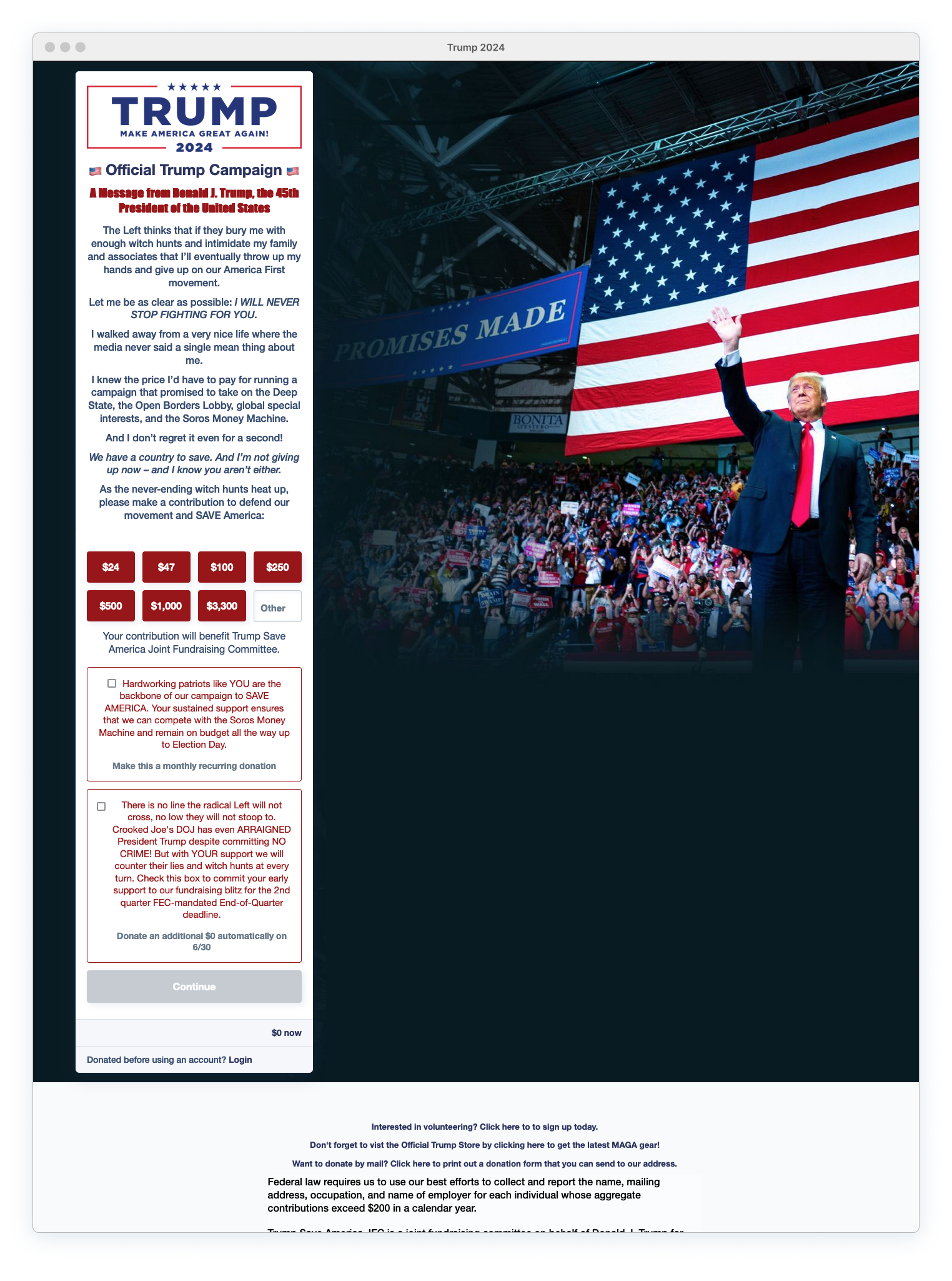
Donald Trump: The Wall of Text
Trump’s donation page reveals that the WinRed form can be split into two sections: Donation Amount and Contact Details. This content separation has the potential to ease cognitive load for donors and enhance the fluidity of page interaction, especially on mobile devices.
Any promising usability benefits from this separation approach are completely destroyed by the mile-long message of poorly stylized text and rambling copy. Trying to read this center-aligned mix of underlined, CAPS, bold, and italic text is both overwhelming and impossible.
Donation Page Pros:
Consistent branding. The donation site utilizes the logo and identical color palate from the main site and found on other Trump promotional materials. Additional links provided in the footer for volunteering, merchandise and donating via mail. Good contrast between form and background image. Two-step form approach — every campaign should be doing this.
Donation Page Cons:
Logo should link to main site.
There are some strange font choices being used here, especially for the headline. The main site uses free fonts including Montserrat for headline copy. It’s odd they’re not using it here, unless the WinRed platform severely restricts font options and provides only a very limited set.
The long messaging is completely on-brand for Trump, but harms overall usability. It’s just too much copy. No one is reading all of this. Cut down on the rambling and get to the point. Or condense this into simple, scannable bullet points.
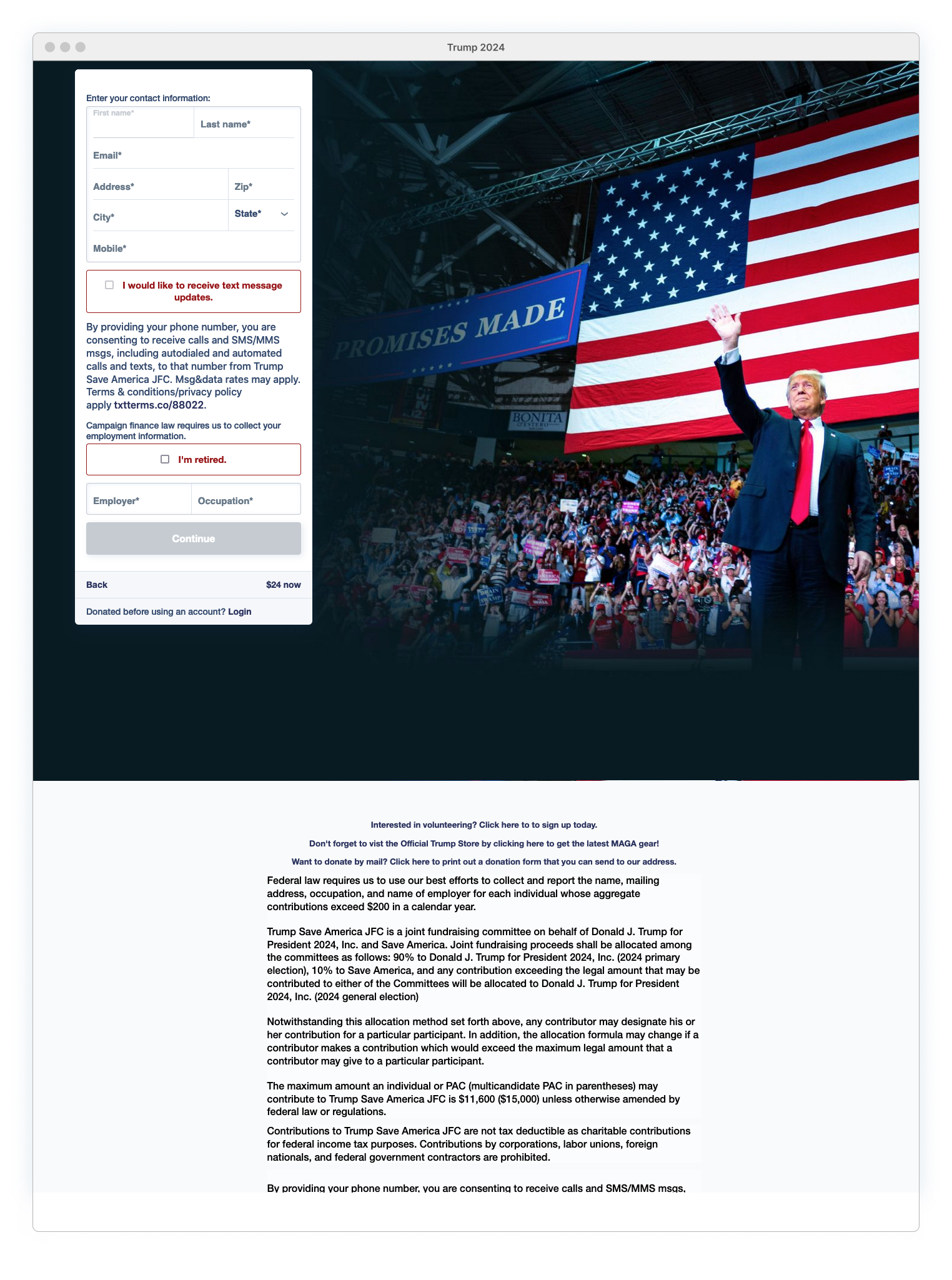
The cursor is hijacked and thrown into the ‘First Name’ field after completing the first form section, causing disorientation. (Platform issue)
Confusing messaging about SMS/Mobile. SMS is listed as optional, but Mobile field is required and they lump everything together “By providing your phone number, you are consenting to receive calls and SMS/MMS msgs…” Seems devious.
Mike Pence (and Mrs. Pence)
While Trump positions himself against a backdrop of enthusiastic supporters, Pence takes a different approach by eliminating the environment completely from the picture. His donation page is just a silhouette of him and his wife, waving into the unknown, against an empty void.
Main Site vs Donation Page
The main site’s limited use of the Antonia typeface, primarily in the logo and headlines, helps soften parts of the page aesthetic and adds contrast to an otherwise rigid, structured design. Most of the main site relies on straight, horizontal, and flat (non-textured) elements with lots of sharp corners. That sharpness is perfectly captured by the heavy use of Futura PT, a font known for its razor-like ascenders. (Seriously, check out those lethal “M”s.)
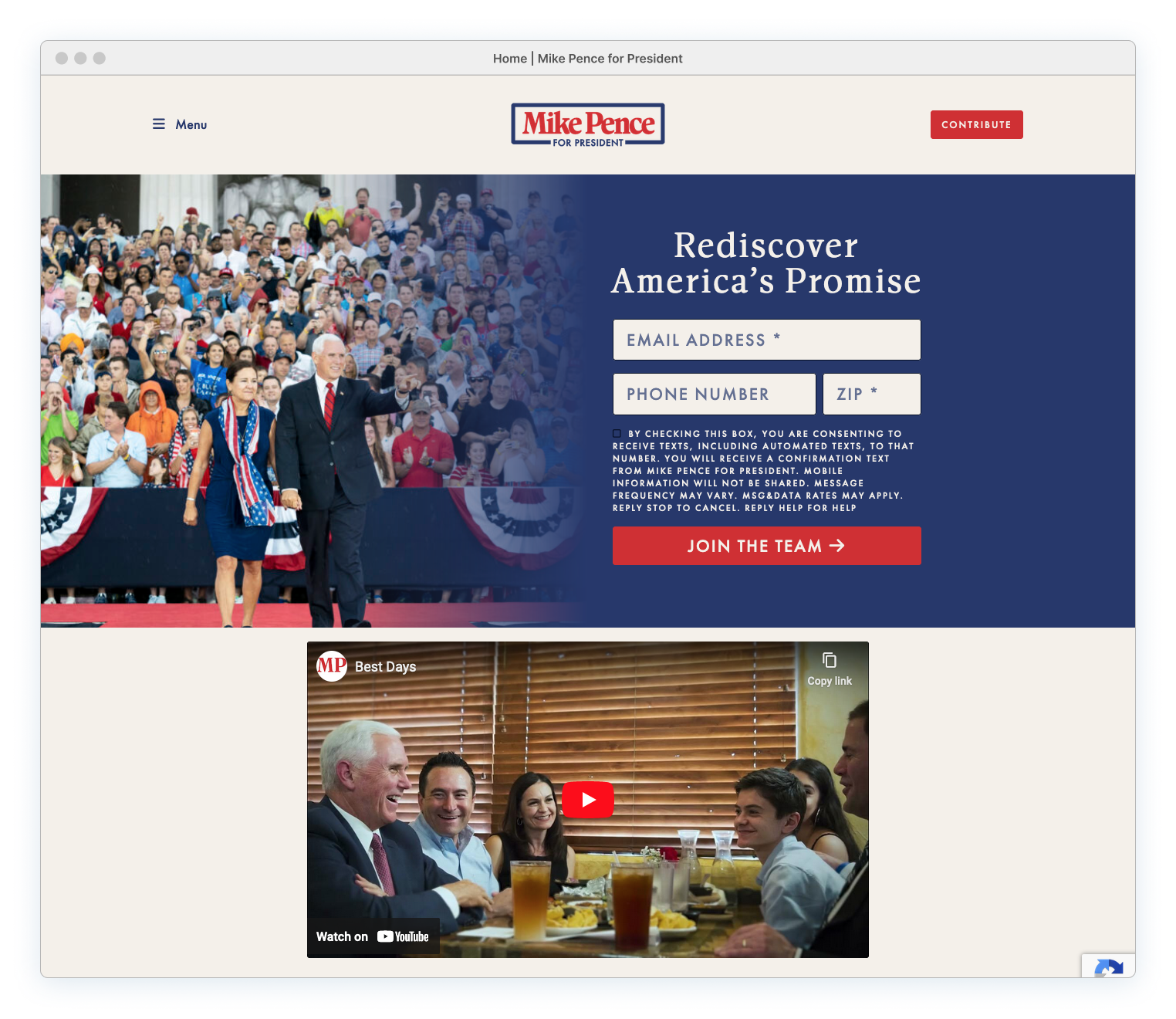
At a quick glance, the main site seamlessly extends into the donation site, offering a smooth transition experience for potential donors. Looking closer, the donation page has a completely different vibe. Elements are arranged diagonally, and the graphic-based banner text is playfully skewed. The absence of sharp corners and boxy, rectangular shapes creates an informal tone. Even the rustic, paper-like halftone background texture and tilted textual elements contrast with the established rigidity, flat-color use, and uptight formality of the Pence main site.
Everything feels just a bit off-brand. It’s as if someone aimed for consistency but ended up with two slightly different personalities.
The real consistency across these sites is resides in Pence’s posture: his arm raised in a stiff wave, accompanied with his vacant expression, both fixated on a point of unknown significance in the distance. This imagery recurs throughout the main site and serves as a branded anchor for his donation page.
Effort Appreciation.The comparison between the main site vs the donation site is intended only to point out that an attempt was made. The result wasn’t ideal, but the effort sets the Pence campaign apart from other candidates. Even assessing other campaigns in terms of how well they extended their brand to their donation sites would be pointless; the majority of them did very little.
Donation Page Pros:
Using images that showcase Pence alongside his wife is important for the brand. Karen Pence is featured prominently in the campaign and it’s almost rare to see Pence without her nearby. Supporters recognize her as an essential component and expect this level of involvement.
Donation Page Cons:
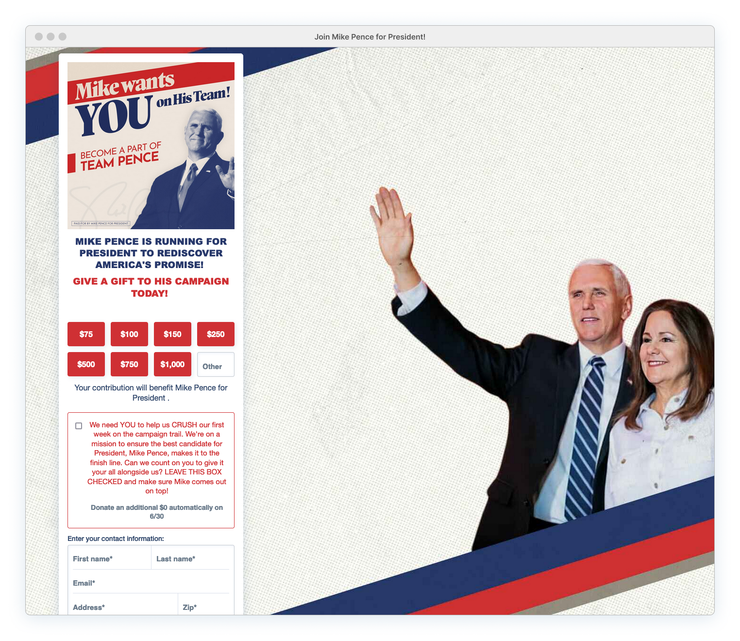
The banner image provides no real value and slants the Futura and Antonia typefaces into angles they were not designed for. Combined with the (multiple) slanted stripe layers, this makes everything awkward and forced for no good reason. The page also doesn’t need another picture of Pence waving into the void. Just use the standard logo.

Alongside the subpar banner copy, the page is plagued by poorly written and formatted content. The unconvincing headline and subheadline scream at the user in a capitalized Arial Black typeface. The additional donation box lacks a compelling argument for contributing extra funds, relying on clichés like ‘crush,’ ‘comes out on top!’ and ‘finish line’.
The WinRed platform likely restricts use of unique fonts due to licensing constraints, explaining why the donation page doesn’t use the same typefaces found in the image banner. This doesn’t justify the use of Arial Black; several common basic fonts would have better aligned with the brand (and been more legible).
Nikki Haley: A Deer In Headlights
Haley takes a similar image cut-out approach. However, unlike Pence, who is anchored by a graphical stripe (and his wife), Haley floats around on a heavy drop shadow. Her direct gaze at the user is unsettling — it’s a relief when her face disappears at smaller browser sizes.
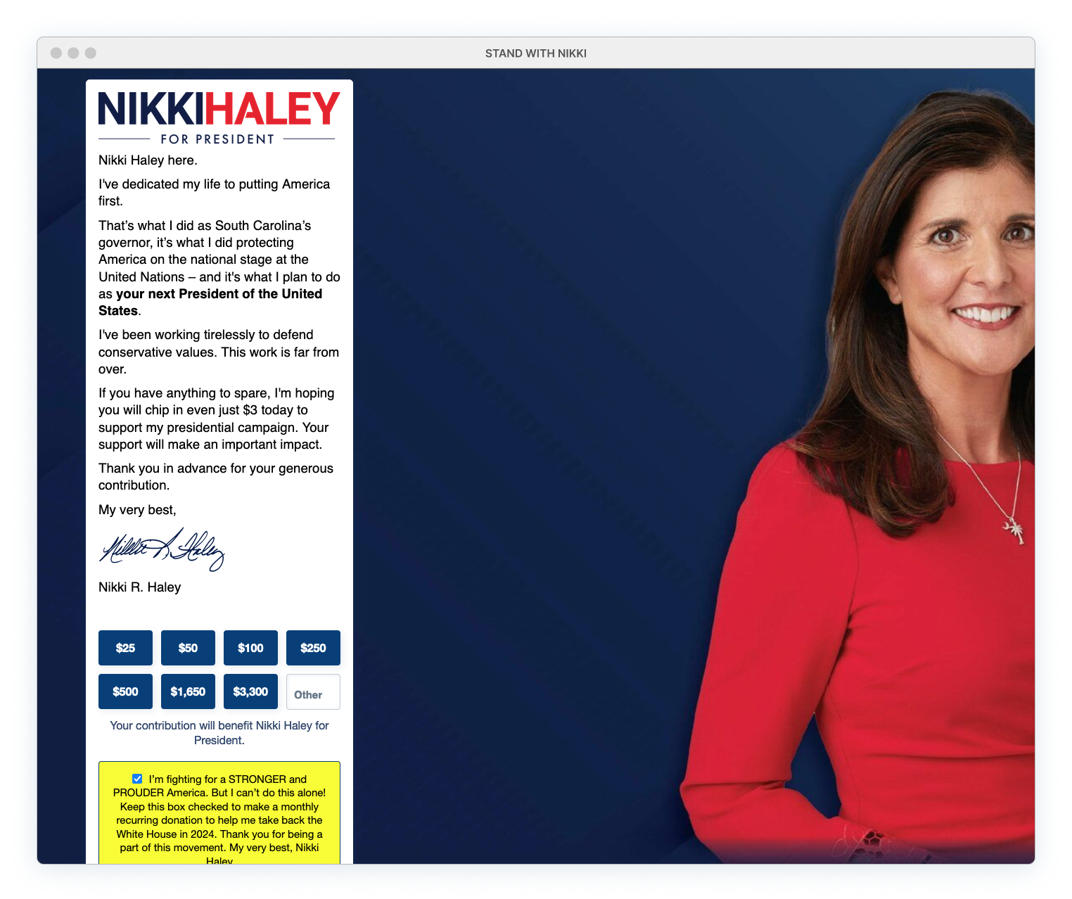
Donation Page Pros:
Nicely presented logo. It’s displayed more effectively here than it is on her main site, where it’s lost against a chaotic background. She is the only candidate to left-align her messaging text, making it more readable than the standard center-aligned approach used by other campaigns.
Donation Page Cons:
Messaging text is still excessively lengthy, spacing/formatting is a mess and each paragraph contains an orphan. Uses the clichéd and dated practice of addressing the user through a letter format, complete with a signature image. Banding issues in the background gradient. Disturbing image choice. The monthly contribution option is pre-selected by default.
Using a silhouetted candidate image may seem like an effective method for eliminating irrelevant distractions and background noise. However, there’s a risk of stripping away vital context and the essence of relatability, reducing the candidate to a flat, two-dimensional representation lacking any real narrative depth.
This flawed approach is a subtle reminder that in the political landscape, outward appearances deliberately conceal the true substance of character, and background context is shaped by smoke and mirrors.
Chris Christie: Talk to the Hand
While Nikki Haley’s piercing gaze delves into the core of the donor’s soul, Chris Christie gives everyone the cold shoulder. And it really is cold. Not only is he looking away with his hand held out in a ‘halt’ gesture, but the image itself is desaturated, toneless and muted. There’s no life here at all.
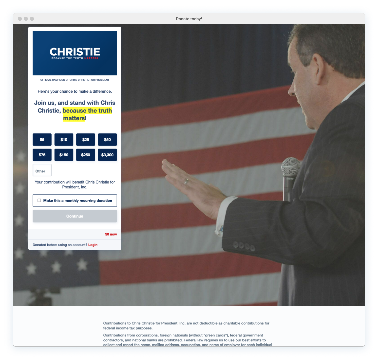
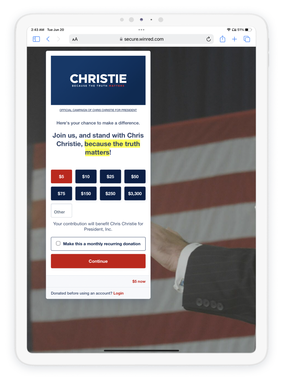
Donation Page Pros:
Has a decent logo. Two-sectioned form approach, making it easier to fill out, especially on mobile. Short and direct copy. Very minimal but cuts the chaos by sticking to the essentials. Not overwhelming.

Donation Page Cons:
Logo could be larger; the small tagline is challenging to read at current size. The yellow highlighter copy is ugly; there are better methods to emphasize messaging. No links provided to his main site. The background image and perspective are horrible. Tablet view is just a wrist. This odd image pose creates speculation about the choice not to use a frontal picture. Own it. Use a photo that actually shows Christie, even if it may not be flattering, or don’t bother at all.
Note: Christie uses the same image on his main site. It creates consistency, but maybe not in a good way.
Francis Suarez: Time to Drop Out
In complete contrast to Christie’s washed out coloring and awkward pose, Suarez stands front and center.
Unafraid of the camera or vibrant hues, the Mayor of Miami boldly embraces loud colors. The neon red/pink/purple vibrancy + pulsating background tagline capture the city’s aesthetic and a hint of a nightclub vibe. Pink flamingos would be completely at home in this page. This type of energetic ambiance might be unconventional for a United States Presidential run, but it does make him stand out.
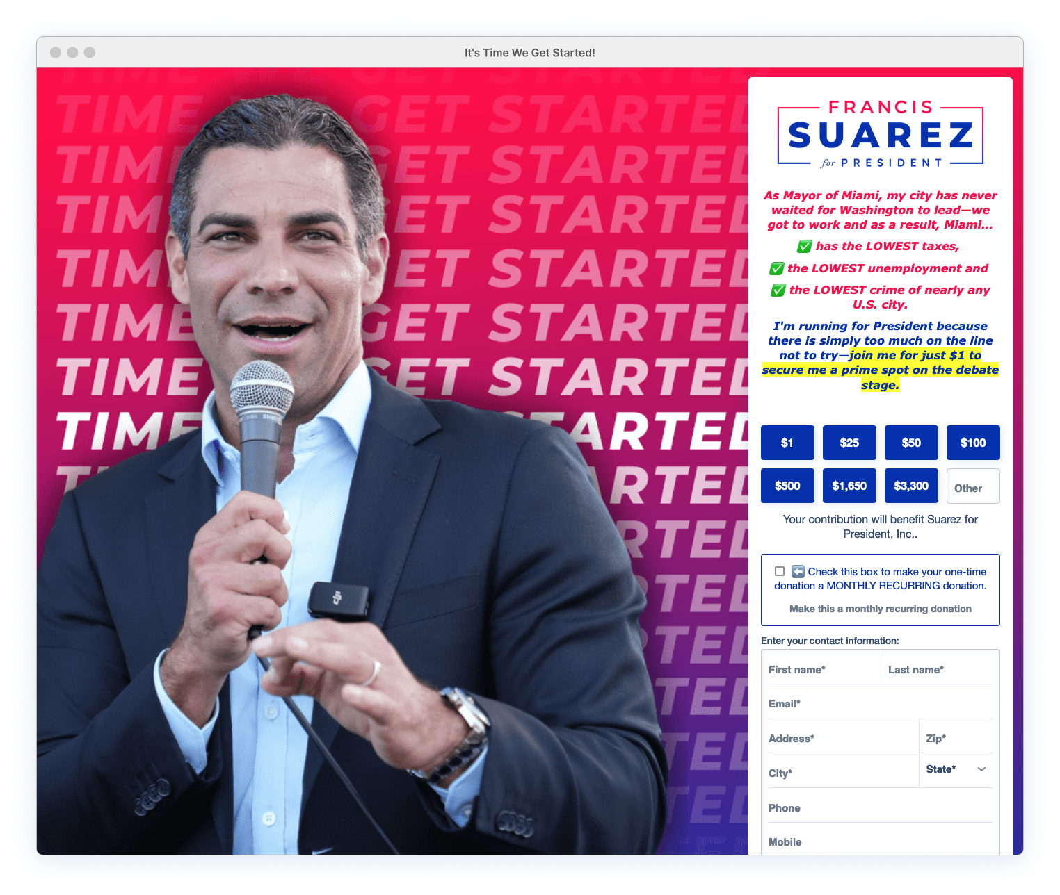
Donation Page Pros:
Memorable colors. But…
Donation Page Cons:
This bright and loud palette might not resonate with traditional voters anticipating the typical patriotic red, white, and blue. Too much is going on; there’s no restraint. Logo is weak and lost within all the chaos. Poor text formatting. A thinner typeface would align better with the logo.” The messaging is awkwardly written. The italicized text is difficult to read and excessively vibrant. <em> tags are applied to the checkmark characters, creating an ugly faux italic skew.
Tone the background down. It’s drawing focus away from the donation form. Hopefully, potentially controversial hand gesture goes unnoticed…
Note: Did the tagline ‘Time to get started’ doom the campaign? Suarez never ‘got started’ and suspended his campaign after failing to qualify for the 1st round of Republican debates. The site review was conducted prior to the qualifying date and is included for comparison purposes.
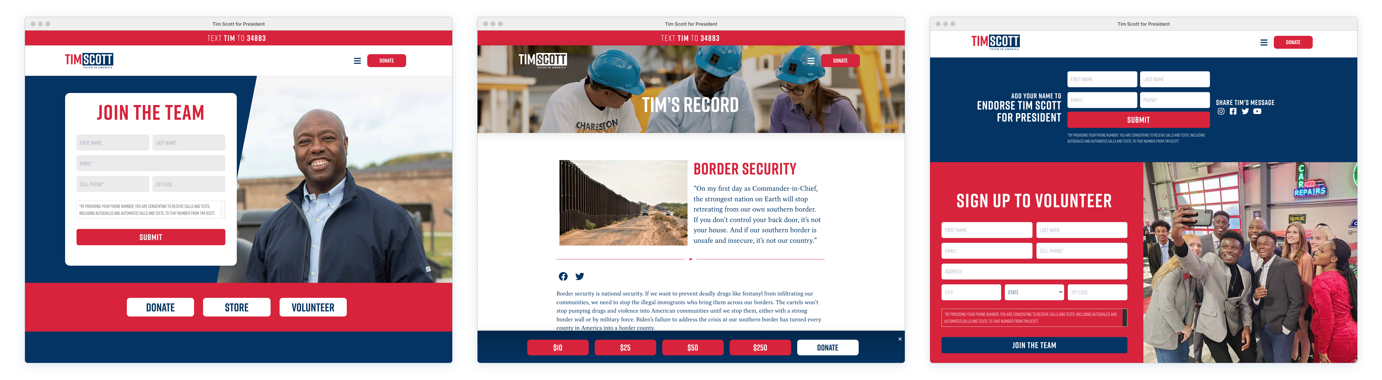
Tim Scott: Sunglasses Required
Scott also embraces radiant color and his page goes full force with a bright yellow highlight. Fearlessly, he positions this neon yellow alongside vibrant red, making a visual intensity so harsh that your eyes bleed. Applying this same headache-inducing sharpness to the large, pre-selected monthly donation option only strengthens the dark pattern. The color is so severe that it’s painful to look at, let alone fully read
The logo is fine, but it’s completely overtaken by a bulky red headline blazing above yellow muck. The light background does nothing to help and only accentuates the mess, making it all appear 100% more extreme. There’s no comfortable contrast or relief anywhere on this page; only light, brighter, and burning.
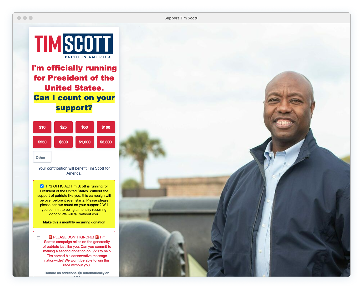
Donation Page Pros:
Horizontal logo works well in this type of space.
Donation Page Cons:
The yellow/red combo overwhelms the form and destroys the page. Poor formatting. Generic, excessively long, and unnecessary copy. Find a better photo for the desktop view. The background environment makes no sense and provides no supporting context. Canons? Is he planning on blowing something up? If this is a metaphor, no one is going to understand it. Use the logo as the primary image on mobile.
Contrast this washed out, generic, and gibberish donation page with Scott’s main site, and the two sites feel like entirely different campaigns. The main site captures a presidential (highly confident) minimalist vibe, featuring only red, white, and blue, complemented by an uppercase, assertive font — completely unlike his weakly yellow donation page.
Horizontal logo works well in this type of space.
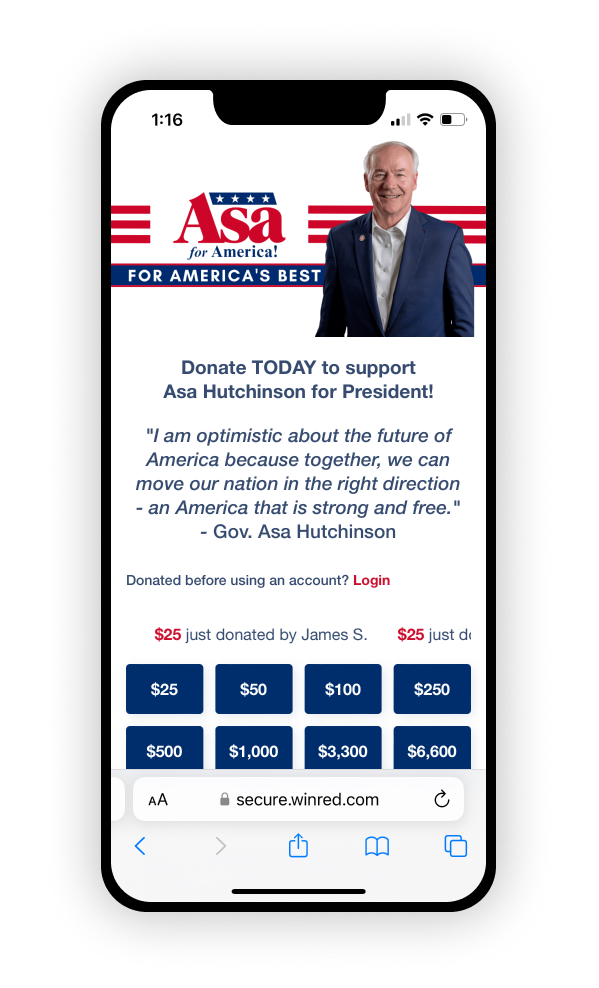
Asa Hutchinson: For America Boredom!
Hutchinson skips the highlighter and goes full-on ‘Merica by saturating his donation page with red, white, and blue. But there’s no balance whatsoever, resulting in an overwhelming patriotic color scheme where everything just blends together. The poor contrast between unformatted, babbling copy and a cluttered background image makes it impossible to concentrate on anything.
Thankfully, this horrible background is replaced on mobile views. On smaller screens, the header image integrates the logo with an appropriate candidate image, creating a design that isn’t overwhelming and allows the content to breathe. While Asa’s floating torso (and proceeding copy) would benefit from some refinement, the logo + candidate image approach is precisely what more WinRed mobile views should be doing.
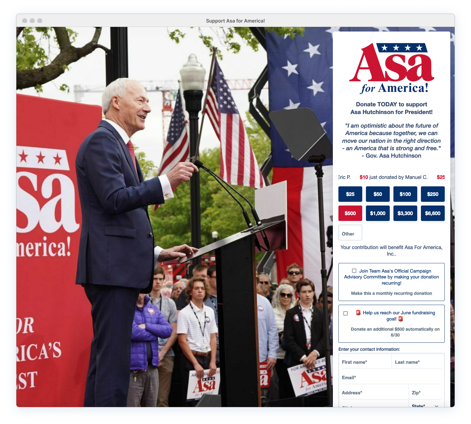
But back to that desktop background image… It’s super cluttered and competes for attention with the form. But that’s just one of the issues. Did anyone take the time to actually look at the facial expressions and body language of the audience before choosing to use this image? The audience displays ZERO enthusiasm and appears completely disinterested (or maybe even mad — are they scowling?). This isn’t a good look, especially for a campaign that features an exclamation point in its tagline “for America!”

Donation Page Pros:
Consistent color theme used on images and page design elements. Decent mobile header image using a logo + candidate approach.
Donation Page Cons:
Poor text formatting, multiple lines of centered text, awkward line breaks (lots of orphans). Animated donor scroll adds to the confusion. Alignment issues with additional funding request checkbox sections. Background is overloaded with visual noise and not toned down. Visually hard to separate the form content from the underlying chaos.
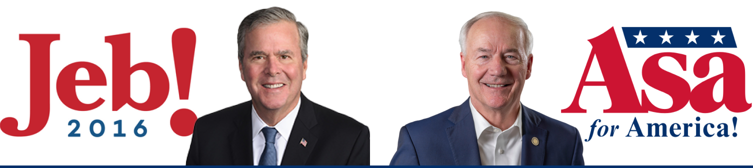
Note: It’s worth mentioning that a candidate in 2016, who also had a three-letter first name, incorporated an exclamation mark into his logo. Unfortunately, similar to Asa’s audience, it failed to generate any enthusiasm.
Vivek Ramaswamy: I Once Caught a Logo This Big…
Vivek comes across as having more energy than stiff Asa, but his pose and mouth expression (fish-lips? Owl hoot?) is just… strange. The form section is dominated by a huge logo, poorly formatted copy and 3 lines of button donation options
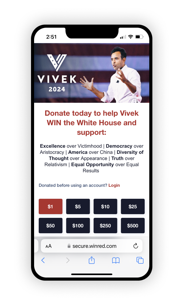
On mobile, the header image is a washed out version of the same desktop image but with a white logo that is slightly lost. The open-armed pose is even more awkward when in such close proximity to the logo.
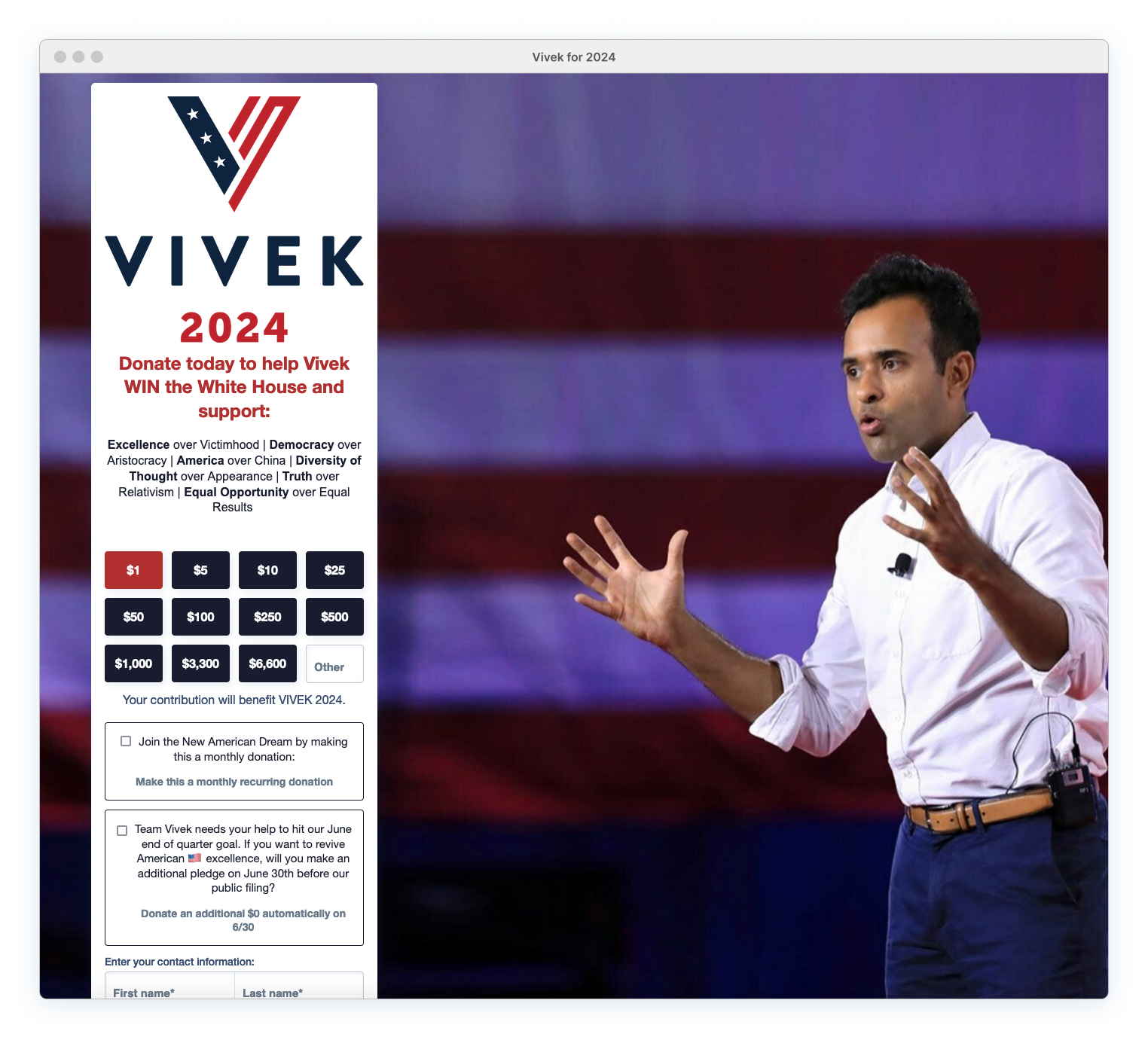
A horizontal logo version, currently featured on bumper sticker merchandise, would work much better for both mobile and desktop. This version already states the goal, “For President,” and could effectively replace that hideous red headline copy. Keep it simple and direct.

Donation Page Pros:
Strong page contrast. The form and Vivek’s bright white shirt stand out. Consistent use of a dark-ish/navy palette with splashes of red. Dark background image aligns with the overall color palette. Placement and sizing of the candidate balance the page composition without diverting attention from the form.
Donation Page Cons:
Poor typography and formatting. Center-aligned issues list with vertical character dividers and bold styling is difficult to read. Awkward candidate photo pose (and strange facial expression). Overwhelmingly large vertical logo. Twelve donation button amount options are overkill. Monthly and end-of-quarter donation request sections use clichéd terms with redundant/excessive copy.
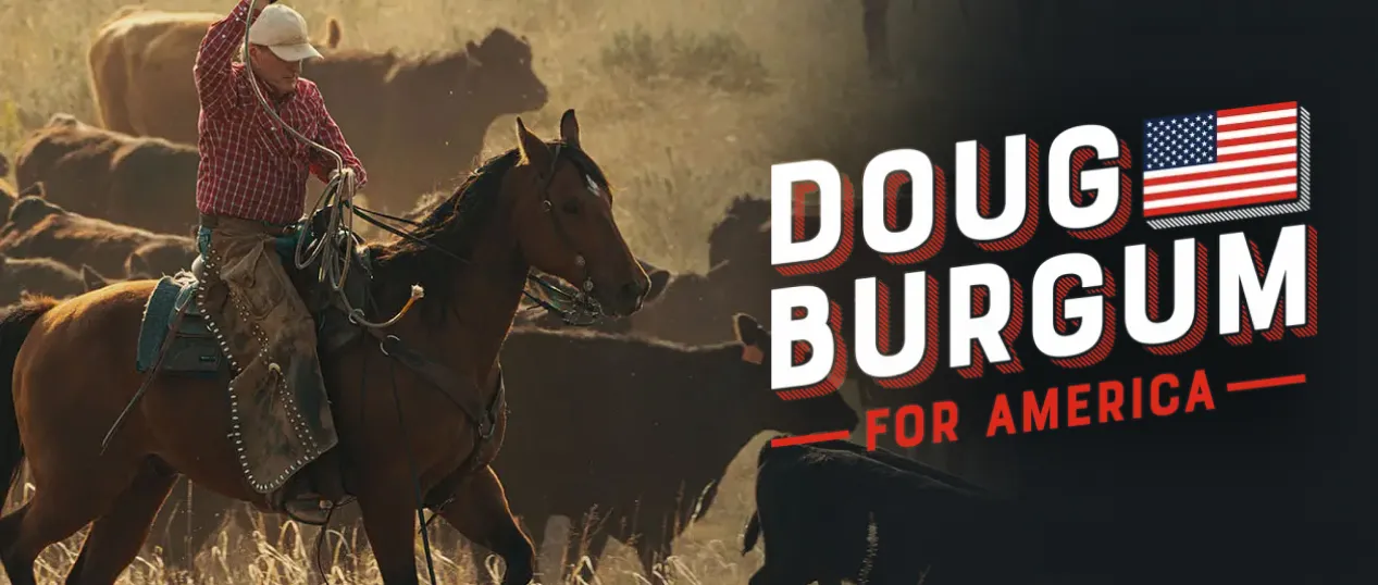
Doug Burgum: Tick-Tock Anxiety
Gotta give Burgum credit for trying something different and including both a video and a countdown clock. The video adds a nice personal touch, providing convenient access to more candidate info without users having to leave the page.
That video thumbnail is a horrible choice given the default positioning of the red play button.
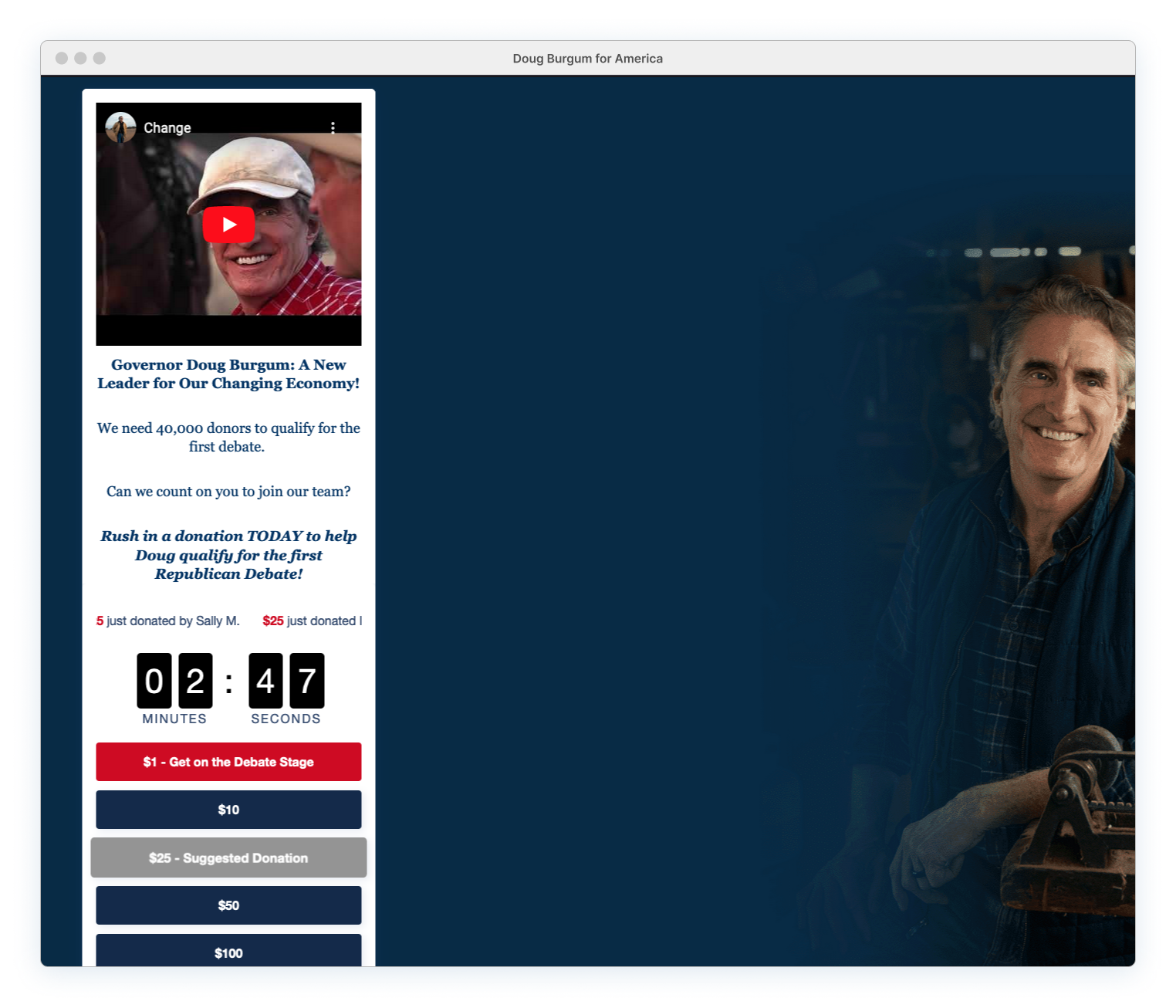
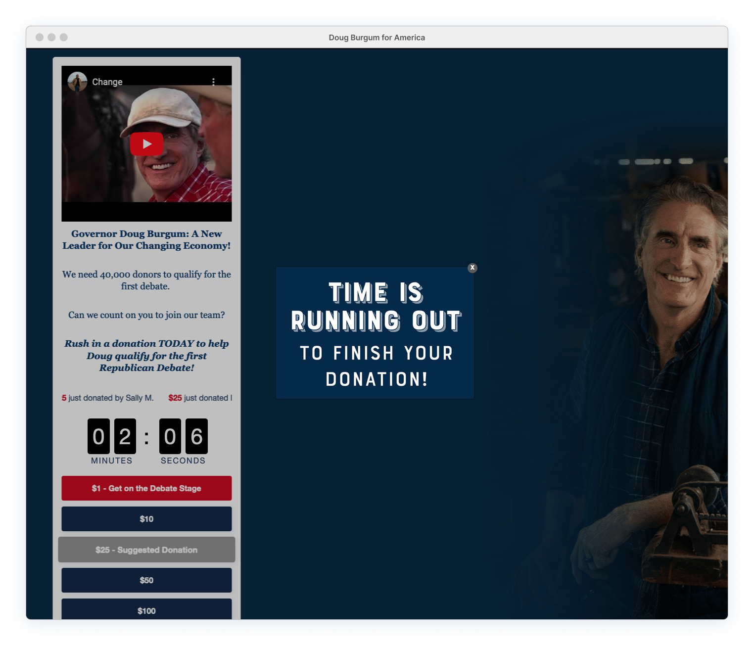
However, any immediate interest in playing the video is completely sidelined by the steady movement of the animated countdown clock. Attention shifts to the donation plea for the impending GOP debate qualification deadline. This ‘emergency’ is further amplified by the inclusion of the donor scroll, and the motion in both sections is so prominent that everything else on the page becomes irrelevant.
This entire experience is uncomfortable for the user, regardless if they’re donating. It feels like a ticking time-bomb, creating a sense of panic.

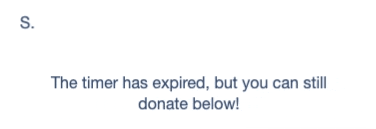
The only positive to this countdown madness is that it diverts attention from the overall horrible condition of the page. It’s unfortunate that this donation site is so neglected, especially considering the distinctive logo, appealing photographs, and unique aesthetic found on Burgum’s main site. That branding could have been extended here, leaving a real and lasting impression.
Donation Page Pros:
Accessible info through video content.
Donation Page Cons:
Form is excessively long and overwhelming with an abundance of pointless content. The video title (“Change”) is vague and cliché. Copy only repeats donation ask, using multiple lines of text with lousy formatting. Animated countdown timer serves no meaningful function, potentially inducing panic and heightened anxiety for users. Multiple button states are confusing, especially the greyed out suggested donation button that appears inactive. Horrible background image choice. Missed opportunity of incorporating strong branded elements from the main site.
Issues: Content vs. Platform
Content Issues
These pages are an absolute mess, with complications beyond just the core WinRed platform problems (see next section). The creators/managers of these pages are responsible for choosing low-quality images, excessive animations, illegible fonts, glaring colors, and subpar copywriting. All of these factors deteriorate the entire user experience. Poor content and design decisions only amplify the underlying platform problems, making the presidential candidates look completely foolish, which they certainly don’t need any additional help with.
Under the Hood
But WinRed doesn’t get off that easy! Sure, these design choices could have been better crafted, but WinRed is responsible for a good hunk of the overall poor experience. Quality content, even if implemented, only goes so far when the underlying experience is already a cesspool of clunky decisions.

WinRed heavily relies on third-party services and various technologies to support all corners of their platform. The effectiveness of integrating these technologies to meet their unique user experience needs is questionable. The platform would benefit from reassessing the usage (and problems) for both donors and campaign page managers to determine what is working, what should be modified, and what belongs in the trash.
Note: As previously mentioned, this is based on my experience looking at the front-end and without direct access to the platform build..
The core user experience needs a complete performance re-haul, while looking at optimizing form interaction, overall flow, and seamless brand integration. Just a few underlying core issues* that surfaced in the user experience include:
- Performance and functionality problems?Yep!
- Payment methods? It’s credit or nothing!
- Dark patterns?Absolutely!
- Accessibility issues?Of course!
- Random confusion?Always!
*These issues (and more) are thoroughly discussed in Part 1
WinRed also needs to step back and stop piggybacking on the campaign donation process. They frequently insert themselves between the donor and the campaign at the worst possible times (see the Post-donation flow from Part I). There are other, less intrusive methods to request platform donations without completely sabotaging the experience and ruining it for everyone.
After evaluating the GOP donation pages, it’s clear that built-in restrictions are crucial to prevent campaigns from making harmful UX errors. For example, the monthly donation button should NEVER be set as the default selection. Don’t assume campaigns will avoid adding multiple countdown clocks, animated avatars, and bouncing buttons to their pages. If they can, they will.


Note: PageSpeed Insight reports conducted on multiple WinRed campaign pages revealed similar assessment ranges, with some performing only slightly better and others slightly worse. CrUX dataset.
The minimum expectation for a platform used by the majority of Republican candidates and committees, covering Federal, Senate, House, Governor, and even state and local races, should be a performative page (both desktop and mobile) with a user-friendly experience.
Yet this is clearly not the case. At one point, the RNC even considered making WinRed the mandatory fundraising platform for every Republican campaign. Although this requirement was never implemented, WinRed has continued to see extensive usage, despite the painful user experience and performance problems. Why is this tolerated, especially for a platform with such a broad reach?
Better Options?
Are other platforms and political parties performing any better? Do candidates unshackled by WinRed have an advantage? And are they, at the very least, handling their content and messaging more effectively?
Or are the standards for presidential donation pages, regardless of party, already so low that it’s just more of the same nonsense?
To Be Continued…
Part III: ActBlue & Alternative Funding Page Failures
UX Circus Articles:
Part I: The DeSantis and WinRed Donation Page Disaster
Focuses on the Ron DeSantis presidential launch, featuring an in-depth design critique of the donation page and donation process.
Part II: GOP Candidates & WinRed Contribution Page Chaos
Provides a general overview of how the other GOP campaigns are handling their content on the problematic WinRed platform. What they're doing right, wrong and how they're standing out.
Part III: ActBlue & Alternative Funding Page Failures
Examines ActBlue, the Democrat Party fundraising platform operated by the DNC (Democratic National Committee). Also included is a look at two alternative platforms used by outsider candidates that decided to ditch ActBlue and WinRed and do their own thing.