This is the first installment in a two-part series exploring how legacy design shapes the modern ice cream landscape. Part II: Freezer Burned will be published soon.
Editorial Note (2026): This article was completed in late 2023 for a design, strategy, and discovery project. Any references or visuals added later have been dated accordingly. The core analysis covers ice cream history through 2023, and the observations remain relevant today.
Unless otherwise noted, composites and graphics are by the author.
Shrinkflation Infiltration?
Grocery shopping is a minefield of sudden price hikes. One wrong item blows the budget. Those days of tossing stuff in the cart without looking are now a distant fantasy.
Prices change faster than stores can update shelf tags, leaving shoppers with two options:
Hunt down the lone, and often broken, self-scan price checker, usually hidden away in a dusty, dark corner. Or…
It’s The Price Is Right at checkout! Guess wrong and eat the cost. Back out, and endure the cashier’s death stare while the sale is voided and your mistake goes back to the mislabeled shelf.
Source: Giphy
At least these surface-level price hikes are straightforward. It’s the outlier products, the ones that somehow stay the same price while competitors climb, that are tinkering with a deeper level of consumer deception.
Sneaky tactics can be used to reduce product quantity, quietly altering the product itself, but without visibly raising prices. Everyday staples like juice, bread, cookies, soap, and toilet paper each have their own customized methods of shrinkflation trickery, with some companies proving far more skilled (and stealthy) than others.
Skimpflation Reformulates a product by reducing expensive components with cheaper ingredients or other substitutes. Otherwise known as watering down the recipe. This is often the most deceptive of all.
Less Product, More Air, Same Look: The only visible change is the updated quantity printed on the package. There are no other packaging changes and even the reduced amount after opening might go unnoticed.
Confusing Quantity Labeling Hiding product reductions by using odd sizes, unfamiliar units and avoiding round numbers.
Graphic Design Deterrents Design updates or typography tweaks that divert attention from quantity reductions. Tactics include relocating quantity information to a less prominent area, adding distracting visual elements, or using less readable typography.
Packaging Modifications Redesigned to visually maintain the same shelf presence while reducing product content. Wider and shorter, taller and slimmer, or featuring recessed bottoms, tops, or sides.
Turkey Hill Ice Cream recently downsized their 1.5-quart containers using several of these shady tactics. Together, the combination of tricks makes the reduction so subtle it quietly slips past the average hurried shopper.
Nonstandard Labeling Measurements: Instead of stating the new amount as a straightforward 46 oz, with familiar quart and liter conversions, the label now reads an unconventional “1.44 QTS”, an odd measurement for an ice cream product. This not only shortens the label (calling less attention to the area) but also makes grocery math more painful for the consumer
Before and After Redesign: Quantity Label Changes. Animation source: Giphy.
Graphic Design Redirection (Look Here, Not There): The bold green outline of the former design gave the quantity label crisp readability, yet it’s now a light green stroke eating away at the faint numerals where things quietly blur into the background to avoid unnecessary attention.
Is this subtle color shift an oversight? Maybe. But it feels deliberate considering the other updates. The logo’s slight bump in size and repositioning make the flavor title (now a large black slab typeface) the dominant focal point. Together, they draw attention away from other areas, most notably the reduced quantity label. These tiny updates are quietly shaping what shoppers see (and what they don’t).
Packaging (Skinny and Sneaky): Even new cartons mask the quantity downgrade by slimming the width while keeping the same height as the old 48oz containers. The once-bulky cardboard lid has also been trimmed into a thinner plastic version. Yet when sitting side-by-side with their predecessors, these subtle updates blend so seamlessly into the existing design that they’re almost imperceptible.
Same Shelf, Less Stuff
It was the side-by-side freezer standoff that exposed the deception: old 48 oz cartons next to new 46 oz ones, mingling on the shelf as if nothing had changed. Honestly, if they’d just purged the 48 oz cartons all at once, I probably wouldn’t have noticed the downsize so fast. It would’ve taken a few grocery runs before realizing I was licking the carton clean way too often.
Vanilla: Canary in the Carton?
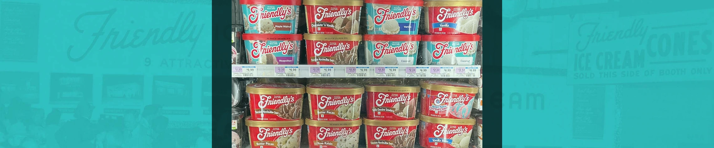
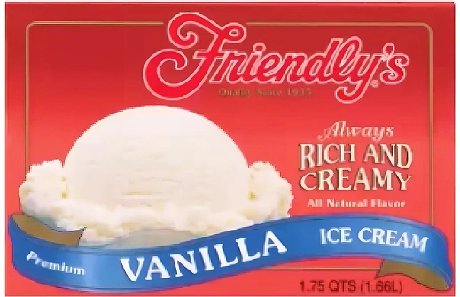
Shortly after this deception was discovered, a new color suddenly popped up in the Friendly’s freezer section. The long-time red carton was suddenly being overtaken by an aqua blue. And this wasn’t one of those limited-edition flavors with its special packaging… this was vanilla.
Vanilla Showdown: Old vs. New
Friendly’s 1.5 qt quantity remains intact, but given Turkey Hill’s recent stealthy downsizing, there’s reason to question how solid those 48 oz Friendly scoops really are. Even without an immediate size reduction, this aesthetic shift could be the foundation for future “adjustments.”
Right now, red cartons sit beside their sleek new aqua-blue replacements, waiting to be sold out of existence.
Could this be a transition design heading toward shrinkflation? A strategic rebrand before quietly downsizing the contents? How soon until a 46 oz container is in the stockroom… or maybe it’s already there?
C-Town freezer aisle, Brooklyn, NY. Photo by author. December 2022.
Drip vs. Deluge…
Judging by their recent price increases, Friendly’s has gone with straight-up price hikes and left container sizes alone for now. The ingredient list is also the same, so at least they haven’t committed the ultimate sin of watering down the product or messing with the recipe.
What’s less reassuring: Friendly’s still says 1.5 QT on the carton, but the metric volume dropped from 1.42L to 1.41L. Maybe it’s just a rounding adjustment, but a subtle reduction may have already quietly happened. Sure, it’s easy to dismiss such an insignificant change, but seeing that number drop, however slight, is a cautionary reminder that shrinkflation can start as a ripple before swelling into a tsunami.
This further suggests the new direction could be a transitional ‘buffer’ design in disguise, a peaceful calm before the sting of a quantity reduction. As the previous, subpar red packaging phases out from store shelves, customers have time to mentally adjust to the refreshed look, making a future size shift feel less disruptive than if both changes had hit them all at once. And this is exactly what Turkey Hill recently did.
Running Down That Hill: Bait-and-Switch
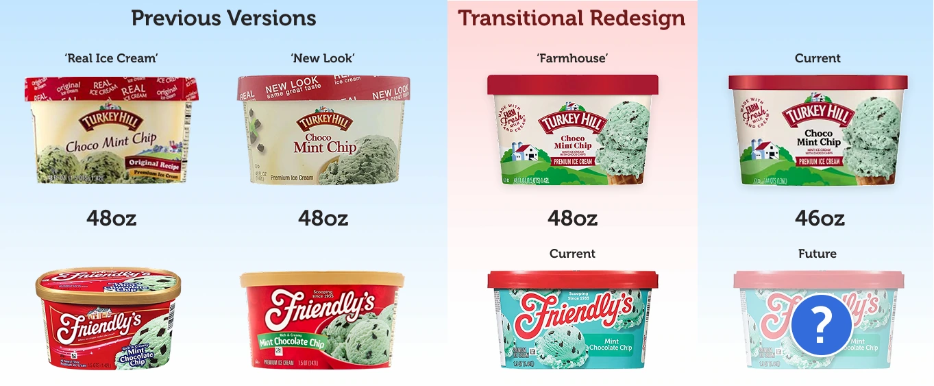
The former Turkey Hill designs (see “Previous Versions” below) had long needed a revamp. Layouts featured bland ice cream scoops set against sickly, textured yellow backgrounds, with poorly set typography and inappropriate typefaces looming over the entire mess. Even the carton lids relied on slogans like ‘REAL Ice Cream’ or ‘NEW LOOK, same great taste’ as a last-ditch effort to convince consumers the product REALLY was appealing, despite the packaging.
These uninviting old containers were phased out in favor of a modern redesign featuring the brand’s iconic white barn and rolling hills. A balanced layout, refreshed logo, and vibrant colors brought the brand to life, making it worthy of the long-used “Premium” label. Same quantity and quality as before, but no longer wrapped in a stale-looking mess.
Had this redesign been released concurrently with the product reduction, it would have been very noticeable. Even worse, the brand would have risked consumers permanently associating the new look with getting less, instantly tarnishing the redesign, making it an unwelcomed guest in any budget-conscious home freezer.
Turkey Hill’s 48 oz ‘Farmhouse’ carton redesign was perfect for a rebrand-buffer-reduction rollout. By introducing the new design at the standard 48 oz size, rather than a reduced 46 oz, it could establish shelf presence and let the new look settle.
Consumers have time to mentally adjust:
‘Farmhouse’ = same amount, same product. No big deal…
As that 48 oz stock cleared, a nearly identical Farmhouse carton (now at 46 oz) could slip onto shelves and cleverly avoid added scrutiny.
Source: Giphy
It’s a bait-and-switch: sitting in its usual freezer spot makes it easy to miss the change, grab a flavor, and move on. Even after the reduction is discovered, those missing scoops are slightly easier to come to terms with when familiar design softens the impact. At 48 oz, it was welcomed into homes. Now, that same familiarity works to normalize what’s been quietly taken away.
After years of carton designs frozen in time, Friendly’s has finally shifted to a more modern look. This change suspiciously coincides with the industry’s downsizing trend. Could this ‘refresh’ be a smokescreen for a future quantity reduction, going down the same shrinkflation hill? With its long history in a red carton, the question arises: is this an innocent, long-overdue update, or a darker indication of things to come?
The Red Cartons
Ice Cream Beacon
Anyone living in the Northeast in the ’80s and early ’90s knows of Friendly’s restaurants, a town staple for family dining where ice cream was the main attraction. Its signature red-and-white color scheme and bold, swooping cursive “F” logo instantly trigger nostalgic trips to the local franchise.
Photo by Sethoscope via Flickr (CC BY-SA 2.0)
Friendly’s had been “Scooping Since 1935,” but it wasn’t until 1987 that they jumped into supermarkets and started chasing the home-dessert crowd. Here they could compete with national brands and use name recognition to move beyond the Eastern restaurants and into national household freezers.
The restaurant’s identity was packaged into take-home containers featuring its flamboyant logo and the same bold red used on its buildings and signage. This aesthetic stuck around for decades, with each new carton in the central product line unmistakably tied to the safe visual familiarity that defined the chain’s 1980s peak, when it operated over 850 locations.
Now, all of this has shifted with a new paint job: a bold color, an inverted logo palette, the removal of gradients and textures, and the loss of the classic golden lid. The carton isn’t a miniature replica of the restaurant facade anymore, yet its identity feels stronger than ever. It’s a respectful nod to the brand’s past, refreshed for the present, and might even justify the inevitable price increase to come (but probably not).
Dates estimated, appearance varied by region, carton nicknames by author and unofficial.
What follows is a general commentary on the primary carton designs. The deeper Friendly’s critique is in Part II, where things get especially sticky.
The Brick
Display Start Date: 1987
According to The History of Friendly’s, with Friendly’s historian Rose Slate, the company first test-launched its supermarket version in a Price Chopper in Albany, NY, using a carton known as “The Brick.” From there, the brand expanded throughout the Northeast with containers decked out in red, staking a claim to the primary color of the restaurant landscape in grocery freezers.
The Brick: Rich and Creamy Line
The Rich and Creamy flavors make up Friendly’s core line and set the design foundation for their other products. Secondary options (special editions, light, sugar-free, etc) moved away from the bold red for product differentiation, but still followed the same blueprint (layout, typography, key elements) established by the flagship style.
Source: Cartons pulled from Friendly’s.com (via Wayback Machine)
This was the era of the ice cream “brick,” a rectangular cardboard box with flaps. These cartons launched Friendly’s into supermarkets in 1987 and came in the now-legendary half-gallon size (64 oz), a common standard for the time.
General Design Notes:
This introductory carton does a great injustice to the Friendly’s logo and well-established brand, making for a disappointing grocery store debut. Rather than reinforcing the restaurant connection with a design supporting the iconic logo, arguably the product’s strongest social proof, it gets swallowed by a blanket of red.
Source: Cartons pulled from Friendlys.com (via Wayback Machine)
This early layout is also mechanical, with everything forced into a rigid, unnatural grid. The “Rich and Creamy” slogan is awkwardly oversized, stretched to fill the space opposite the product image. The natural scanning flow is further disrupted by right-aligning the logo with the tagline, leaving the upper left corner completely vacant. A square gold trim contains the entire design, almost foreshadowing the golden lids to come.
Beyond the Brick: The Squround
Start Date: 2007
A ‘squround’ (or ‘scround’ ) is a container shape that falls somewhere between a square and a round tub. It resembles an oval but is closer to a rectangle with rounded corners (Wikipedia).
The Squround: Rich and Creamy Line
General Design Notes: Updating "The Brick" to the Squround in 2007 was a significant packaging shift, physically and graphically. The rounded corners made scooping easier, reduced freezer burn, and supported an easier-to-reseal lid (goodbye, flimsy cardboard flaps!). It also replaced the red logo with a crisper white version, helping the product stand out in the unpredictable dark depths of commercial freezers. The logo gained further prominence as the “Rich and Creamy” was toned down and no longer shouted in oversized, old-fashioned styling.
The Squround: Peanut Butter Cup, Chocolate’n Vanilla, Vanilla Chocolate Strawberry, Tin Roof Sundae
The former “brick” grid is broken, allowing elements to breathe and move. A gradient-blue flavor banner sweeps across the package, while the logo and supporting copy sit at a 15-degree angle, directing attention to the Staring Scoop in the corner. Although the flavor title rests on a slightly awkward curved baseline (and using a questionable faux-italic font), it stays readable and moves naturally with the composition. All of this energy sweeps upward to be crowned by a new golden lid.
Heritage Design: The Classic Illustration
Estimated Date: Late 2008/Early 2009
Shrinkflation came for ice cream again in 2008. Around this time, brands like Breyers and Edy’s cut their container sizes from 1.75 quarts (56 oz) to 1.5 quarts (48 oz), and these smaller containers quickly became the standard for managing rising production costs. While the exact timing of Friendly’s reduction is unclear, this carton was likely the one that delivered the bad news.
The Classic Illustration: Rich and Creamy Line
Previous cartons limited restaurant references to a small side-panel snippet, leaving the logo as the sole ambassador. This design puts the connection front and center: a playful drawing of the iconic Friendly’s restaurant, linking the supermarket line right back to the booths. Even the classic “Quality Since 1935” has been swapped for “Where ice cream makes the meal,” lifted straight from Friendly’s menus. This is a great way to tap into nostalgia and lend credibility to the grocery carton while reminding customers of the dining experience.
General Design Notes: Regardless of any nostalgic ‘feels’, this design captures the same energy as the previous Squround design, reflected in the curves, flow, and wavy, banner-like background elements. The wispy white curves, busy ornamentation, and snowflake-like stars come dangerously close to feeling Christmas-y, giving the design an oddly placed winter holiday charm. This is a playful wonderland, where the flavor name, set in a bubble-like font, happily bounces over its ice cream.
The Classic Illustration: Royal Banana Split
It’s far from perfect (more on that in Part II), yet a masterpiece next to what was coming…
Dean Foods was in a position to expand Friendly’s ice cream beyond the Northeast, tapping into markets where the restaurant brand was largely unknown. So — speculating here — it’s no surprise they’d want to distance the ice cream product from its brick-and-mortar roots. This is reflected in the 2016 carton slogan change from “Where ice cream makes the meal” to “Scooping since 1935”, shifting focus from the pure restaurant experience to something closer to the broader ice cream product.
The carton design that emerged during this time was a stripped-down hybrid, merging elements from the Squround and Classic Illustration cartons. The visual formula was still in place: golden lid, white logo on red, product image on the right. It’s a safe update that keeps the product on familiar ground despite the slogan change. Yet this mash-up of surface-level similarities doesn’t quite work and falls apart in the details.
The Red Bowl Trio: Vanilla
General Design Notes: Sadly, the iconic storefront illustration vanished with the restaurant split. The wavy banner background was also scrapped, and without this anchor, everything scatters into the blood-red void. What remains are three under-defined scoops, sunk in an unappetizing red bowl, with a janky gradient banner cramming the flavor name into a painfully illegible type treatment. Everything is slightly off-balance… a mess of mismatched parts thrown together without a solid foundation.
Even by mid-2010s standards, this is a huge downgrade. It’s dated and trapped in the past, but not in a good, nostalgic way.
Side Note: Color Exceptions During the Red Carton Years
While the red-and-white color combo defined the core product line, design variations were used for non-classic flavors, such as Light and Natural options and Frozen Yogurt. Packaging variations also extended to limited editions, including holiday releases and brand collaborations like Crayola and Nutty Buddy.
Even behind frosty glass and visually breaking with the ‘classic’ red container, these colorful (and often creative) cartons retained the distinctive identity that was, without a doubt, unmistakably Friendly’s.
Note: Part II looks closer at Limited Editions.
Secondary Flavors: Various iterations from 1987 to 2022
The Hunger Games: Red Rivals
Bold red branding has long been a staple in the food industry, and for good reason: it’s eye-catching, linked to impulsiveness, and known to stimulate appetite — the perfect combo for any restaurant chain. The classic formula of a white logo, often accented with yellow (looking at you, Golden Arches), on a radiant red may not be very original, but it still gets attention. Even a flimsy wordmark can become a hunger-inducing beacon with the power of red behind it.
Red-Based Restaurant Brands
Strip away the logos, and even the shades of red blur together across brands. Any remaining distinctions are often limited to signage shapes, architecture, and subtle secondary brand cues. All of this has slowly been changing as many chains pursue new “modern” looks, often favoring muted colors and more distinctive visual identities. But red long ago became the industry’s default setting, shaped by decades of recognition and hard to displace.
Nostalgic Showdown in the Freezer
It’s no surprise that when Friendly’s entered retail freezers in 1987, its signature red palette came along for the ride. Already known for ice cream, the brand could keep its visual identity intact and take full advantage of a freezer landscape largely untouched by other ‘red restaurant’ rivals.
Aside from Dairy Queen (more on Her Highness next), most chains avoided supermarket distribution altogether, leaving the ice cream aisle wide open for an established restaurant brand. McDonald’s certainly wasn’t in this space, and given their track record with broken ice cream machines, it would’ve been a disaster.
AI-generated illustration by author
The Queen
Dairy Queen (which doesn’t suffer from broken ice cream machines) was a brick-and-mortar exception that also made its way into the freezer aisle.
Founded in 1940, five years after Friendly’s, Dairy Queen had the same Main Street start but built on soft serve. It’s basically the Midwestern cousin. Like Friendly’s, it eventually expanded into supermarket distribution as another way to reach consumers. But that’s where the grocery similarities end.
Friendly’s: Photo via Friendlysrestaurants.com, Dairy Queen: Photo by Shuvaev, (CC BY-SA 4.0)
Location vs Distribution
Both restaurants became household names through similar aesthetics and experiences, and both are outliers in the supermarket arena where few restaurant brands dare tread. Yet in grocery freezers, these two ice cream icons rarely duke it out scoop to scoop, avoiding overlap in products and visual presentation.
This isn’t surprising, given their primary market access differs: Dairy Queen reaches most of its customers
Dairy Queen: Photo by Anon a mouse Lee (CC BY-SA 4.0)
Friendly’s = Distribution Reach. Despite its small restaurant network, Friendly’s ice cream division (owned by DFA Dairy Brands, separate from restaurant operations) distributes through major U.S. chains, reaching an audience far beyond the restaurant locations. Its classic flavors move naturally from factory production to retail shelves and into home freezers. Dairy Queen lacks a comparable mass-market model, with limited supermarket presence and availability that varies widely by region.
AI-generated illustration by author
Overlooking Friendly’s distribution advantage, comparing these brands based on grocery products is an apples-to-oranges comparison, when Dairy Queen’s most popular items can’t even physically survive supermarket shelves.
Dairy Queen’s Blizzards, soft serve, and cakes can’t distribute. Toppings are mixed fresh. Cups are flipped at the counter. That can’t be boxed up for grocery shelves. Even the ice cream cakes stay in-house, giving the company full quality control and avoiding the questionable refrigeration standards of third-party stores.
In-Store Dairy Queen Products: A Prepackaged Impossibility
Product Overlap
The few products Dairy Queen allows beyond its tightly controlled retail locations are its novelty items. Iconic Dilly Bars, Buster Bars, and DQ Sandwiches date back decades and remain closely tied to the brand. But the commercial novelty category is already crowded, with brands like Friendly’s fighting for distinction and turning supermarket freezers into a “Battle of the Bars” showdown.
Friendwich vs. DQ Sandwich
Friendly’s generic lineup of bars and sandwiches could be sold under any mass-market grocery brand. While they’ve created signature items like ice cream rolls and cakes (Jubilee, Wattamelon, Celebration), that same level of creative identity is nowhere in their packaged lineup. They have no signature or beloved novelty products, the kind Dairy Queen has built over decades. Just slapping the name “Friendwich” on a basic, history-free ice cream sandwich doesn’t make it distinctive. It’s lazy.
Friendly’s vs. DQ
Identity Issues
At the time of this review, Friendly’s novelty designs hadn’t been updated with the turquoise-blue. They still featured the classic white logo on red, with a white-and-red awning-like element stretched awkwardly across the top of the box. This already feels a little off, and things get even weirder with these ‘storefront’ items.
Instead of featuring a single product image against the same overwhelming red backgrounds used for their scooped siblings, each novelty item is shown twice, awkwardly paired in surreal lifestyle scenes: lounging side by side at the beach, riding a rollercoaster, sitting on a park bench, or attending a backyard BBQ. One box even features an entire team of Vanilla Krunch cones (that’s Krunch with a “K,” for reasons unknown) playing soccer.
The randomness of environments and activities makes no sense for the product, the brand, or any of it. And this weird personification of ice cream bars — giving them feelings, backstories, whatever — is unsettling, not charming. More on that later.
Friendly’s Novelties
With near-identical products available from multiple competitors, there’s really nothing (other than the Friendly’s logo) setting these common novelties apart. None have distinct product histories to lean on, the items themselves are lackluster, and even the creative naming attempts are flat and forgettable (sorry, but Krunch with a “K” just stupid).
Each is just another interchangeable bar, filling the same generic slot on the freezer shelf.
Multiple Brands: Classic Chocolate Crunch/Eclair Bar
This is a huge contrast to Dairy Queen’s novelties that know exactly who they are and hold their own in the freezer aisle. Confident these won’t get lost among generic treats, this Queen is free to scrap old packaging and start fresh each time. Ongoing redesigns keep these legacy products feeling current, trusting that deep customer loyalty won’t be swayed by new packaging appearances. After all, a Dilly Bar is always a Dilly Bar, its iconic essence unchanged by the wrapping. It doesn’t need the Dairy Queen name for recognition or validation.
Unlike Friendly’s red cartons (which evolved by building on past designs), Dairy Queen’s iterations look nothing like their predecessors. While some nod to the logo’s color scheme of the time, the connection ends there: shapes, typography, and tone form a mix of bold experiments and unconventional styles.
Yet all of this is easily ignored because the designs revolve around the iconic product, overshadowing the larger brand identity. The DQ logo could’ve been left off entirely and made no difference in product recognition.
Dilly Bar Packages throughout the years.
Dairy Queen’s latest packages show just how product-first these designs have become. Each ice cream bar gets its own spotlight, free of logo-driven branding and recycled visuals. The typical cut-and-paste approach (where only names and images are swapped out) is avoided. Instead, bold color palettes and illustrations are customized for each bar. High-quality images, loud uppercase titles, and quirky line art set a powerful and playful tone, keeping these iconic treats contemporary in modern freezers.
Dairy Queen: Current Novelty Items
The novelties continue to hold their own, independent of Dairy Queen’s broader visual identity. The logo sits quietly on the sidelines, a faint (but unnecessary) reminder of the brand behind these iconic products.
Logo Redesign
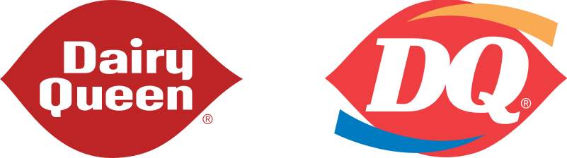
Dairy Queen’s logo can take a back seat on its novelties, but in other contexts it carries the full weight of representing an iconic brand experience. Unfortunately, the most recent redesign fails to stand meaningfully on its own. The simple red-and-white symbol that held the brand’s identity together for over four decades has been gutted, reshaped, and sacrificed to the gods of modernization.
“The traditional logo is the foundation for the new one, a more symmetrical ellipse enhanced with gold and blue curved swishes signifying food and treats. The DQ lettering also has been updated to a font that is more current, adding greater personality.” — Press release
If “greater personality” was the goal, Dairy Queen missed the mark with this update. Instead, they’ve managed to kill all the emotional charm that once made the earlier logos feel human. Gone are the nostalgic associations with the words “Dairy Queen” set in that soft, white, mechanical typeface that actually looked like lickable vanilla soft-serve. The original “DQ” mark, where the Q’s tail once resembled a Dilly Bar, has been twisted and bent, leaving the poor thing broken and deformed.
And the destruction doesn’t end there… the iconic asymmetrical lips weren’t spared. Their deep, rich red became a generic, out-of-the-box crayon color. Worst of all, it was made symmetrical, stripping away the quirk that shaped the restaurant’s signage for most of its history. How does any of this add more personality?
This redesign reflected Dairy Queen’s shift to full-service “Grill & Chill” locations: a more modern, expanded take on the brand featuring larger spaces and broader menus. But in this ‘contemporary’ push, something fundamental was severed from its iconic past.
A handful of the smaller-menu, “Brazier” locations (mostly rural or small-town stores) held onto the classic signage, but many legacy shops eventually fell under the rebranding knife. Renovated (and all new) locations were stripped of the basic logo versions and burdened with an oversized “Restaurant” tag or a huge italicized “Dairy Queen” label, to differentiate them from the larger “Grill & Chill” venues.
This heavy clutter only tears apart the simplicity that made the original so great.
Even more frustrating is that the 1959 and 1965 logos still hold up today. They only needed a few tweaks for contemporary needs: tightening the positive/negative space for better readability and playing up the quirky typography. That would have been enough for a modern facelift while keeping the original Dairy Queen essence alive. Instead, this solid foundation was tossed aside for a cheap, plastic-looking remake stripped of everything that made the originals so special.
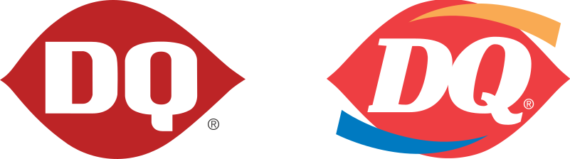
Just look at the classic abbreviated “DQ” version. It’s already simple, flexible, and adaptable to the branding demands of the digital world. Any updates should have focused on minor adjustments for better contextual use while avoiding conceptual clutter. Instead, this iconic symbol was reworked so heavily that the emotional connection — its true value — was sucked away and lost for nothing.
We’re left with a hard-to-read, tightly kerned, bold-italic DQ wordmark paired with nonsensical gold and blue swishes/arcs that only add to the confusion. More on that in the next section.
Dairy Queen gets a slight pass on the pointy swish/arc additions. In their defense, this design originated in 2001 (for Grill & Chill locations) before becoming the primary logo in 2007. They may have been swept up in the fading “swoosh” branding fad that lingered from the ’90s, when companies slapped a curve, swish, swirl, or boomerang-like shape into their logos for no reason whatsoever.
There was also an attempt to legitimize the tacked-on arcs by claiming “gold = hot foods; blue = cold treats. Realistically, that (very hidden) symbolism isn’t doing much of anything. Even for the few who know the reference, it’s still seen as pretentious, not clever. To everyone else, the shapes are just empty, swooping decorations typical of the time.
The Swoosh Logo Epidemic of the ’90s and Early 2000s: Arches, Swirls, Curves & Boomerangs
There’s zero excuse for this madness after 2010. By then, most brands had come to their senses and were in the process of embracing some form of minimalism. (In some cases it might have gone too far, but at least it killed off the decorative nonsense.)
Fast-forward into the multi-device, digital world of the 2020s and DQ is still clinging to its over-decorated logo. All that noise doesn’t scale and struggles across consumer touchpoints. For instance, simplified logo variations aren’t even used for the extremes and the same detail-burdened design intended for highway signage is also forced into a 24×24 favicon space.
Dairy Queen Favicon
This adaptivity problem extends to the physical world where it becomes even more apparent that this is a difficult logo to just drop into any context. The unbalanced top and bottom arcs suggest motion, while the aggressive typeface pushes the forward-momentum effect. With so much happening around the central ellipse, integrating this into storefronts, product packaging, menus, or promotional materials can feel forced, slightly off-kilter and even tonally incompatible.
Beyond contextual alignment problems, the shape extrusions often require MORE visual additions (drop shadows/stroke outlines), for legibility. With all these sharp, pointed angles and aggressive typeface, this logo is ready to slash anything nearby, making it nearly impossible to fit non-aggressively and naturally into a design lock-up.
Meanwhile, Dairy Queen sacrificed the soft, lickable quality of its former logo in the name of contemporary expansion. This loss is felt most in the revamped physical locations, where the original brand is now a hollow replica and its soul has been gutted. The closest thing to salvation now sits in the freezer aisle. Here, the nostalgic novelties still carry their iconic names, while the larger identity has been largely tossed to the curb.
What a contrast to Friendly’s approach! Their primary retail items were modernized with a simple palette change, all without disrupting their core identity. It’s still unclear whether the blue/teal retail refresh will extend to the restaurant division, but everything seems to be in safe hands. New color or not, Friendly’s original charm remains across experiences, whereas Dairy Queen’s has fallen apart.
Side note: Dairy Queen has the perfect opportunity to revive its early-’80s aesthetic, refreshed for modern audiences (especially the ’80s kids now footing the bill). Burger King pulled off something similar with its 70s-inspired retro rebrand, featuring warm color palettes, chunky typography, and minimalist packaging.
Vintage Dairy Queen Posters: Featuring Dennis the Menace (mascot from 1971 to 2002, retired during a brand refresh).
DQ doesn’t even have to look far for inspiration. Just look at those old poster designs. Playful typography. Isolated product shots against bold, vibrant gradients. That asymmetrical red logo — so iconic they slapped it on twice per ad. The potential is right there waiting to be recalled: untapped nostalgia, reformatted for the modern era. Vintage vibes are a heck of a lot more interesting than temperature-themed arcs.
The King (of Lactaid)
Hood is another New England-based company that recently updated its carton packaging. Like Friendly’s, they were shaped by the same regional culture of ice cream traditions and family-friendly vibes. And, also like Friendly’s, they recently took the palette-change approach to modernize their ice cream line and (wisely) left the logo alone.
At first glance, Hood’s logo is nothing special and is about as basic as a wordmark can get. It’s the same white-on-red color cliché of the food industry and doesn’t even bother with a unique symbol or flourish to set it apart. There’s no flashy flamboyance like Friendly’s cursive “F” or the distinctive plumpness of DQ’s luscious lips. Hood is perfectly at home, sitting in its simple oval.
This quiet confidence makes it a timeless mark and perfect for what it needs to do. Its clean shape, straightforward font, and bold background color make the logo adaptable across their entire dairy lineup. Whether it’s a yogurt cup, a creamer bottle, or a gallon of whole milk, it has a semi-magical ability to mesh with the unique graphics and color schemes tailored to each item. Everything stays balanced, recognizable, and visually anchored, no matter the package’s shape, size, or color.
A mix of old and new Hood packaging featuring the same logo
Eye of the Storm
Hood’s ice cream items are the exception: the logo survives, but the visual language dies. The rhythm that works so well across their other dairy products is completely abandoned. Even the tone shifts to something entirely different. That same delightful cheerfulness of a single-serve coffee creamer or the quiet comfort of a seasonal eggnog is nowhere to be found in the ice cream line.
Instead, everything is loud and visually exhausting. Chaotic red swirls transform the iconic logo into the eye of a hurricane, creating a destructive backdrop of even more visual noise. There’s no relief, and the breathable balance that defines Hood’s other products is gone. This aesthetic turns the ice cream line into the oddball, ugly stepsister in an otherwise sane family.
Pre-2022 Designs: Hood Novelties and Standard Ice Cream Line
If Hood were a restaurant, that white-on-red logo would be perfectly at home in the red-themed dining landscape. While their other dairy products carefully avoid submerging themselves in the restaurant-red aesthetic, their ice cream line dives right in and plunges into Friendly’s retail territory… picking up more than just a shared color along the way.
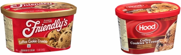
Line up both brands’ red cartons side by side as they appeared on shelves during the same timeframe, and the similarities are hard to ignore: logo and flavor title anchored on the left, scoop (or scoops) to the right, all layered over red textured backgrounds, gold trim, and gradient-heavy labeling. Same structure, same aesthetic.
Former Designs: Pre-2022
Hood’s oversized scoop imagery is a bit cleaner and crisper than Friendly’s, but the designs are still eerily identical. They even look like they came from a similar budget design template, sharing the same flaws. But who influenced whom?
At the time, this gold trim and gradient-heavy aesthetic was a common stylistic choice, a cheap way to dress up everyday products as something premium. Both brands may have instinctively reached for the same contemporary formula of golds and gradients, spitting out a similar result. Coincidence or not, the style has long since expired, leaving two regional favorites sitting in a stale, outdated mess.
Friendly's and Hood's Classic Flavors: Packaging (Pre-2022)
Ditch the Red: Here Comes the Sun
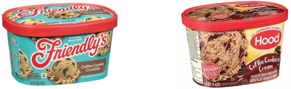
Thankfully, both brands have parted ways and finally abandoned this outdated style motif. The swampy red is gone, the overloaded gradients have been flattened, and the golden trim removed, replaced with a refreshed color palette suited for today’s freezer aisle. These once-similar cartons may have landed in very different aesthetics, but they share one key outcome: both iconic identities now feel relevant in the modern world.
Current Designs
Hood solved its contemporary design crisis with a burst of sunshine, transforming the package into a bright landscape where the iconic logo stands in as the sun. Yellow rays radiate outward, amplifying the classic mark, while hill-like curves guide the eye to a product label no longer weighed down by outdated styling. Small illustrative touches, like cookie pieces or vanilla flowers, add extra sparks of visual interest, balancing the composition without overwhelming it.
The novelty items adopt the same color pattern and come to life with this simple shift. Take the former ice cream sandwich package (below): the red background is so overpowering that it distorts what should be a pure white filling, turning it yellowish and gloppy, wedged between equally depressing red-brown wafers. This item had clearly overstayed its freezer time and is thankfully evicted by a redesign that makes it clean, bright, and genuinely appetizing.
Hood: Old vs New Packaging
It’s Always Sunny…
There’s still plenty to nitpick with this sunshine update. Hood replaces the traditional scoop-on-a-fluffy-base with a giant ice-cream wheel that dominates the carton. Instead of resembling a delicious scoop, this oversized, crater-covered mass looks ready to steamroll the logo and flavor title.
Meanwhile, the ice cream sandwich ménage à trois might be far less threatening (and more appetizing), but just two sandwiches would’ve been enough. The image presentation is awkward, and that poor guy in the back looks sad and left out.
Both products use a playful title font that breaks free from the heavy drop shadows and rigid baseline of its outdated serif predecessor. This new typeface has plenty of personality, but reading that handwritten scrawl on a curved path isn’t easy. The letterforms already lack definition and become even more amorphous behind frosty freezer glass.
Flavor Titles With the New Typography
There’s also the issue with supermarket clichés. Like it or not, we’ve been pre-programmed with product associated color cues… and this redesign looks like it landed in the wrong neighborhood.
Any packaging update is slightly disorienting, but Hood’s climb from a dark hellscape to a Teletubby playground is dramatic. Adding to that disorientation is how closely the sunshine-y palette and radiating sunray design align with breakfast foods, not dessert treats.
The Teletubby Sun Baby
While this packaging feels more appropriate for waffles or microwaveable sausages, it could be an advantage against brands still clinging to stale ice cream visuals (assuming shoppers recognize it as ice cream, and not frozen pancakes). So toss stereotypes aside and let dessert treats have their morning sunshine!
Eggo, Banquet, and Hood packaging
Nostalgic Taste, Regional Appeal
The sunny, breakfast-style design covers Hood’s national ice cream lines, but a more localized approach was needed for their New England–based products. This line is all about regionally themed graphics and area-specific flavor names. And Hood takes it beyond surface-level references by actually swirling those local flavors right into the ice cream.
Hood is already one of the most widely recognized dairy brands in the country, best known as the official supplier of Lactaid milk in the U.S. With its New England Creamery line (available only in the Northeast) the brand still keeps some things close to home.
This product line features flavors inspired by beloved destinations across New England. Varieties like Martha’s Vineyard Black Raspberry,Maine Sweet Blueberry, and Green Mountain Mint Chip tap into regional culture and character. These references, framed by the iconic red Hood logo, reinforce the brand’s identity as a true Northeast staple.
Friendly’s made their own New England wink with their limited-edition Nor’easter Pothole flavor in early 2018. The carton describes it as “chocolate ice cream swirled with black tar fudge, crème cookie gravel, and chocolate asphalt chips.” Anyone familiar with Northern winter driving will get the humor, but it misses the deeper local connection that Hood’s Creamery line captures so successfully.
Hood New England Creamery flavors surrounding Friendly's Monster Pothole.
That regional emphasis is front and center, with a heritage-inspired typeface paired with the regionally inspired flavors below. Even the prominent red Hood logo takes a backseat, letting the Creamery branding shine. Look closely, and there’s custom background illustrations for each flavor: bears, blueberry bushes, and local landmarks reinforce the cultural connection. This overall aesthetic feels modern and traditional all at once, with home-grown pride in the details.
Both the carton and the ice cream got a serious upgrade.
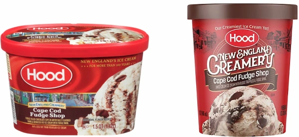
Hood’s limited-edition flavors had originally been grouped under the “Creamery” name rather than a standalone product offering. The Creamery cartons were just slight modifications of Hood’s red container (see below), featuring seasonal and novelty flavors outside the standard lineup. But after a 2022 relaunch with a “ new, premium formulation,” the secondary label ended its short-run status and was repositioned as a permanent collection of New England–themed flavors.
Cape Cod Fudge Shop: Old vs New
This upgrade came with a downsize: the half-gallon was reduced to a quart, a rare case where quality improved as quantity decreased. The once-secondary label was no longer confined to a tiny banner and allowed a space (and identity) all its own. A fresh aesthetic, new tagline, and unique flavors positioned the “new” New England Creamery as a premium offering. These changes also helped the product distance itself from Hood’s lower-tier line and avoid the size-reduction backlash a previously “established” offering might have faced.
Participation Trophy: Cold Stone Creamery
Cold Stone Ice Cream lives in a freezer far, far away from Hood’s New England grocery universe. With a retail footprint limited to ice cream-flavored coffee pods and dessert toppings, it’s one of those products discovered on one trip and lost by the next. Pre-packaged ice cream is available, but sold only in its own U.S. and international locations.
Despite operating in very different retail worlds, the parallels are hard to ignore. The “Creamery” title in each hits a comparable brand tone, while the dark maroon–patterned background, decorative font, and centered scoop follow the same visual approach. Even with a huge price gap (Cold Stone makes Hood’s prices look like free samples) and very different regional roots (Cold Stone originated in Arizona, a more ice cream–friendly climate than cold New England), the design succeeds for both. Cold Stone is a young contender in the ice cream kingdom (founded in 1988), compared to long-time rulers Friendly’s, Hood, and Dairy Queen. While they haven’t reached that deep nostalgic status that comes with regional royalty and multi-generational exposure (yet??), Cold Stone still deserves a design mention for their gorgeous quarts. Those black lids, bold type, and towering scoops don’t get much recognition when they’re locked away inside their own stores. And it’s too bad: those cartons would be striking in a supermarket freezer.
Home Field Advantage: The Desert of Champions
Hood might not have a physical restaurant, but as the Official Dairy of the Boston Red Sox it has something even better: Fenway Park. Fans can grab soft serve, ice cream bars, and the signature Hoodwich right in the stands.
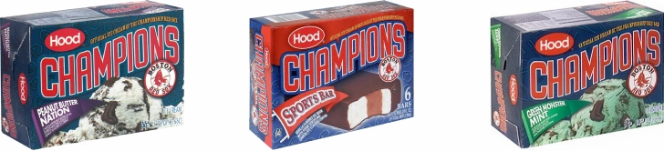
The collaboration didn’t stop at the park. After the Red Sox’s 2004 World Series win (ending an 86-year losing streak), the partnership launched a special-edition Champions line of team-inspired flavors and sports-themed novelties. It became a permanent retail offering across New England, before rebranded as Red Sox.
Original Champions Line (2004)
This gave Hood a real edge in grocery-store differentiation. While their Red Sox ice cream flavors got creative (beyond the usual chocolate, vanilla, and strawberry lineup — more on that later), the novelty items were the same boring ice cream sandwiches, sports bars, and sundae cones found under any brand (see earlier: Dairy Queen’s novelty designs). But stamp a Red Sox logo on one of these mundane products and they magically became symbolic beacons of New England spirit and team allegiance.
Friendly’s, by contrast, doesn’t let its own iconic logo do the work. Instead, it tries to escape the generic novelty bucket with a lazy attempt at product personification. Bars and cones are dropped into oddball scenarios completely irrelevant to the brand, busy living ‘YOLO’ through human activities that are literal death traps for ice cream. They’re living on the edge, with the missing chunks to prove it.
This confusion could have been avoided by actually focusing on the brand. Without any real identity or clear purpose, Friendly’s novelties are as interchangeable as any other bar on the shelf. Even the names (Krunch with a ‘K’? Cookies ’n Cream Dreams?) deepen the identity crisis of these faceless ice cream manifestations. This feels like a strange detour taken on a whim. Taking the personification route means going all in and fully committing.
Friendly’s Novelties
Character branding that connects consumers to a cheerful entity that’s also edible, delicious, and meant to be devoured is completely absent here. These novelties don’t need to become iconic mascots (Mr. Peanut, the Pillsbury Doughboy, or the infamous cannibal M&Ms), but they fail to create even a basic bond between brand and eater. Without that emotional hook, Friendly’s treats can’t earn a memorable “lovable murder.” They’re just thoughtlessly consumed, if purchased at all, and quickly forgotten.
Edible Personalities
Friendly’s Sundae Cones look like another generic product dumped into a random stock backdrop. Here, two cones attend a baseball game, perched in the bleachers and overlooking an empty field. Why baseball is as unclear as why their mini ice-cream sandwiches are riding a roller coaster.
This stadium choice only becomes interesting if, by some twist of grocery-freezer fate, these cones end up next to Hood’s nearly identical product… a Sundae Cone that carries the official Red Sox label and has real baseball roots.
Friendly’s vs. Hood: Sundae Cones
Pure coincidence or thoughtful imitation? It’s hard not to wonder if Friendly’s harbors a bit of unspoken jealousy over those official branding rights. Could this be a subtle, passive-aggressive response? Competing against the ‘Official Ice Cream Cone of the Championship Red Sox’ can’t be easy, especially in New England.
Red Sox Design/Background
No disrespect to Friendly’s, but Hood’s deep ties to the team and the greater Boston community make them the ideal branding partner, both in and out of the park. Beyond being one of New England’s most recognizable dairy brands, Hood has sponsored the team for decades, is a partner with the Red Sox Foundation, and youth baseball across Massachusetts. Even the iconic Hood blimp , which has been circling Fenway Park with the team’s logo since the mid-1990s, is part of the local sports landscape.
Bringing that same spirit directly to the freezer aisle makes perfect sense. The Red Sox & Hood grocery collaboration is a natural next step: two regional icons, rooted in tradition and community pride, teaming up for America’s favorite pastime and dessert sales.
Unfortunately, the packaging doesn’t do justice to this iconic collaboration. Setting aside the generic sports visuals (more on that later), the novelty designs are overworked, over-styled, and drowning in artificial gradients. What should be fun, appetizing treats are instead forced into stiff, unnatural angles, making them look uncomfortable. A harsh, pulsating halo around each item only amplifies the artificiality.
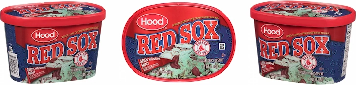
Red Sox Grocery Products: Sports Bars, Fenway Fudge, BoSox Brownie, Caramel Ice Cream Sandwiches, and Single-Serve Green Monster Mint
The ice cream lineup is no better off. A tightly cropped scoop at the center of each carton resembles a pitcher’s mound, but any appetizing appeal is buried under layers of text and clutter. The background makes everything worse, with cartoonish clip art of gloves, hats, and balls adding to the chaos.
It’s busy, unbalanced, and just too much. But failing to capture the team’s identity is the real sin.
Green Monster Mint
Branded packaging is an easy hook for fans and shoppers. Yet instead of leaning into the Red Sox’s distinctive identity, Hood uses generic sports clichés: the wavy script, oversized scoreboard type, and pennant-shaped flavor label. The design is so generic that any sports club (even outside of baseball) could be swapped in with minimal changes. It’s a lazy, ineffective way to signal a tie-in with one of the most recognizable baseball teams in the world.
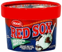
The undersized, awkwardly positioned Boston logo looks slapped on as an afterthought, almost unsure if it belongs. They don’t even bother putting it on single-serve items, making those tiny servings feel even less legit.
Single-serve (6 oz): Where's the Logo?
While creative flavor names like “Green Monster Mint” offer an authentic nod to Fenway’s iconic left field wall, the official Red Sox color palette is completely ignored. The solid red, white, and dark blue — and their team roles as primary, secondary, and tertiary colors — are all discarded.
Creative liberties are taken with off-brand reds and blues, yellow text, and even gradients. The team’s color balance is completely thrown off by reducing white to a mere afterthought, when it should be front and center, supported by red and blue undertones. All of this fumbles the official team connection and leaves the product looking like a Dollar Store reject.
Fans are tied to their sports teams through color. Just seeing the right shades side by side triggers instant recognition, no logo required. Those colors become fan identity, worn proudly as symbols of loyalty and belonging.
That bond is best captured through the field uniform: how the colors move, perform, and make fans feel, game after game, season after season. The jersey is that direct connection.
Yet Hood is sloppy, ignoring the long-established visual language. They rely on copy-driven references like Fenway Fudge and novelty add-ins (little chocolate socks) to hit that real-world connection. These clever details end up doing all the heavy lifting in weaving the partnership into the ice cream.
Copywriters and product developers nailed the team touches, while the packaging team just phoned in the design. (more on this below, in “Chocolate Sox of Delight”)
Rather than squeezing every drop of genuine visual representation (and emotional connection) into the packaging, it’s tossed aside for generic red-and-blue shades and clichéd sports fonts. Even the logo is treated like secondhand clothing. This disregard for the long-standing team aesthetic and emblem, loved and worn by loyal fans, is both insulting and a squandered opportunity.
Hood’s plain sour cream, dressed in simple red and white with a splash of blue, looks more Red Sox than the official Red Sox products.
Keep it simple and close to the uniform’s color balance of 60% white, 30% red, and 10% blue. That official trio alone is more than enough to carry the team identity. All the gradients, swirls, repeating patterns, and multiple font styles only deepen the disconnect. A typeface with curved lines and sharp serifs would have better matched the arched lettering that’s been on the jerseys since 1936. Instead, the team name is slapped into a heavy slab serif set on a generic type-on-a-path arc.
Details matter. The packaging should feel like an authentic extension of what fans are cheering for.
Away uniforms, alternates, and special editions like the Boston Marathon-inspired yellow or St. Patrick’s Day green all come and go. But it’s the classic (home) white uniform with red lettering and a blue cap (roughly a 60%, 30%, 10% ratio) that has persisted for most of the club’s history. Even from a distance, the brand connection is immediate. Just look at Walley the Green Monster, the Red Sox mascot. Even against all that green, the standard jersey still evokes the team legacy.
Hood holds the naming rights to one of New England’s most beloved franchises but missed the chance to deliver true take-home nostalgia: packaging that feels like it belongs at Fenway, yet is available at the local grocery store.
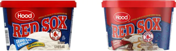
Still, there’s an underlying charm to the Red Sox grocery line, despite its visual misalignment. Crafting the lineup around legendary team references and baseball themes offers some product differentiation (and personality) in an already overcrowded market. Especially when some Hood flavors, like Grand Slam Vanilla, are literally just plain vanilla.
Basic Flavors, Playful Names: “Grand Slam Vanilla” and “Comeback Caramel”
Hood could have taken the same vanilla approach across the entire lineup and just repackaged generic ice cream in lazy baseball puns. But to their credit, they give fans more than just the same old flavors hiding behind a clever label.
Fandom is aligned to flavor. BoSox Brownie has brownie chunks. Fenway Fudge is loaded with fudge. Even the sock-shaped candies change for each flavor: fudge-stuffed in Fenway Fudge, mint in Green Monster Mint, and peanut butter in Peanut Butter Nation. Then there’s Comeback Caramel, a nod to the team’s 2004 ALCS comeback against the Yankees, with chocolate caramel socks swirled into caramel ice cream.
These details connect with fans and curious shoppers, yet that same level of team-centric detail never made it to the packaging. The chocolate sox delivered… but the design forgot the uniform.
Iconic Perfection
While the Boston products fall slightly short of fully capturing that regional nostalgia, one Hood item gets it exactly right… the iconic Hoodsie Cup is a near-perfect New England classic.
This simple ice cream staple of half chocolate, half vanilla, has been served to generations since since 1947. It’s exclusive to New England, strengthening its role as a cultural fixture. “Hood” is baked right into the name, and the design reflects that brand-product synergy: the red-and-white swirly Hoodsie logo, full of energy, mirrors the wave-like separation of the two flavors inside.
Does it taste good? Not really. Does the included wooden spoon add a hint of sawdust flavor? Yep. But few sensory experiences are as painfully beloved as eating chocolate and vanilla with the risk of a tongue splinter from a cheap wooden spoon. Credit to Hood for not changing it.
Hoodwich, Hoodsie, Hood Milk: the nostalgia is the name. For their other products that never reached that iconic status, the red-and-white oval wordmark is all the authenticity they need. In a world busy “modernizing” every brand mark (often for no good reason), Hood has made the boldest move of all by doing nothing.
Hood: Old (Top) vs. New Packaging (Bottom)
This smart decision is perfectly reflected in Hood’s latest ice cream packaging. Instead of reworking the logo into some atrocity (like so many other brands), Hood updates the context around it. Dull, dated cartons are replaced with energetic, uplifting fonts and colors, without ever touching the oval mark. The refreshed design launches the product into a new era, and all the logo needs is a bright ray of sunshine to get there.
Friendly’s redesign takes a similar approach. A simple color update strips away stale design elements, reviving the classic charm that had gradually deteriorated after years of poor packaging choices (discussed in greater detail later). Like Hood, they’ve kept their hands off the logo itself, confident it’s still strong enough in its original form.
Lesson: Don’t mess with what isn’t broken… looking at you, Dairy Queen.
Baskin Robbins
This section was inevitable… Any discussion of ice cream design eventually leads to Baskin-Robbins and the number they made famous: 31. While the company lacks New England roots and avoids the sea of red-and-white food tropes, it’s still built from the same iconic DNA of frozen treats, family-focused service, and a distinctive experience wrapped in decades-old imagery recognized by everyone.
Primary Logo: 2006–2020
BR / 31
In the 1940s, most ice cream shops stuck to the basics: vanilla, chocolate, strawberry. Baskin-Robbins challenged expectations by launching with 21 flavors, instantly setting itself apart from the competition. This early commitment to variety eventually evolved into their now-iconic “31 flavors” (symbolizing a different flavor for each day of the month), and creating a new type of ice cream experience. The number became so synonymous with the brand that in many East Asian countries, Baskin-Robbins is simply known as “31” or “31 Ice Cream”.
The “31” concept was about more than just offering multiple options. Small sampling spoons encouraged customers to be adventurous and try new flavors, a strategy later copied by other ice cream shops — and often abused by customers.
“31 flavors” is so central to Baskin Robbins’ identity that it’s built into every logo iteration. The original 1953 mark used 31 circles, styled as scoops, to surround a giant “31.” This hidden-in-plain-sight concept reappeared in the 2006 logo by swapping the inner colors of the ‘B’ and ‘R’ to quietly form a “31.”
Adventures in Packaging Pints: A Mixed-Economy Mess
Baskin’s early choice of cotton-candy pink and circus-like energy set the fun, carefree vibe expected of an ice cream brand. Variations of that pink have appeared in every logo and package update, with hue, saturation, and tone adjusted to reflect the slightly shifting style over time.
This should be an easy win in the retail freezer. That loud pink, paired with one of the most recognizable ice cream names in the world, creates instant visibility. The bold logo, product image, and flavor title are nicely positioned, tied together by a giant “31” echoing in the background. Overall, this is a good design for the standard one-size-fits-all flavors approach (typically used by mass-market players and most often on half gallons).
But the pint freezer operates under a very different set of rules. The barrier to entry is lower, allowing smaller runs and easier access for upstarts, locals, and seasonal picks. This isn’t a curated shelf of slightly fluctuating equals like the half-gallon world, which has long been locked down by a handful giants (aside from rare exceptions, it’s basically the same cast of characters). Some aren’t even true pints at all… often, 14 oz quietly sneak in next to their 16 oz rivals.
In many supermarkets, the pint coliseum is a chaotic free-for-all: budget offerings, household names, pretentious labels, and new upstarts in constant rotation, all battling it out at wildly different price points.
Range of Options
It’s here that Baskin’s otherwise ‘fine’ design suddenly feels mediocre, boring, and a little old-fashioned.
Sticking with the predictable half-gallon formula (normal logo + standard product photo + general flavor name) shrunk down for a pint size just doesn’t carry the same weight when neighboring brands have abandoned traditional ice cream design conventions altogether. Gelato, sorbet, keto, and other niche contenders are thrown into the mix, adding even more competitive disruption. Everything screams of bigger, better taste adventures, while playing it safe risks fading into obscurity.
For many of these products, following an outdated design formula makes little sense when the pint-size offers so much room for experimentation. Unlike half-gallon squround containers, cylindrical pints are easier to design for; graphics wrap smoothly and continuously, without the awkward breaks and distortions of boxy cartons. This uninterrupted surface opens up all kinds of flavor and product storytelling possibilities.
On a pint-size canvas, a visual identity can fit in the palm of a hand. That intimacy makes the design even more important given the high likelihood the product will be eaten directly from the pint and examined, rotated, reread, and scrutinized between bites. These mini playgrounds are the perfect vessel for any ice cream brand (especially ambitious newcomers) trying to stay relevant and on the shelf.
Side note: The Scoops Ahoy ice cream line (a Stranger Things and Walmart promotion) is a great example of packaging narrative into a pint. The fictional ice cream shop from Season 3 is adapted for real-world freezers. While the packaging doesn’t adopt the 80s aesthetic, it still brings the Hawkins universe to life with show-related flavors, turning the pint into an extension of the series.
Stranger Things Ice Cream Pints
Limited pints are perfect for this. They catch the popular hype and allow for uncommon, story-driven flavors that probably wouldn’t survive on shelves year-round (Pineapple Upside Down, anyone?). The pint becomes a piece of the storyline you can hold and eat while the show plays.
Skip the Scoop
Pint-only brands are often relatively young, so they’re free to experiment with logos, typography, playful illustrations, and flavor-specific visual systems. With adventurous flavors like Strawberry Honey Balsamic with Black Pepper (Salt & Straw) or Brambleberry Crisp (Jeni’s), the packaging must be just as unconventional and expressive to match the elevated taste experiences they claim to offer.
These brands aren’t targeting some random seven year old with these pretentious labels or flashy new flavor experiences — and given the price points of some of these options, milk money won’t even buy a nibble.
Complexity, bliss, and indulgence are baked into the high-level design and flavors. Even longer-established brands are pushing creatively, unwilling to sit back while their youthful* competitors have all the fun.
• *youthful = roughly 1–15 years on a grocery freezer shelf
Each pursues its own distinct aesthetic and tone. Many (especially at the premium level) are united by one choice: ditching the traditional ice cream scoop shot. That overburdened image, tasked with capturing an entire taste promise in a single photograph, is often nowhere to be found.
Artisan, Craft & Higher-End Pints Available in Select US Grocery Stores (Varies by Region)
Expectations are incredibly high: these pints aren’t bargain-basement brands. Even the most perfectly lit and meticulously retouched scoop can’t live up to the masterpiece carton it sits on. Opting for a no-scoop design is next-level curation with clever copy, vibrant color, inventive typography, and storytelling for the heavy lifting. The design grabs attention but leaves plenty of room for the imagination.
But drop in a silly scoop image and all that carefully built mystery instantly evaporates. Now it’s just another interchangeable pint on an overcrowded shelf.
Van Leeuwen’s Peanut Butter Brownie Chip vs. Brands Featuring a Visual Scoop
Side note: The scoop shot hasn’t gone extinct on all pints. It’s still common among generic store brands (e.g., Great Value) and retail giants like Turkey Hill and Breyers. Both tier-levels are known for their half gallons, which proudly display the traditional ice cream image, which are just adapted (scoop and all) to pint size for brand consistency. The real sales driver remains the half gallon; pints are often limited, serving as an occasional pick-me up for those seeking a single serving. Ben & Jerry’s is one of the few higher-tier, pro-scoop outliers. Though pint-focused, they showcase their scoops. But decades of recognition and dominant freezer presence, along with some great branding and visuals, they can show it all, and still take down some very creative competition. These scoop displays are grounded by stable, low-risk products locked into freezer shelves and shopping lists. Some through affordability, but all through long-term familiarity. Product image or not, consumers know exactly what to expect.
Vanilla Scoop Shots
Classic Wordplay… Just Add Salt
Even common flavors wrapped in packaging fit for the Gods are at risk of losing some of their footing when every brand, at every price point, carries the same classic flavor.
Many premium and artisanal brands give their baseline flavors a little extra linguistic lift, reframing them for distinction. Some borrow the same craft/technique-driven language more appropriate for truly complex flavors and apply it to common options (e.g., Double Vanilla, Strawberry Buttermilk,Chocolate Chocolate). This implies a depth that may not even exist, yet somehow justifies dropping $10 for a pint of plain strawberry. Others stick with vague intensifiers (e.g., Ultra Chocolate, Super Vanilla, Overload Strawberry) that promise “something much more extreme” to stand out… but might be just empty, hollow adjectives.
A longer product name is inherently performative, especially on a surface with limited space. These extra adjectives demand attention, dressing up ordinary flavors in language better suited for their more complex siblings.
This reframing isn’t limited to higher-tier products. But mid- and lower-end take the simple route and just add one word to a plain flavor: Simply Strawberry, Classic Caramel, Rich Coffee, Double Chocolate. These familiar modifiers, flexible enough to work on most flavors, carefully avoid any fancy wordy drama that might alienate long-term customers.
Fancy or not, the casual addition of sea and/or salt to otherwise common flavors has become ubiquitous across all price points. Sure, sea salt + caramel are a legit pairing, but this labeling approach has expanded far beyond its original scope of just caramel. What once felt artisanal and special now reads as routine filler, thanks in part to its prevalence across standard grocery products (see note below). It’s become lazy shorthand for quality, authenticity, and sustainability — usually where those claims are highly questionable. We’re at the point where no one questions whether an ice cream called “Deep Sea Treasure” or “Atlantic Sea Salt” even makes sense
Sea & Salt
Side note: This isn’t to say these products aren’t delivering on the “sea salt” — some certainly are. But many are guilty of pushing a trendy label. This trend extends far beyond just ice cream flavors: look around any grocery store, and some version of ‘sea salt’ is slapped onto every imaginable product (crackers, cereals, chocolate bars, coffee, body scrubs, lotions, candles, and even cleaning products). In many cases, this is just a marketing gimmick, not an intentional ingredient.
Boring Baskins
All the clever flavors, inventive packaging, and glossy messaging fighting it out in today’s freezer cases are just a modern remix of what made Baskin-Robbins a success: ambitious variety. And yet, the very company that built its name (literally) on options that challenged the three-flavor status quo now feels like a predictable pint of vanilla.
“31 flavors” doesn’t mean much anymore with every brand offering endless choices. Next to premium pints showing off shiny labels and trend-driven concepts, Baskin-Robbins looks archaic and unadventurous. The brand that introduced multiple ice cream options now barely registers in the freezer case.
Side note: The Paradox of Choice (i.e., too many options can lead to decision paralysis), along with related principles like Hick’s Law (decision time increases with the number of choices) and Miller’s Law (humans can only handle about 7 ± 2 pieces in working memory), immediately come to mind with Baskin-Robbins. These ideas generally argue for reducing complexity to improve decision-making: an approach at odds with a company identity built around offering 31 flavors. Yet this becomes somewhat irrelevant when that same product sits in a commercial freezer aisle as just another option in an oversaturated field.
Here, they play it safe and stick to the basics like regular Chocolate Chip and plain Strawberry. Forget about finding a Flavor of the Month that captures the inventive spirit of Baskin-Robbins: most grocery stores carry about six flavors, nowhere near the full 31 — more on that later. Occasionally, a creative option claws its way onto select shelves (Love Potion 31 is one outlier), but the more adventurous flavors are typically held captive in scoop shops and never reach the grocery aisle.
Mainstream Flavor Lineup
A Late Supermarket Debut
Baskin-Robbins was already late to the retail freezer compared to other ice cream shop brands. Dairy Queen (late ‘90s), Friendly’s (by 1987), Häagen-Dazs (early ‘70s), and Ben & Jerry’s (early ’80s) had already settled into retail markets. By the time Baskin-Robbins finally showed up in 2013, they’d abandoned the ice cream and launched shelf-stable sherbet freezer bars that needed to be frozen at home.
These bars weren’t even sold in their own shops. This strange product was even more questionable with “Baskin-Robbins inspired flavors” and “Artificially Flavored” plastered all over the hot pink packaging. Skipping the brand’s core product was an odd way to move from scoop shop to grocery store.
2013 Sherbet Freezer Bars & 2014 Pint Debut
A better supermarket debut came in 2014 with 16 flavors of ice cream in 14 oz cartons. It still wasn’t the full 31-flavor lineup, and probably a disappointment for anyone looking for their personal favorite. Most stores didn’t even carry all 16, with availability varying by retailer and location. Still, this product was familiar, actual ice cream, (not a weird sherbet concoction) with recognizable flavors from the original shops.
This launch also attempted to break into the overcrowded novelty space with three chocolate-coated ice cream bars, exclusive to grocery stores. But the bars were nothing special and indistinguishable from countless other generic, mass-market offerings. With no real customer following or distinct identity (nothing like the nostalgic charm of a Dilly Bar) it’s no surprise the lineup was quietly
discontinued.
Generic Ice Cream Bars: Friendly’s Counterparts vs. Baskin-Robbins
Pint Problems — Part One: The Pint Pinch
In grocery stores, Baskin-Robbins is all about the dependable classics and their iconic name. They’re in the same mid-market, family-friendly tier as Friendly’s, Turkey Hill, Edy’s, Blue Bunny, and Breyers, with similar ingredients and prices. Half-gallons run this ice cream bracket. Smart, given only 23% of grocery ice cream buyers prefer a pint.
This makes things an uphill battle for Baskin’s awkward, tiny 14-oz pints. A mid-tier brand also needs a quantity that survives beyond a single dessert, knowing its target audience isn’t shopping for a one-time snack. While some brands do offer smaller sizes, the selection is often limited to a few core flavors, because this household demographic can’t be sustained on little pint-sized servings.
That pink pint and clever logo might catch the eye in some freezers, but next to a wall of half-gallon options — many with decades on shelves and lots of flavors — this iconic name gets skipped for the bigger, easier option.
For families, picking Baskin-Robbins means buying a whole bunch of small cartons instead of one or two much cheaper half-gallons from another brand with similar flavors. Then there’s the stress of picking a flavor mix to please everyone. A half-gallon shuts down complaints and fights over flavors. Bubblegum or coffee, everyone is stuck with the same half-gallon. Grocery shopping isn’t about creating a special dessert moment like going out for ice cream. It’s about filling the freezer for the week with the least amount of hassle.
Let’s be real: even if one of these dinky pints makes it to a household freezer, it’s as good as gone the second it’s opened.
Unhappy Reality: A Pint for a Full Week
Pint Problems — Part Two: Frozen Out
The expectation might be that Baskin-Robbins belongs next to the classic premiums like Häagen-Dazs and Ben & Jerry’s. After all, all three started as scoop shops before they showed up in grocery freezers as pints. So, the same wall of flavors and shelf space.
But Häagen-Dazs and Ben & Jerry’s had a good head start in the supermarket aisle. By entering groceries in the 1970s (Häagen‑Dazs) and 80s (Ben & Jerry’s), both built decades of customer loyalty and shelf presence, becoming permanent go-tos as premium grocery options. People know exactly what they’re getting; there’s no guesswork with these pint-sized giants, further insulating them from trendy artisanal startups. Baskin-Robbins has yet to establish anything close to this level of freezer-aisle authority among grocery shoppers seeking out their favorite classic pint.
Unhappy Reality: A Pint for a Full Week
Regional factors like demand, freezer space, and logistical/cost constraints are likely at play.
From what I’ve seen, Baskin-Robbins pints have a limited selection in NYC and Brooklyn. Neighborhood grocers carry just a few flavors, while Häagen-Dazs, Ben & Jerry’s, and artisanal brands fill the freezer. Even the huge Downtown Brooklyn Target stocks only four Baskin-Robbins flavors yet gives Häagen-Dazs a whole wall.
That little pink carton must feel a bit jealous of its fellow scoop-shop brands…
The Great Wall of Häagen-Dazs
In the greater New York area, the most extensive Baskin-Robbins selections pop up in a few large suburban chains, some stocking as many as 16–20 flavors. This pattern of concentrated availability extends nationwide: a few select big-box retailers (Acme, Shaw’s, Safeway) go all-in with extensive Baskin-Robbins assortments. By contrast, most stores (large and small) carry just 2–6 flavors and barely acknowledge the brand’s presence.
Associated Supermarket — Park Slope, Brooklyn, Early 2026. Baskin-Robbins Flavors: Cookies & Creme, Chocolate Chip
Pint Problems — Part Three: The Pint Imposter
And, as the cherry on top of these disadvantages, Baskin’s is restricted to a tiny 14 oz container, not even a full 16 oz pint. At 14 oz, it’s a “faux pint,” normally associated with artisanal brands that use premium ingredients or a niche position to justify the reduced size. (Shrinkflation is less a factor with small-batch brands; Baskin-Robbins also entered the market at this size, so it’s not the result of cutbacks). Even Ben & Jerry’s delivers a true 16 oz (473 ml) without inflated airs.
The pint is a problem. Baskin-Robbins poses as premium, but it’s just mid-market. It’s too small for a household staple but can’t deliver the experience of an elite 14 oz pint.
But it gets worse. Baskin’s is even undercut by value-oriented private labels (i.e., Kroger, Walmart’s Great Value, Target’s Favorite Day) which often match their half-gallon sections with identical pints, many at bargain prices, and in TRUE 16 oz sizes. While their brand prestige may be lower, their flavor range, size options, and overall shelf dominance easily exceed Baskin’s and destroy the “31 Flavors” promise.
Great Value Brand
All of this throws Baskin-Robbins into a strange freezer vortex. As much weight as that iconic name carries, the full brand value prop isn’t there, and it’s certainly not a go-to premium indulgence. This isn’t to say that Baskins is a complete failure in the grocery store. It just feels misplaced; like it got lost in the grocery store on the way to the scoop shop.
In 2023, Statista put U.S. brand awareness at 86%. Keep in mind physical store distribution is geographically skewed, with most shops in California and pockets in the South/Southwest and far fewer locations across the northern half of the country.
Among this aware audience are younger consumers (Gen Z and millennials), who show a preference for trendy flavors and scoop-shop experiences, leading them to shops rather than grocery stores. A 2013 study* (Factors Influencing Consumers’ Choice of Ice-Cream: A Study on Impulse Buying Behavior, p. 231) even found that the 18–24 age demographic often skipped grocery ice cream altogether. It’s unclear how often this audience is choosing Baskin-Robbins for their ice cream adventures, but any exposure could eventually benefit the brand’s grocery line: nudging pints into home freezers as this demographic transitions into household buying habits.
*more recent data is needed to confirm current behavior, especially post-COVID.
Google Maps: As of 2025, Brooklyn has about 41 Baskin-Robbins locations, many paired with Dunkin' (Scrapehero.com). Additional locations may not appear at this zoom level.
The Grocery Store Killed the Ice Cream Star
Big restaurant brands don’t taste the same at the grocery store. Baskin-Robbins’ grocery pints can’t escape comparison to the similar products in their scoop shops. By the time they hit supermarket shelves, things have changed: classic recipes are tweaked for mass production, longer shelf life, and spotty freezer conditions. Recreating the texture of a fresh scoop (served at the right temp, under ideal conditions) just can’t be replicated in a factory-sealed pint.
Putting an altered product into the wild when the original is so well known is an open invitation for negative feedback. That risk escalates even further when there’s more than 2,500 ice cream shop locations, making a crossover between the in-shop experience and the lackluster store-bought version unavoidable. A loyal customer can have the “real” thing in a shop one day, then dig into the weaker supermarket pint the next. Now they’re second-guessing their own taste buds.
Baskin-Robbins also hand-packs takeaway cartons right from the ice cream tubs its shops. If one of those fresh cartons lands in the same home freezer as a factory-produced grocery pint, the side-by-side taste test may confirm the difference isn’t all in the customer’s head.
There are scattered reviews across the internet with Baskins often makes the list of horrible grocery Ice Creams making them a favorite for Food-review sites and curated lists of disappointing grocery products as relative to their in-store counterparts.
Even with 2,500+ U.S. locations, plenty of people have still never set foot inside a real Baskin-Robbins. Parts of the Northeast and the Mountain/Northern Plains regions are fairly barren when it comes to shop locations. In those areas, grocery stores tend to pick up the slack, with Shaw’s, Safeway, and other major chains offering decent-sized pint selections, making the underwhelming grocery version the only exposure to the brand.
If that underwhelming pint sets expectations, they’ll never even know what they’re really missing out on. Worse, they may assume the in-shop experience is just as mediocre and skip visiting a real location altogether if they ever encounter one.
Store Density: Data from Scrapehero.com (est. 2024). Graphic by author
Without a BR nearby, the lack of a direct comparison might actually be a saving grace. No deep disappointment, just another average pint from the freezer aisle.
It’s understandable that an unavoidable consequence of mass distribution is a slight drop in quality, and a certain level of forgiveness is expected. But there are tolerance limits. In this case (as with many store-bought products), brands behave as if nothing has changed, leaving people wondering whether the difference is real or all in their heads.
One FAQ on the Baskin-Robbins At Home website from 2014 casually mentions that this store vs. grocery product discrepancy may not be a figment of the imagination:
Their response relies on vague references to “core” (???) Baskin-Robbins flavors and “slight” (???) formula changes without offering any real specifics. Equally concerning is how this information was buried on the site in tiny print (the screenshot above was magnified 133%) and only uncovered through the Wayback Machine. This section quietly disappeared sometime after 2014 and (as far as I could determine through searches of the current site and archived Wayback snapshots), Baskin-Robbins–provided details around store vs. grocery products are nowhere to be found.
Refusing to acknowledge changing formulations has become the norm across many products in this era of shrinkflation, and very few of the major ice cream brands remain untouched. Freezers have become infiltrated with “frozen dairy dessert” labels and other linguistic gymnastics for what was once just a combo of sugar, cream and milk.
Even products still classified as ‘ice cream’ have had to reduce the font size on their ever-growing ingredient lists, keeping items like polysorbate 80, xanthan gum, carrageenan E407, and guar gum (to name only a few) from overtaking the carton design. This wall of ‘ingredients’ seems more appropriate for a demented science experiment than an edible dessert.
All of this is amplified when nostalgia is thrown into the mix, putting Baskin-Robbins and Friendly’s even more on the consumer chopping block than brands that don’t have to live up to childhood tastebud memories. It’s easy to dismiss this as a lack of a mature palate, but there’s more at play here than just fuzzy memories.
Friendly’s even faced a class-action lawsuit (2019) alleging that its ‘vanilla’ ice cream products contained no real vanilla and additive extracts were (allegedly) used to simulate vanilla-based coloring. The case was dismissed for undisclosed reasons, but people noticed long before this lawsuit how far the product has fallen from the ice cream they remember.
The memory of a fresh scoop of ice cream will always win over a contemporary product built for the unpredictable conditions of supermarket distribution. But somewhere along the way, between expanding ingredient lists, disappearing “ice cream” labels, and the rise of shrinkflation, the quality gap has grown too large to ignore. Consumers are left wondering what happened to the experience they grew up on and how much of the original product still remains.
Let Them Eat Cake
One classic they haven’t let slip? Cakes. Like Dairy Queen, cake sales at Baskin-Robbins remain exclusive to their own shops, where they can maintain full quality control.
Mishandled displays, freshness issues, and all the wild chaos that comes with the freezer aisle are avoided. Inventory mismanagement is no longer a concern and those unsold Easter-themed bunny cakes won’t be left sitting out until Christmas. These elaborate displays are already tricky to transport without damage, but throw in the unpredictability of a fast-paced grocery store and you’ve got a smashed disaster waiting to happen.
Baskin Robbins Cakes
Between stabilizers, limited flavor availability, and an often unpredictable cake selection, a visit to a real Baskin-Robbins location easily beats the grocery store experience. Available for pre-order and better protected from smushes, temperature swings, and supermarket chaos, the products feel more worthy of the iconic logo.
But even this once-pure and nostalgic “Baskin-Robbins Ice Cream Experience™” defined by rows of giant tubs, a rotating wall of flavors, and the glowing “31” beacon above the storefront has been diluted, merged, and folded into something else entirely… Coffee.
Dunkin’ Ice Cream
Baskin-Robbins built its brand by offering customers a huge range of flavors (now over over 1,400, including limited-edition varieties). This approach cemented its identity. For decades, a visit meant one thing: ice cream.
Ice cream was the main event. Not an afterthought tacked onto burgers and fries. It was just scoops (and maybe a cake for a special occasion). But this singular ice cream shoppe experience isn’t as simple as it used to be.
Baskin-Robbins, 40th and Walnut Streets, February 11, 1981. Source:Pinterest (original attribution unknown)
While Baskin-Robbins and Dunkin’ had shared locations before, the new owners began deliberately merging the two in co-branded retail spaces. That led to a very different strategy for what used to be a stand-alone ice cream shoppe.
Current Logo Lock-Up
The financial advantages were obvious:
People show up all day: Starting with morning coffee runs and ending with evening family treats, one co-branded shop could cover breakfast, lunch, random snack stops, and after-dinner cones for commuters, remote workers, parents, and retirees.
Seasonal weather balance: When it’s cold, coffee carries the store. When it’s hot, ice cream takes over. One’s slow season is the other’s busy season.
Result:The store stays busy from open to close, all-audience flexibility. In a crowded market, one-stop shopping made sense. Post-COVID habits made managing everything under one roof even more practical.
Even with all the advantages, housing an ice cream parlor and a coffee shop under one roof reshapes and dilutes both experiences. Products aside, it’s an odd cultural pairing: Dunkin’, with its loud Massachusetts hustle, and Baskin-Robbins, with its pastel California chill, now operating in a shared space. This co-counter setup blurs both iconic identities, knocking them slightly out of character. Long-time fans of either chain may not consciously know why, but something feels out of whack once that clean separation disappears.
Co-Counter Setup: Composite for Critique. Assembled from Public Sources.
These products are built on ritual: the daily habit of morning coffee, or going out for ice cream to celebrate. But do groggy early-morning Dunkin' commuters really want sweet scoop displays in their face while they wait for their caffeine fix? Do after-dinner ice cream customers want the smell of brewing coffee messing with their perfect pick out of 31 flavors? Coffee and ice cream aren't inherently at odds - it's not like putting an Edible Arrangements inside a KFC - but each belongs to a specific moment. Blending them degrades the singular experience of each, implying neither deserved a pure, standalone moment.
Even drive-thru locations add to the identity crisis, with a bizarro-brand multiverse of 31 flavors and coffee combos crammed onto an overloaded menu board. Sorting through one brand is hard enough. But two?
Drive Thru Menus. Composite for Critique. Assembled from Public Sources.
No Sync with the Pink
Both companies have undergone independent rebranding while operating in these co-spaces. New logos, fonts, and names - Dunkin' dropped "Donuts," Baskin-Robbins built "31" into its logo - have kept their identities modern and relevant. And through it all, they've remained consistently loyal to some variation of pink as a visual stand-in for energy, fun, and familiarity.
Yet despite sharing a parent company and often operating just feet apart in co-locations, they've never aligned on a single, unified shade. Each remains in its own branded bubble (shifting tone, hue, and brightness across its own visual identity) while refusing to acknowledge the other or their shared corporate family through any visual concessions.
Primary Logos: Brand Timeline Crossovers
For either brand, even a tiny change in pink to "sync up" would mess with its identity. Pink can cover a lot of ground and even a small tweak can quickly flip it from soft and quiet to loud and obnoxious. Baskin's early pinkish pastel, was soft and relaxed with an old-school ice cream parlor aesthetic. Meanwhile, Dunkin's neon pink perfectly captured an over-caffeinated, get-up-and-go energy. Two very different pinks, each tuned to a specific emotional role.
These once-distinct pinks got closer in the 2020s as both brands pushed brighter, more saturated colors. The colors aren't 100% identical, but just a tweak from either side could have met comfortably in a shared middle ground and still worked fine for both brands.
Synced Pink: Both Brands' Pinks Blended Into a Shared Color
But deliberately syncing official logos for hybrid stores would have compromised each brand's core identity and created a dangerous co-dependency.
Sure, the shared building facades (and any places where the two logos might need to co-mingle) might feel less awkward, but future iterations would require an added layer of rules and constraints to maintain consistency. Once established, that alignment would be difficult to undo. Even worse, a forced sync would visually acknowledge their shared corporate overlords, further diluting the distinct experience (and history) each brand has worked to preserve, manage, and evolve on its own terms.
Source: Giphy
Logo notes: The most legitimate versions of each logo were pulled from official websites (including archival tools like the Wayback Machine) and other reputable design references. But even officially sourced digital assets are impacted by image compression, file formats, and display settings. Subtle color variations, especially in older online logos, are often common, especially during the early/pre 2000s. Back then digital brand guidelines were the Wild West: loose and rarely enforced.
Newlyweds (Est. overlap: 1991–2007)
These two brands tied the co-location knot in the early 2000s, and it was immediately clear they'd been operating on very different tonal tracks.
Dunkin' had been using that loud pink since the 1960s and the plump, donut-shaped orange typeface since 1976. In 2002 they added the steaming cup icon, signaling they were about more than just making the donuts. The coffee illustration and bright pink/orange wordmark combo perfectly captured the bouncing, over-caffeinated brand.
Fred the Baker from the Dunkin’ Donuts commercials (1981–1997). Source: Giphy
Baskin-Robbins had been content with quiet browns and pastel pink. In 1991 they finally dropped their old brown woodcut typeface for a friendlier serif more appropriate for the era. A conservative navy blue quickly replaced the remaining traces of brown, forming a softer color pairing with their classic pink.
Source: Official brand materials and archived logo usage across these time periods.
Both brands wanted to feel welcoming, but arrived there from opposite extremes. One shouted for attention - loud, energetic, and slightly obnoxious. The other hung back - chill, inviting, just glad to be included. The extrovert and the introvert became roommates.
By the mid-2000s, brands were cutting the clutter. Logos got simpler, language cleaner. These marks weren't minimal, but they had lost weight. Both embraced abbreviation as a first step toward slimming down.
Dunkin's subtle shift toward simplicity led to a bolder, more streamlined cup icon, replacing the full company name with the more easily readable "DD". Baskin-Robbins went further by removing their standalone "31" entirely and folding the numeral into the structure of the 'BR' mark.
Source: Official brand materials and archived logo usage across these time periods.
Baskin's new asymmetrical typeface didn't exactly reduce the clutter, but it pushed the same adventurous spirit found in the new "BR" mark. Yet this update feels tonally at odds with the pastel pink and low-key blue inherited from the previous logo. The conservative palette never quite catches up, holding the mark back from fully unleashing the over-the-top personality of the new typeface.
Meanwhile, Dunkin upped the volume on its pink, landing in reddish territory and becoming even more unapologetically loud. It committed to the high-energy extrovert direction that Baskin's redesign had yet to fully embrace.
Proud and Loud (Est overlap: 2019–2022)
On the surface, the next update didn't seem like a huge departure, but it marked a significant tonal shift. Both brands leaned hard into modernity: Baskin finally embraced bold saturation, ditching its weak palette in favor of a more electric vibe, while Dunkin' dropped the "Donuts" from its name entirely. These upgrades were also better suited to digital and mobile environments than their washed-out, more verbose predecessors.
The simplification and color shifts distilled what each brand had become as they moved into the 2020s. For Dunkin', removing the redundant "Donuts" descriptor and cup icon, and pulling the once-dominant hot pink into a small apostrophe, dialed down the volume. The donut-shaped wordmark was still 100% Dunkin', but no longer screaming from the rooftops. It had reached single-word recognition and stopped explaining itself.
Source: Official brand materials and archived logo usage across these time periods.
Baskin finally turns up the color volume with higher saturation and contrast to match its energetic letterforms. A radiant pink is pushed to a hot burn, paired with a rich saturated blue that can hold its own. The palette no longer whimpers out and finally steps up to match the identity.
This revamped logo lives up to the quirky personality it had been harboring all along. The lowercase zigzag letterforms are tuned up. The previously asymmetrical "31" shapes are smoothed down. That hidden numeral has finally settled into the form, making what was once a clever Easter egg now an established part of the mark. With color and structure tonally aligned, the brand voice is no longer fighting itself. It's louder and finally comfortable in its own skin.
Dunkin toned it down, Baskin dialed it up. Their pinks met in the middle, barely a shade apart.
Modern and Mature (Est overlap: 2022-Current)
Both brands have entered new tonal territory with their most recent updates. Only faint echoes of their former personalities remain, and the energy has been dialed down to barely a whisper. Gone are the spontaneity and visual excess. Loudness (at times bordering on obnoxiousness) has been replaced by a serious, grown-up presence that feels appropriate in a retirement community serving decaf coffee and sugar-free cones.
They've officially entered adulthood. These logos are in bed by 9 p.m., but they're also navigating a world of mobile apps, digital ordering, drive-thru signage, and fragmented customer touchpoints. This latest adaptation prioritizes a more modern aesthetic, designed to function across digital and physical environments with greater clarity, legibility, and consistency.
Source: Official websites.
Dunkin's typeface went on Ozempic and cut back on the donuts. It shed the baby fat and dialed back the saturation for modern screens. The doughy letterforms slimmed down and firmed up, taking some of that over-caffeinated, bounce-house energy with them. The colors suffered a similar fate. The once-vibrant orange was pulled toward warmer, slightly brownish undertones and sent into an eternal pumpkin-spice-season hibernation. Even the pink apostrophe looks exhausted, fading into a subdued reddish tone. It's lost the bite that once gave it that neon-exclamation-point energy. Now it just hangs out quietly in the background, a faint reminder of a former sugar-fueled personality.
Baskin's typeface traded whimsy for responsibility. Its letters stand at full attention on a rigid horizontal baseline, with no zigzags or asymmetrical flair or fun. These letterforms have gone from a triple-scoop sundae with extra syrup, sprinkles, and a cherry on top to a tiny scoop of sugar-free joyless vanilla. Like Dunkin', the colors have been drained and pushed away from heavy saturation into warmer undertones, friendlier for digital interfaces. Pink remains, but it's been dialed back considerably from the former screeching banshee it once was. The bigger jump is bringing back the deep dark brown from their original identity, replacing the blue entirely and completely reshaping the palette.
For better (or worse), the brands are now speaking in the same subdued tone.
Source: Giphy
Four Colors, Two Brands. One Building.
Shared restraint is most visible in the physical co-locations where the updated branding now sits side by side. Here, the new logos behave as grown-ups in quiet coexistence rather than two oddball kids screaming for attention. Each now carries a quiet confidence, even when forced into close, unavoidable proximity.
Source:Peter Schwabe, Inc. construction of a Dunkin' Donuts/Baskin-Robbins co-branded storefront in Cottage Grove, WI.
This is a huge departure from the clumsy co-branded storefronts of the past. Those early monstrosities often looked thrown together under the cover of night: a chaotic funhouse of mismatched proportions, unnatural signage, and logos forced into cramped compositions.
Composite for Critique. Assembled from Public Sources
And that wasn't too far from the truth. Hybrid locations were a relatively new concept at the time, so many were remodeled Dunkin' stores with Baskin-Robbins squeezed into the existing footprint, both operating as separate brands within the same space. Even as co-locations became more common, Dunkin' continued to take top billing, while poor Baskins was often reduced to a subtitle.
Composite for Critique. Assembled from Public Sources
Yet the storefronts only tipped further into chaos with equal visibility. Equal-sized logos, pressed right up against their roommate and often just inches apart, only turned up the volume. These earlier brand identities, of bold, saturated colors and attention-grabbing typefaces, were never designed to stay quietly in their own lane. Throw them haphazardly onto a small inline storefront without much consideration for how they'd get along, and a visual shouting match breaks out.
Composite for Critique. Assembled from Public Sources
Locations designed specifically to house both brands under one roof can help soften the intensity of these attention battles. Whether built from the ground up or retrofitted from existing structures (former banks, restaurants, and even oil-change facilities), this fresh-start approach gives both identities a more deliberate architectural framework to work within.
And when the underlying structure allows for more generous separation between the brands, the entire dynamic changes. They're no longer battling each other from the rooftops in a broken composition. Logo sizing, spacing, and integration are handled with greater intention and restraint, lowering the volume on the fight for attention and allowing for a more comfortable coexistence. Each identity is given room to breathe, now with a measure of respect for its roommate.
But this modular coexistence feels unnatural.
Composite for Critique. Assembled from Public Sources
Everything is pieced together. One section, sometimes just a logo clinging to a pylon, might belong to Baskin-Robbins while the rest of the building is wrapped in Dunkin' orange and mocha browns. Other locations reach for Baskin's pink around the upper facade while Dunkin's striped awnings claim the storefront windows below. On freestanding sites with multiple exposed sides, logos and brand-colored trim collide at every corner. Even the shared entrance switches allegiance depending on how the colors are arranged around it.
Composite for Critique. Assembled from Public Sources
Many of these co-locations put both brands on every exposed side. But the stitched-together aesthetic still warps how the building reads depending on the viewing angle. Sightlines can't be fully controlled, and highway visibility or approach angles shape perception. One perspective might read as Dunkin'; another as Baskin-Robbins - but move a few feet and it's suddenly both.
The architecture can't commit to a single identity, so it alternates between the two, with one always lurking just outside the frame: an unsettling four-sided billboard with a split personality.
Composite for Critique. Assembled from Public Sources
All of this has shifted with the newest generation of locations built around the 2022 branding refreshes of both companies. Former branded zones are being replaced by a unified palette of neutral whites, charcoals, brick textures, and clean monochromatic surfaces.
It's more sterile (and less adventurous) compared to the previous palette, but this restrained system keeps both brands grounded in the same grown-up tone of their newer identities.
Composite for Critique. Assembled from Public Sources
The branded big-top pylons might be gone and the architecture more cohesive, but many locations still skew in favor of Dunkin'. Dunkin's iconic bubble-like typography remains the default for most secondary signage: drive-thru signs, store hours, and location info. Their orange has been tamed down, shifting toward a more brownish hue with the refresh. It still shows up on trim, awnings, and exterior accents, but with more restraint than before. This lower-saturation orange also sits tonally closer to Baskin-Robbins' current dark brown, making it a much better fit than the previous electric tone.
This imbalance is most noticeable in logo hierarchy. Dunkin' continues the trend of being given top billing, with their name placed significantly higher on the building when the structure allows it. To be fair, this likely reflects physical layout and business dynamics: Dunkin' is often the primary traffic driver, with Baskin-Robbins operating as an additive layer.
Composite for Critique. Assembled from Public Sources
Business metrics aside, the visual execution is more unified and tonally balanced. Depending on the building, it still often favors Dunkin', but the equilibrium is only slightly out of whack. Baskin-Robbins isn't swallowed whole or reduced to an asterisk anymore. The two brands feel a step closer to merging into one experience.
The tradeoff is personality.
The newest hybrid locations veer dangerously close to the "soulless little box" aesthetic (known as "Chipotle-ification") that's been spreading across fast-food/casual dining in recent years. Restaurants have abandoned the exaggerated architectural traits that once made them instantly recognizable: Pizza Hut ditching its iconic red rooflines; Taco Bell stripping away its colorful, mission-style facades; even McDonald's phasing out its bold red-and-yellow color scheme (something we should have seen coming once the oversized arches and playgrounds started disappearing).
Old Building Styles: Composite for Critique. Assembled from Public SourcesModern Updates: Composite for Critique. Assembled from Public Sources
Quirky, distinctive design is gradually being killed off in favor of contemporary box-like buildings, as corporate minimalism continues to erase personality from the restaurant landscape.
Dunkin' and Baskin-Robbins locations have fallen in line with this trend. There's very little separating the newer stores from the interchangeable "faux five-star restaurant" aesthetic dominating the fast-food landscape. To be fair, both brands have matured, and their buildings should reflect that tonal shift. But maturity doesn't have to mean surrendering personality in favor of boring architectural language. Drop one of these co-locations onto a busy highway and it becomes just another big, boxy rectangle: forgettable, interchangeable, and slightly muted.
The new standalone Baskin-Robbins stores have also embraced the soulless, minimalist architecture overtaking suburban strips, with only a slightly different color approach. Same box, different palette. At least these solo locations are free from the baggage of a hand-me-down partnership with Dunkin', giving Baskin-Robbins full control.
This contemporary aesthetic reflects the same restraint driving the rebrand. Like the updated logo, these buildings strip away the loud, bubbly personality of earlier storefronts for a cleaner, more refined identity. The stage is now set for Baskin-Robbins' next act: a modern take on its own nostalgia.
New Logo: Solo Crit
Baskin-Robbins went flat and minimalist by wrapping nostalgic references in a contemporary package. The rebrand reaches back to the company's original Western-style, circus-inspired logos of the 1940s for visual cues, while also retaining the core idea behind its more recent (and iconic) "BR" logo hiding the 31.
That playful "BR" abbreviation ditched an almost hand-drawn personality for a heavy slab-serif wordmark that references the woodcut lettering of the original logo. The brown-and-pink color combo further reinforce the connection, while the hidden "31" remains intact, although reformatted into a rather uptight identity.
The full company name gets the typical uppercase sans-serif treatment (not another overused Helvetica clone), as seen in so many modern rebrands. A single pink "scoop" dot in the wordmark acts as a divider while also nodding to the 31-flavor gimmick, originally represented by 31 dots surrounding the logo.
Modern vibrancy is balanced with vintage restraint. The neon intensity of the 2020 logo is dialed down, but avoids drifting back into the cotton-candy pastels. There's just enough energy to feel contemporary without the overpowering sugar crash.
Dropping the equally intense blue shifts the identity into something more modern and less attention-seeking. Baskin-Robbins brings back the brown, pushing it into a richer, confident tone. Throw in the pink and white, and this contemporary palette becomes the classic chocolate, strawberry, and vanilla combo. These colors are solid and grounded. They know who they are and have a tactile quality suitable for a matured brand.
"The logo redesign of 2022, held by the Baskin Robbins brand, was meant to represent the growth of the company, and its ability to change in line with modern trends and tendencies. The redesign of the badge has kept the main elements of the concept but introduced them in a refined refreshed way, reflecting a powerful company".
Modernizing while keeping the nostalgia makes sense. Yet "reflecting a powerful company" is wrong for ice cream. It comes across as self-important, trading the playfulness that once defined Baskin-Robbins for an alienating corporate authority.
They didn't need the same high-intensity, circus-like whimsy of the 2020s. But did plunging into "powerful company" territory have to drain all the happiness away?
Prior: 2020–2022; Current: 2022–
Thirty-One Meltdowns
The lost joy takes a backseat to the more prominent structural issues. Forcing the "31" into this particular serif feels unnatural. The "B" almost reads as an "8", with those giant circular cutouts leaving only hairline connections between the stem and bowls. Meanwhile, the "R" isn't doing much better. It's pinched in two places: the thin neck near the top where it meets the hidden "1", and the fragile join below where the bowl meets the stem. These thin connectors are hanging on for dear life, ready to snap at any moment.
Logo modified by author
Strip away the outer strokes of the "B" and "R" and the "31" left behind is awkward and disjointed. A reminder of clunky birthday-cake candle numerals, though the typography of waxy supermarket candles is more consistent. The curve of the "1" breaks the flow, making the oddly clipped "3" feel even more displaced. It's almost embarrassing how hard the numeral tries to force itself into the letterforms, yet it never settles comfortably within them.
Logo modified by author
Hidden or whole, deciphering these forms is a chore. Neither the "BR" nor the "31" stands comfortably on its own or together. In earlier versions, spotting the hidden 31 was an added delight, not an excuse for poor execution. The integration felt natural, and the mark stood on its own whether the numeral was discovered or not.
Now imagine encountering this monogram for the first time, with no prior knowledge of the hidden number. The entire form appears needlessly fractured and on the edge of collapse, its shapes oddly clipped, unstable and inconsistent. The composition is so busy fighting itself that it's uncomfortable to look at. Worst of all, requiring a history lesson to justify these strange letterforms is just lazy design.
Logo modified by author
One of the few places that isn't broken is the tail of the monogram "R" and the wispy curve at the tip of its leg. Yep, that sure looks like an ice cream swirl and a singular crack of joy in an otherwise sterile mark. It's a shame this kind of stylistic thinking wasn't pushed harder. Bring more of that original playfulness to the surface instead of trying to mute it. It doesn't need to become the full-blown circus of past logos, but there should be more than a single hint of approachable happiness.
Logo modified by author
Even the sans serif company name falls flat on approachability. To be blunt, it's ugly. It's a good thing the monogram gets all the attention, because as a custom typeface it still delivers the same boring, forgettable impact as a generic sans serif. There are some interesting curves in the details (the 'K' and 'R', and the heavier base of the lower 'B' ) but they don't go far enough to feel approachable or escape an almost cold, mechanical tone.
Beyond spelling out the company name, it does very little. Its brand relevance is unclear, making it feel like a missed design opportunity. It fails to push the customization into something that actually brings life to the mark.
Baskin-Robbins wordmark (custom sans serif)
Back to the Future
We're caught in a nostalgia tidal wave. Chains are reviving retro logos and entire industries are repackaging the aesthetics and moods of earlier eras. Legacy brands are rummaging through their attics, dusting off relics and refurbishing the cherished pieces that still carry emotional weight.
Few products are more deeply tied to memory than iconic ice cream brands. Childhood and traditions are wrapped up in taste, visuals, and texture, remaining accessible and inseparable from the brand itself. This product is perfectly suited for sensory excavation, and it's unsurprising that many of the industry's oldest names are treating their own histories as the launchpad into a modern future.
Source: Giphy
Some emerge warmer and more energized, reclaiming iconic personalities with a contemporary twist. Others land colder and more restrained, muting pieces of their original character while preserving just enough of their past to feel comfortably familiar. A few plunge right into the modern abyss, reducing their former identity to skeletal remains and losing what made the brand resonate in the first place.
The long-term impact of these nostalgic reincarnations remains unclear. Will they reconnect brands with consumers in a modern context, or evolve into something entirely new, leaving their iconic histories behind in the process? Part II looks at how Friendly's recent color refresh fits into all of this, and whether it lands too hard, too soft, or finds the perfect scoop between preservation and reinvention in the modern grocery freezer.
Image AI-generated illustration by author
Disclaimer: This is a broad design critique based on personal observation of ice cream packaging and branding, supported by publicly available sources. While every effort has been made to avoid inaccuracies, it is not a definitive historical account and doesn't account for every regional or limited-run variation. I likely missed some lesser-known outliers given the range of products and eras. The focus is on design, branding systems, and their evolution in retail environments.
Series Overview: Nostalgia in the Ice Cream Case
Part I: Screaming for Ice Cream Examines iconic brands and the designs that shaped their place in today’s ice cream experience.
Part II: Freezer Burned (coming soon) Uses Friendly’s packaging history as a jumping-off point. Breaks down how design choices can, for better or worse, impact ice cream presentation in a chaotic freezer aisle.